Uicurio — Hand-picked UI Libraries & Design Engineering Gems

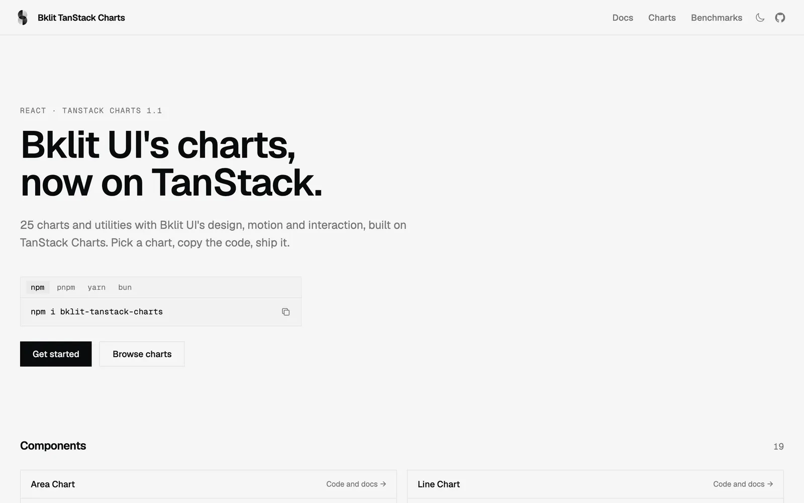
Bklit TanStack Charts — Bklit UI chart components rebuilt on TanStack Charts with identical API and motion.

Bklit TanStack ChartsData Viz

Bklit UI chart components rebuilt on TanStack Charts with identical API and motion.

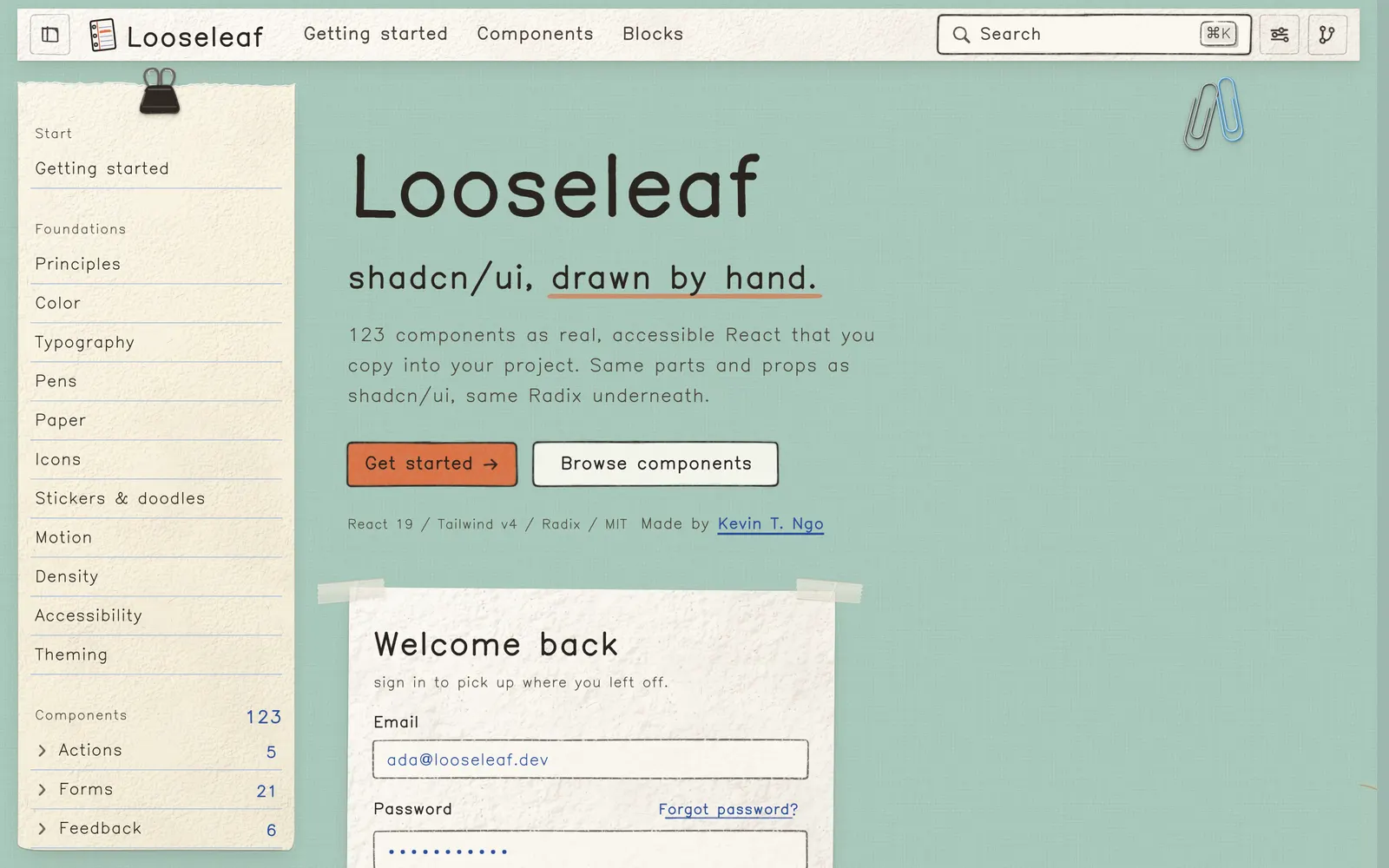
Looseleaf — Hand-drawn React components and shadcn registry where every surface is paper.

LooseleafCollections

Hand-drawn React components and shadcn registry where every surface is paper.

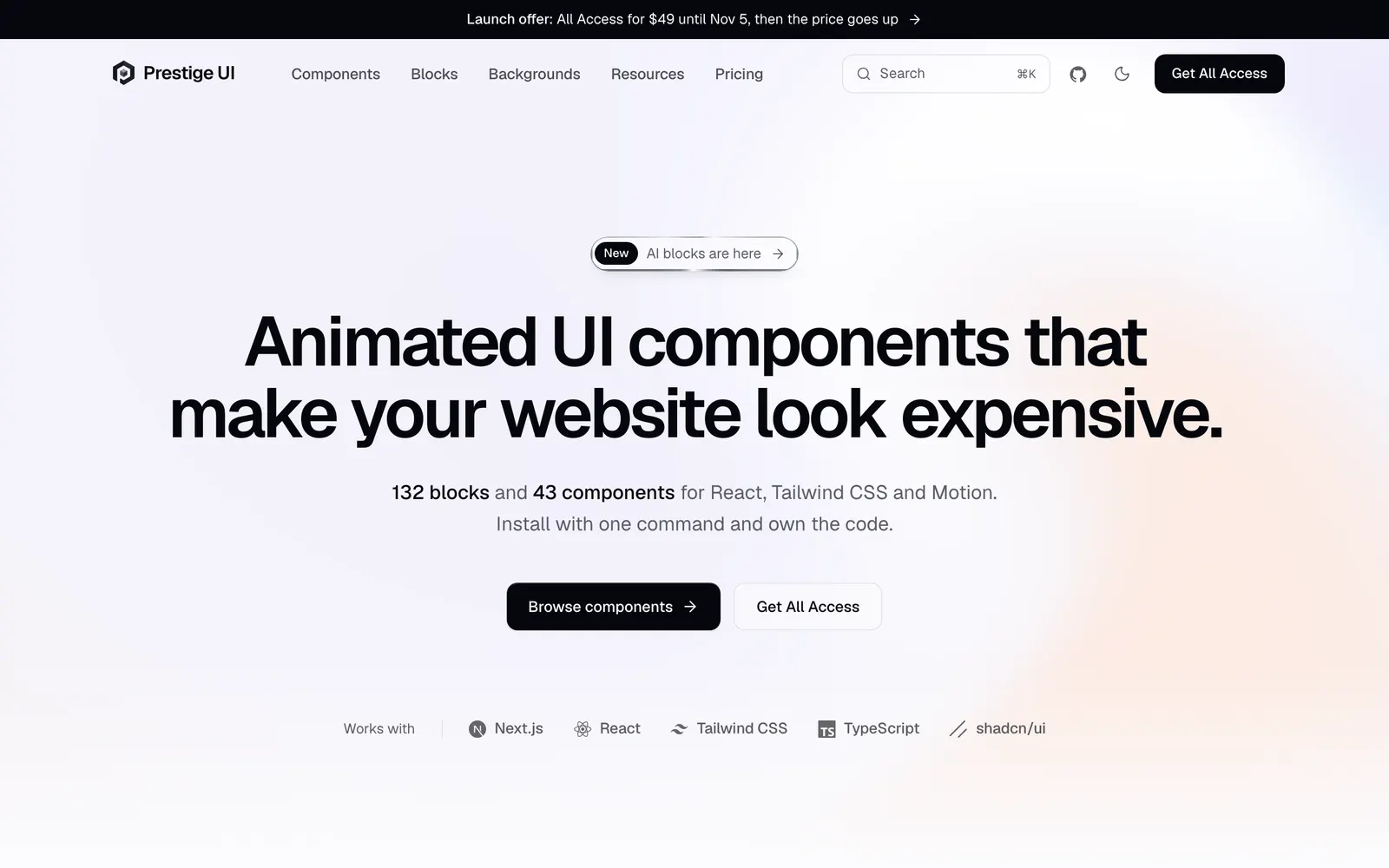
Prestige UI — Animated React components and full-page blocks built with Tailwind CSS and Motion.

Prestige UICollections

Animated React components and full-page blocks built with Tailwind CSS and Motion.

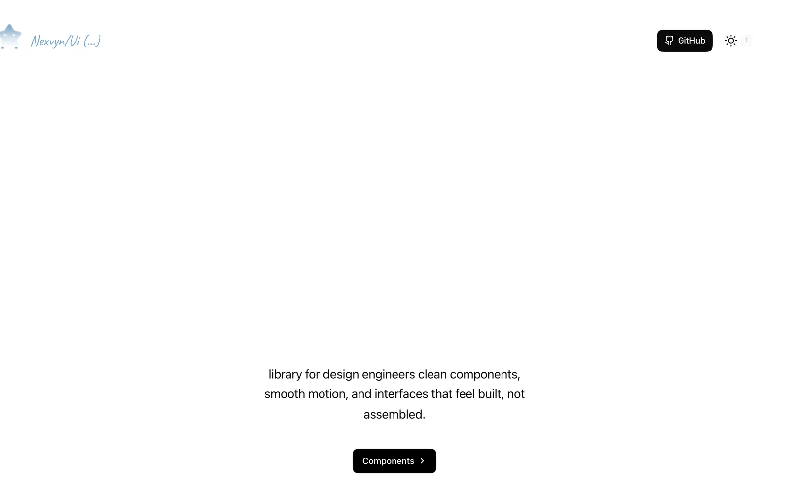
Nexvyn UI — Animated React components with spring physics built on shadcn/ui and Motion.

Nexvyn UICollections

Animated React components with spring physics built on shadcn/ui and Motion.

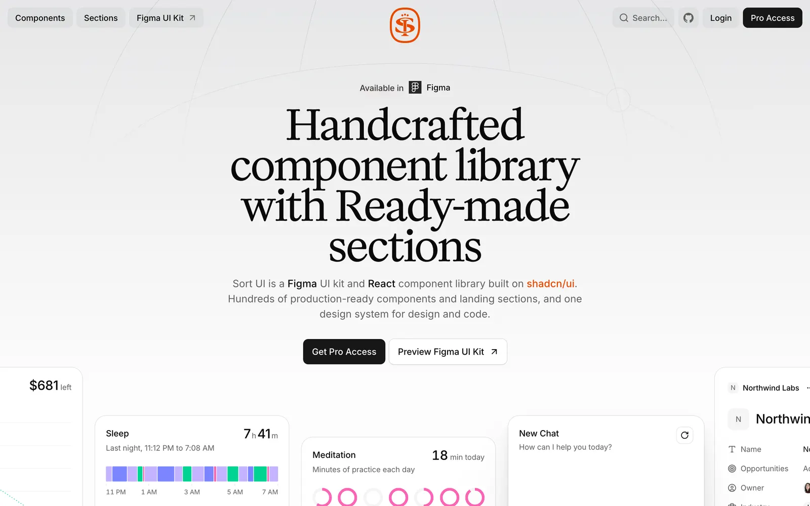
SortUI — Production-grade design system on shadcn/ui with Figma sync and AI components.

SortUICollections

Production-grade design system on shadcn/ui with Figma sync and AI components.

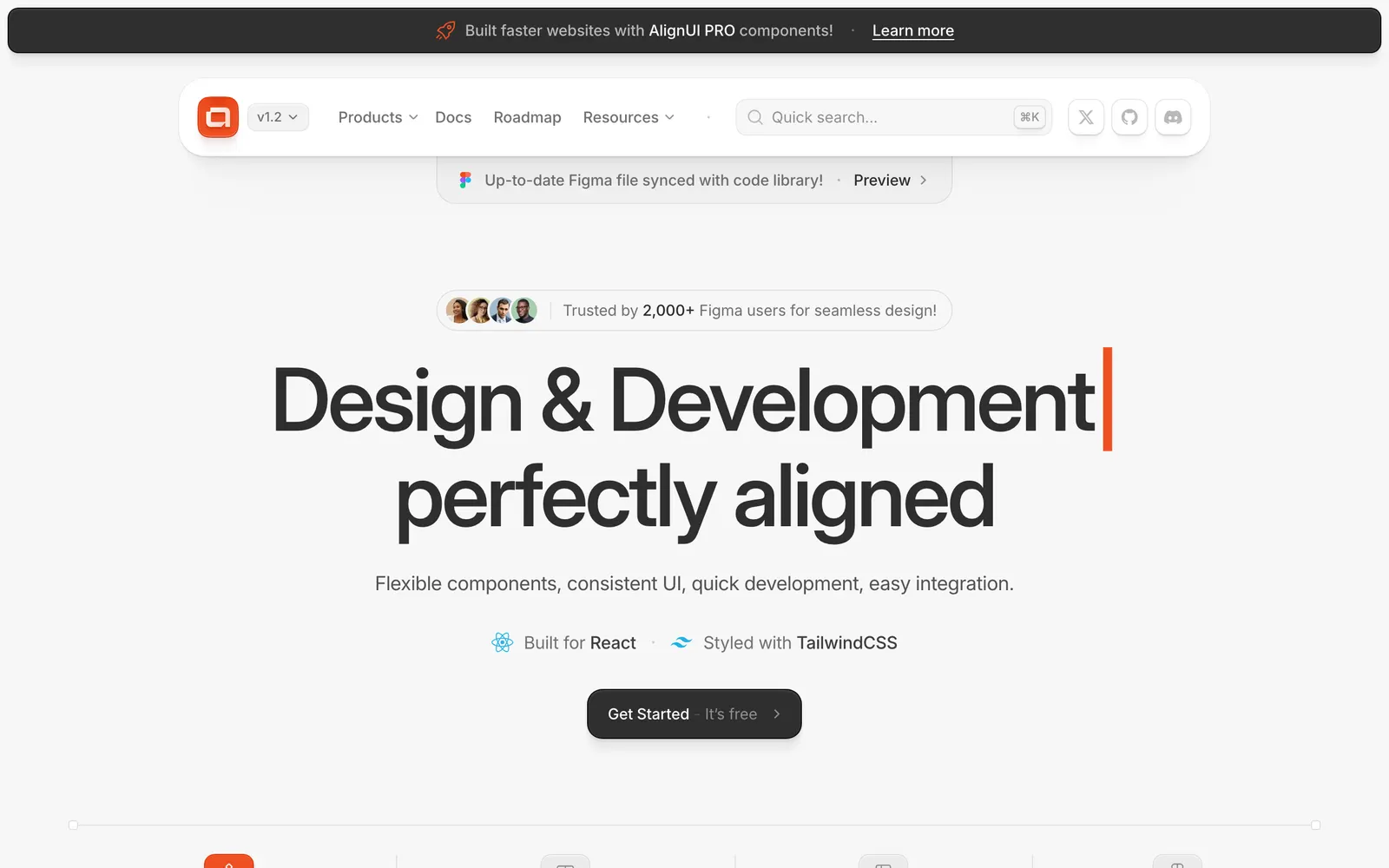
AlignUI — Production-ready Tailwind and Radix UI components with copy-paste CLI.

AlignUICollections

Production-ready Tailwind and Radix UI components with copy-paste CLI.

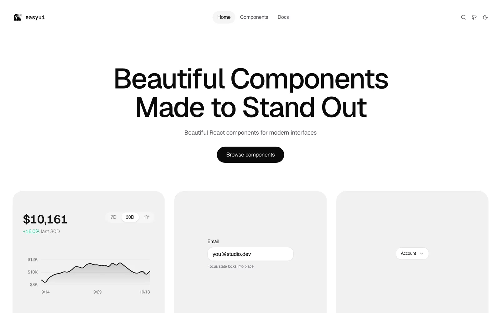
EasyUI — Over 130 production-ready animated React components with shadcn registry support.

EasyUICollections

Over 130 production-ready animated React components with shadcn registry support.

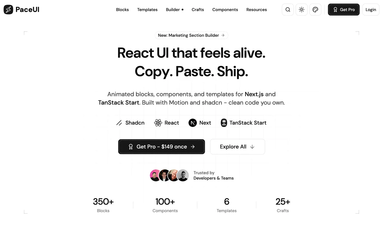
PaceUI — Animated React blocks and crafts for Next.js and TanStack Start with Motion.

PaceUICollections

Animated React blocks and crafts for Next.js and TanStack Start with Motion.

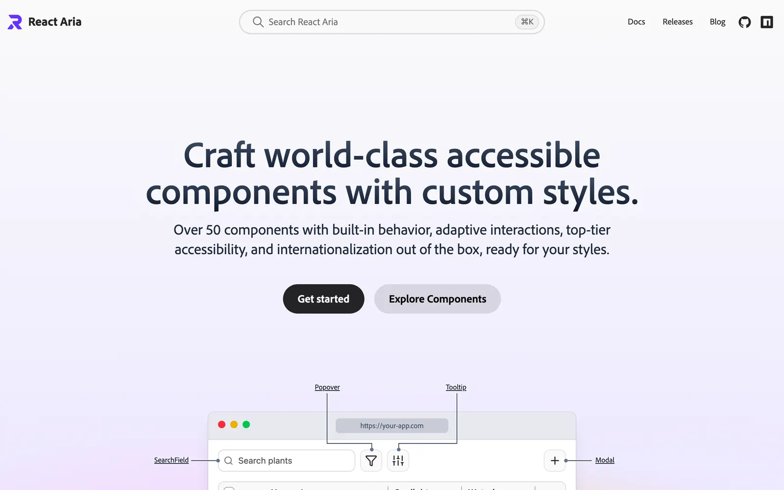
React Aria — Unstyled, accessible React component primitives with adaptive interactions by Adobe.

React AriaCollections

Unstyled, accessible React component primitives with adaptive interactions by Adobe.

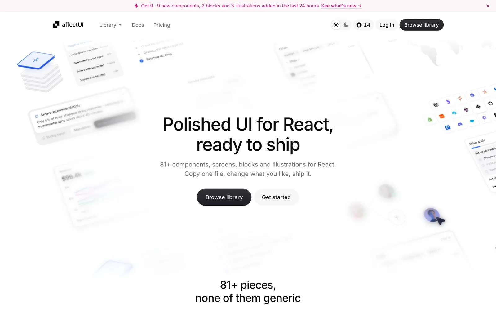
affectUI — Handcrafted React UI components and calm motion for AI apps with zero CSS dependencies.

affectUICollections

Handcrafted React UI components and calm motion for AI apps with zero CSS dependencies.

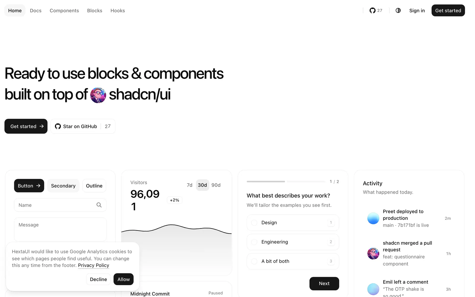
HextaUI — React components and blocks on shadcn/ui and Base UI with built-in motion and states.

HextaUICollections

React components and blocks on shadcn/ui and Base UI with built-in motion and states.

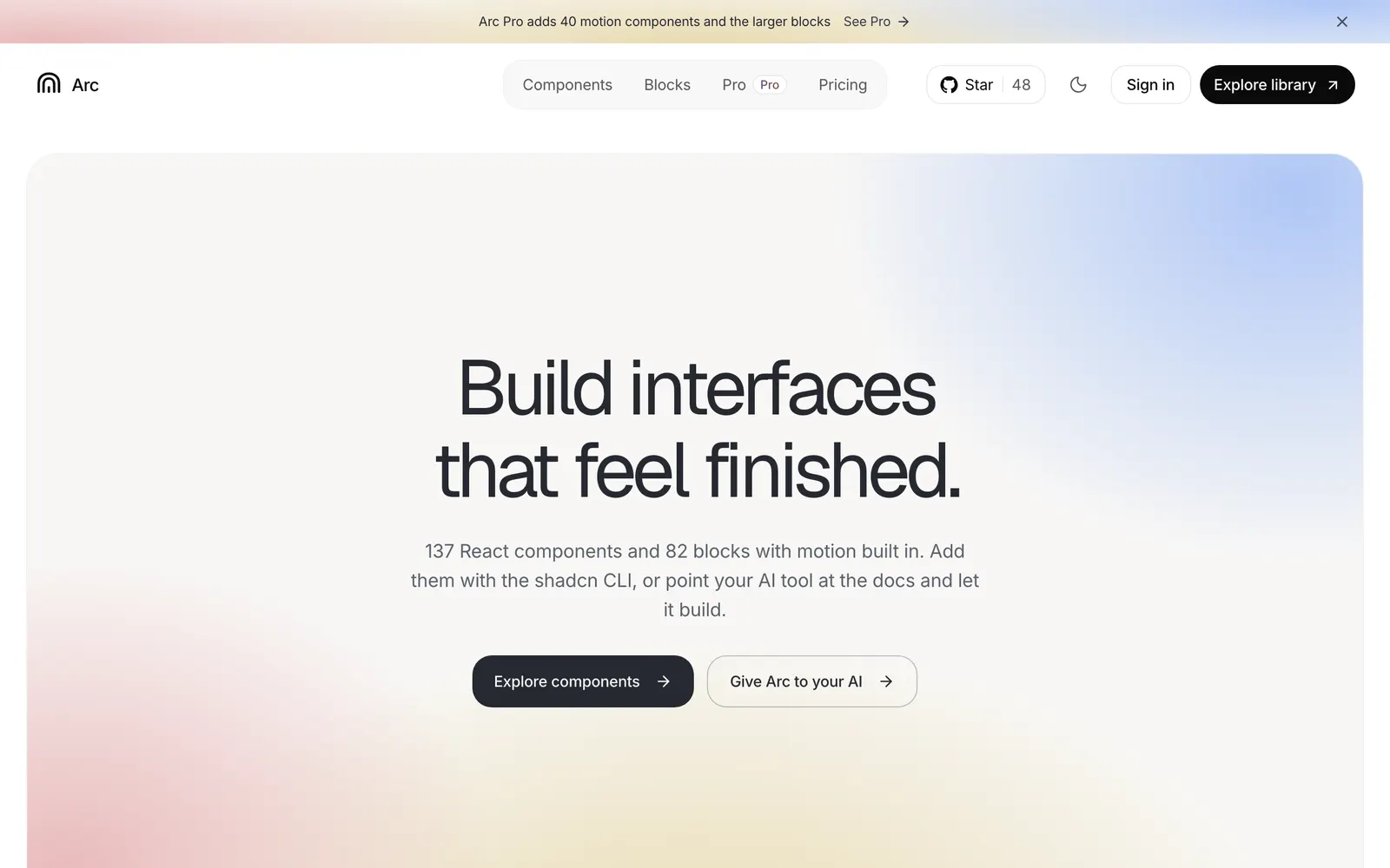
Arc UI — Open-source React components and blocks with calm, polished built-in motion.

Arc UICollections

Open-source React components and blocks with calm, polished built-in motion.

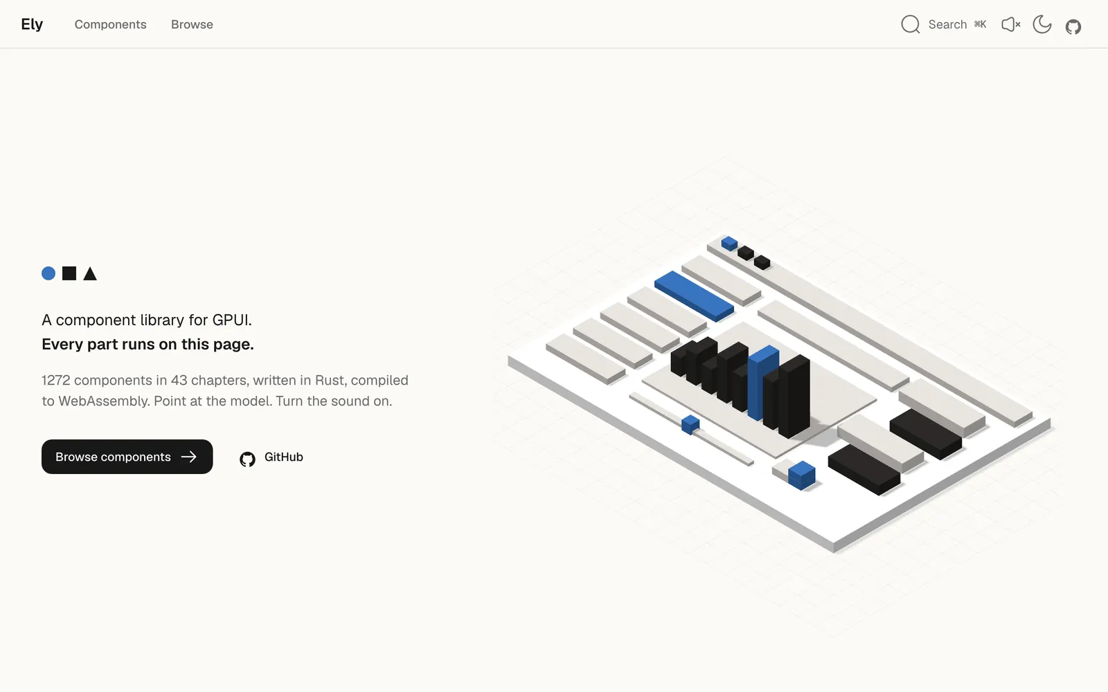
Ely — A warm, minimal GPUI component library in Rust, compiled live to WebAssembly.

ElyCollections

A warm, minimal GPUI component library in Rust, compiled live to WebAssembly.

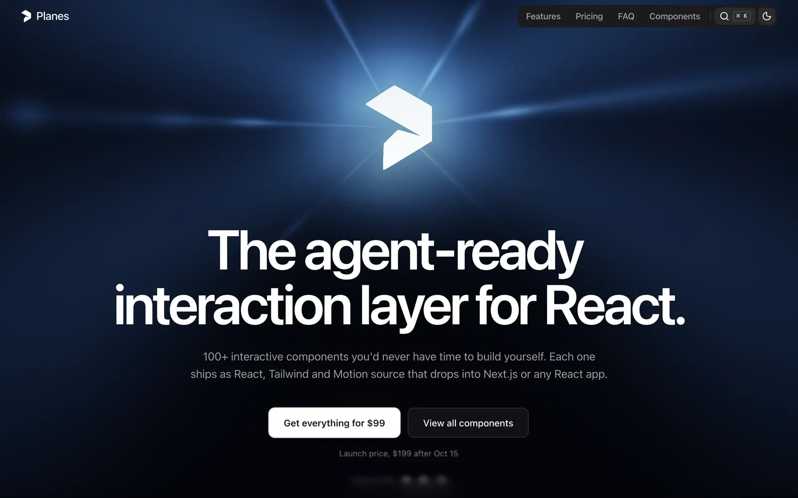
Planes — A high-craft React interaction and motion layer tailored for modern design workflows.

PlanesCollections

A high-craft React interaction and motion layer tailored for modern design workflows.

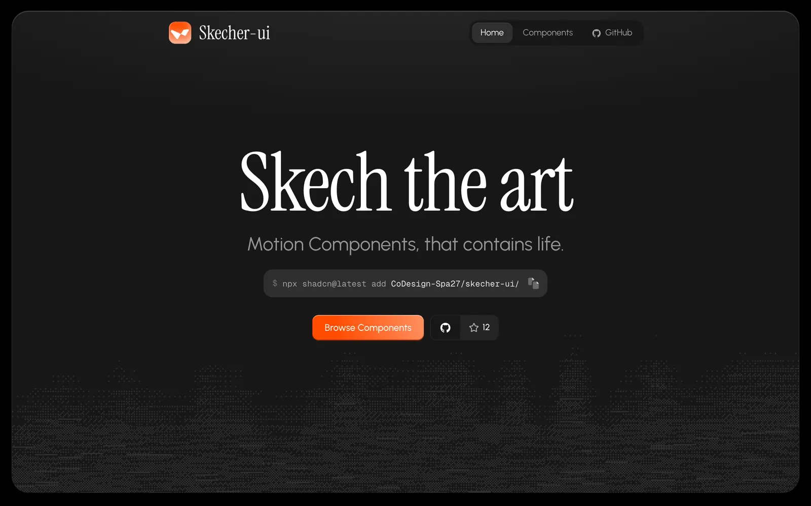
Skecher UI — Polished React motion components and micro-interactions built for the shadcn CLI.

Skecher UICollections

Polished React motion components and micro-interactions built for the shadcn CLI.

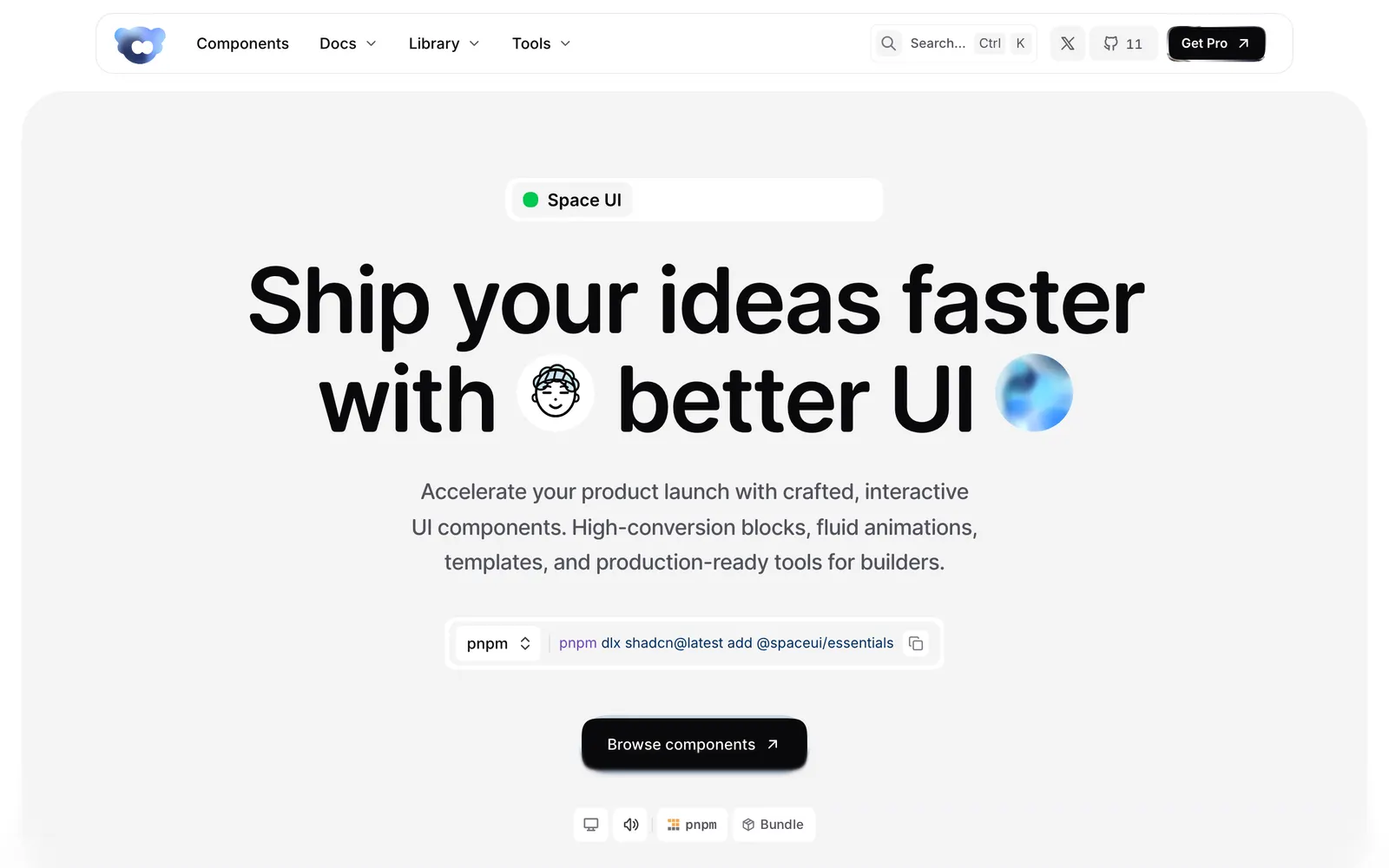
Space UI — Interactive React components, WebGL shaders, and high-conversion landing blocks.

Space UICollections

Interactive React components, WebGL shaders, and high-conversion landing blocks.

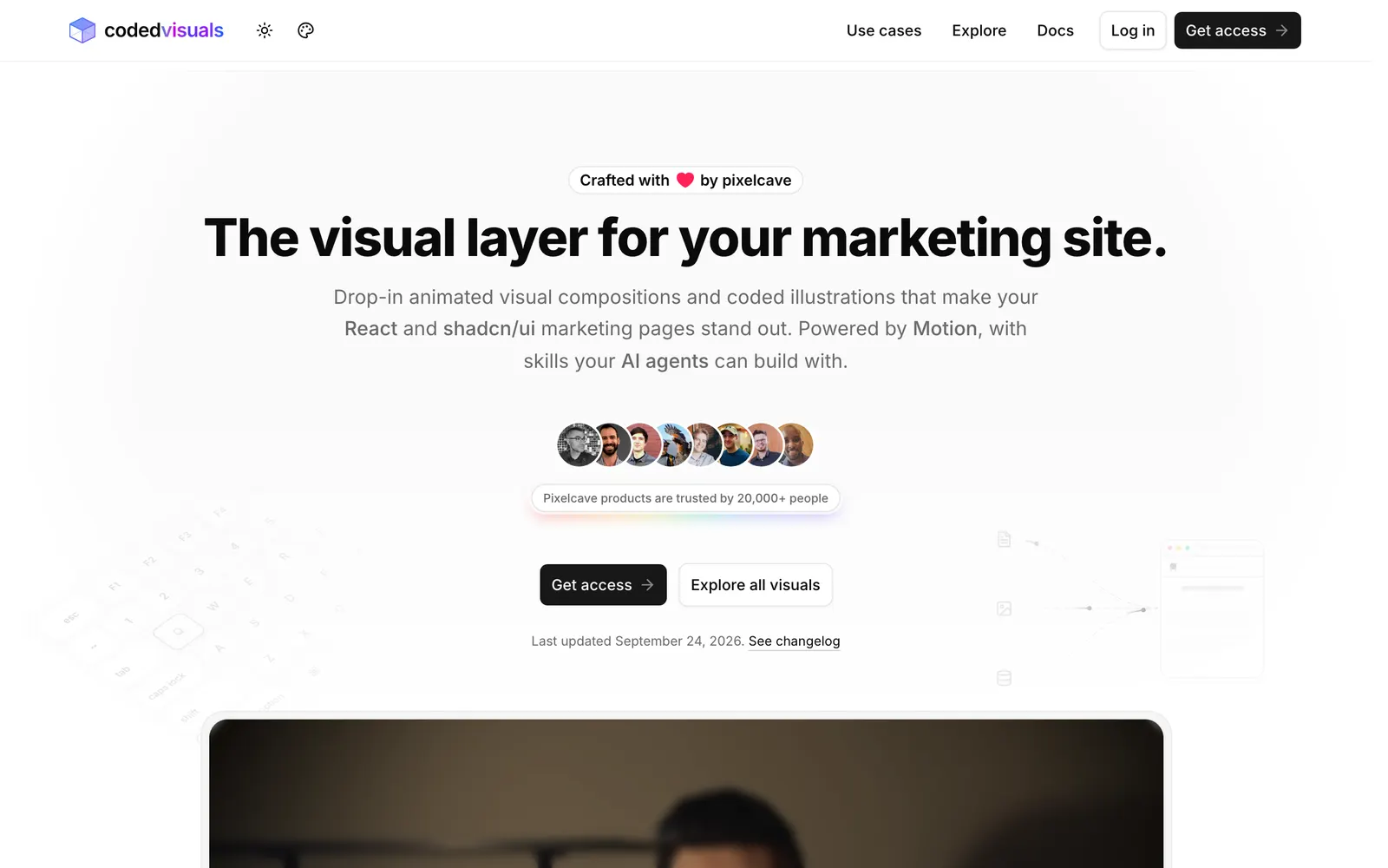
CodedVisuals — Copy-paste animated illustrations and landing visuals for React and shadcn/ui.

CodedVisualsCollections

Copy-paste animated illustrations and landing visuals for React and shadcn/ui.

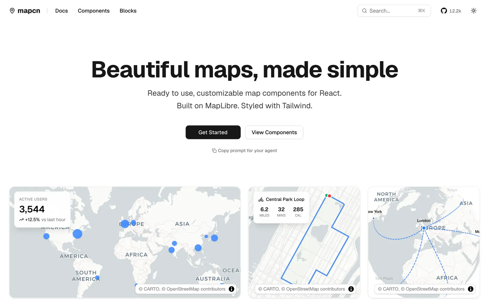
mapcn — Composable React map components built on MapLibre GL and styled with Tailwind CSS.

mapcnData Viz

Composable React map components built on MapLibre GL and styled with Tailwind CSS.

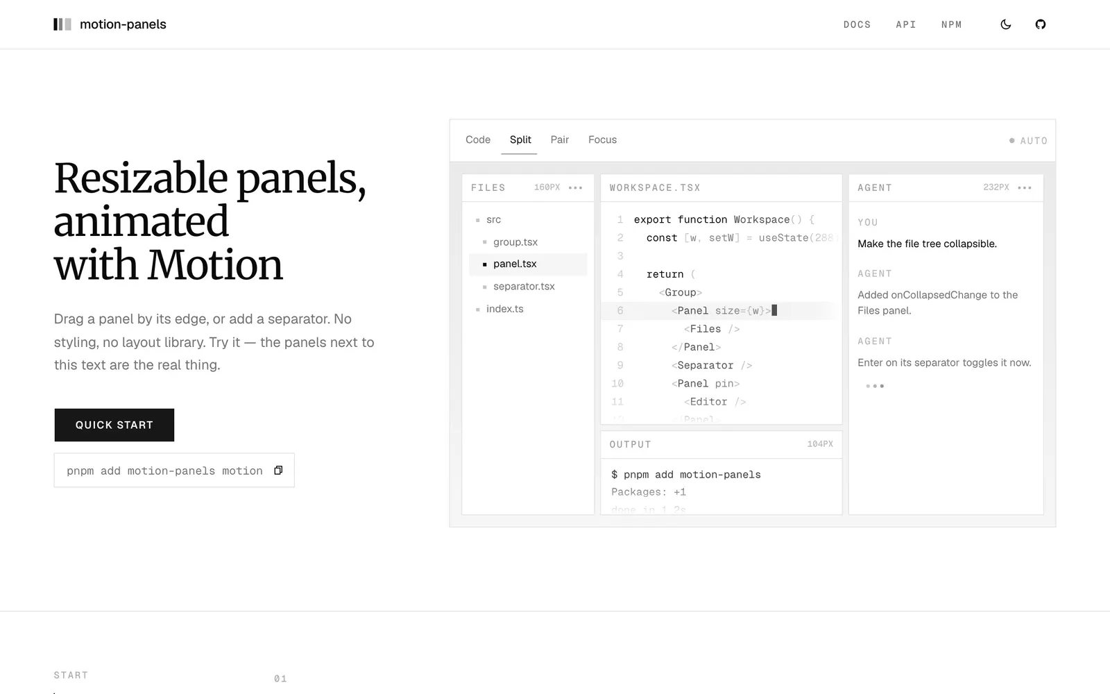
motion-panels — Resizable split panels animated with Motion, featuring smooth folding and snapping.

motion-panelsInput Controls

Resizable split panels animated with Motion, featuring smooth folding and snapping.

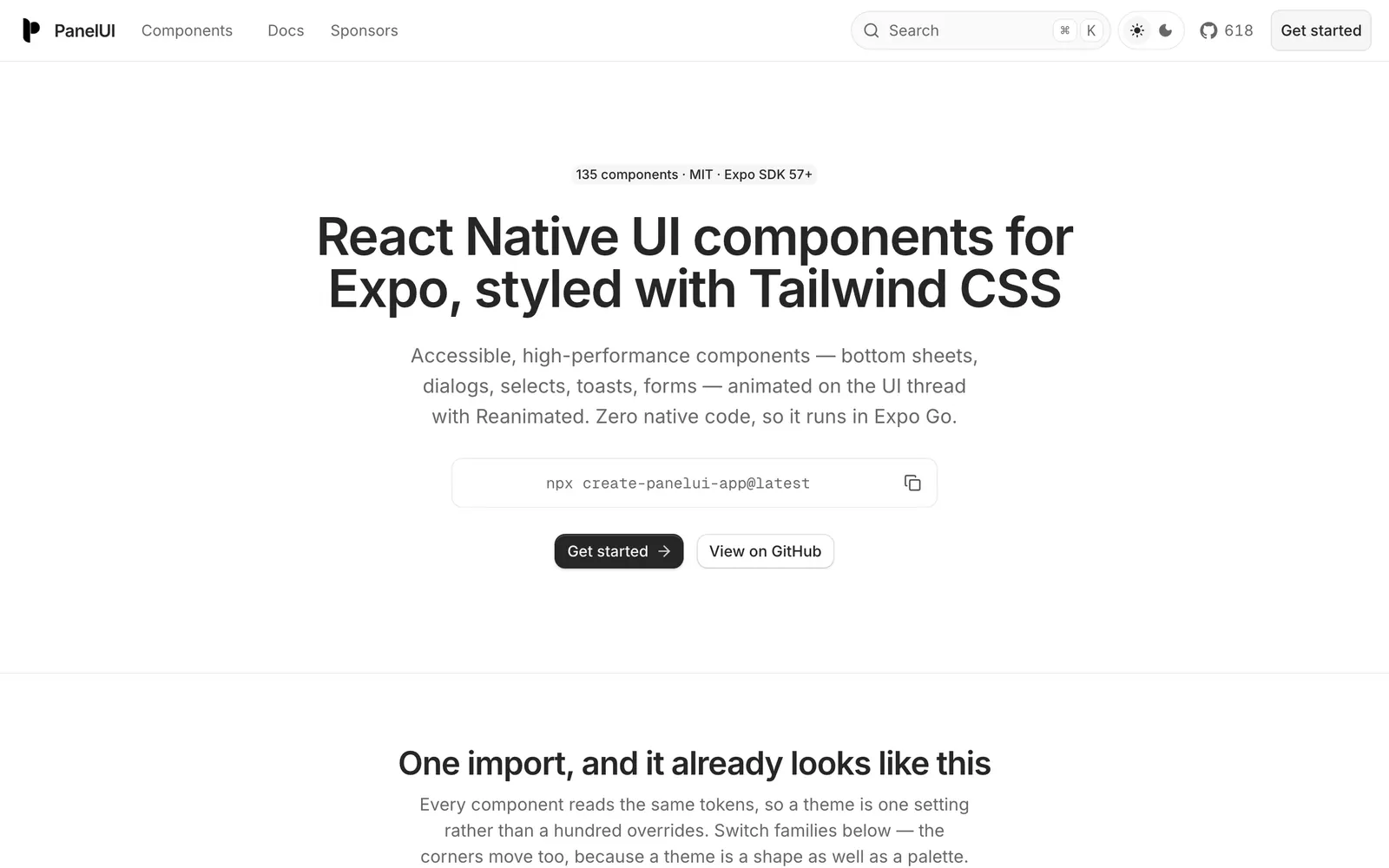
PanelUI — Accessible React Native and Expo component library styled with Tailwind CSS.

PanelUICollections

Accessible React Native and Expo component library styled with Tailwind CSS.

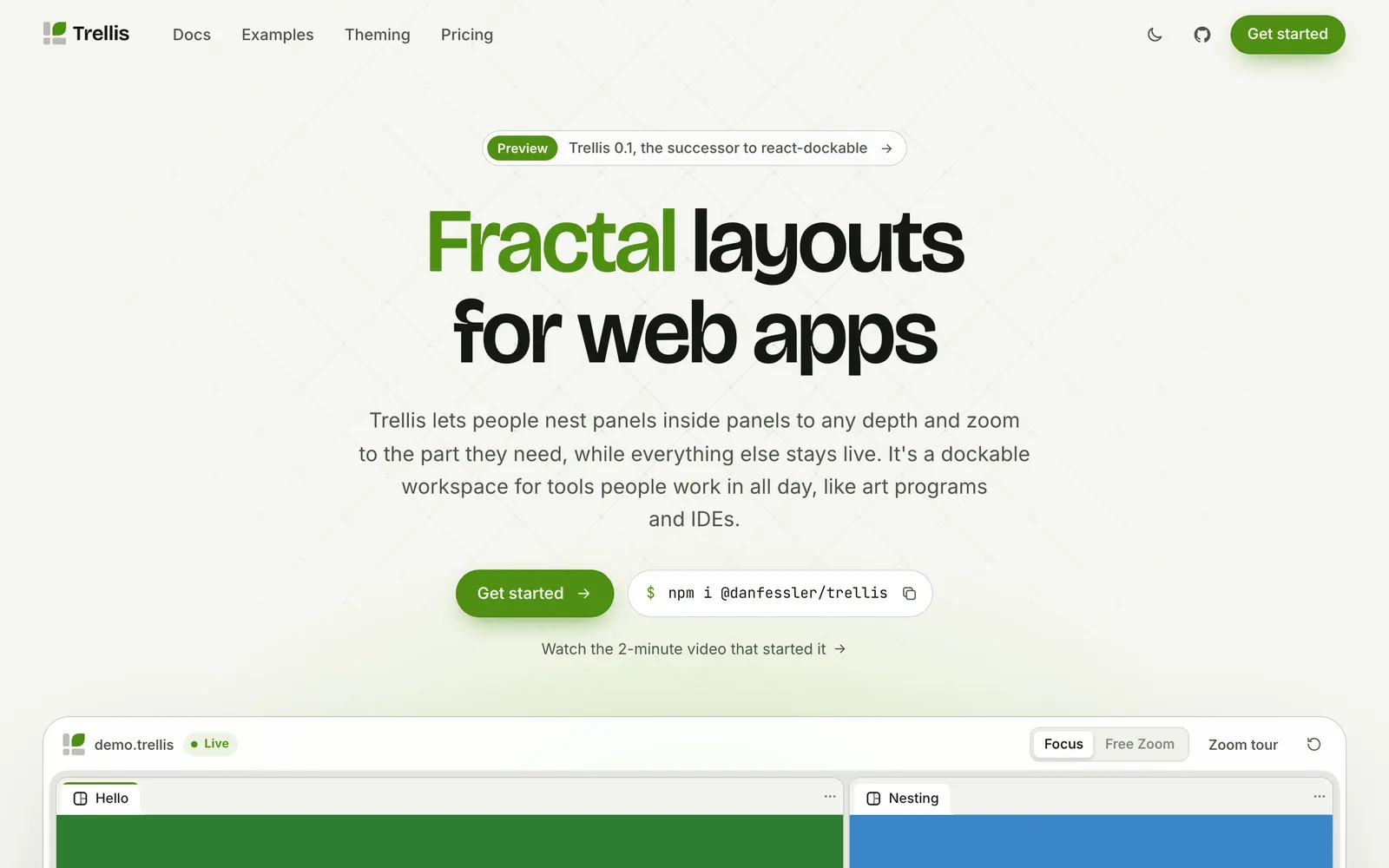
Trellis — Fractal, dockable workspace layouts with deep panel nesting and infinite zoom.

TrellisInput Controls

Fractal, dockable workspace layouts with deep panel nesting and infinite zoom.

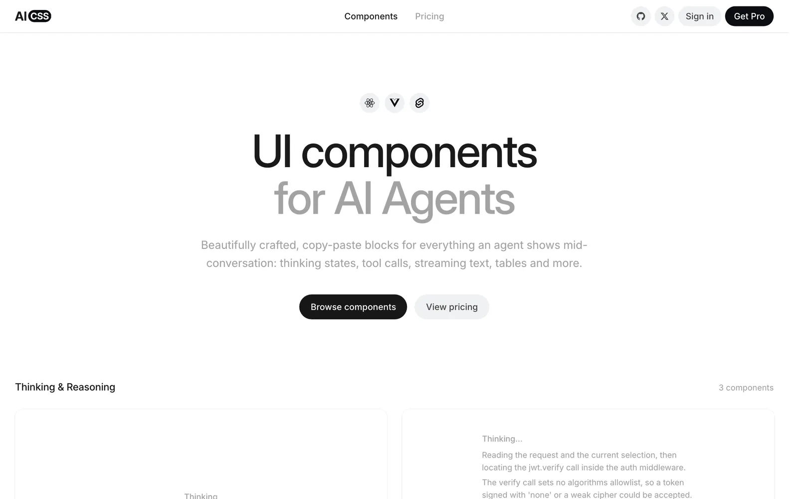
AICSS — Crafted UI components for AI agents: thinking states, tool calls, and streaming text.

AICSSCollections

Crafted UI components for AI agents: thinking states, tool calls, and streaming text.

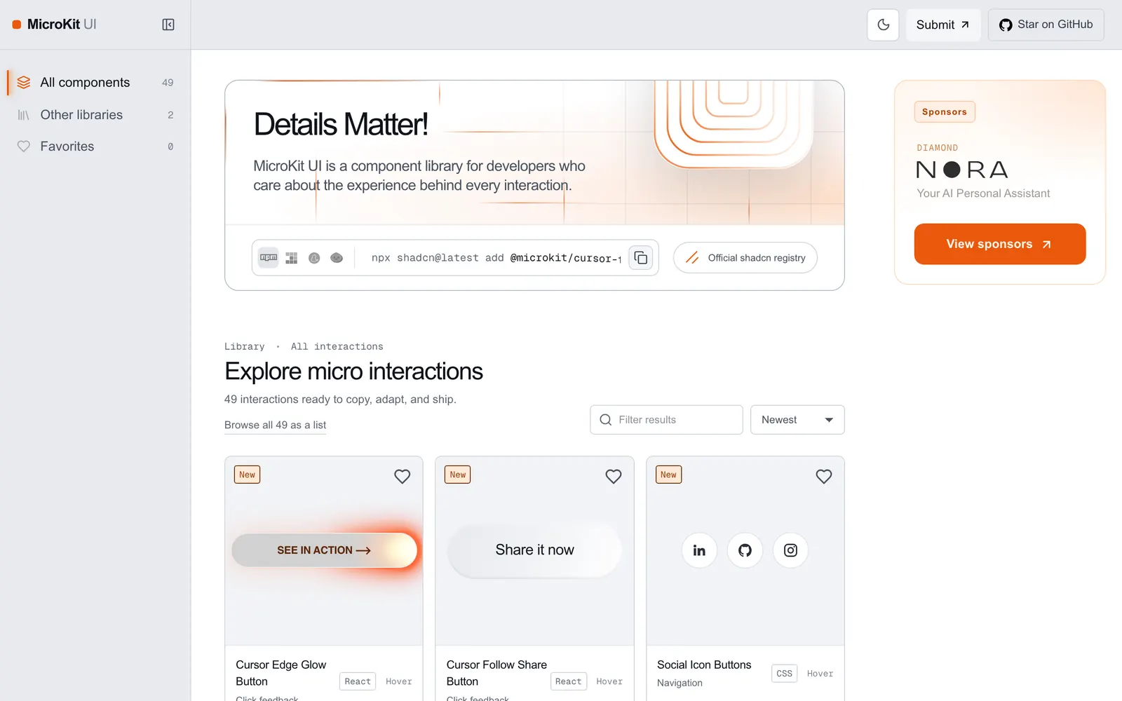
MicroKit UI — Copy-paste microinteractions and subtle UI animations for React and Tailwind.

MicroKit UICollections

Copy-paste microinteractions and subtle UI animations for React and Tailwind.

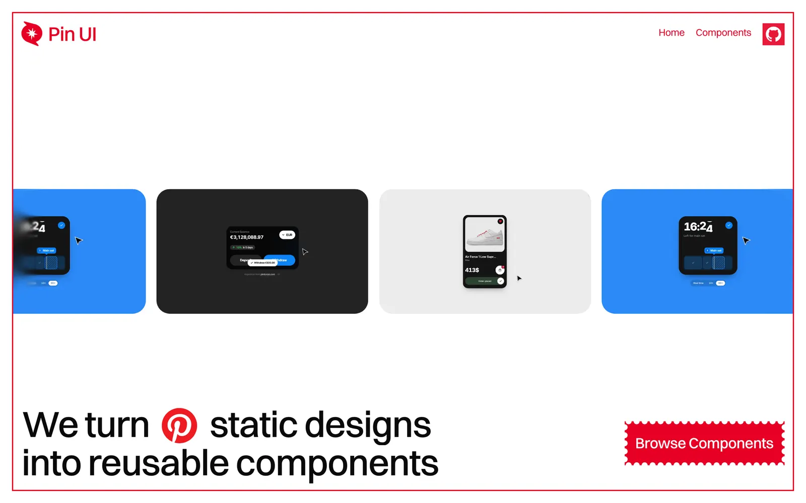
Pin UI — Turns Pinterest visual ideas into production-ready, copy-paste React components.

Pin UICollections

Turns Pinterest visual ideas into production-ready, copy-paste React components.

Loading more…