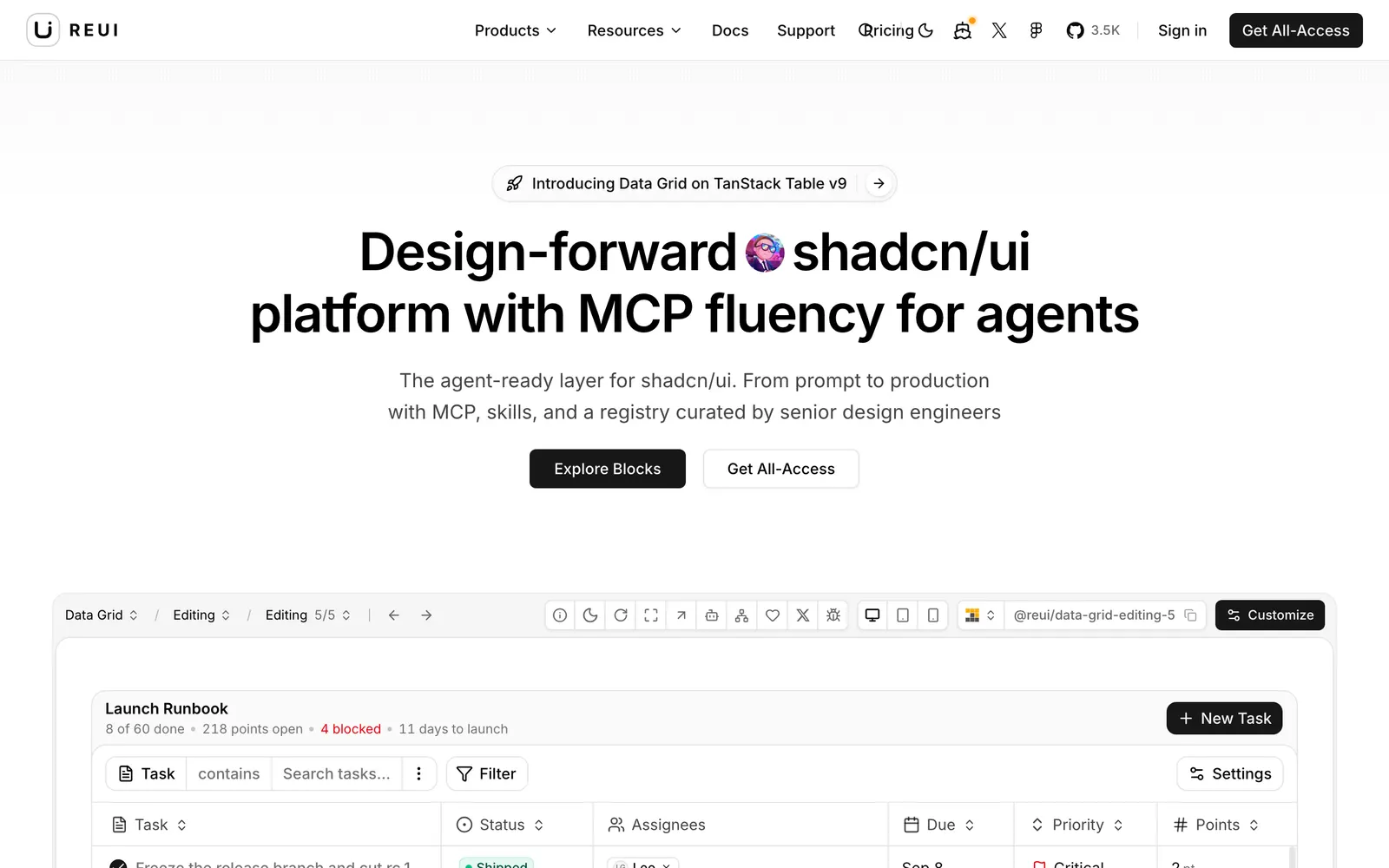
Accessible and customizable UI components built using Base UI primitives.
Included Components
101
Roadmap (has updates coming soon)Figma6KPro blocksShareShadcn ButtonShadcn BadgeShadcn CardShadcn PopoverShadcn TooltipBrowse all Marketing blocksNext20 Shadcn Alert ComponentsGet All-AccessApp ShellAdded 10 new app shell blocksAuthCardChartDialogEmpty StateEvent CalendarFlowFormGanttKanban BoardListNavbarOnboardingProfileScheduleSettingsSheetStatsTimelineWizardAgentsAI OpsAnalyticsBillingBookingsCRMFilesInventoryUsersAI ChatAgent ActivityE-commerceLandingAll templatesCategory CardCheckoutComparisonCouponFilter SidebarProduct CardProduct DetailProduct GridReceiptReviewShopping CartWishlistShop HeroColumnsDrag & DropEditingExpansionFilteringGroupingVirtualizationCTAAdded 11 new CTA blocksHeroIconsMCP for AgentsTailwind Plus AlternativeRoadmap(has updates coming soon)Privacy PolicyTerms & ConditionsRefundsCookiesReui_io@reui_ioShadcn Ui Design System By ReuiWhat is Shadcn Accordion?Why Use Shadcn Accordion?Shadcn Accordion FeaturesIntegrating with Other ComponentsFAQ Blocks in ReUIFrequently Asked QuestionsStart building with ReUI Pro today.ApplicationSolutionsAI & AgentseCommerceData GridMarketingResourcesLegalAccessible DialogPositioned PopoverFlexible DropdownCustom SelectKeyboard Slider
Re UI leverages the latest Base UI headless primitives to craft accessible, highly customisable components styled with modern Tailwind CSS. It focuses on accessible keyboard loops, robust popover positioning, and clean, developer-friendly composition APIs.