LooseleafCollections
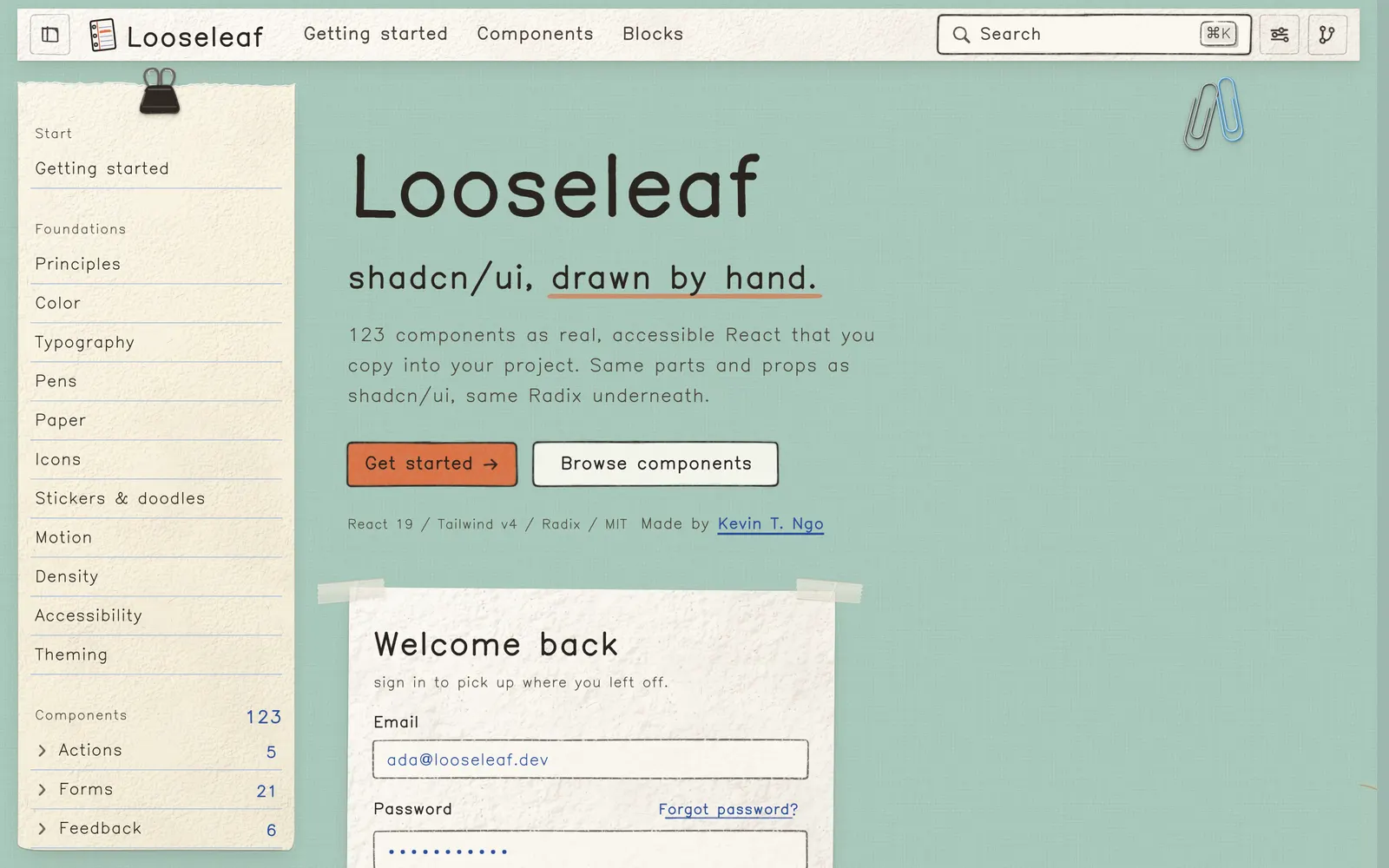
Hand-drawn React components and shadcn registry where every surface is paper.
Curated collection of 84 open source UI libraries and design engineering components for Tailwind CSS. Explore component lists, live previews and code repos.
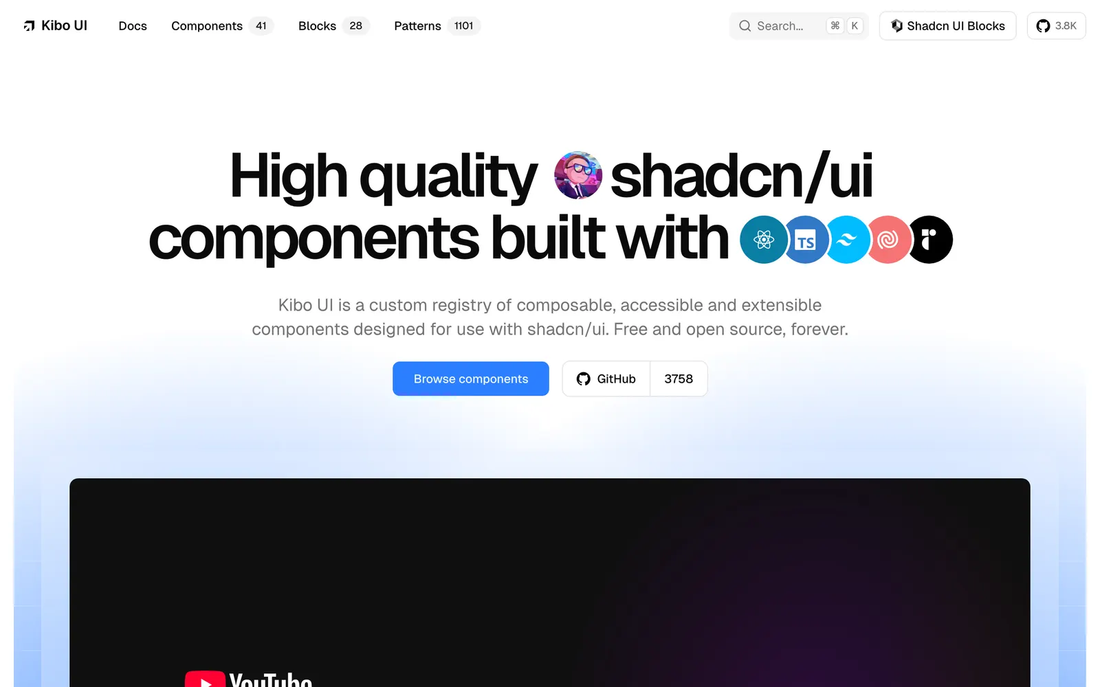
Hand-drawn React components and shadcn registry where every surface is paper.
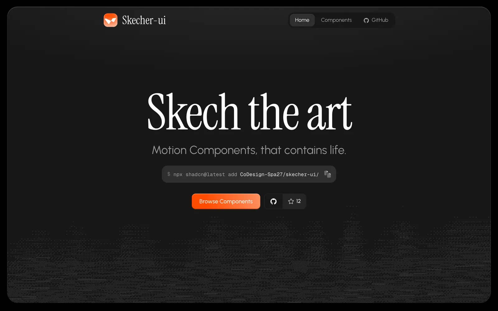
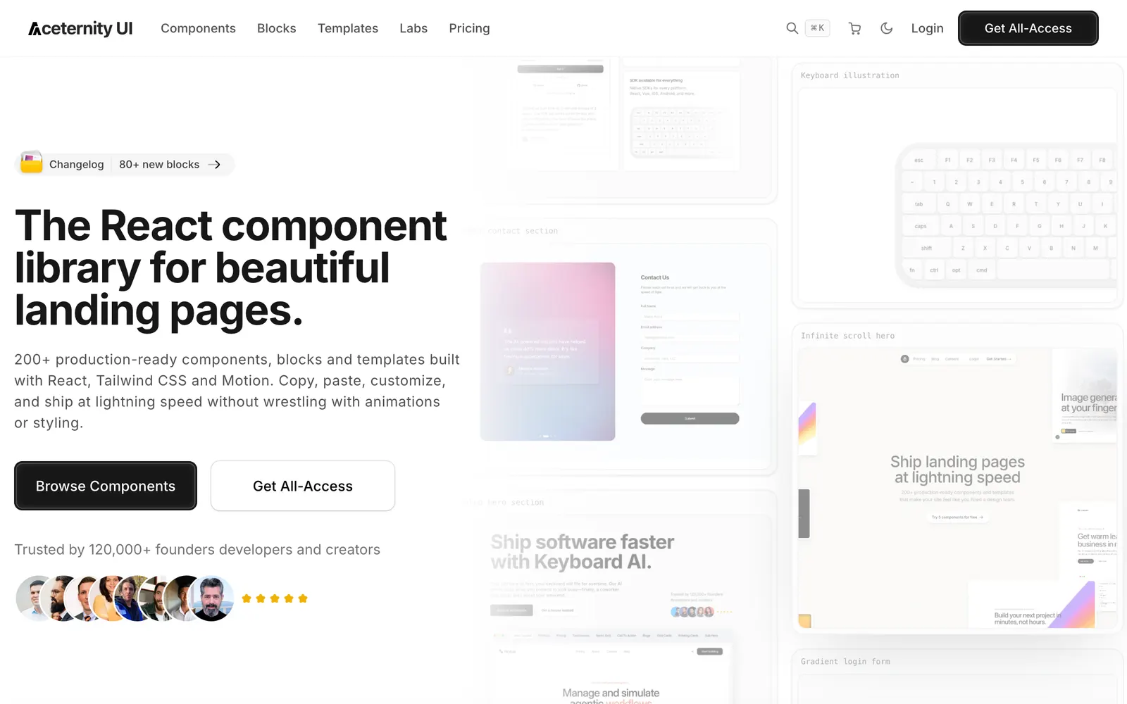
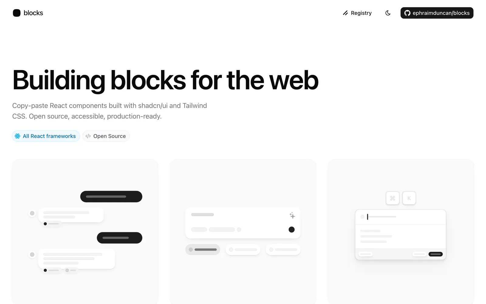
Animated React components and full-page blocks built with Tailwind CSS and Motion.
Animated React components with spring physics built on shadcn/ui and Motion.
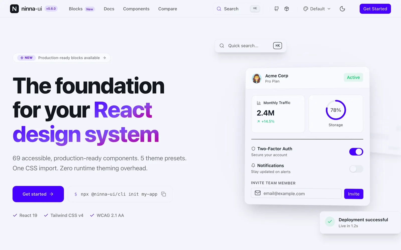
Production-grade design system on shadcn/ui with Figma sync and AI components.
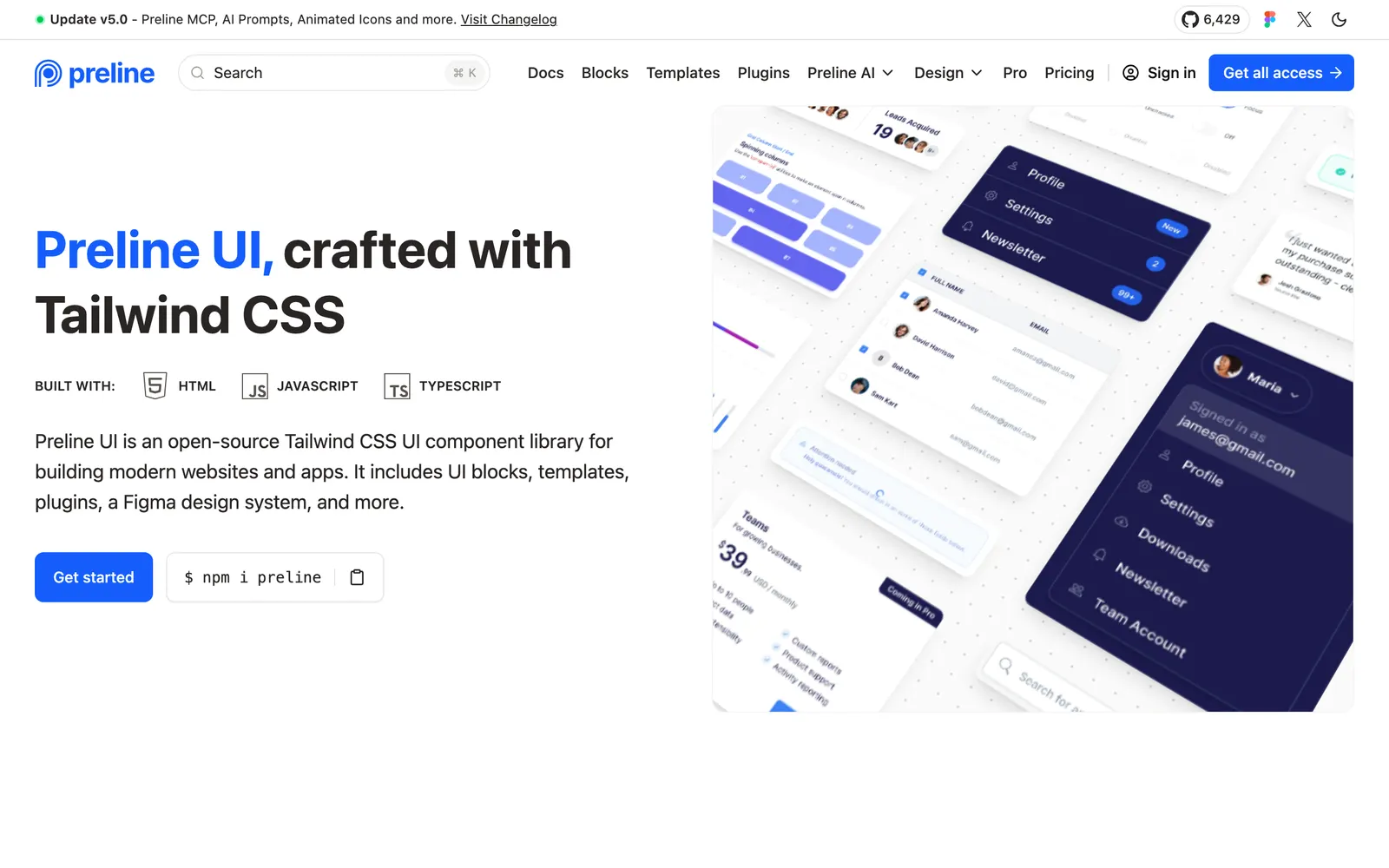
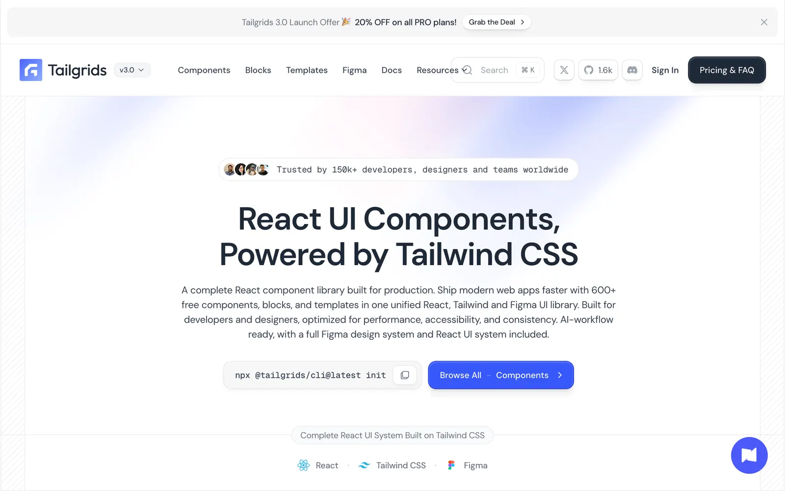
Production-ready Tailwind and Radix UI components with copy-paste CLI.
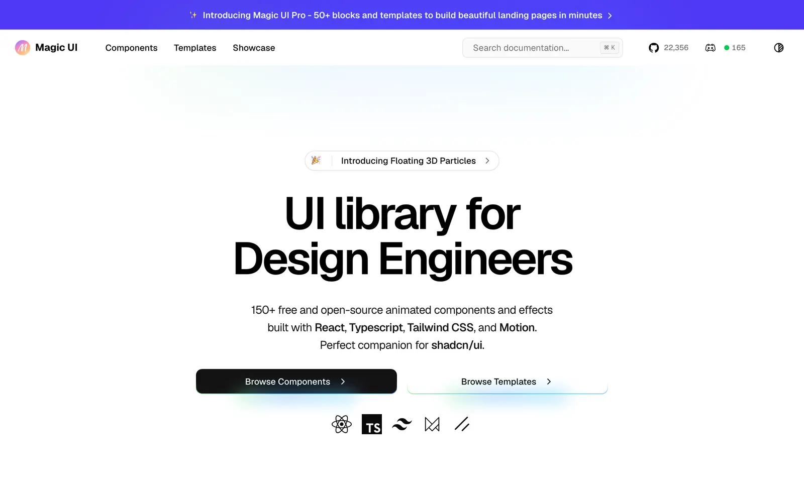
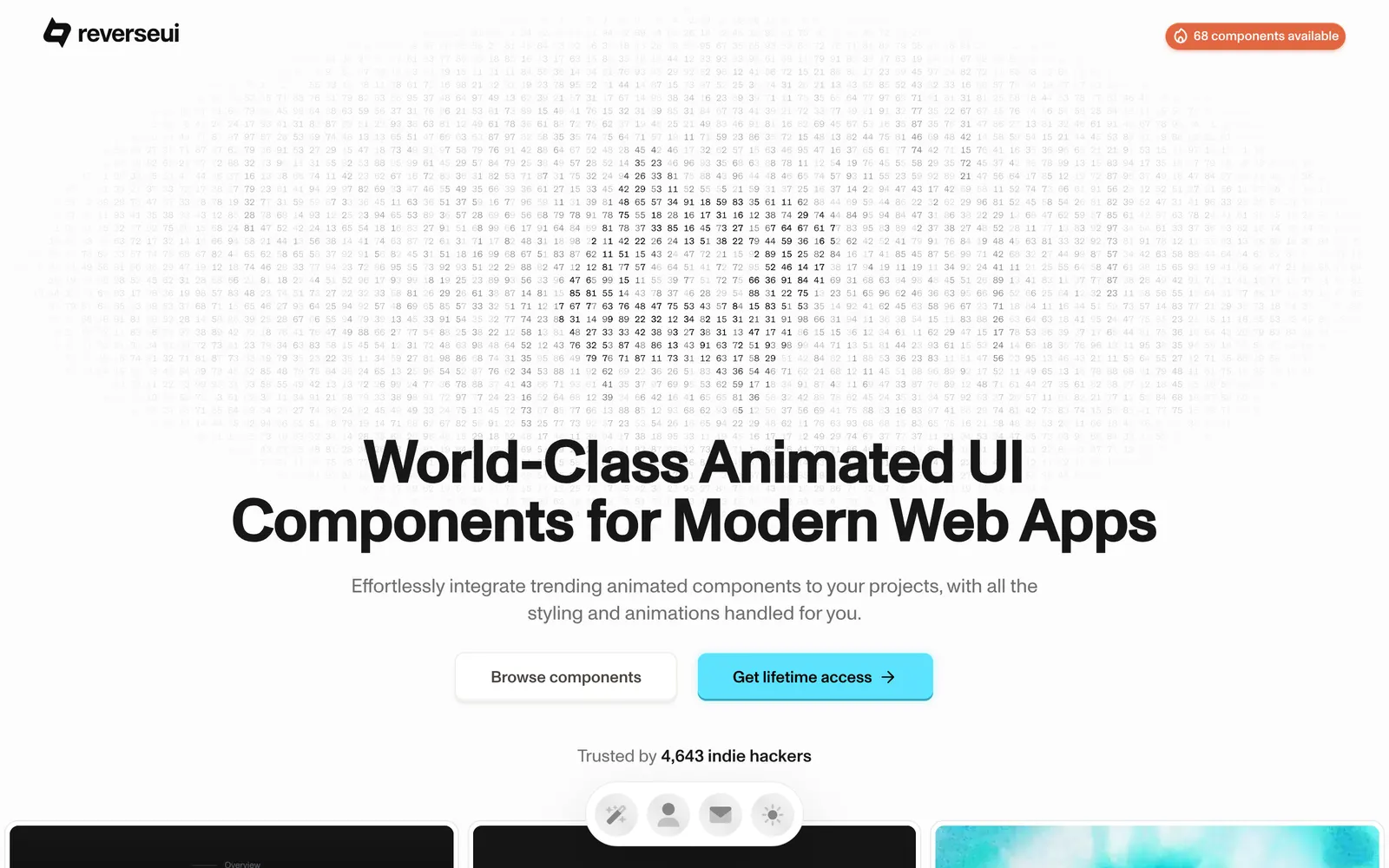
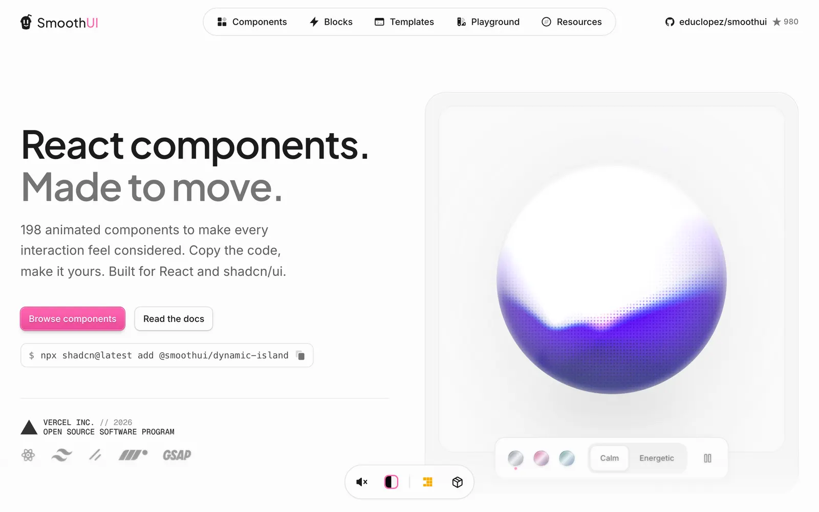
Over 130 production-ready animated React components with shadcn registry support.
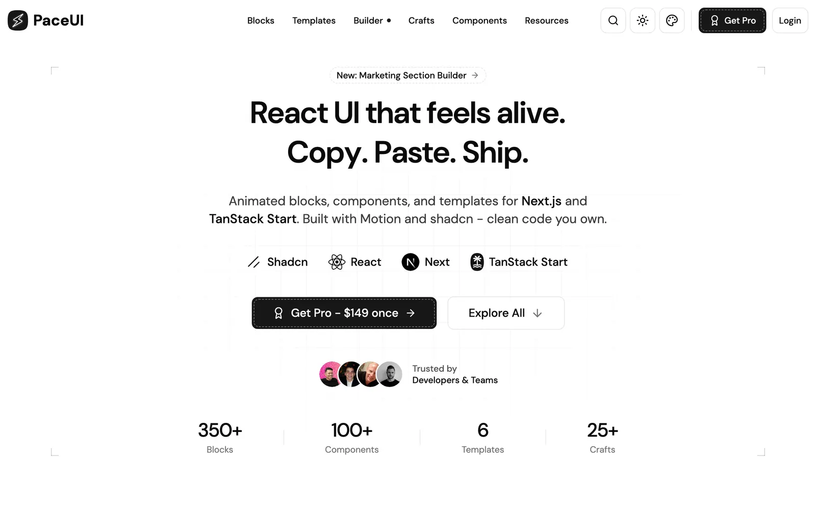
Animated React blocks and crafts for Next.js and TanStack Start with Motion.
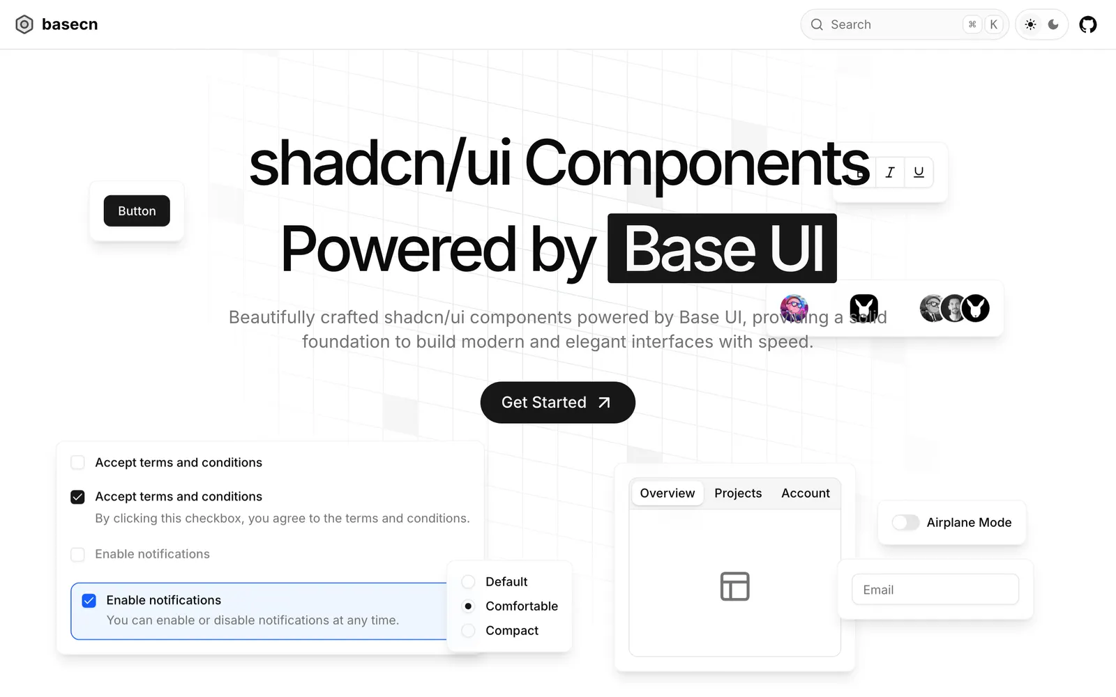
React components and blocks on shadcn/ui and Base UI with built-in motion and states.
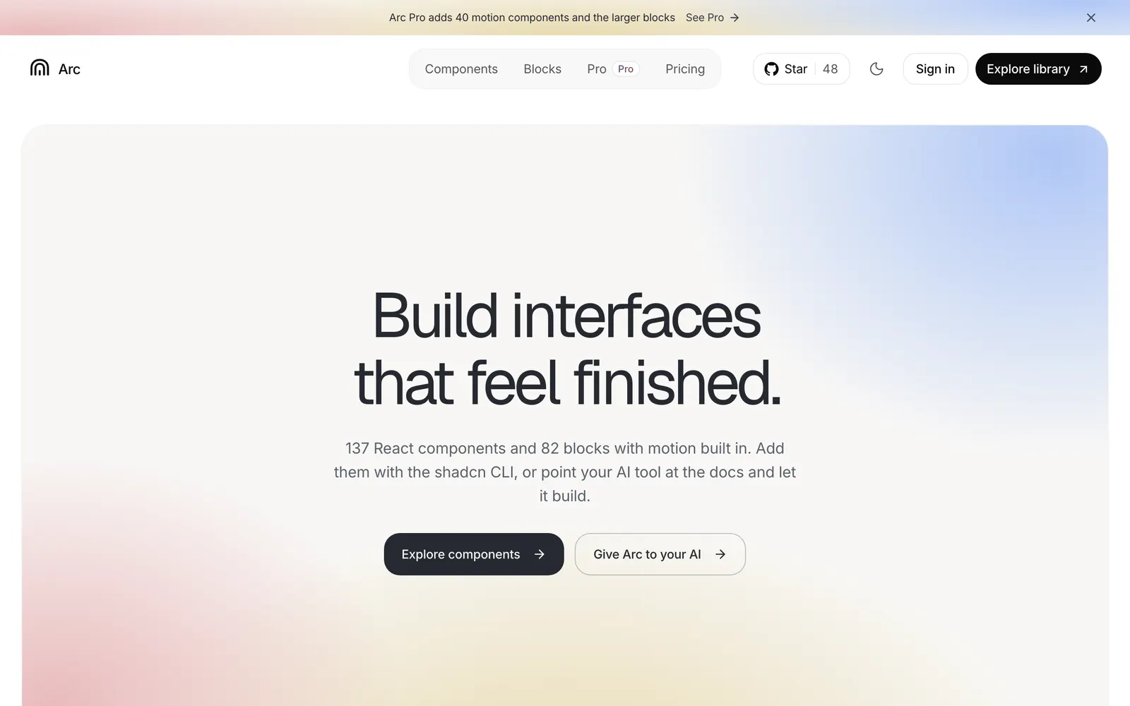
Open-source React components and blocks with calm, polished built-in motion.
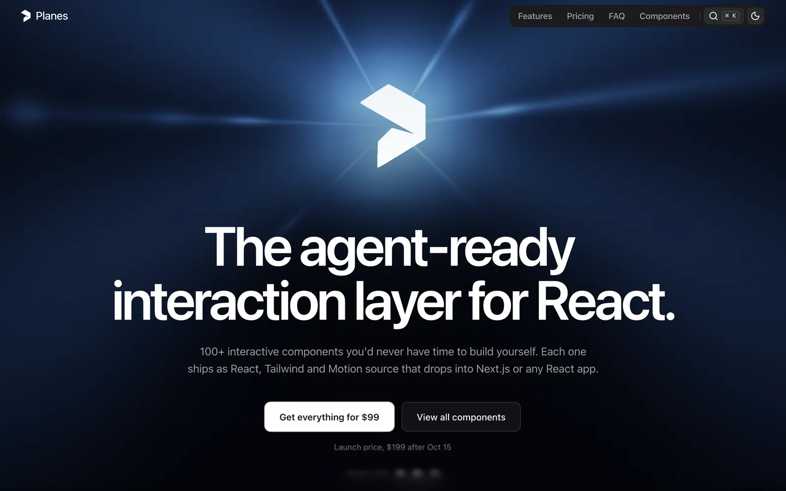
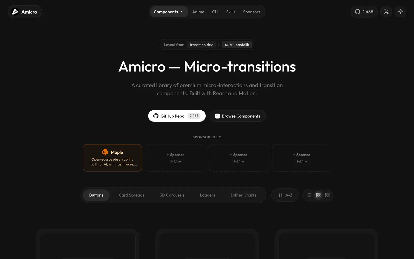
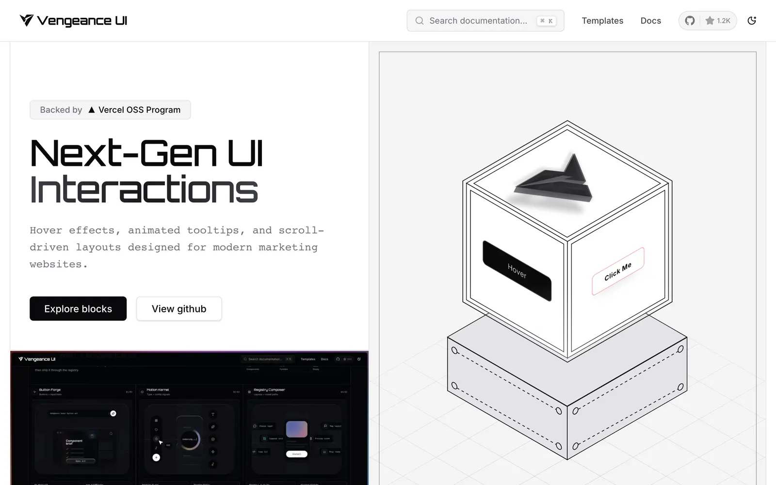
A high-craft React interaction and motion layer tailored for modern design workflows.
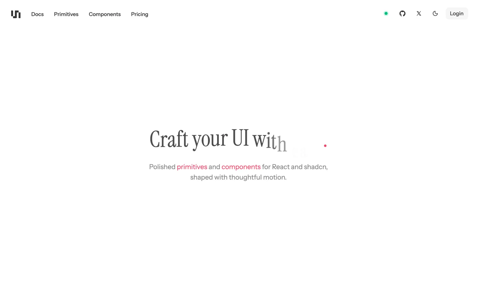
Polished React motion components and micro-interactions built for the shadcn CLI.
Interactive React components, WebGL shaders, and high-conversion landing blocks.
Copy-paste animated illustrations and landing visuals for React and shadcn/ui.
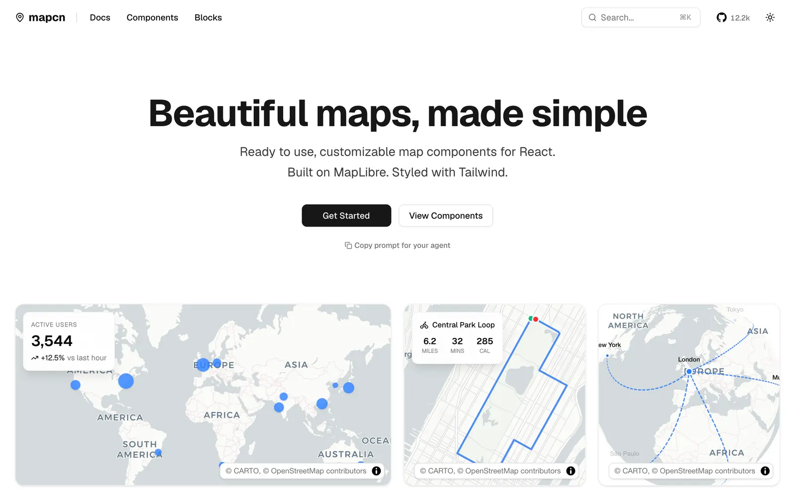
Composable React map components built on MapLibre GL and styled with Tailwind CSS.
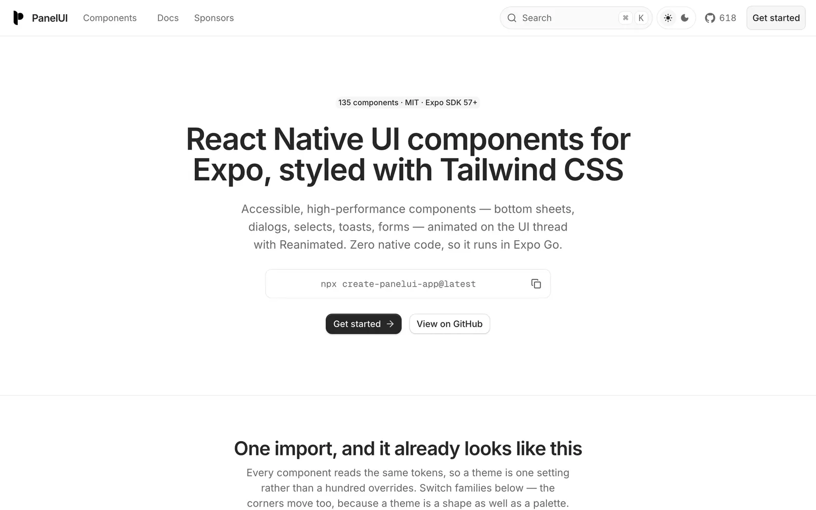
Accessible React Native and Expo component library styled with Tailwind CSS.
Crafted UI components for AI agents: thinking states, tool calls, and streaming text.
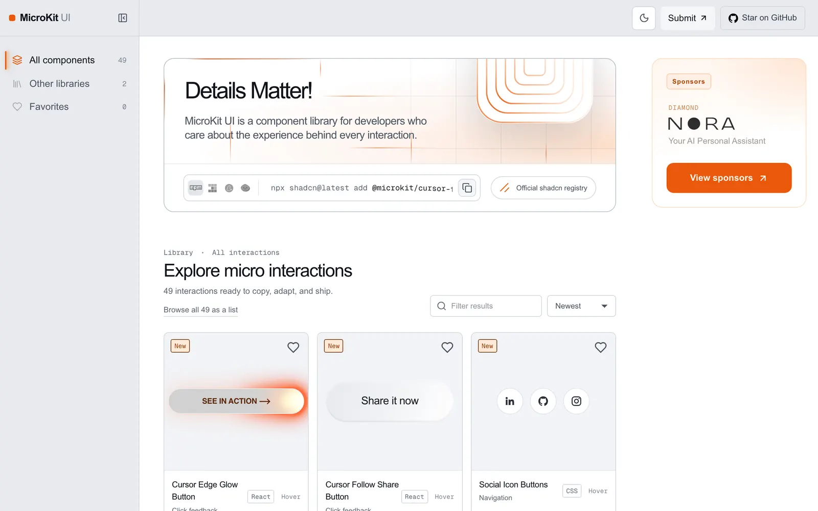
Copy-paste microinteractions and subtle UI animations for React and Tailwind.
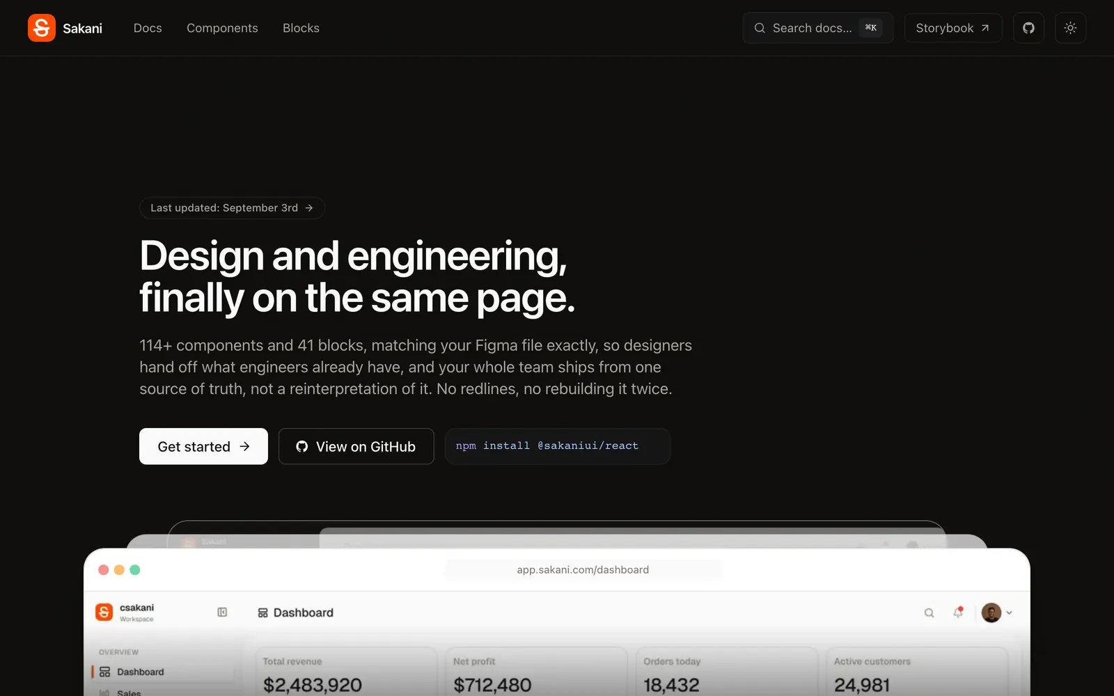
Open-source React design system with 114+ accessible components matching Figma 1:1.
Community registry for shadcn components, motion primitives, and full blocks.
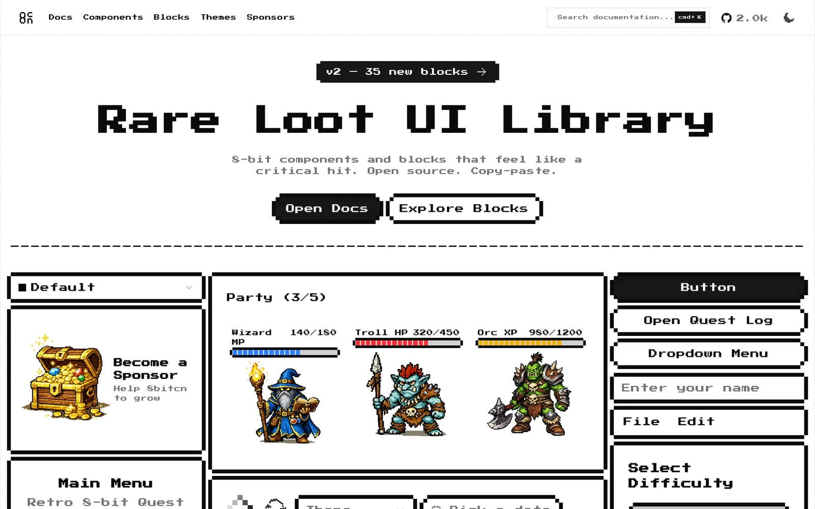
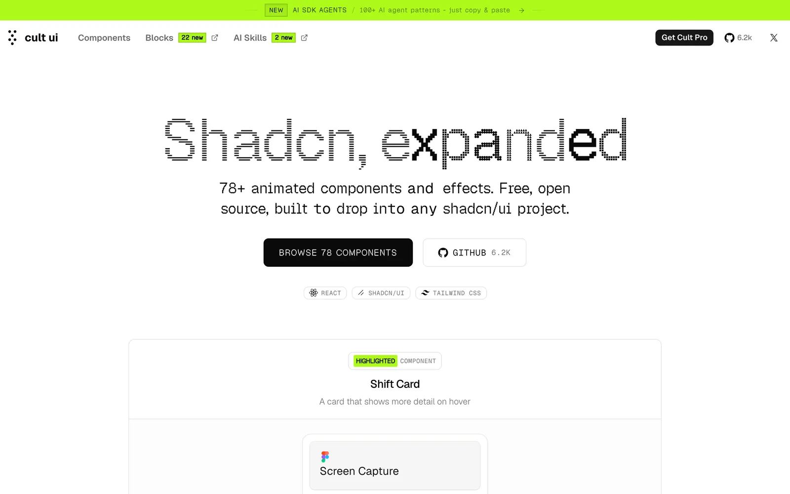
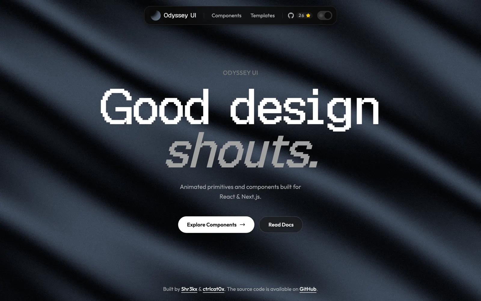
Retro 8-bit pixel art style UI components built on top of shadcn/ui.
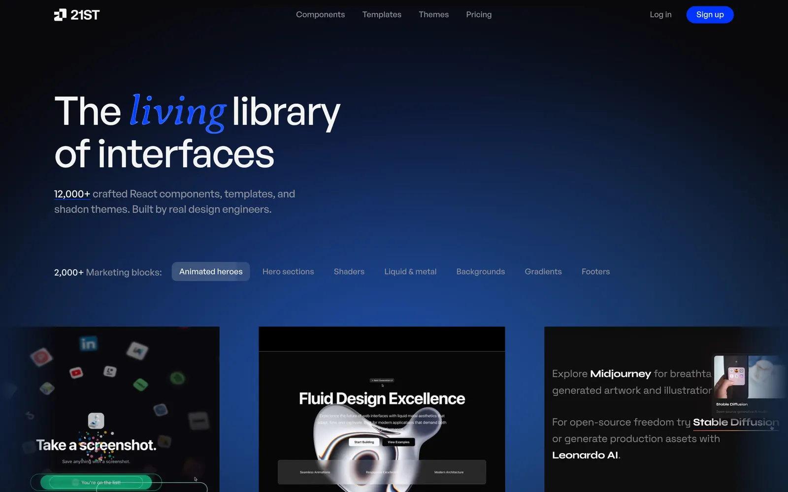
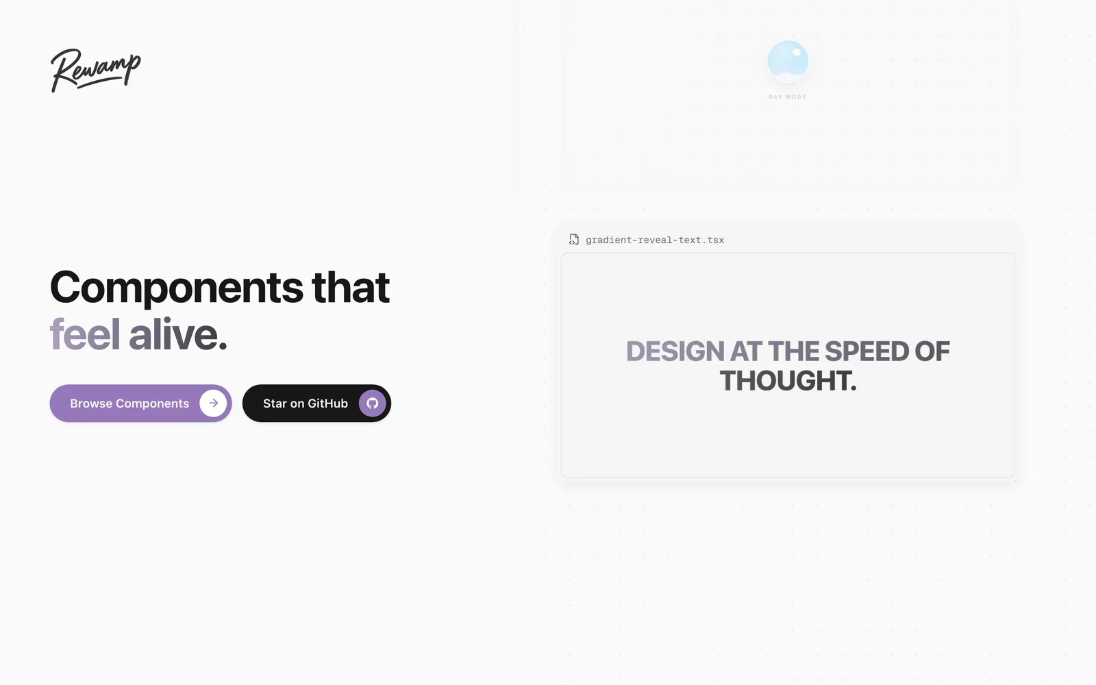
Trending copy-paste animated components and hero sections for modern web.
Lightweight drop-in React micro-animation primitives for clickable elements.
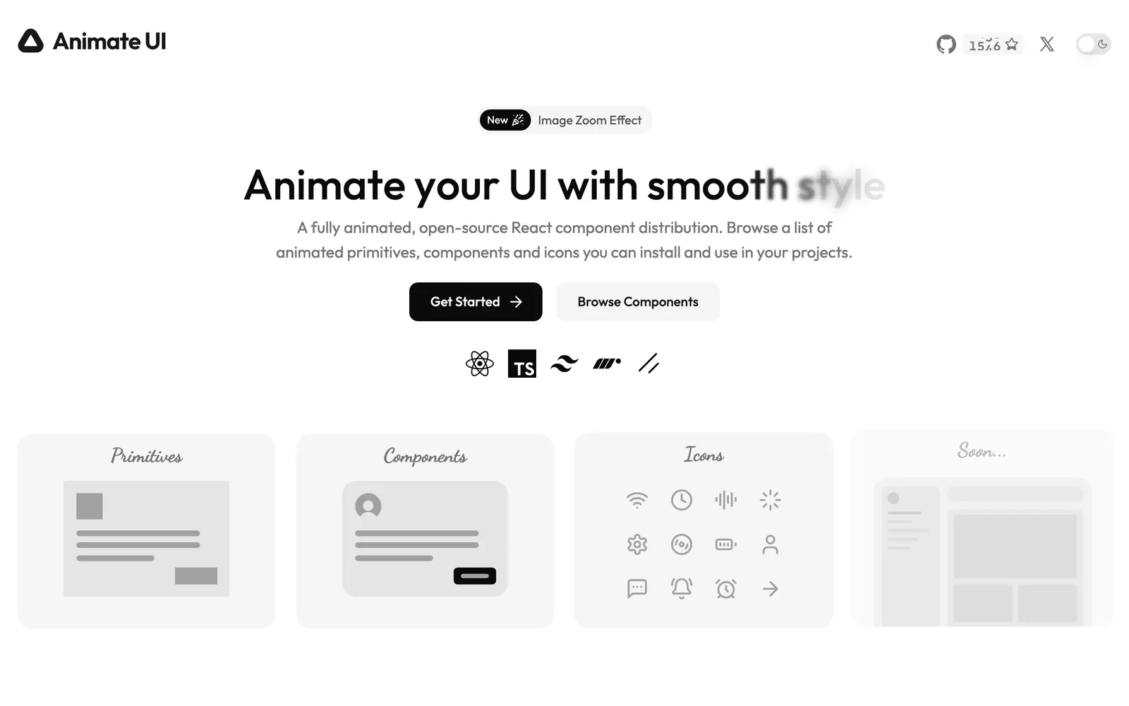
Accessible shadcn UI components beautifully animated with Motion and CSS.
Base UI component primitives adapted for the shadcn copy-paste CLI format.
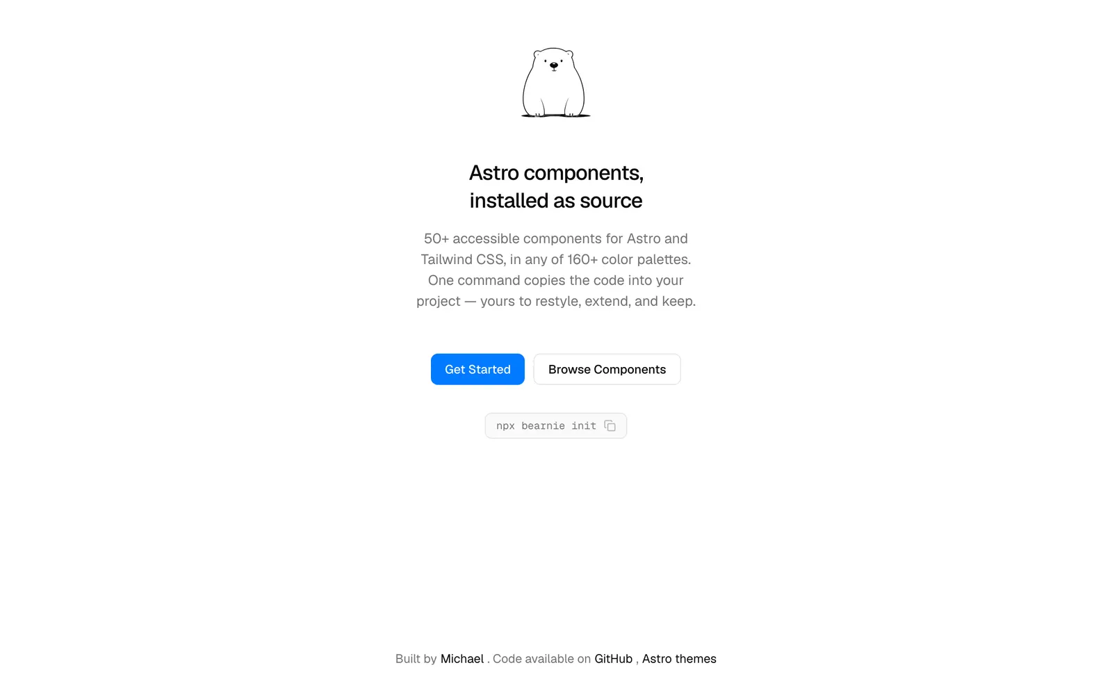
Component collection and landing page blocks designed for Astro and Tailwind.
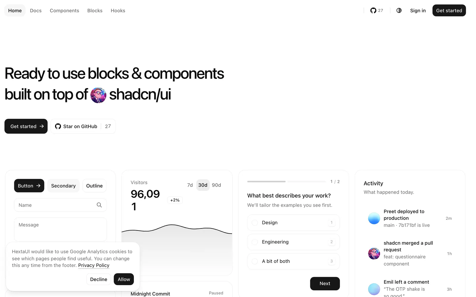
Open-source website blocks and components installable directly via shadcn CLI.
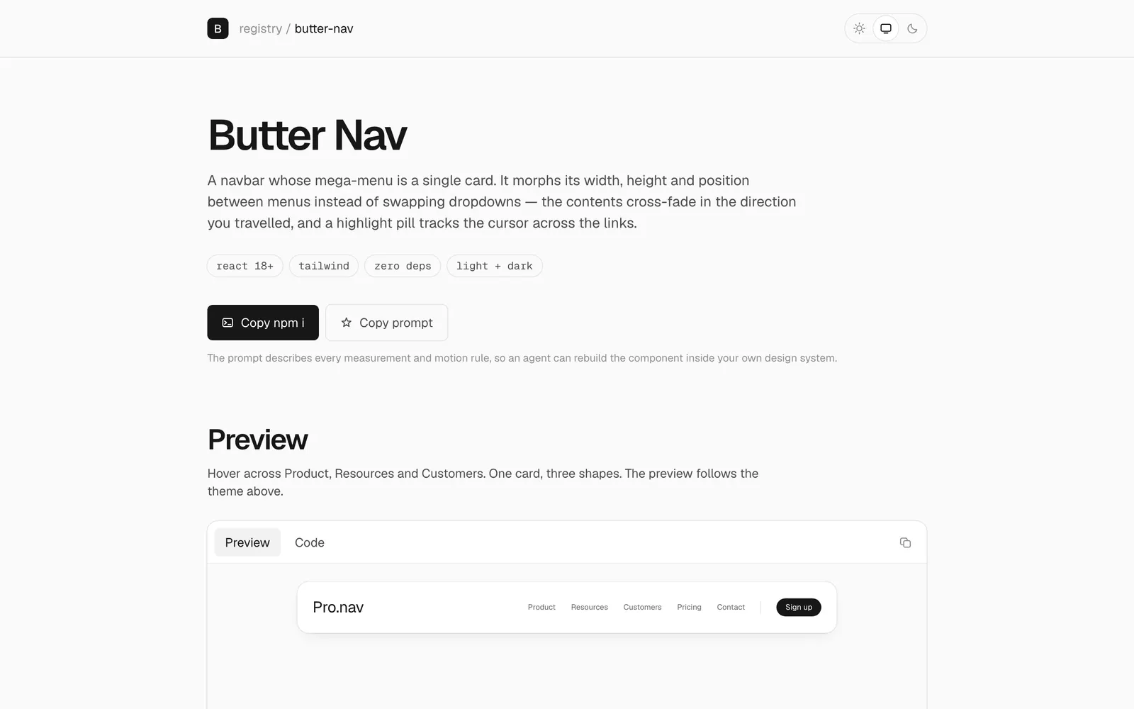
Mega-menu featuring fluid layout morphing transitions and silky physics.
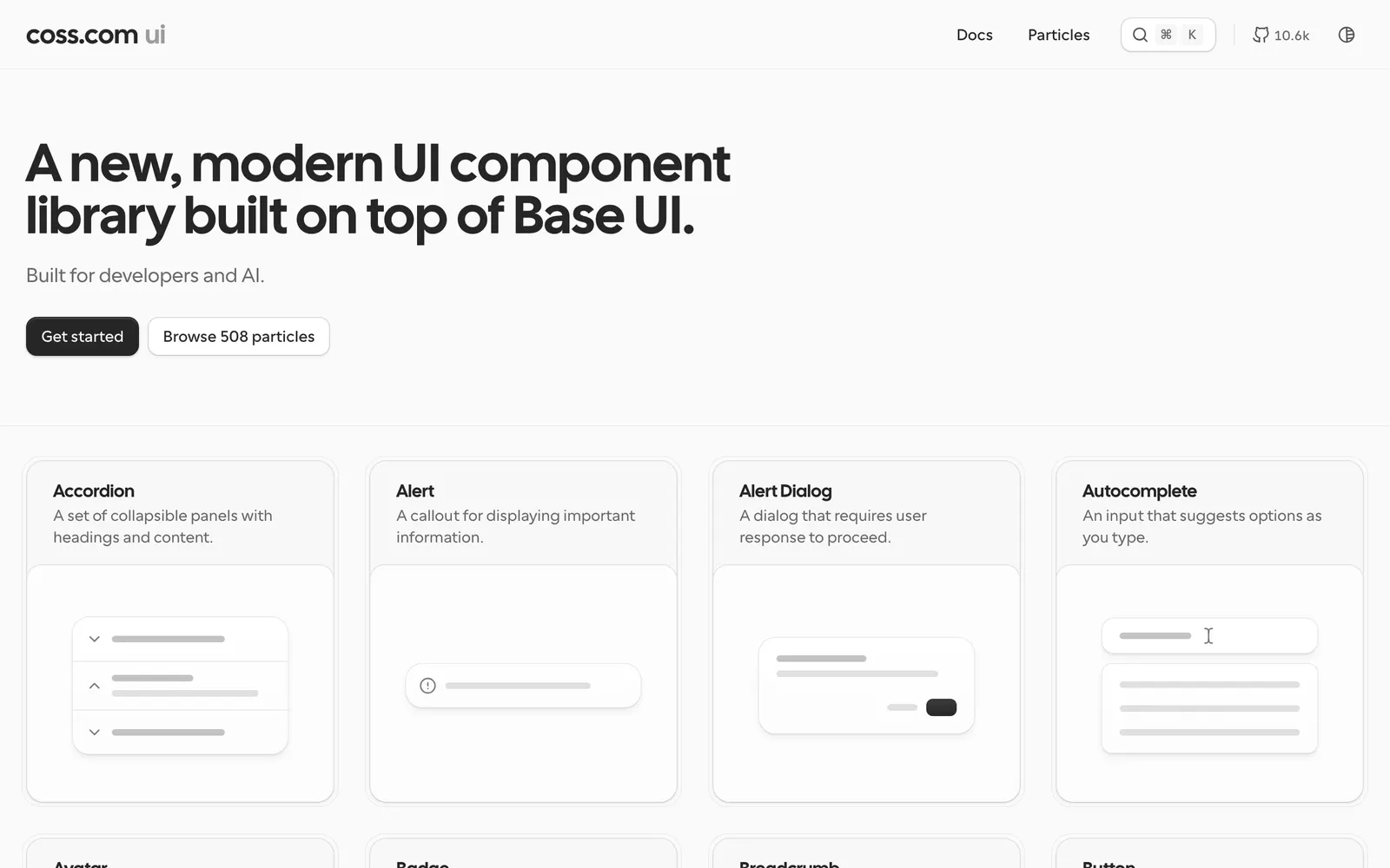
Accessible copy-paste UI components built on top of Base UI and Tailwind CSS.
Curated animated React components crafted with Framer Motion and Tailwind.
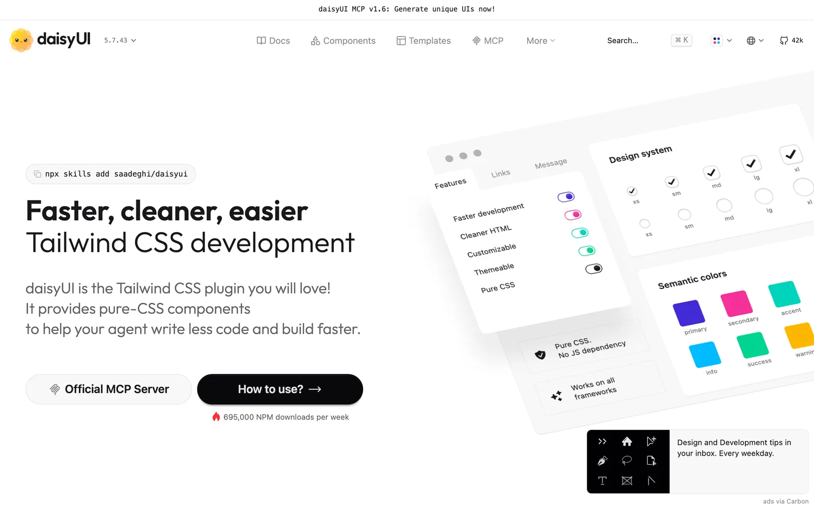
Most popular component class library for Tailwind CSS with deep semantic theme support.
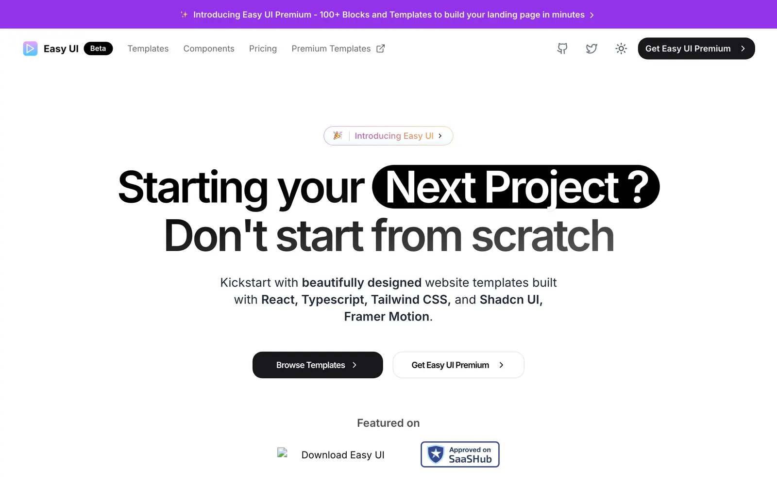
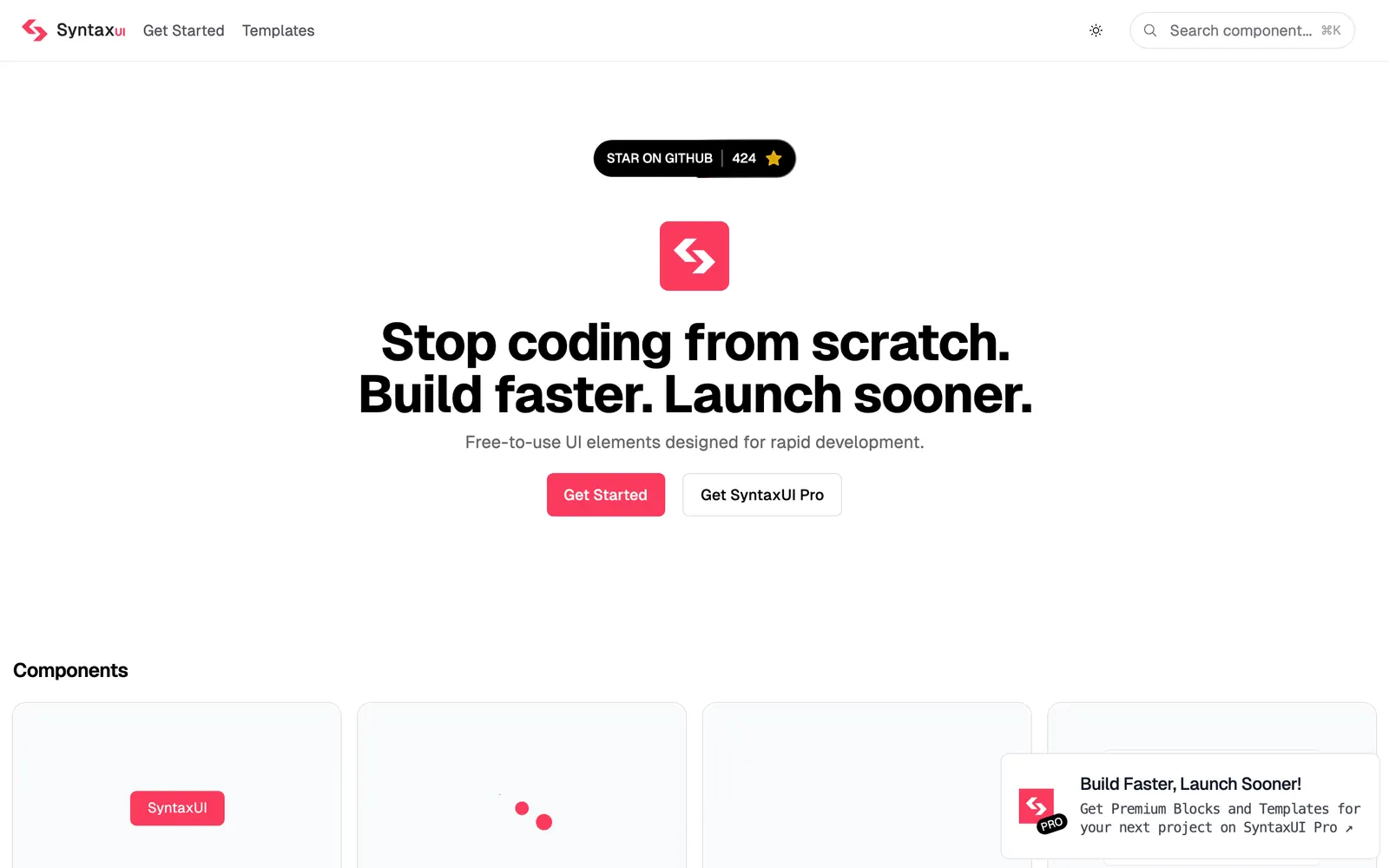
Over 50 ready-to-use high-converting website templates and UI components.
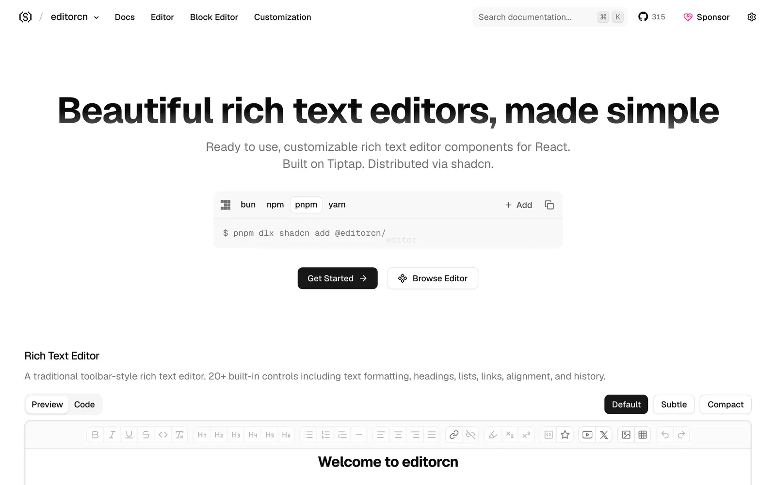
Headless rich text editor components for React, built on Tiptap and shadcn.
Animated React components and interactive hero sections tailored for startups.
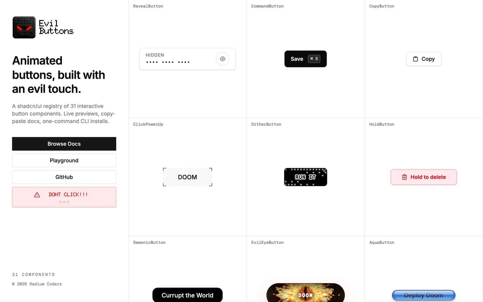
Interactive, tactile, and expressive button components crafted for modern apps.
Animated SVG charts designed specifically for shadcn/ui with minimal weight.
Playful and physics-driven React components to bring joyful motion to the web.
Modern, clean Tailwind CSS and React components crafted for marketing sites.
Ecosystem of open-source UI components built with Tailwind CSS utility classes.
Semantic, accessible Tailwind CSS component library ready for Tailwind v4.
Animated React and Tailwind UI components and blocks compatible with shadcn/ui.
Copy-paste React and Tailwind CSS components built with accessible mechanics.
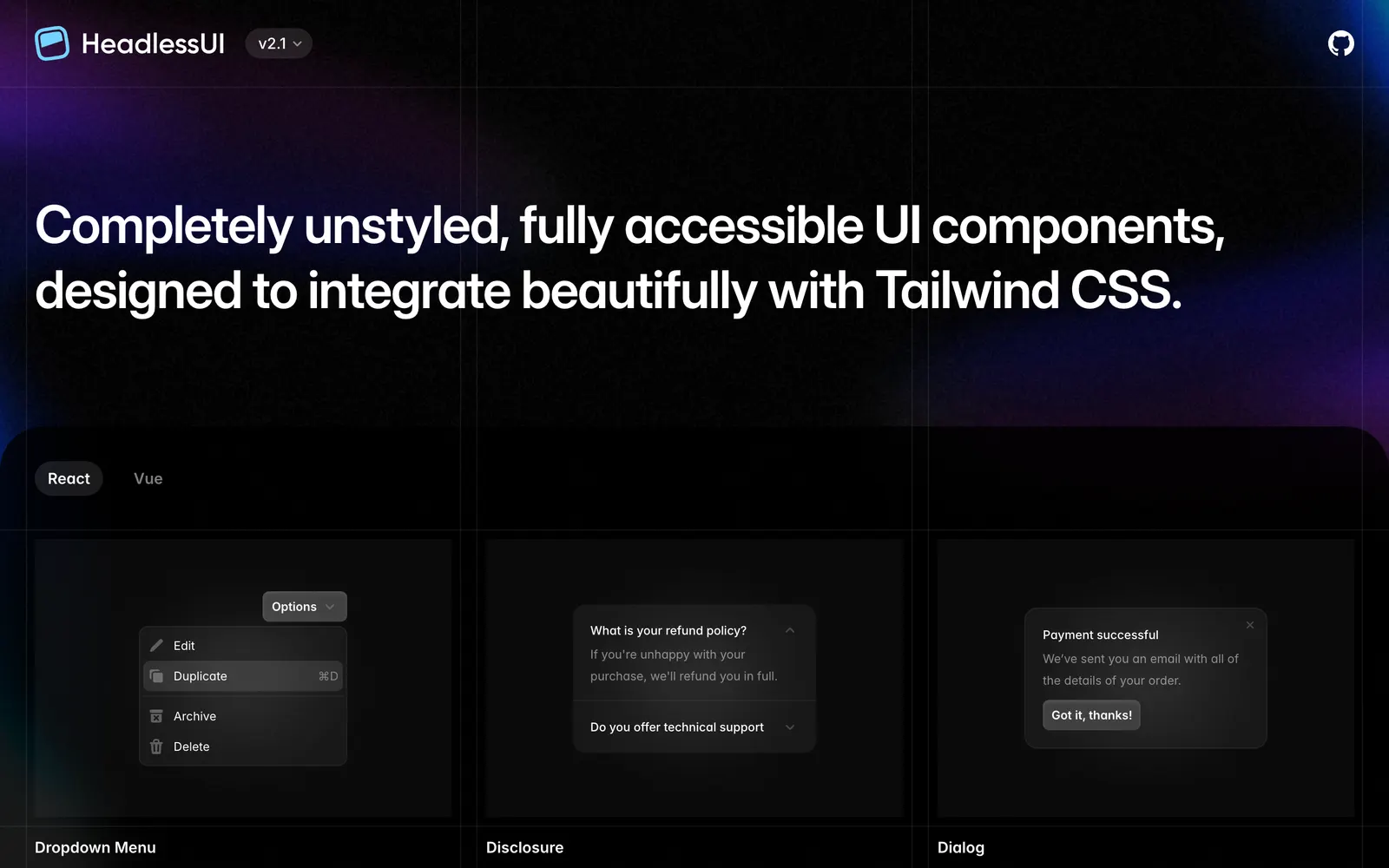
Completely unstyled, fully accessible UI components from the Tailwind Labs team.
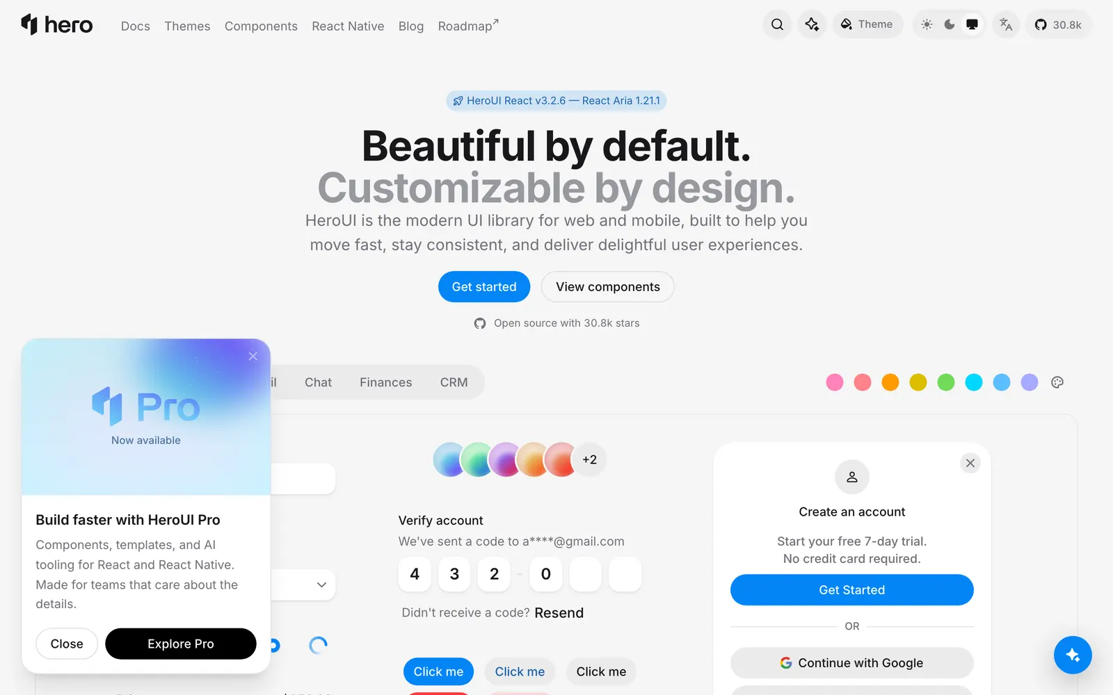
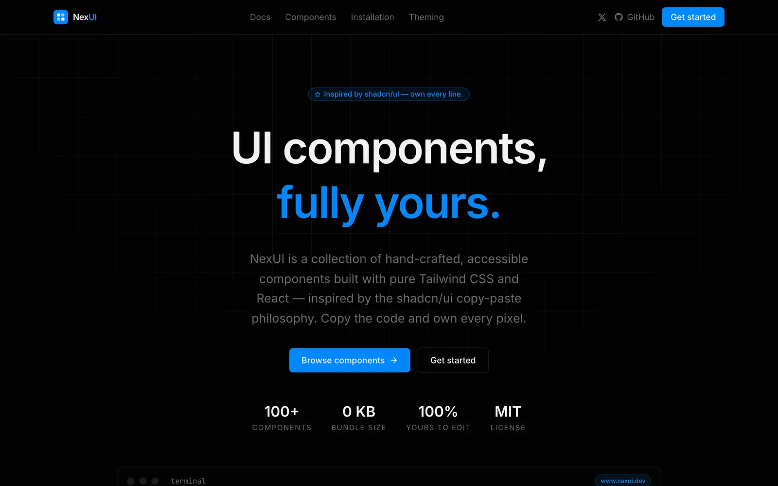
Beautiful, fast and modern React UI library, formerly known as NextUI.
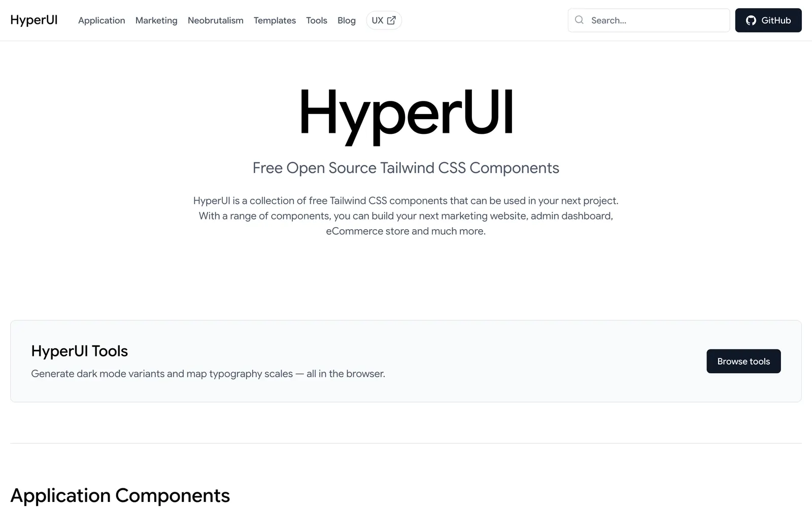
Free open-source Tailwind CSS components for marketing, ecommerce and app UI.
Component registry tailored for AI interfaces, chat experiences, and workflows.
Creative interactive components for React and Tailwind in shadcn format.
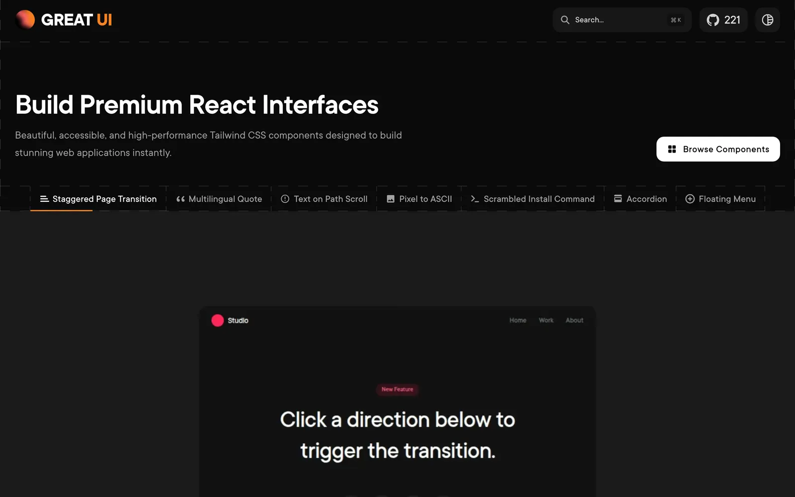
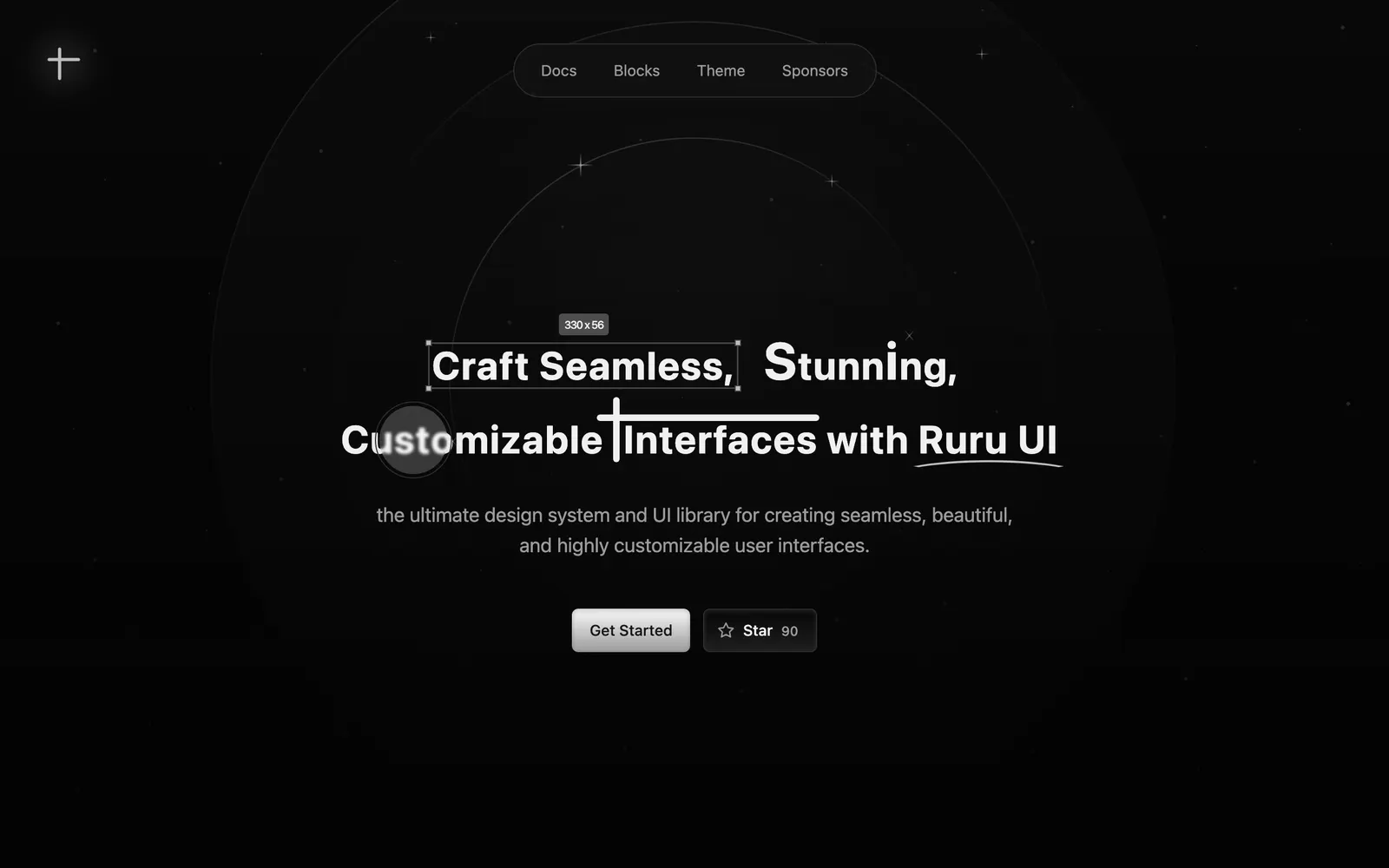
Tailwind CSS components featuring ambient lighting, neon glows, and dark aesthetics.
Over 150 animated components crafted for landing pages and modern products.
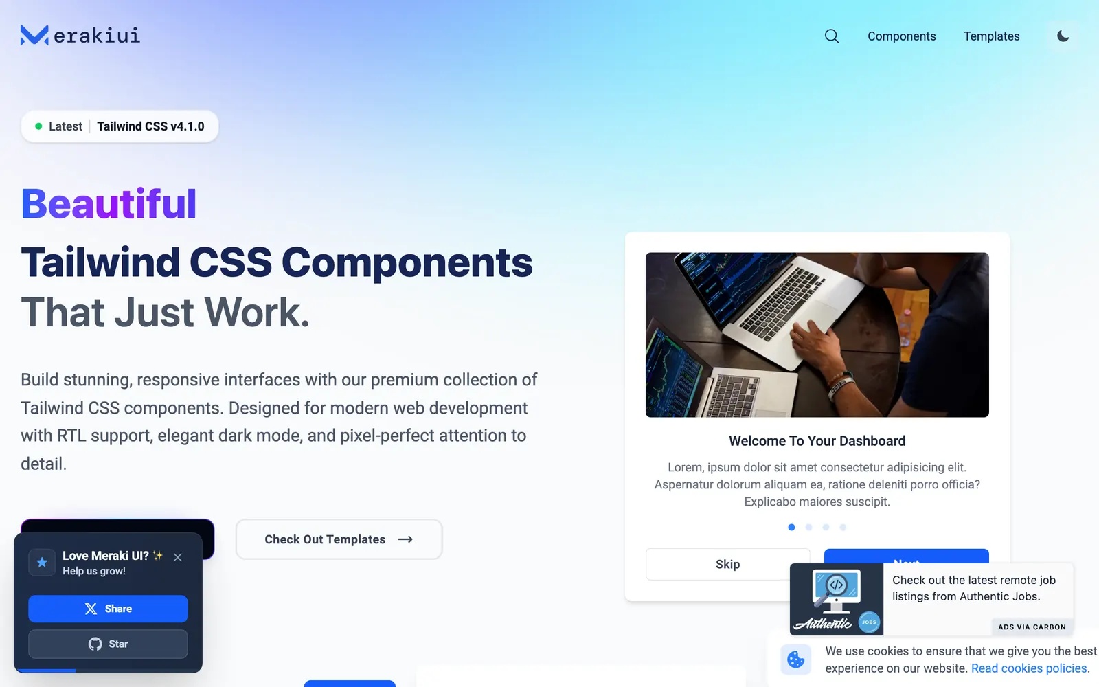
Responsive Tailwind CSS components featuring full right-to-left language support.
Advanced motion and interactive components built with Motion and Tailwind CSS.
Extensible and accessible component library designed for modern web startups.
Lightweight and modular UI components engineered for maximum website performance.
Animated React components built on shadcn/ui and Framer Motion for SaaS.
Open-source Tailwind CSS components tailored for complex SaaS dashboards.
Chat and AI interface component primitives for building natural conversational apps.
Accessible and customizable UI components built using Base UI primitives.
Creative React and Tailwind CSS components built with playful micro-interactions.
A copy-paste React component collection built with Motion, Tailwind CSS, and Three.js.
Accessible and customizable UI components engineered for polished React apps.
Minimalist React components designed for effortless shadcn CLI integration.
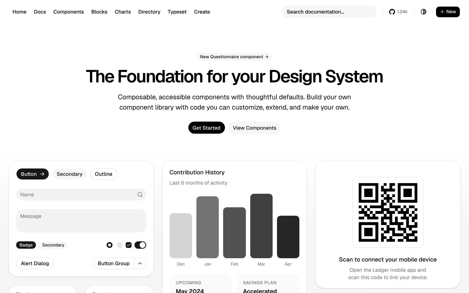
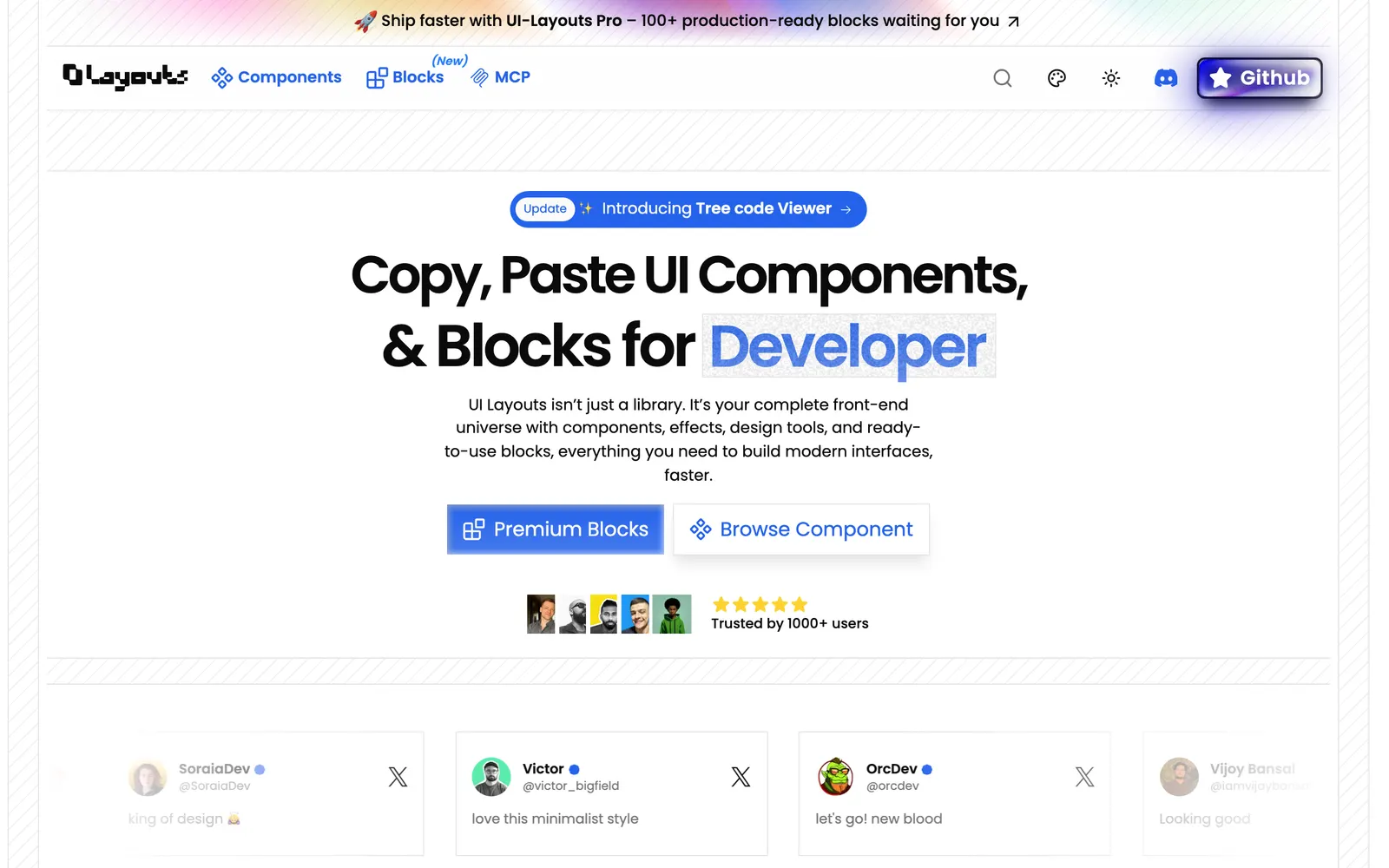
Beautifully designed components that you can copy and paste into your apps.
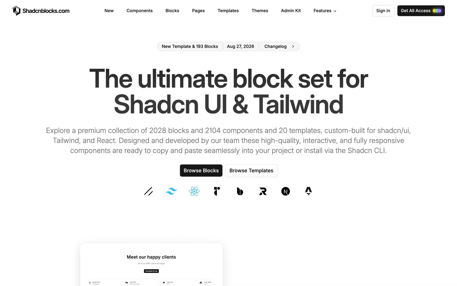
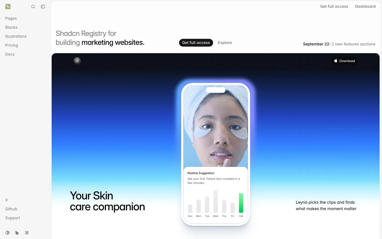
Comprehensive library of ready-to-use shadcn website blocks and UI sections.
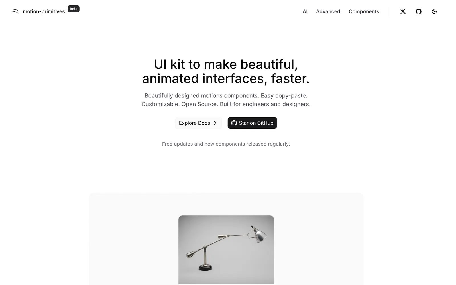
Animated UI primitives and motion widgets designed for modern Tailwind CSS.
Motion-heavy React components ready to copy and paste for silky user interfaces.
Animated React components designed for developer ownership and fluid aesthetics.
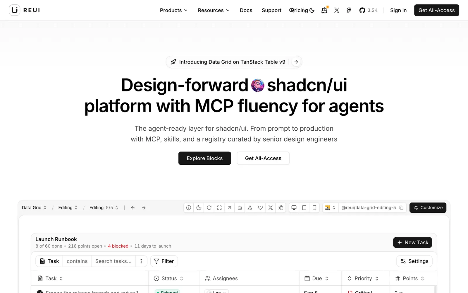
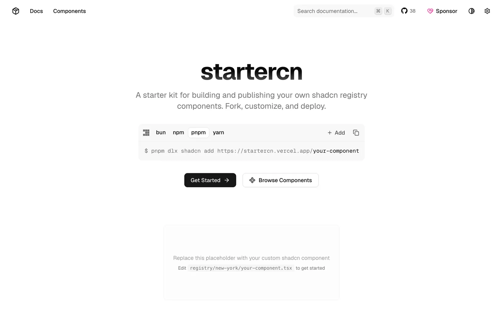
Comprehensive shadcn/ui registry template with docs, landing page, and AI agent support.
Animated copy-paste components and creative interactions for landing pages.
Handcrafted Tailwind CSS marketing sections and blocks for SaaS landing pages.
Extensive library of responsive, beautifully crafted UI blocks for Tailwind.
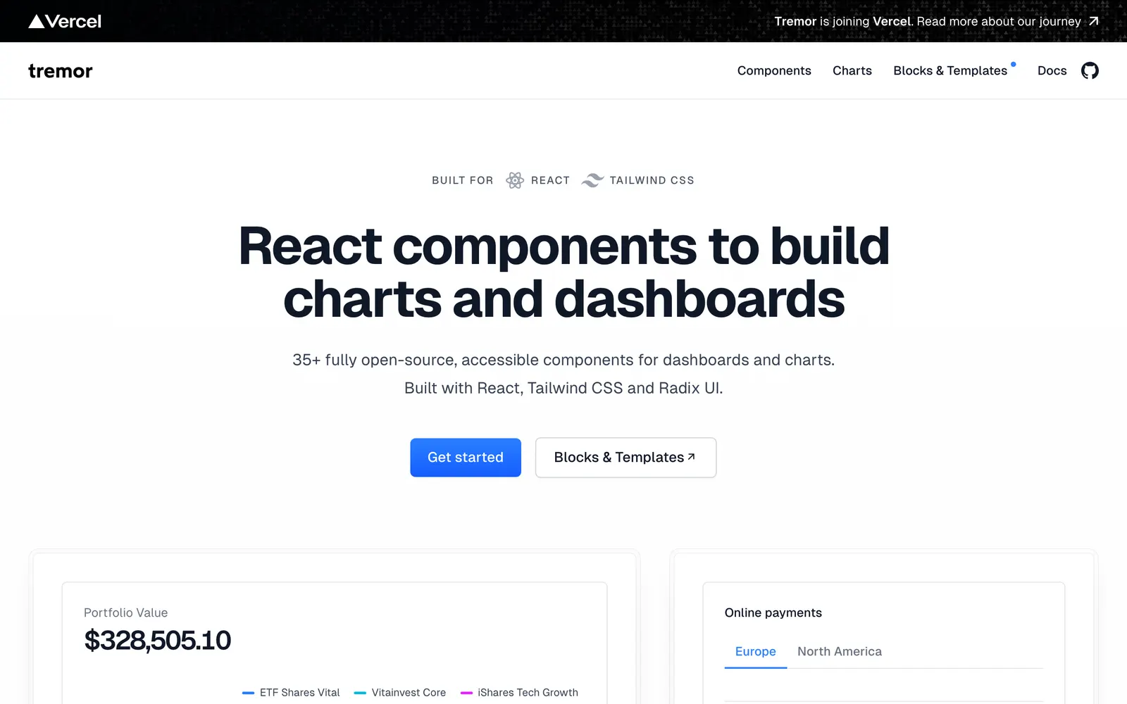
Modular React component library built on Tailwind CSS for dashboards and charts.
Full-page layouts, hero sections, and interactive headers built with Tailwind.
Minimalist, dark-mode first React component library installable via CLI.
Free Tailwind CSS components and sections designed for rapid web prototyping.
Animated React components featuring kinetic scroll interactions and bold motion.
Fresh, colorful React component collection expanding the shadcn ecosystem.
A collection of creative animated React components built with Motion and Tailwind CSS.
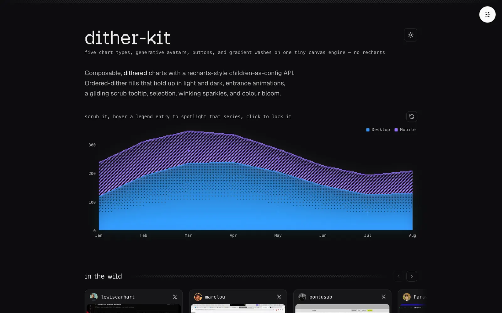
Composable dithered charts and components for shadcn/ui on a tiny canvas engine.
A curated registry of rare animated React components built with Motion and shadcn.
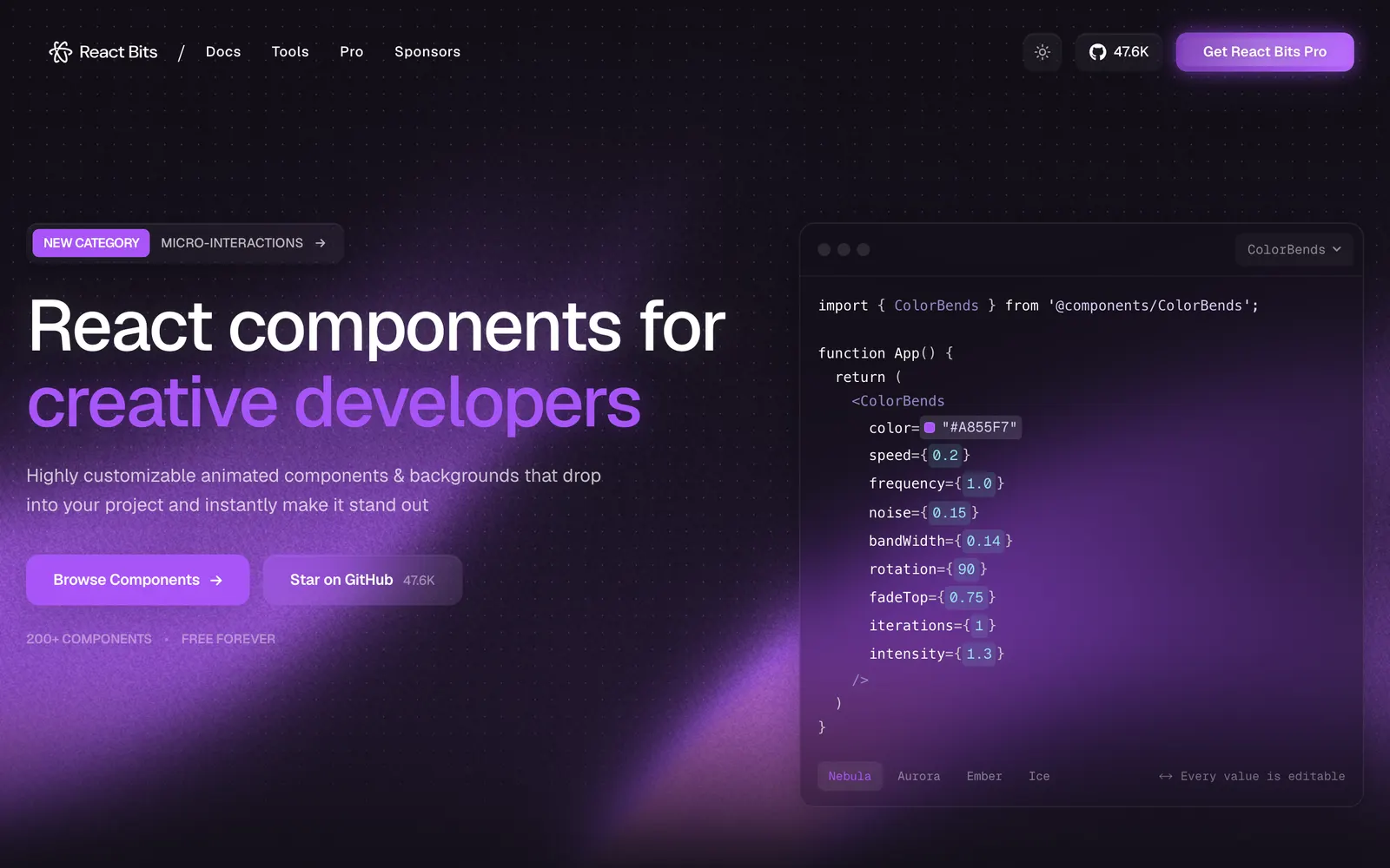
Over 200 animated React components, interactive backgrounds, and creative text effects.
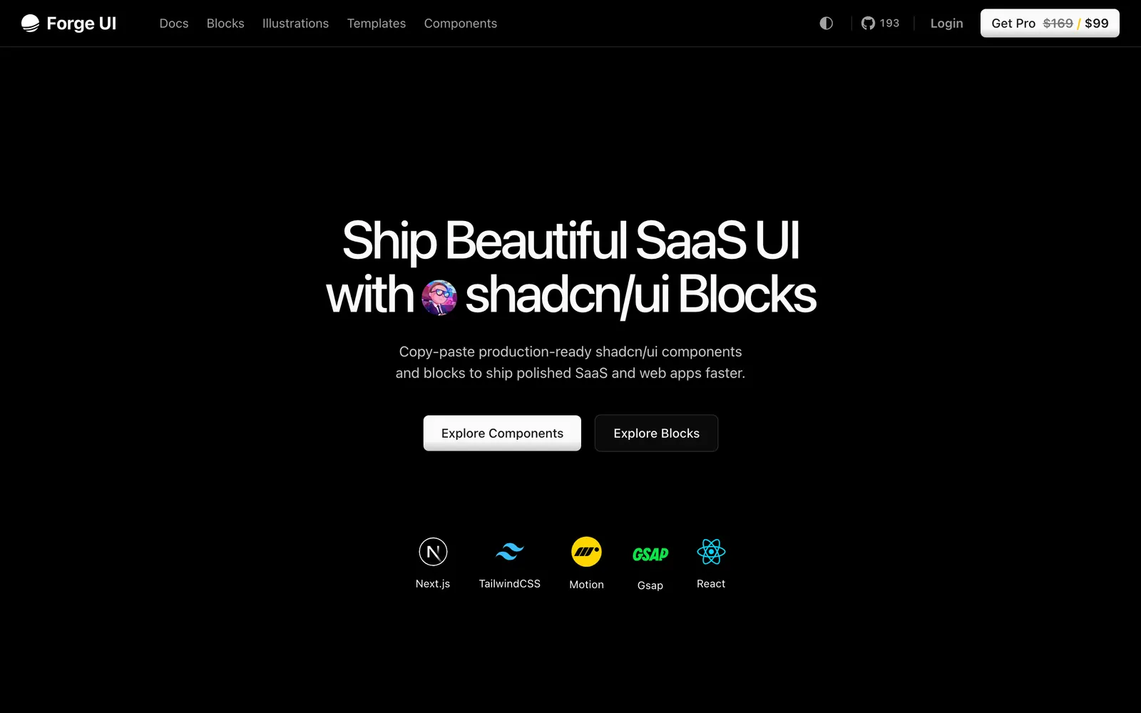
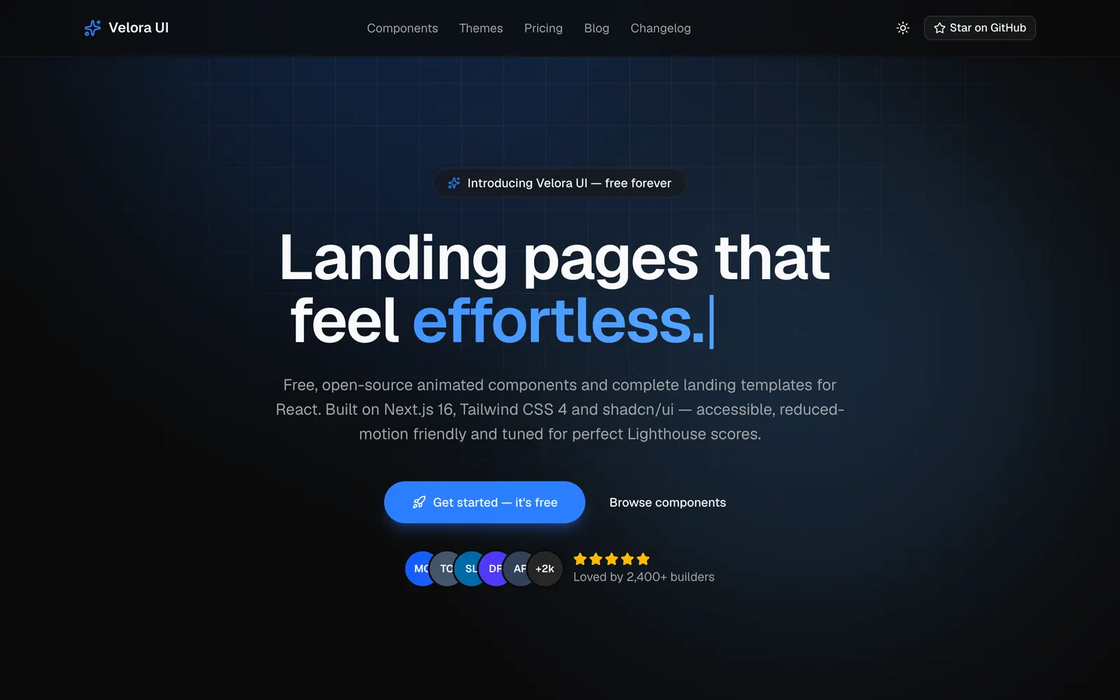
Open-source, animation-ready React components and blocks built with Next.js, Tailwind CSS, Motion, TypeScript, and shadcn/ui for SaaS and AI apps.
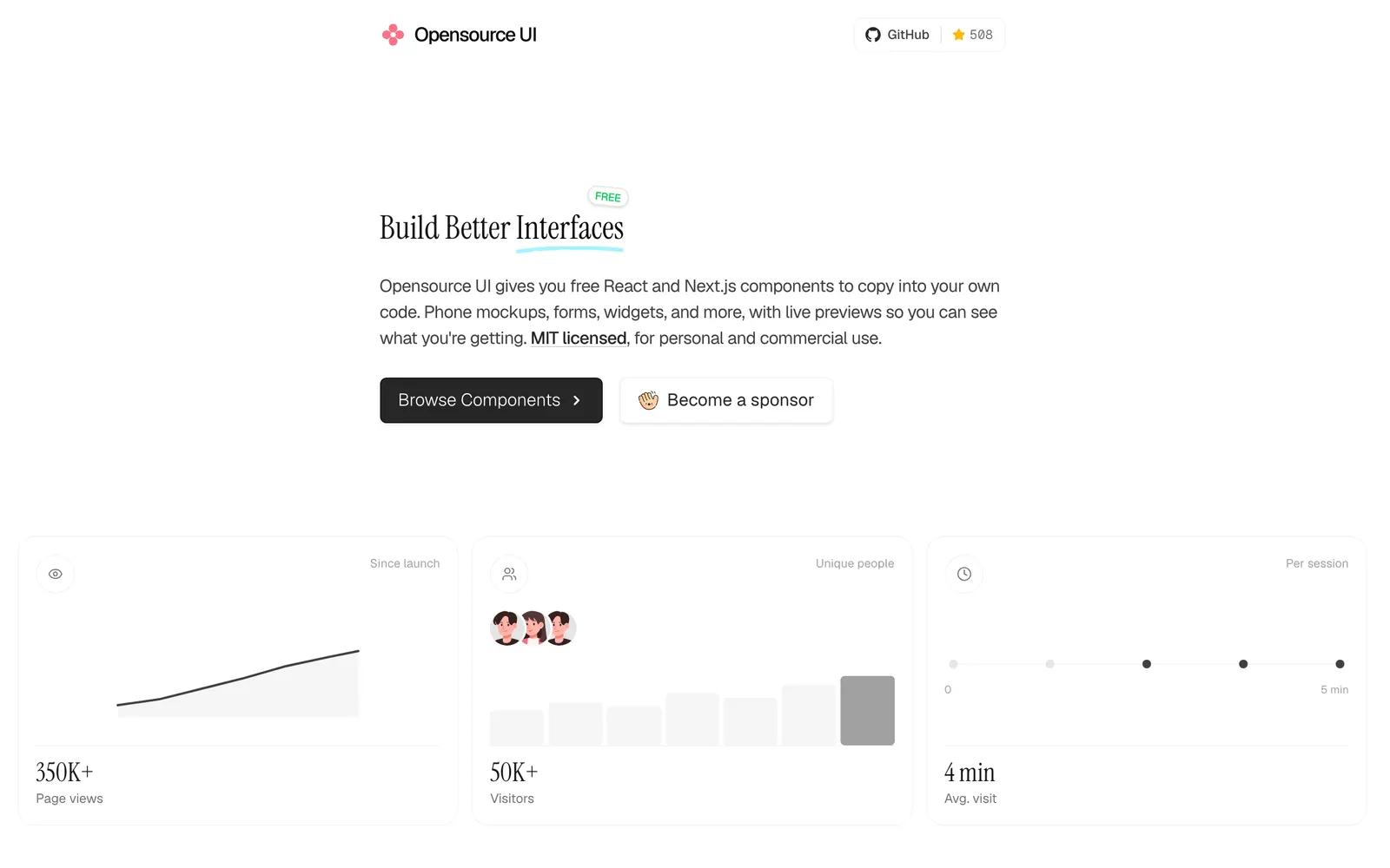
A free UI library for React and Next.js — 200+ MIT-licensed copy-paste components, Tailwind CSS blocks, iPhone and MacBook mockups.
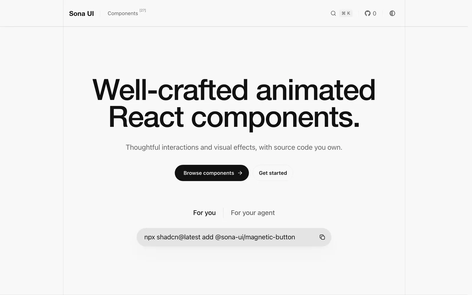
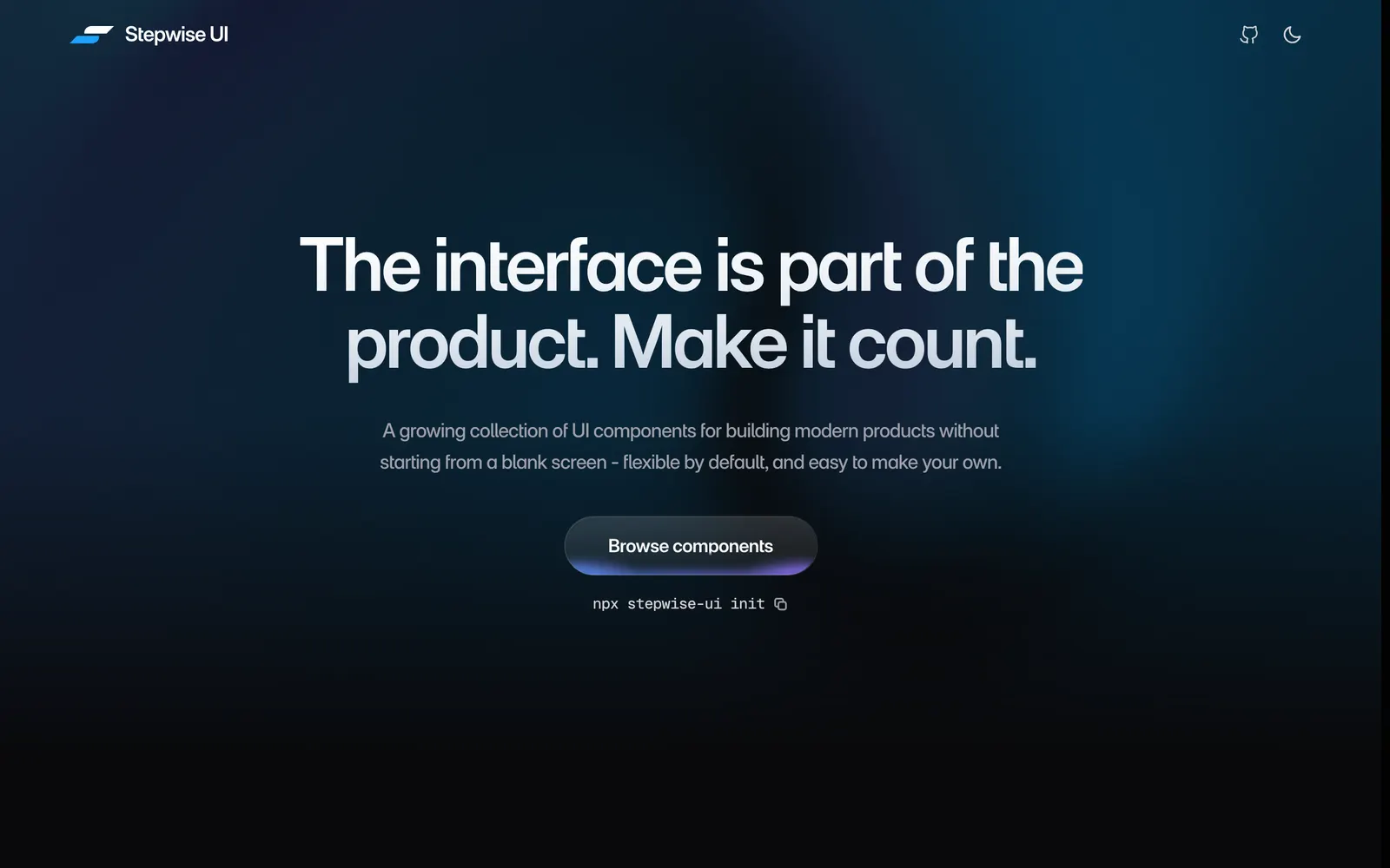
A growing collection of React components for building modern products. Arrives as source code you can read, edit, and make your own with your coding agent.
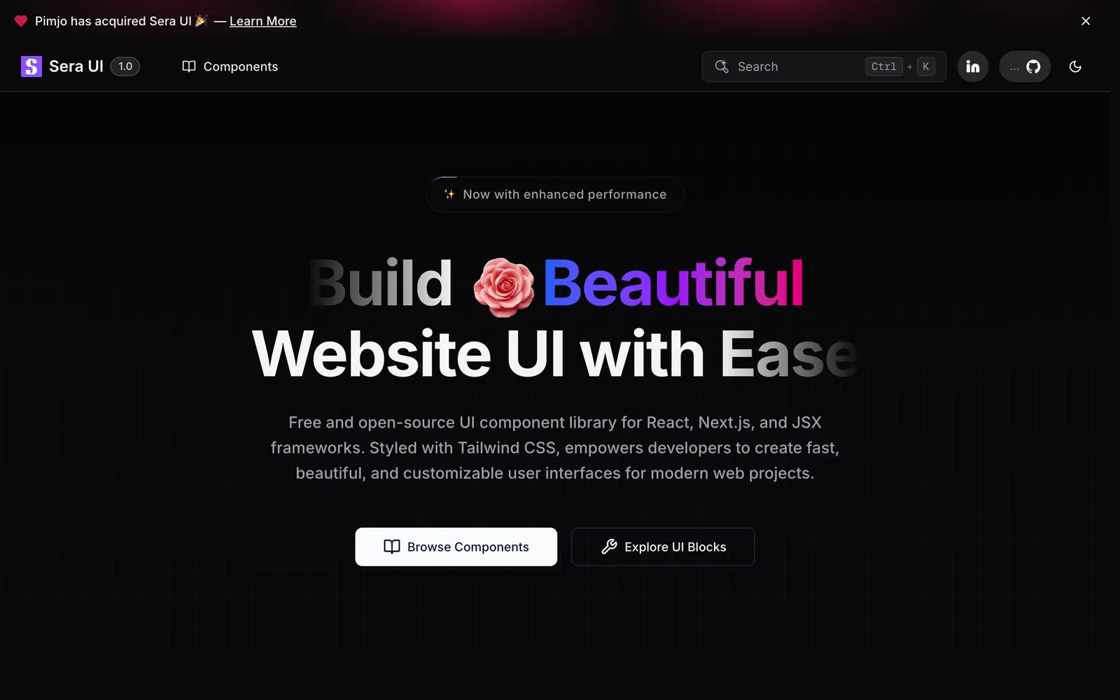
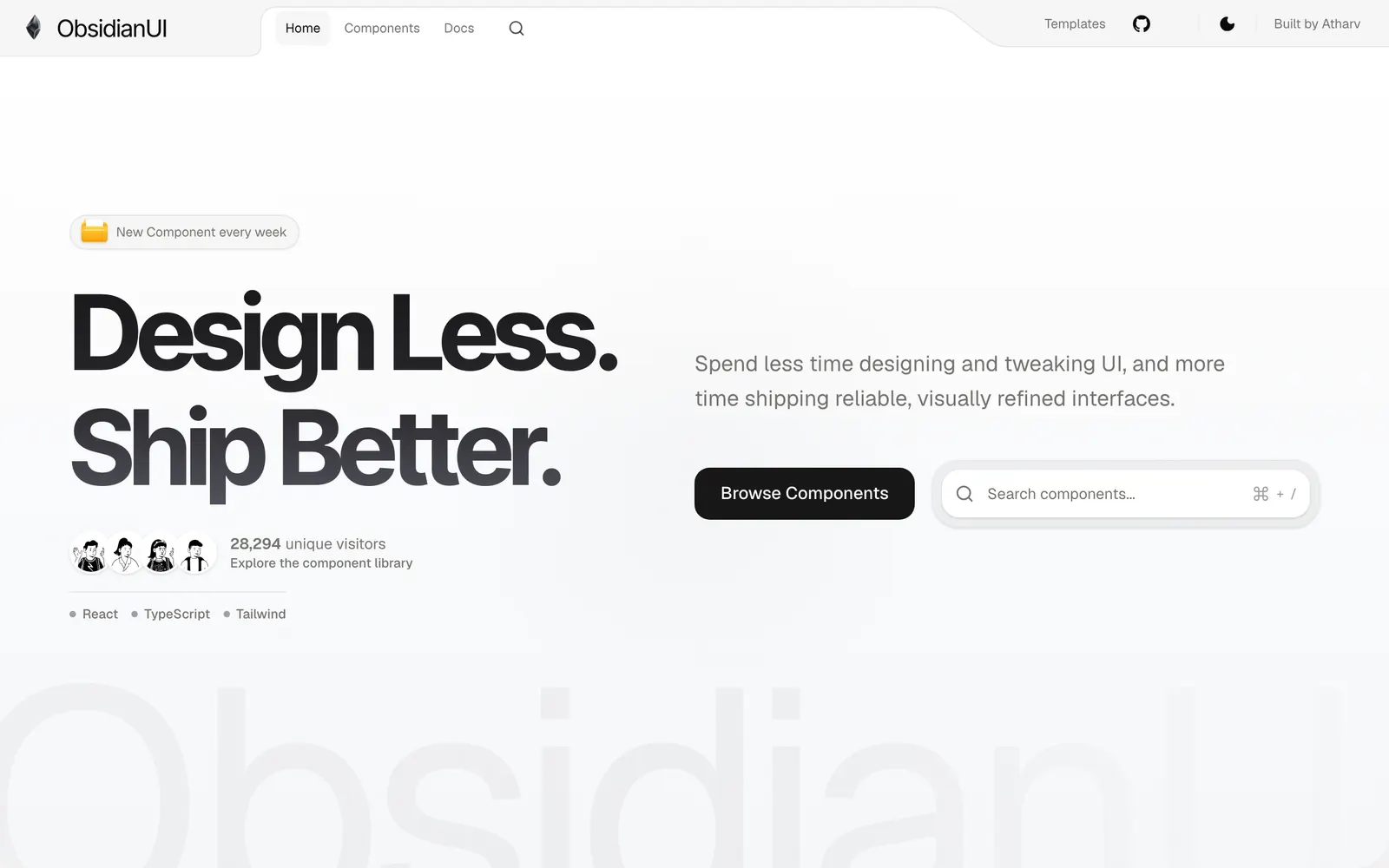
Beautiful, sophisticated UI components designed for modern React and Tailwind CSS applications.
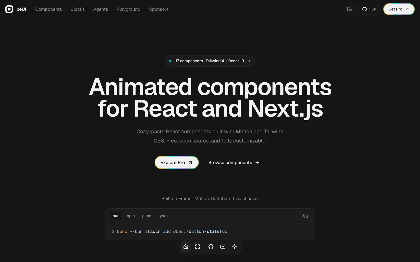
Free, open-source animated components for React and Next.js, built with Motion and Tailwind CSS. Copy the source or install with the shadcn CLI.