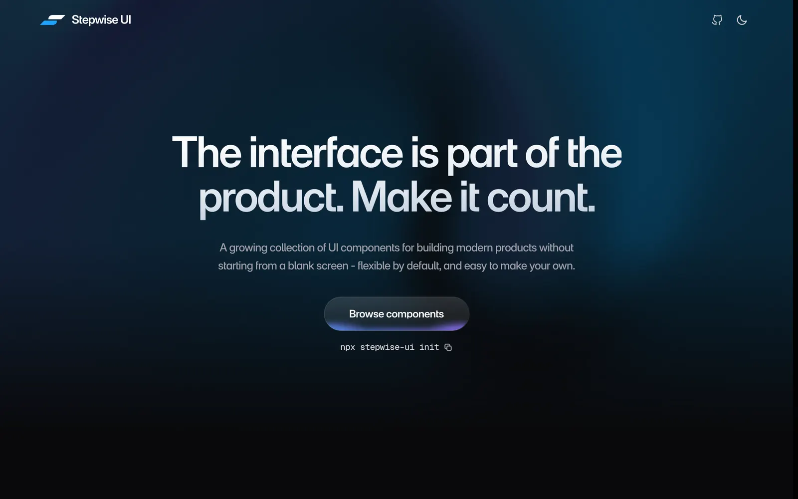
A growing collection of React components for building modern products. Arrives as source code you can read, edit, and make your own with your coding agent.
Included Components
77
AgentsAccordionApple SelectAvatarBreadcrumbsButtonCalendarCheckboxChipColor PickerColor SwatchComboboxCommand PaletteConversation TimelineDate PickerDot Grid LoaderDrawerDropdown MenuFile UploaderFolderGlow ButtonInputKbdModalMultiselectOTP InputPaginationPopoverProgressQuantity InputRadioScaleScroll AreaSegmentSelectSelection FrameSeparatorSliderSocial ButtonSpinnerTableTheme ToggleTime PickerToastToggleTooltipVideo PlayerDiagonal LinesDotted GridDotted SpotlightZigzag LinesFramePricing CardProduct CardProfile CardArcLensCircle AnnotationFade TextScramble TextShimmer TextSquiggly UnderlineTypewriterWhat it isMade to be changedSquircle cornersWhere this is goingWhere to go nextMulti-step WizardProgress StepperForm Flow ContainerConfirmation ModalInteractive ChecklistChoice Card GridStatus BadgeOnboarding CardContext Drawer
Stepwise UI provides a thoughtful collection of step-by-step product interaction patterns, wizard flows, and stateful widgets for React applications. Engineered to look genuinely designed rather than procedurally generated, each component arrives as clean, self-contained source code that you can freely adapt, customize, or let your AI coding agent extend. Highlights include progressive onboarding steppers, choice matrices, and contextual drawer flows.