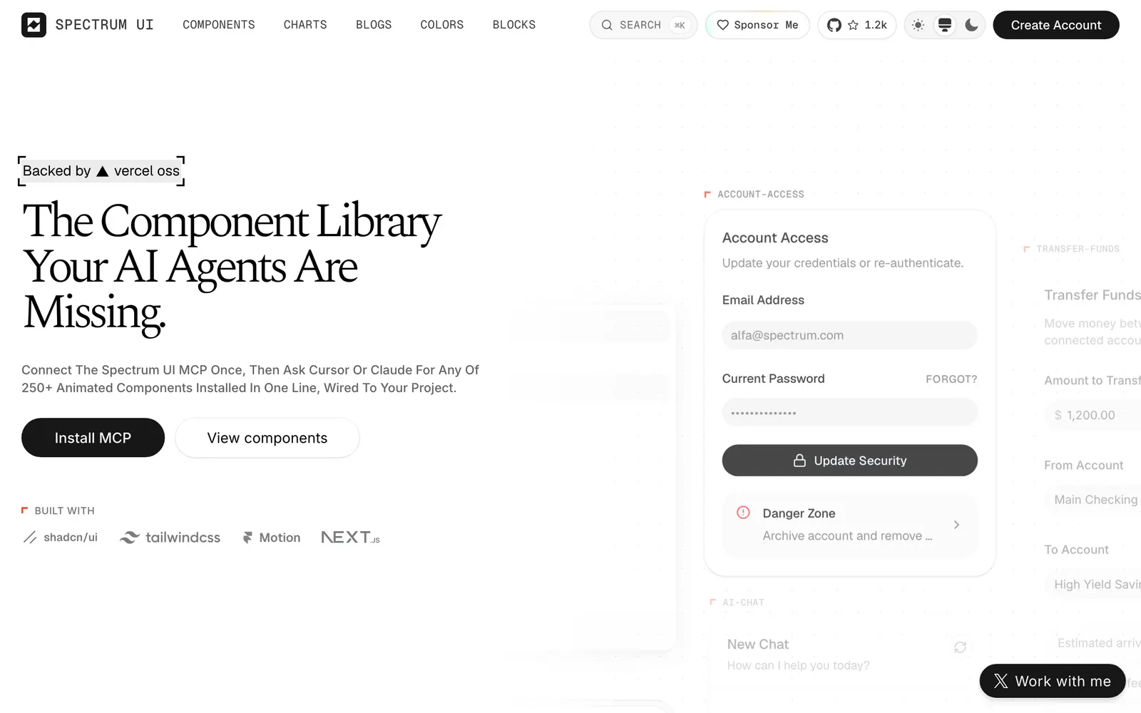
Open-source, animation-ready React components and blocks built with Next.js, Tailwind CSS, Motion, TypeScript, and shadcn/ui for SaaS and AI apps.
Included Components
83
BlogsColorsSponsor MeSign upCreate AccountTwitter @arihantcodesMCP ServerAccordionAccount Access CardAI Chat CardAnimated AlertAnimated CardAnimated DrawerAnimated SVG ChartAnimated SwitchAutosize TextareaAvatar StackBeam CardBeam Search BarButtonCardCommand SearchData TableDatetime PickerDual Range SliderExpandable Action BarFAQ Tabs CardFeedback CardFloating Label InputFollow ButtonHold to ConfirmImage PreviewInfinite ScrollKanban BoardKbd KeyLike ButtonLoading ButtonLogin CardMetal ButtonMetal Prompt BarMorph ButtonMultiple SelectorNav List CardNotification BellNumber TickerPassword StrengthProfile DropdownQuantity StepperReaction BarRecent ActivityScratch CardShare ButtonSkeleton RevealSpinnerStar RatingStatus BadgeSwipe to DeleteTask CheckboxText StatesToast StackTransfer Funds CardTree NavUndo Pill3D Event Badge3D Tilt CardNextInstallationGuidesFAQsLLM InfoBrandShip your next productComponents58Glow ButtonShimmer CardAnimated Gradient BackgroundDynamic DockBento Grid ShowcaseNoise Texture OverlaySpotlight CardBorder BeamMagnetic ButtonSmooth AccordionFloating NavigationSparkles Text
Spectrum UI is an animation-first component library created for modern SaaS landing pages, AI agent applications, and design-led products. Built on the shadcn/ui foundation with Motion and Tailwind CSS, it offers over 50 copy-paste components and blocks featuring neon glow borders, interactive spotlight cards, shimmer effects, physics-based magnetic cursors, and fluid bento layouts, complete with an official MCP server for AI coding assistants.