Motion

Curated collection of 38 open source UI libraries and design engineering components for Motion. Explore component lists, live previews and code repos.

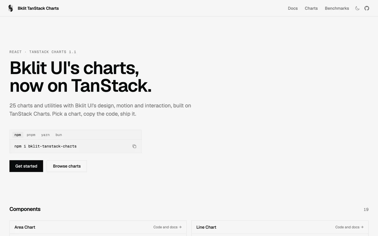
Bklit TanStack Charts — Bklit UI chart components rebuilt on TanStack Charts with identical API and motion.

Bklit TanStack ChartsData Viz

Bklit UI chart components rebuilt on TanStack Charts with identical API and motion.

Prestige UI — Animated React components and full-page blocks built with Tailwind CSS and Motion.

Prestige UICollections

Animated React components and full-page blocks built with Tailwind CSS and Motion.

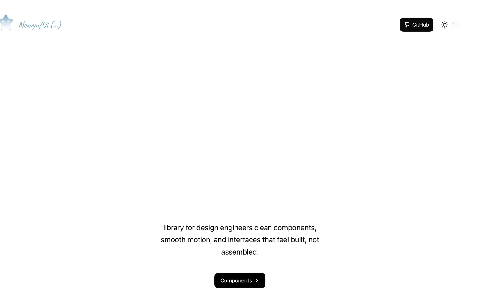
Nexvyn UI — Animated React components with spring physics built on shadcn/ui and Motion.

Nexvyn UICollections

Animated React components with spring physics built on shadcn/ui and Motion.

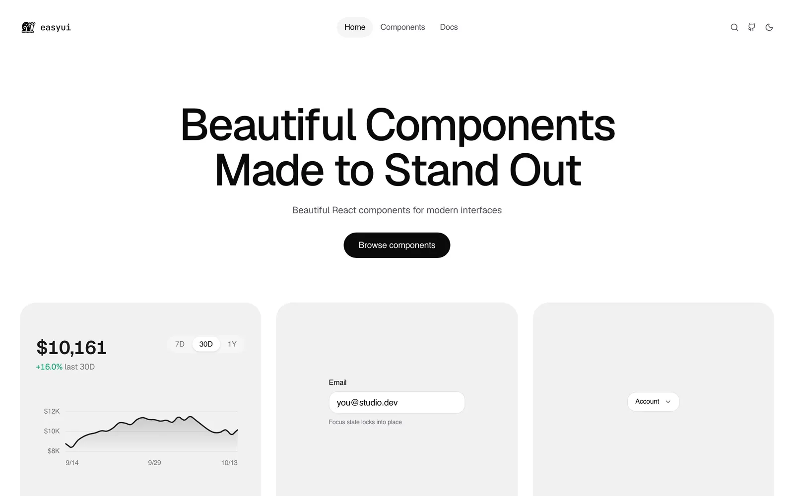
EasyUI — Over 130 production-ready animated React components with shadcn registry support.

EasyUICollections

Over 130 production-ready animated React components with shadcn registry support.

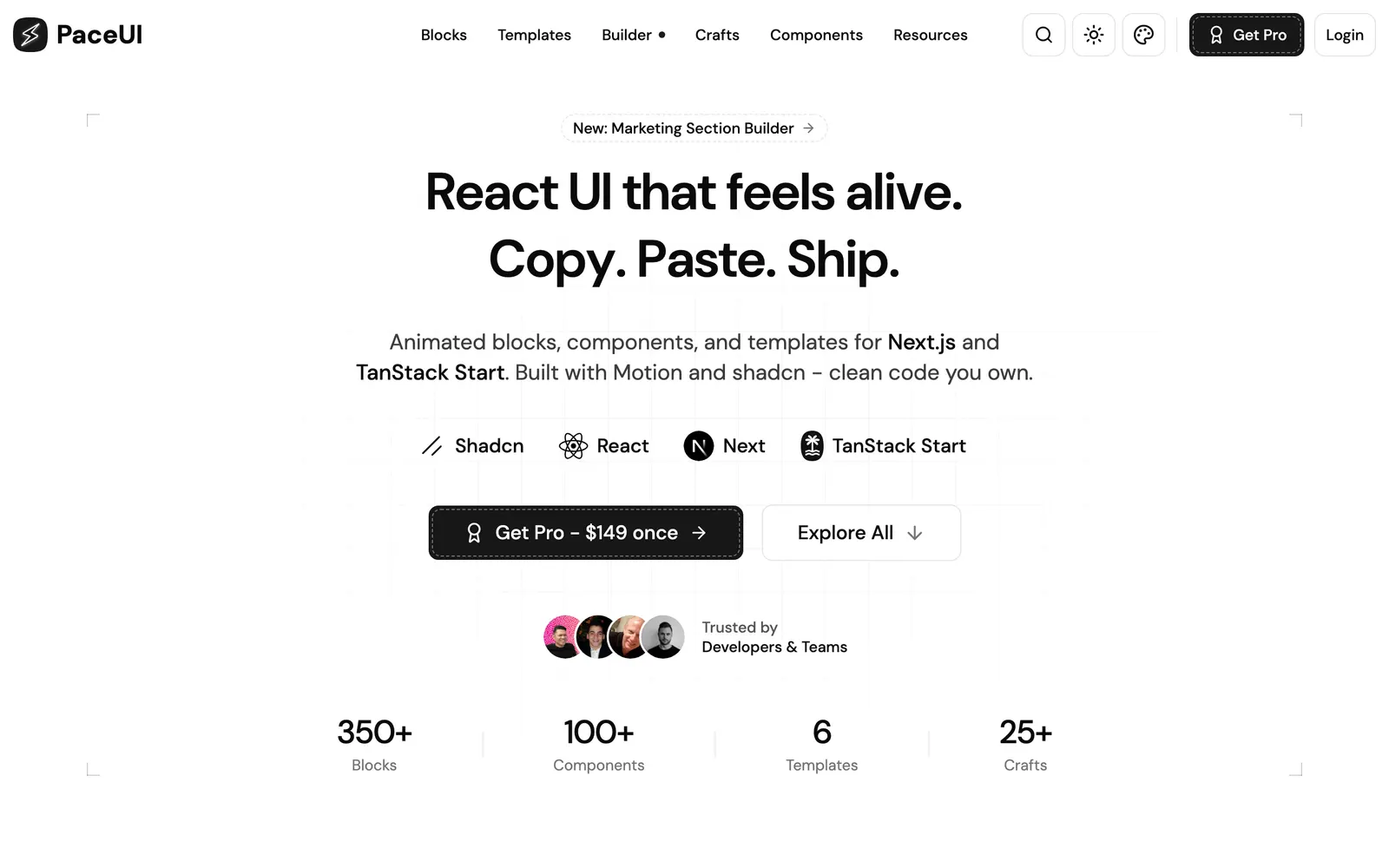
PaceUI — Animated React blocks and crafts for Next.js and TanStack Start with Motion.

PaceUICollections

Animated React blocks and crafts for Next.js and TanStack Start with Motion.

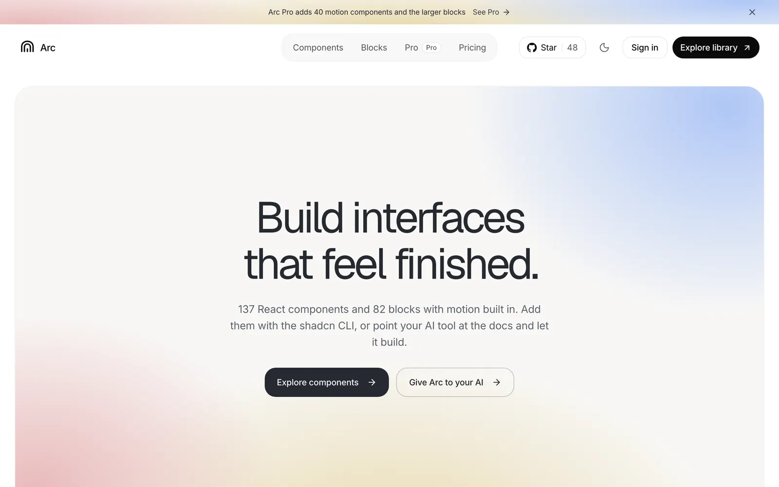
Arc UI — Open-source React components and blocks with calm, polished built-in motion.

Arc UICollections

Open-source React components and blocks with calm, polished built-in motion.

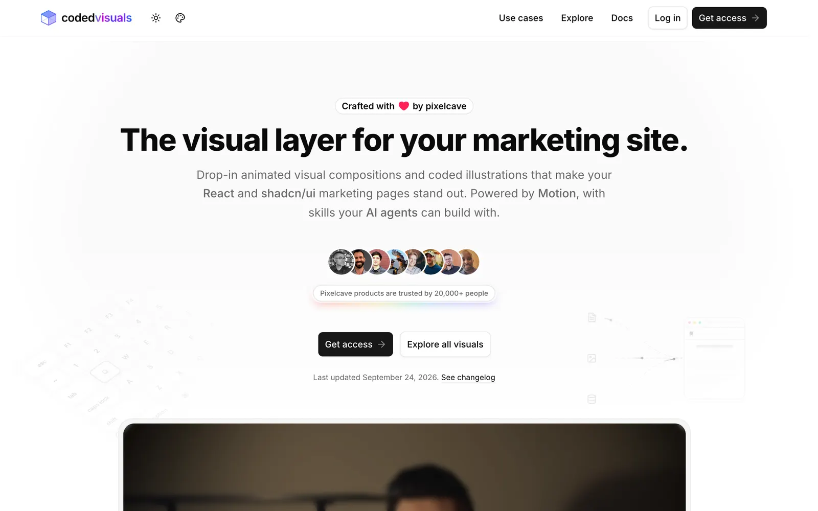
CodedVisuals — Copy-paste animated illustrations and landing visuals for React and shadcn/ui.

CodedVisualsCollections

Copy-paste animated illustrations and landing visuals for React and shadcn/ui.

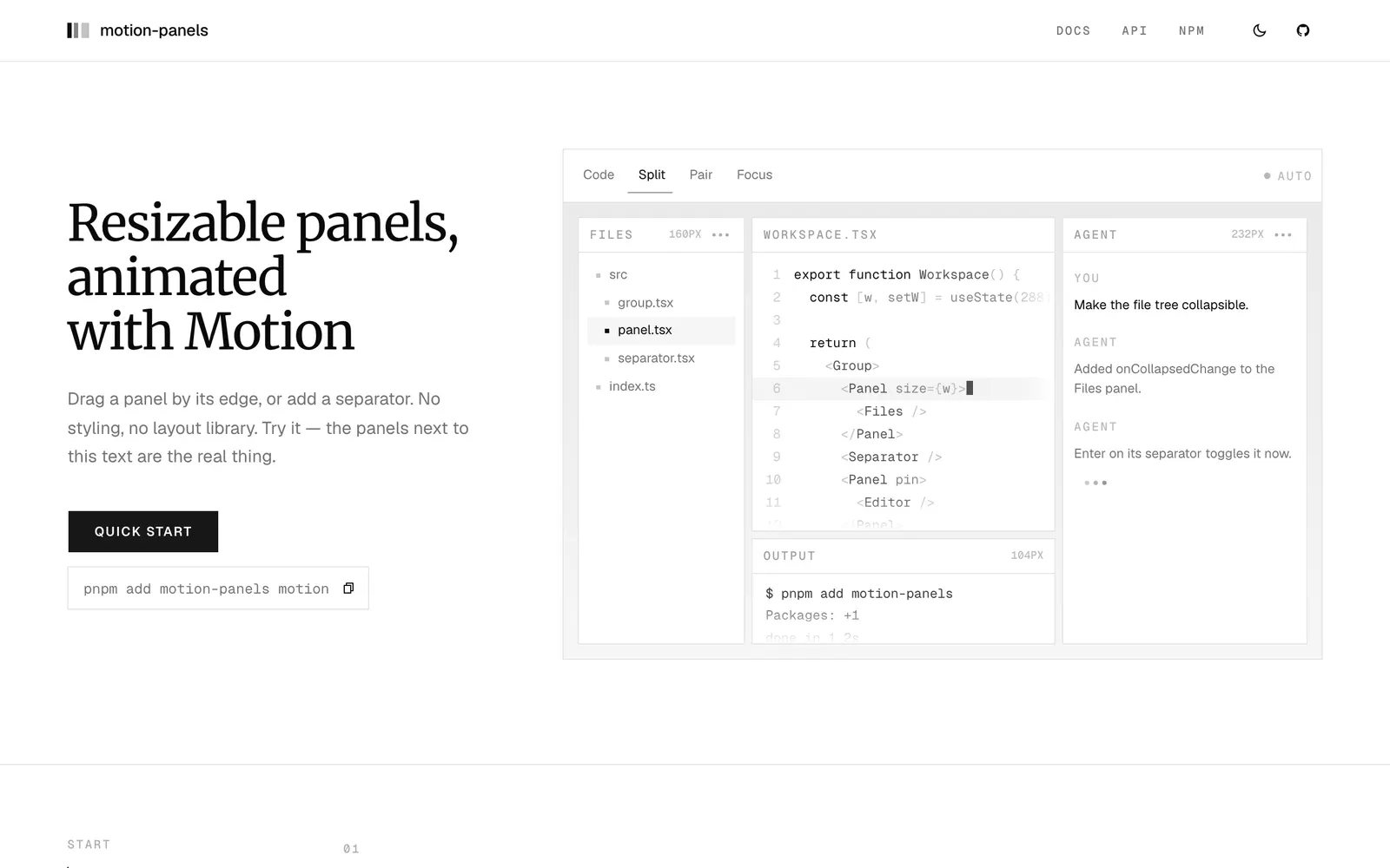
motion-panels — Resizable split panels animated with Motion, featuring smooth folding and snapping.

motion-panelsInput Controls

Resizable split panels animated with Motion, featuring smooth folding and snapping.

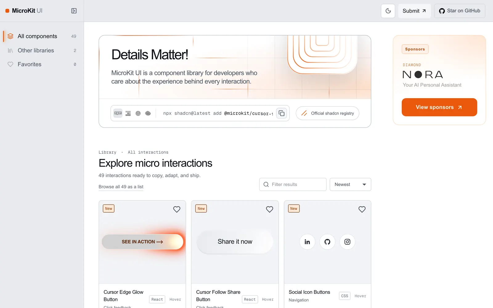
MicroKit UI — Copy-paste microinteractions and subtle UI animations for React and Tailwind.

MicroKit UICollections

Copy-paste microinteractions and subtle UI animations for React and Tailwind.

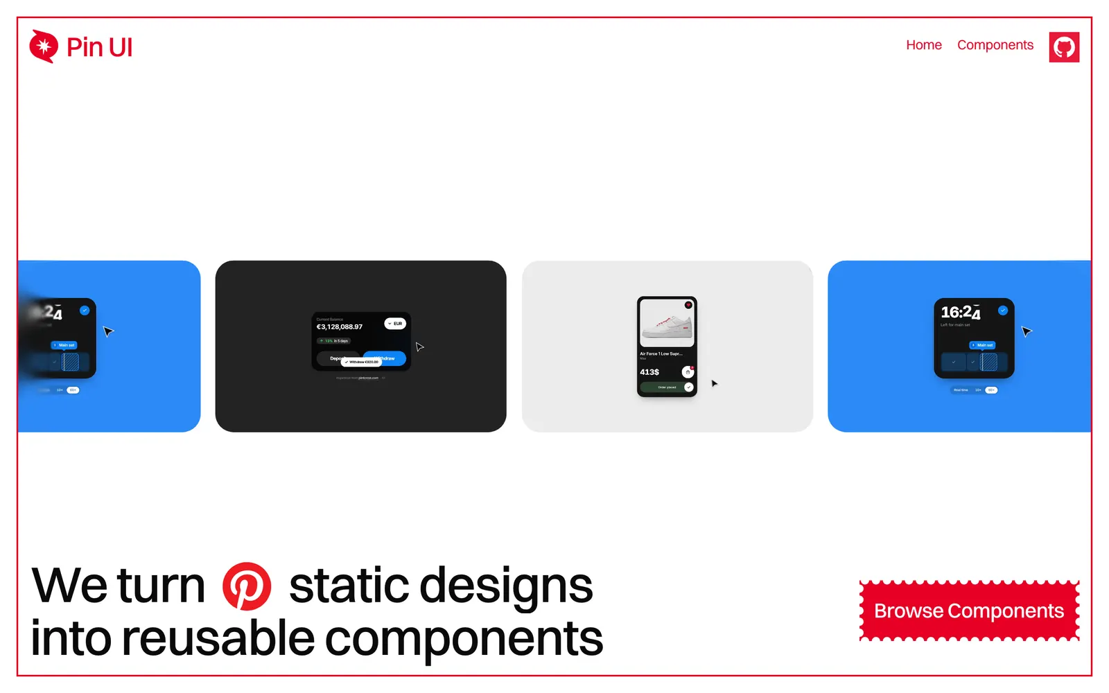
Pin UI — Turns Pinterest visual ideas into production-ready, copy-paste React components.

Pin UICollections

Turns Pinterest visual ideas into production-ready, copy-paste React components.

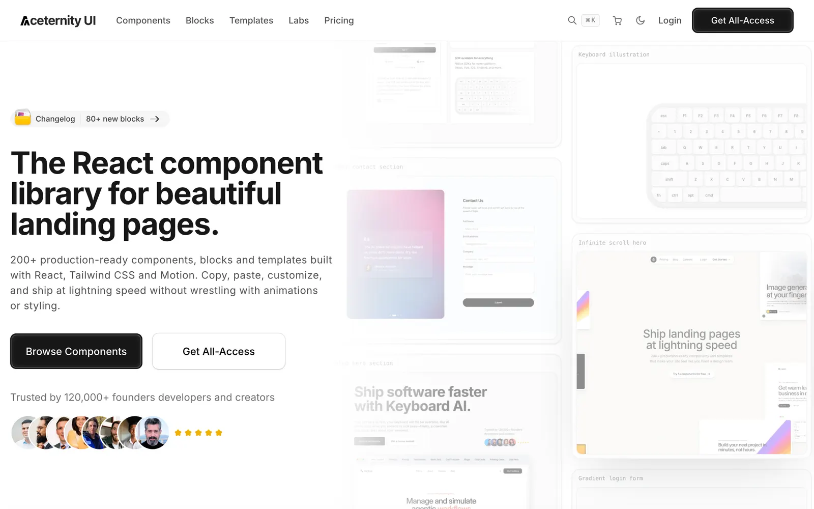
Aceternity UI — Trending copy-paste animated components and hero sections for modern web.

Aceternity UICollections

Trending copy-paste animated components and hero sections for modern web.

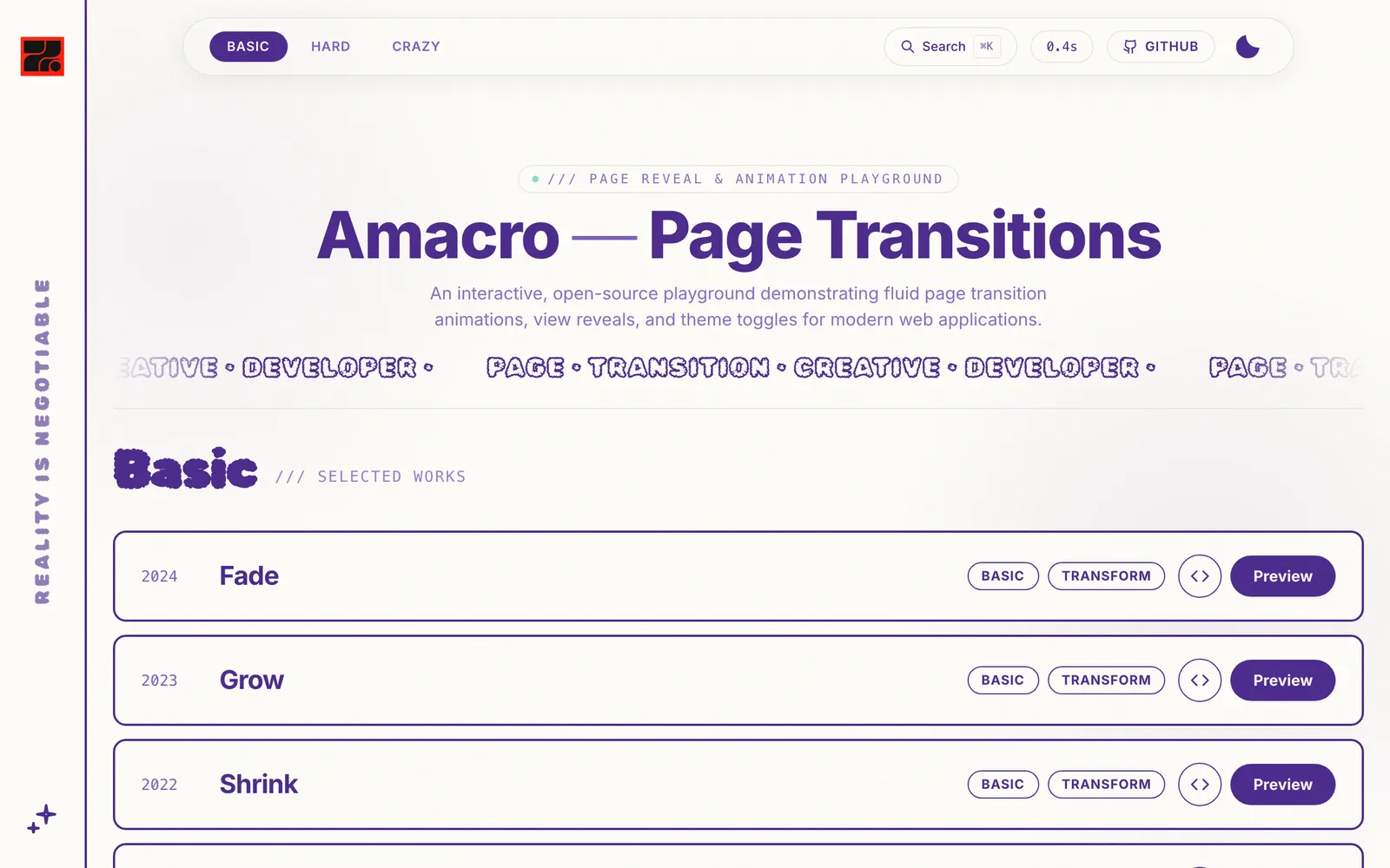
Amacro — Drop-in page reveal animations and fluid scene curtain transitions for React.

AmacroCollections

Drop-in page reveal animations and fluid scene curtain transitions for React.

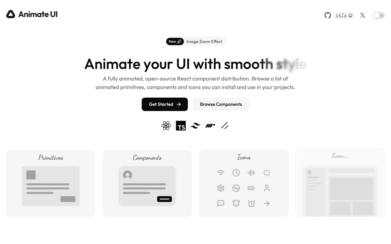
Animate UI — Accessible shadcn UI components beautifully animated with Motion and CSS.

Animate UICollections

Accessible shadcn UI components beautifully animated with Motion and CSS.

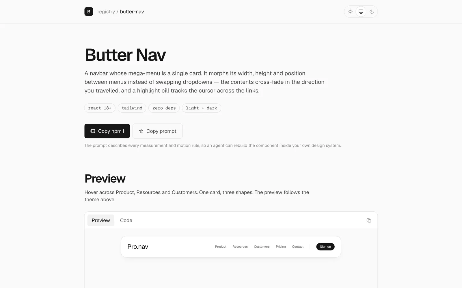
Butter Nav — Mega-menu featuring fluid layout morphing transitions and silky physics.

Butter NavCollections

Mega-menu featuring fluid layout morphing transitions and silky physics.

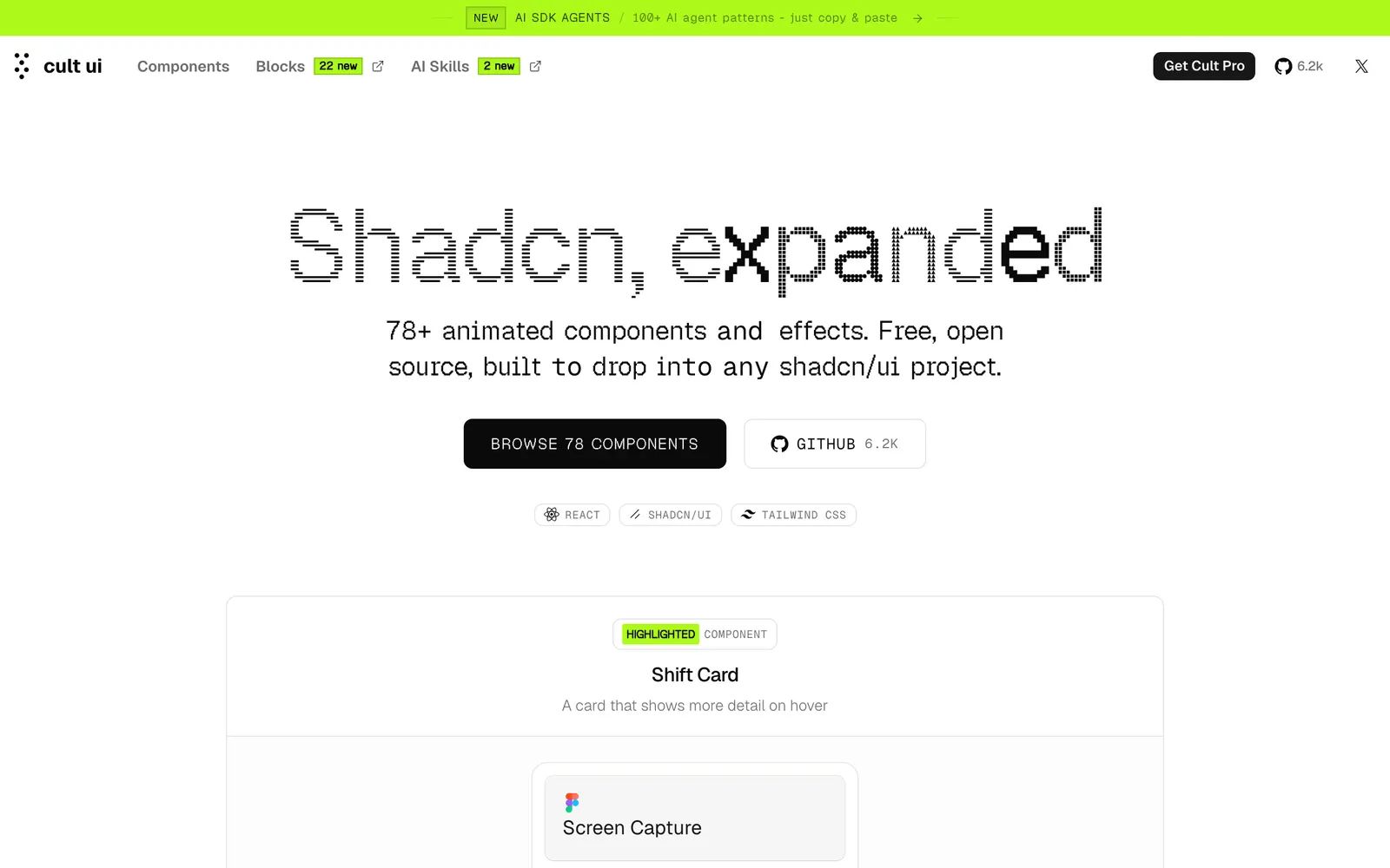
Cult UI — Curated animated React components crafted with Framer Motion and Tailwind.

Cult UICollections

Curated animated React components crafted with Framer Motion and Tailwind.

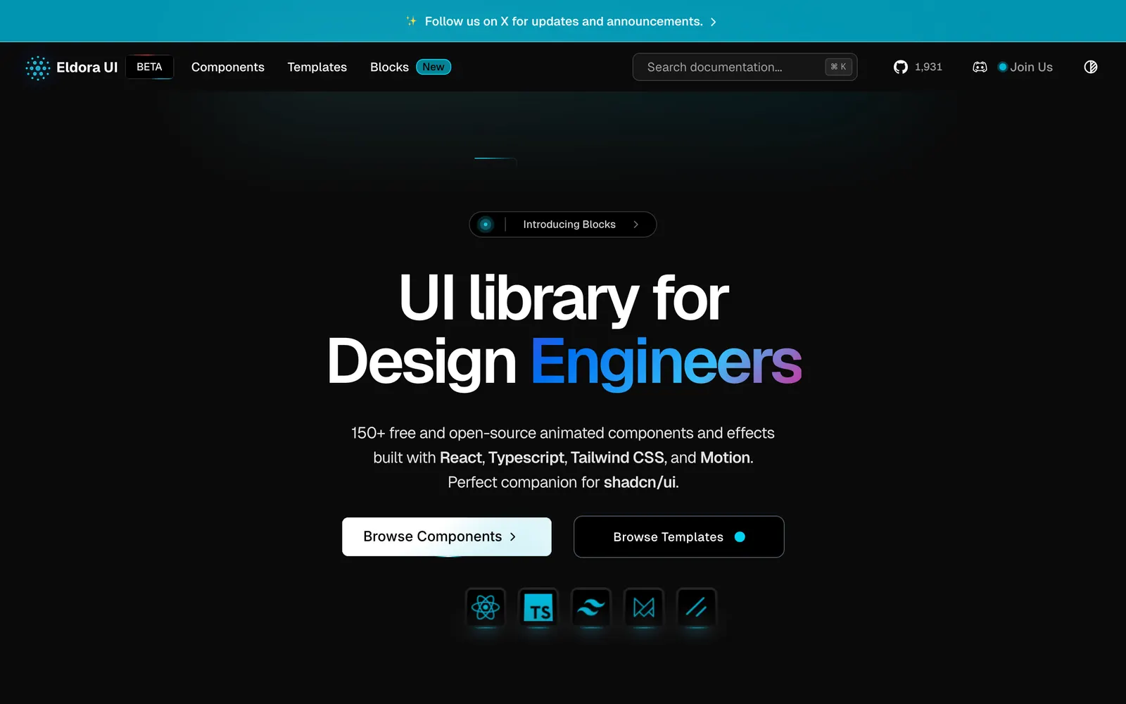
Eldora UI — Animated React components and interactive hero sections tailored for startups.

Eldora UICollections

Animated React components and interactive hero sections tailored for startups.

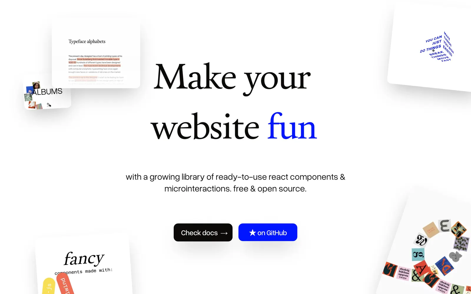
Fancy Components — Playful and physics-driven React components to bring joyful motion to the web.

Fancy ComponentsCollections

Playful and physics-driven React components to bring joyful motion to the web.

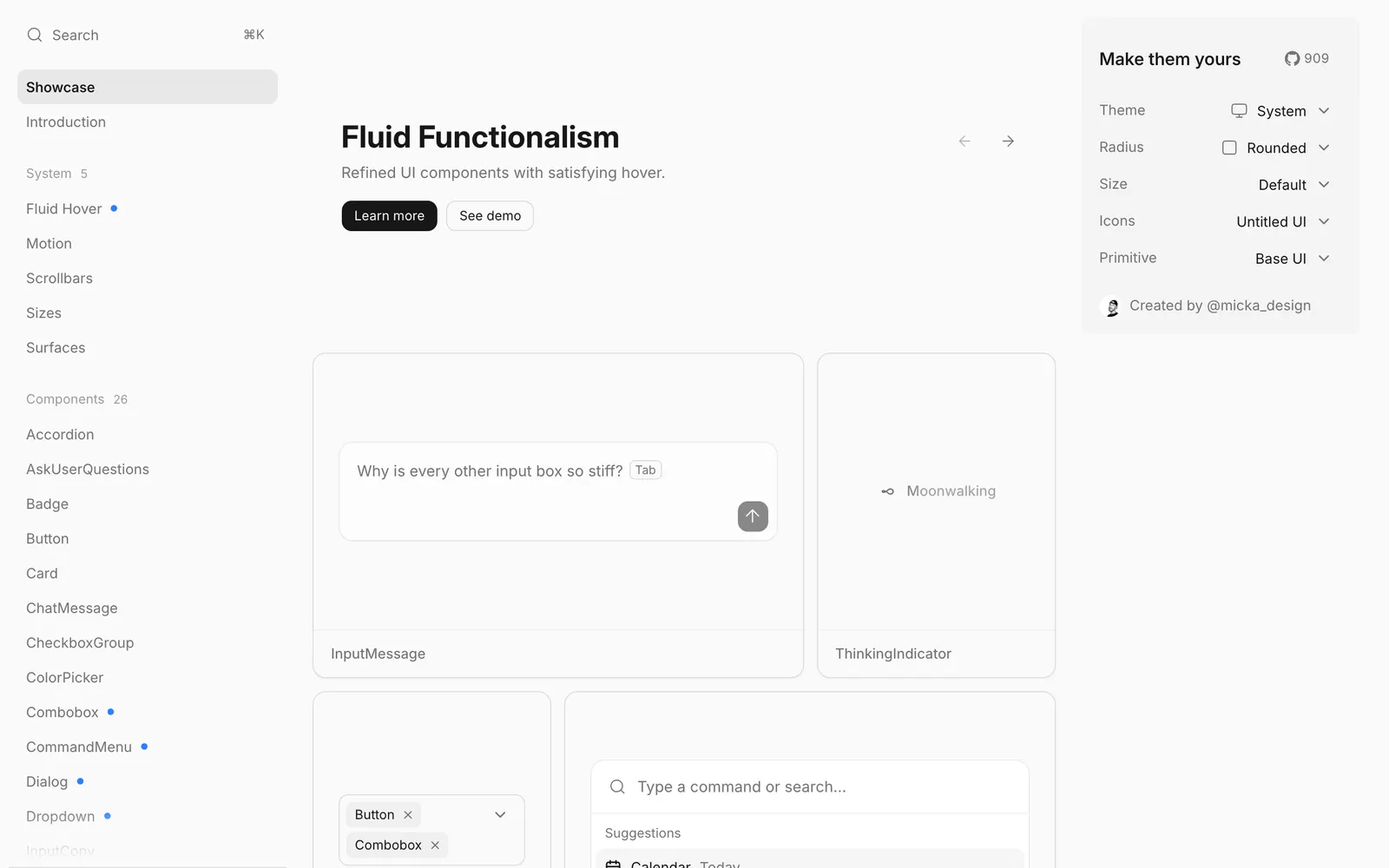
Fluid Functionalism — Design principles and interactive components engineered with purposeful physical animation.

Fluid FunctionalismCollections

Design principles and interactive components engineered with purposeful physical animation.

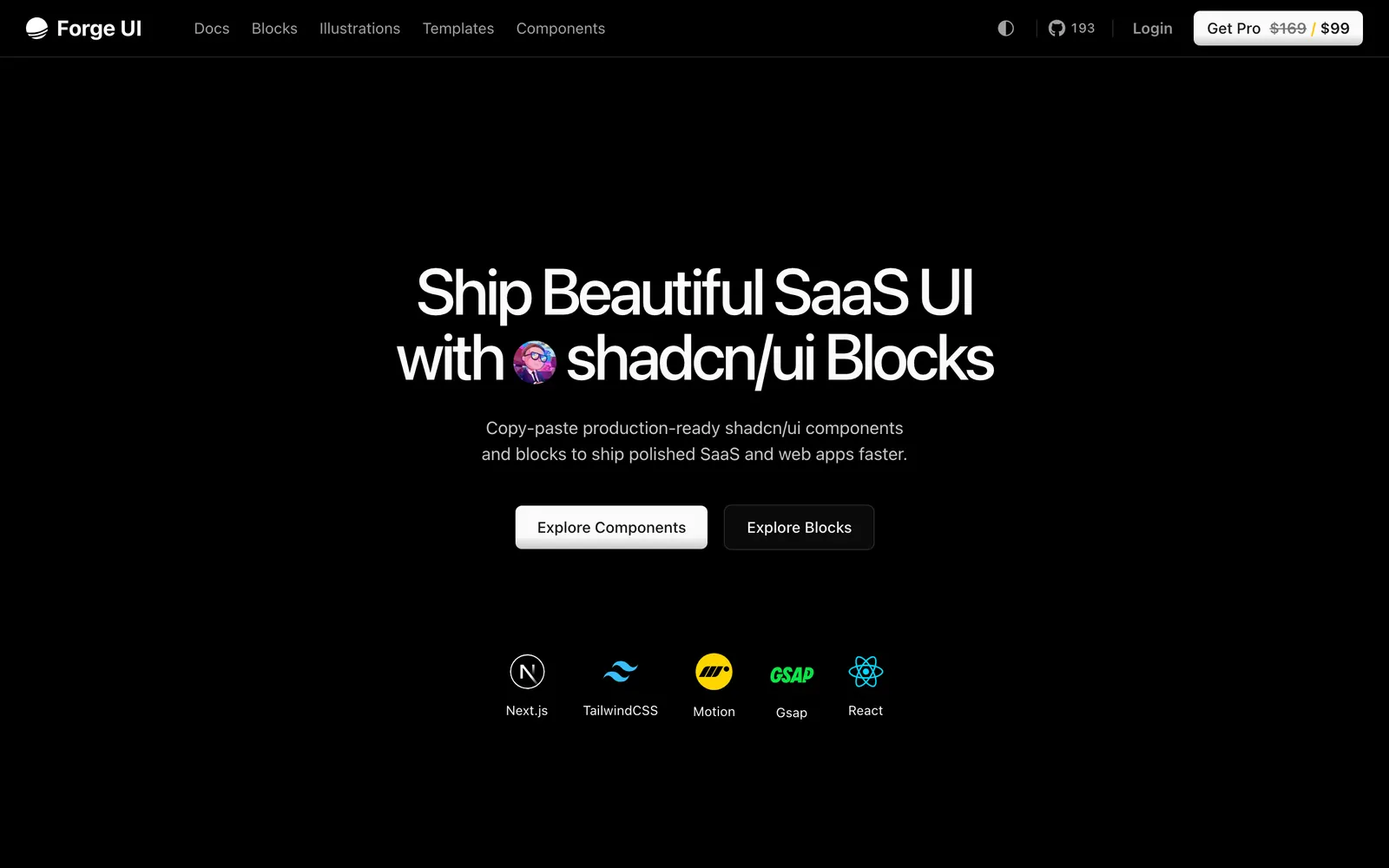
Forge UI — Animated React and Tailwind UI components and blocks compatible with shadcn/ui.

Forge UICollections

Animated React and Tailwind UI components and blocks compatible with shadcn/ui.

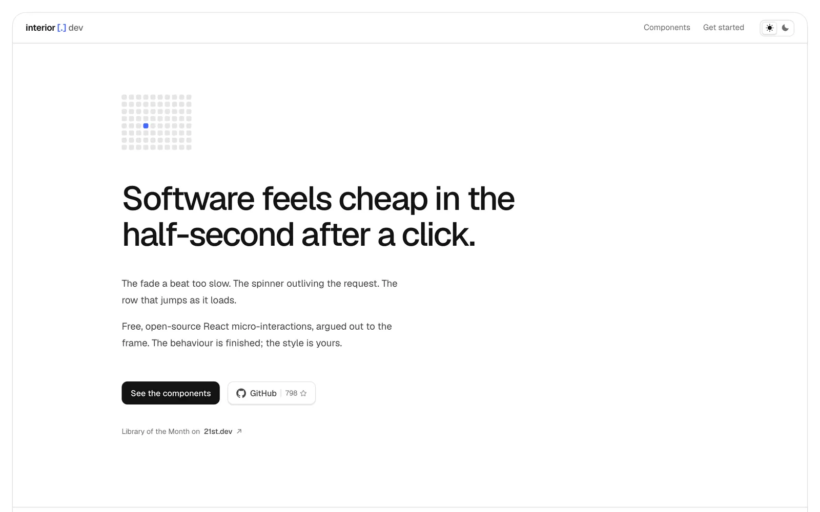
interior.dev — Micro-interactions and tactile UI controls finely tuned for click responsiveness.

interior.devInput Controls

Micro-interactions and tactile UI controls finely tuned for click responsiveness.

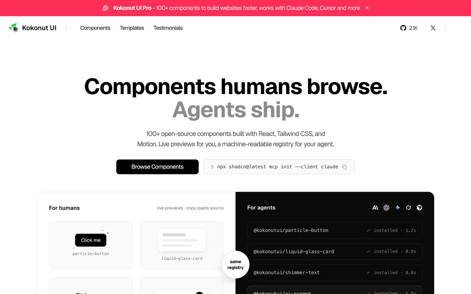
Kokonut UI — Creative interactive components for React and Tailwind in shadcn format.

Kokonut UICollections

Creative interactive components for React and Tailwind in shadcn format.

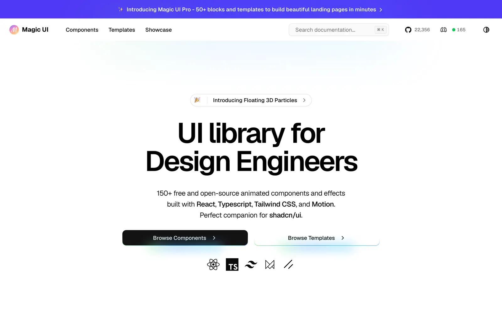
Magic UI — Over 150 animated components crafted for landing pages and modern products.

Magic UICollections

Over 150 animated components crafted for landing pages and modern products.

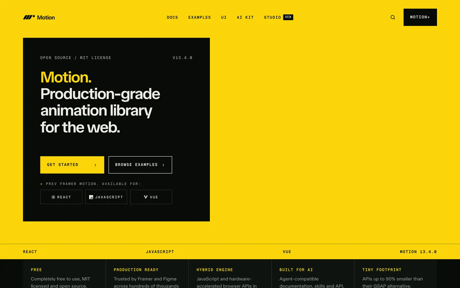
Motion — Production-ready animation and gesture library for React and modern JavaScript.

MotionCollections

Production-ready animation and gesture library for React and modern JavaScript.

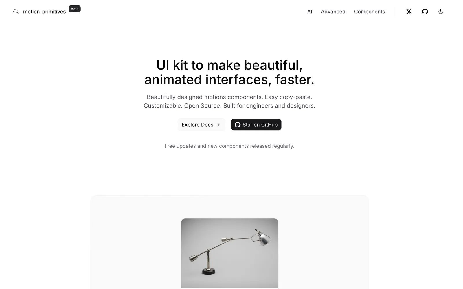
Motion Primitives — Advanced motion and interactive components built with Motion and Tailwind CSS.

Motion PrimitivesCollections

Advanced motion and interactive components built with Motion and Tailwind CSS.

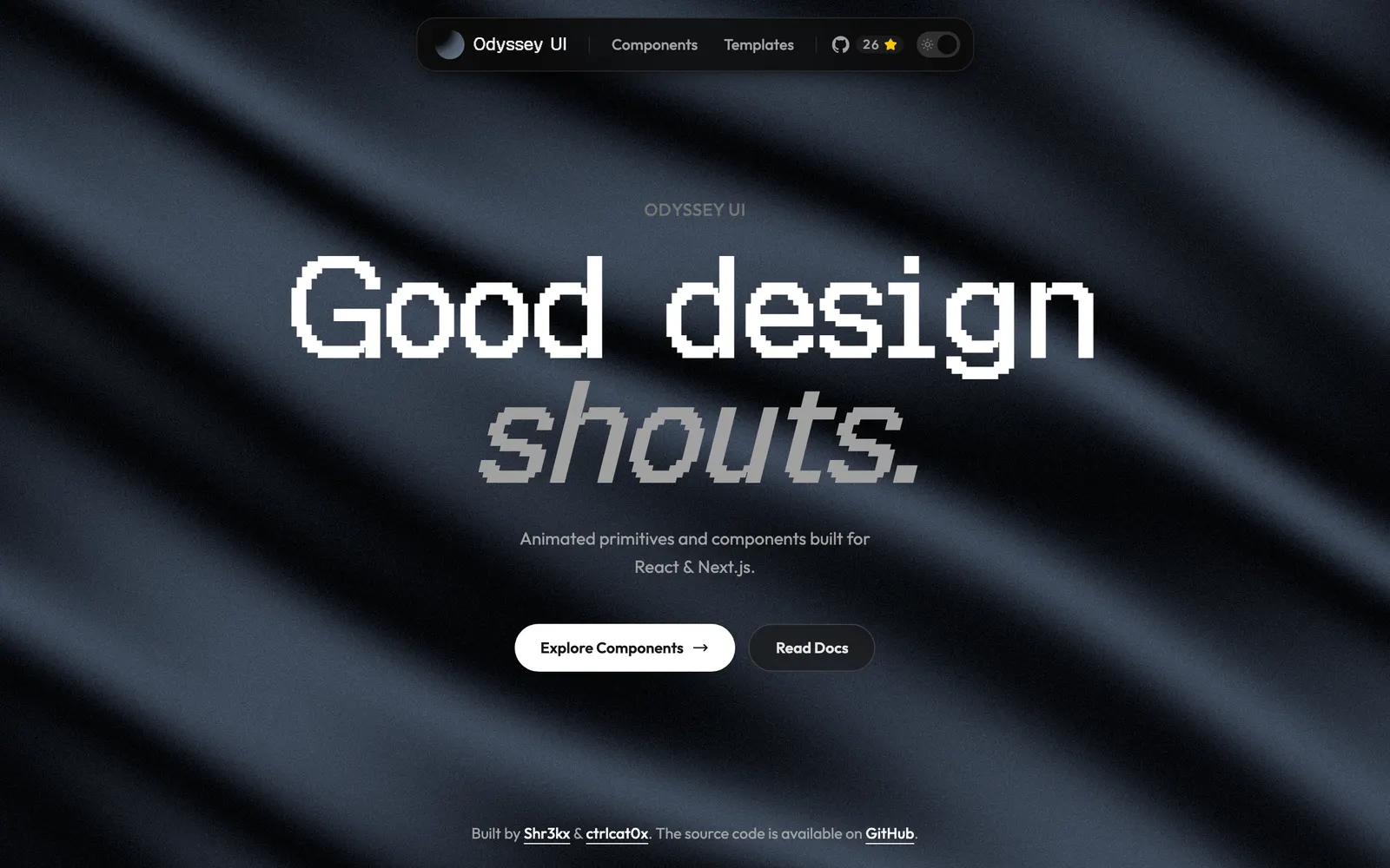
Odyssey UI — Animated React components built on shadcn/ui and Framer Motion for SaaS.

Odyssey UICollections

Animated React components built on shadcn/ui and Framer Motion for SaaS.

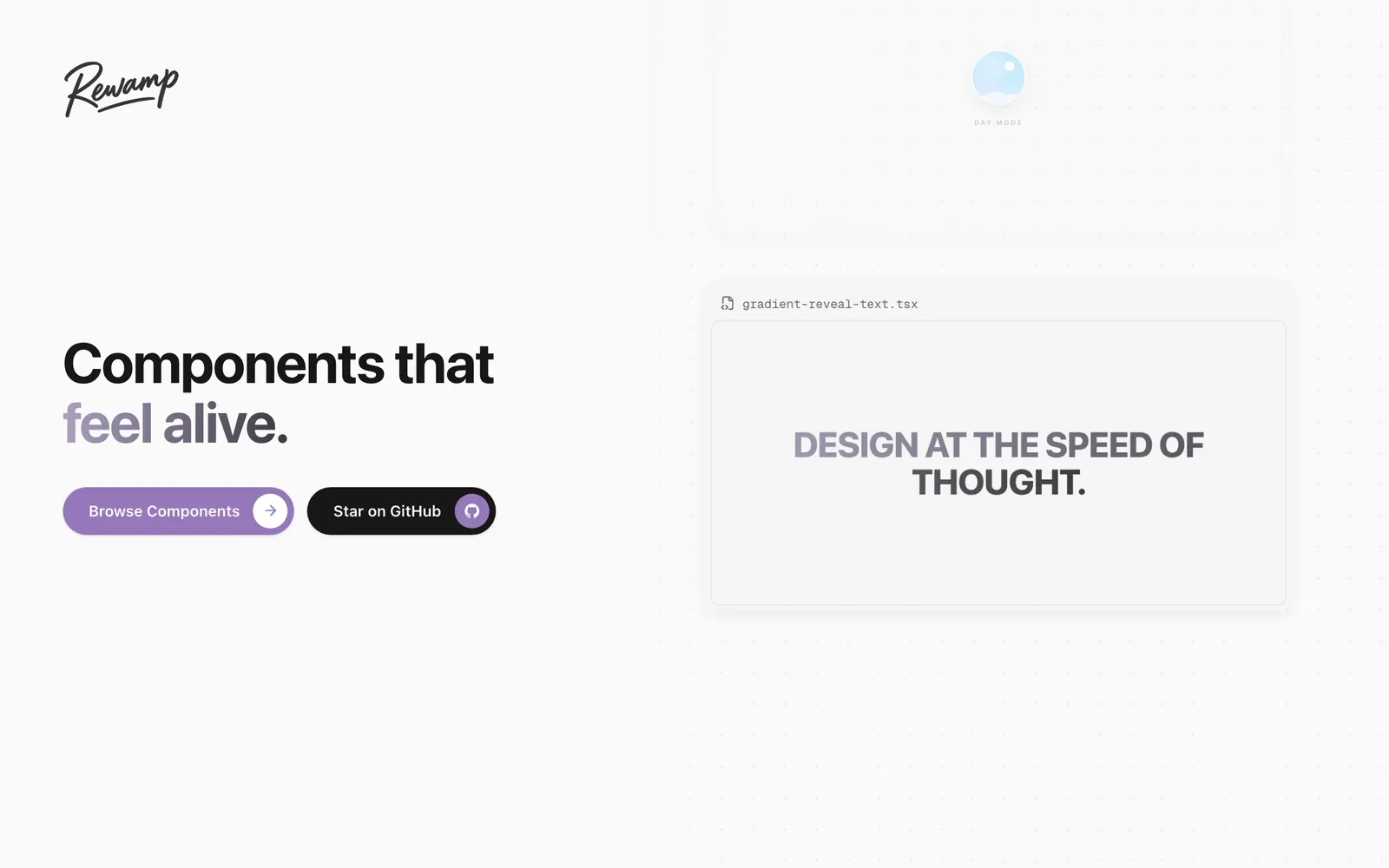
Rewamp UI — A copy-paste React component collection built with Motion, Tailwind CSS, and Three.js.

Rewamp UICollections

A copy-paste React component collection built with Motion, Tailwind CSS, and Three.js.

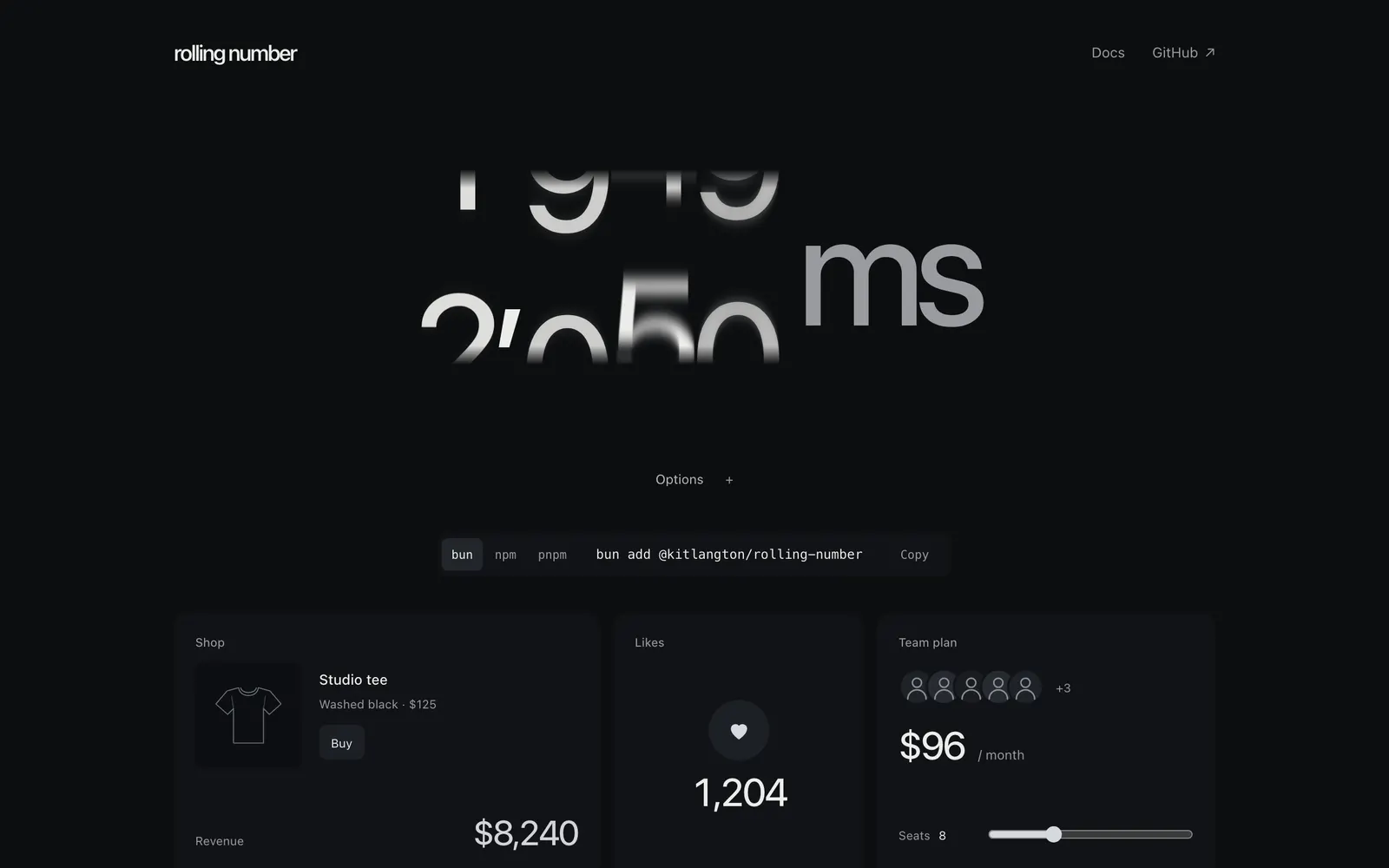
Rolling Number — Smooth digit-rolling number counter component with spring physics for React.

Rolling NumberText & Typography

Smooth digit-rolling number counter component with spring physics for React.

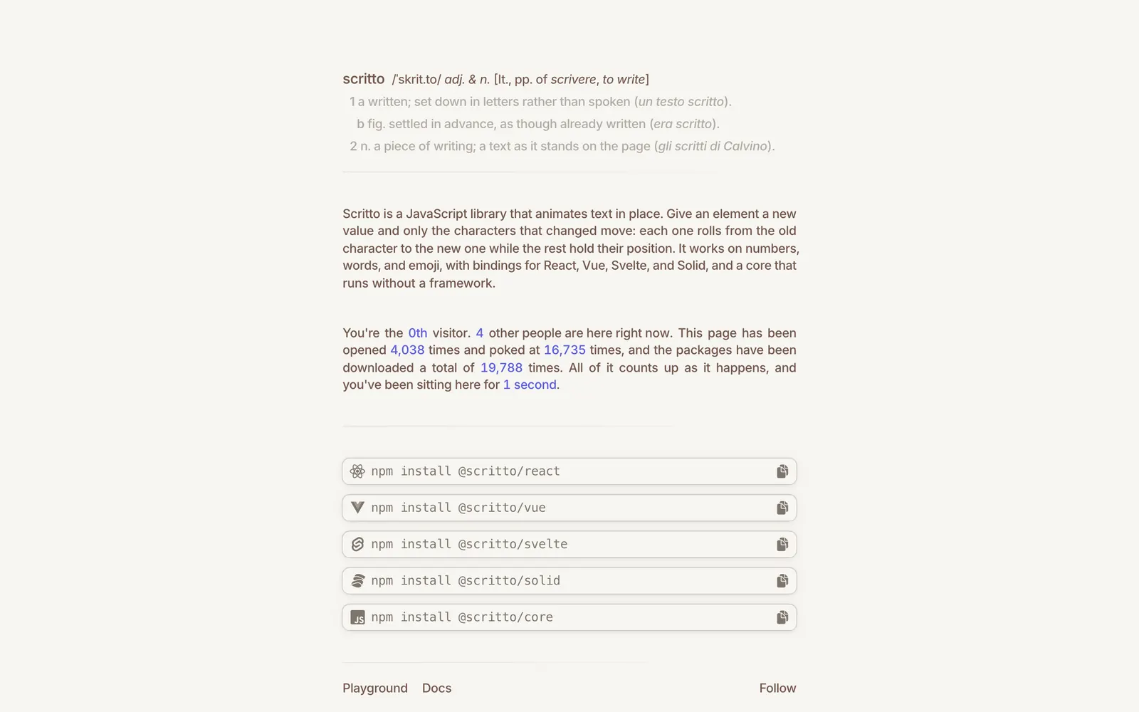
Scritto — Rolling character text transition component library for expressive headings.

ScrittoText & Typography

Rolling character text transition component library for expressive headings.

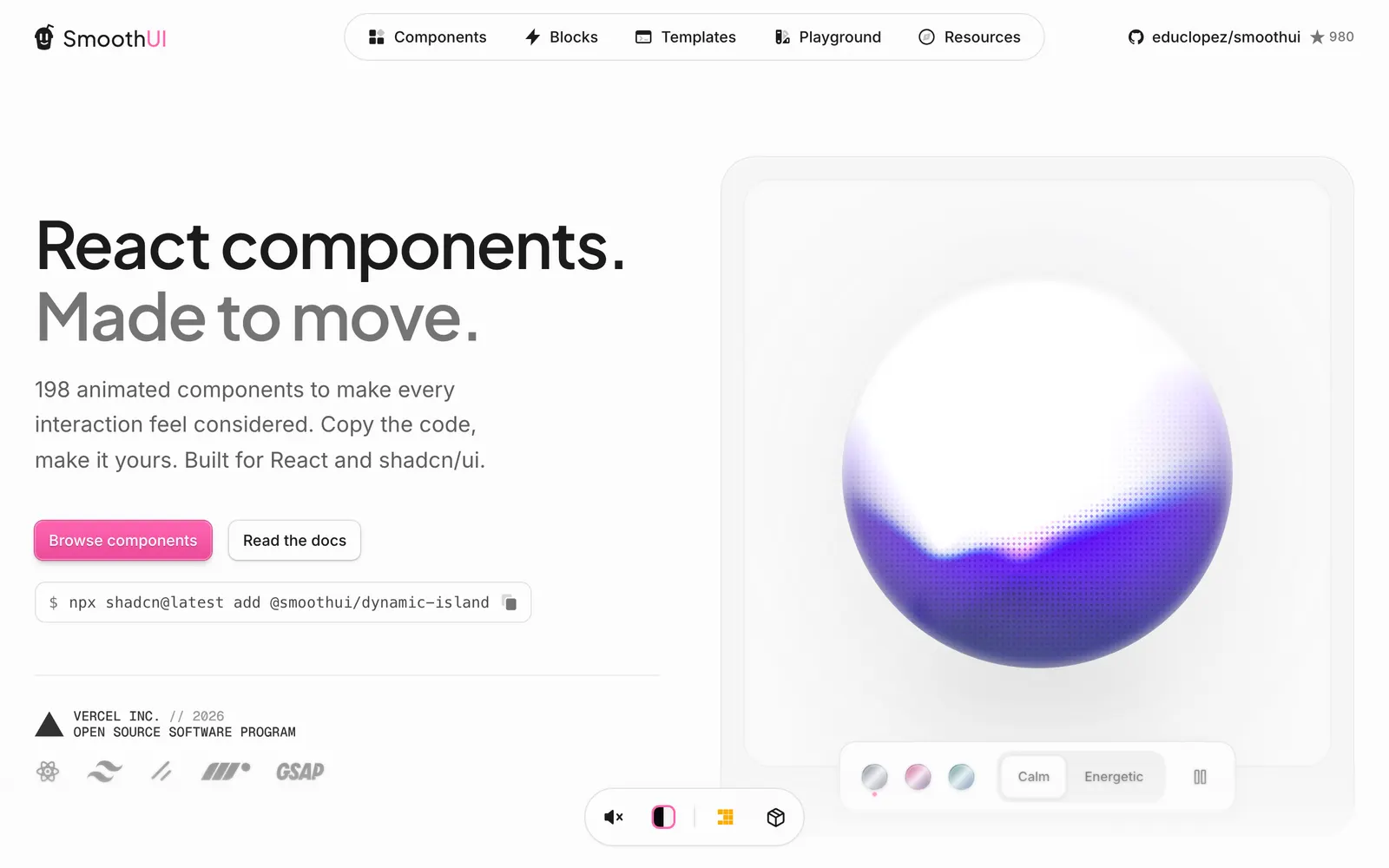
Smooth UI — Motion-heavy React components ready to copy and paste for silky user interfaces.

Smooth UICollections

Motion-heavy React components ready to copy and paste for silky user interfaces.

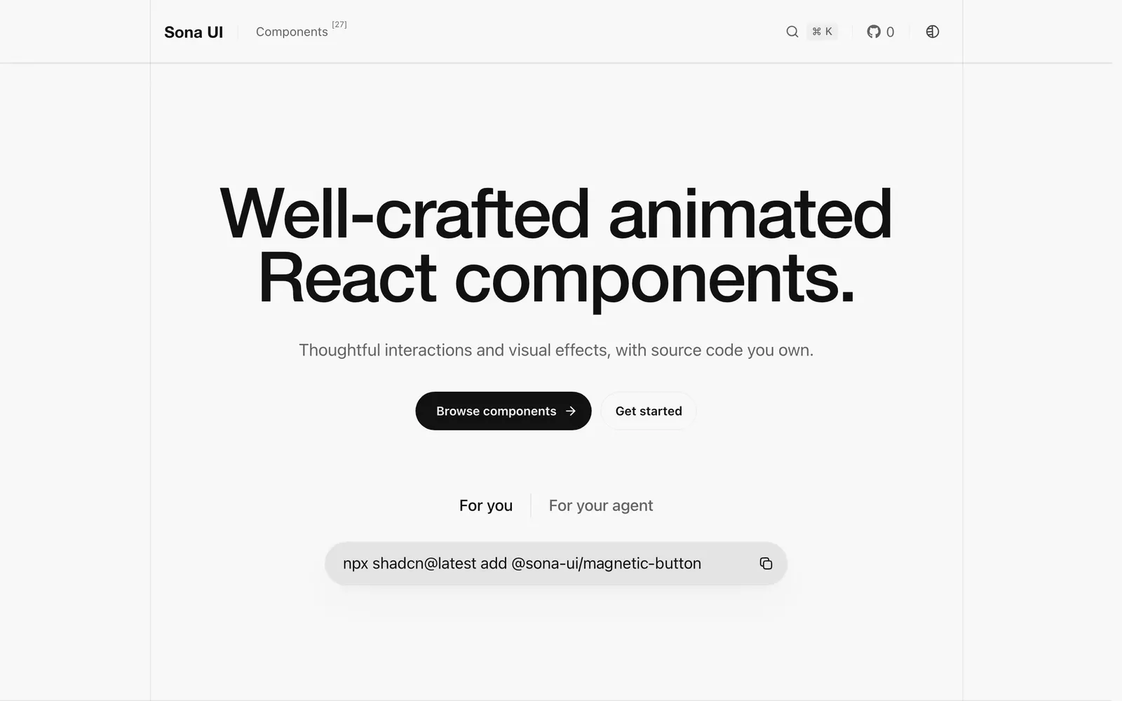
Sona UI — Animated React components designed for developer ownership and fluid aesthetics.

Sona UICollections

Animated React components designed for developer ownership and fluid aesthetics.

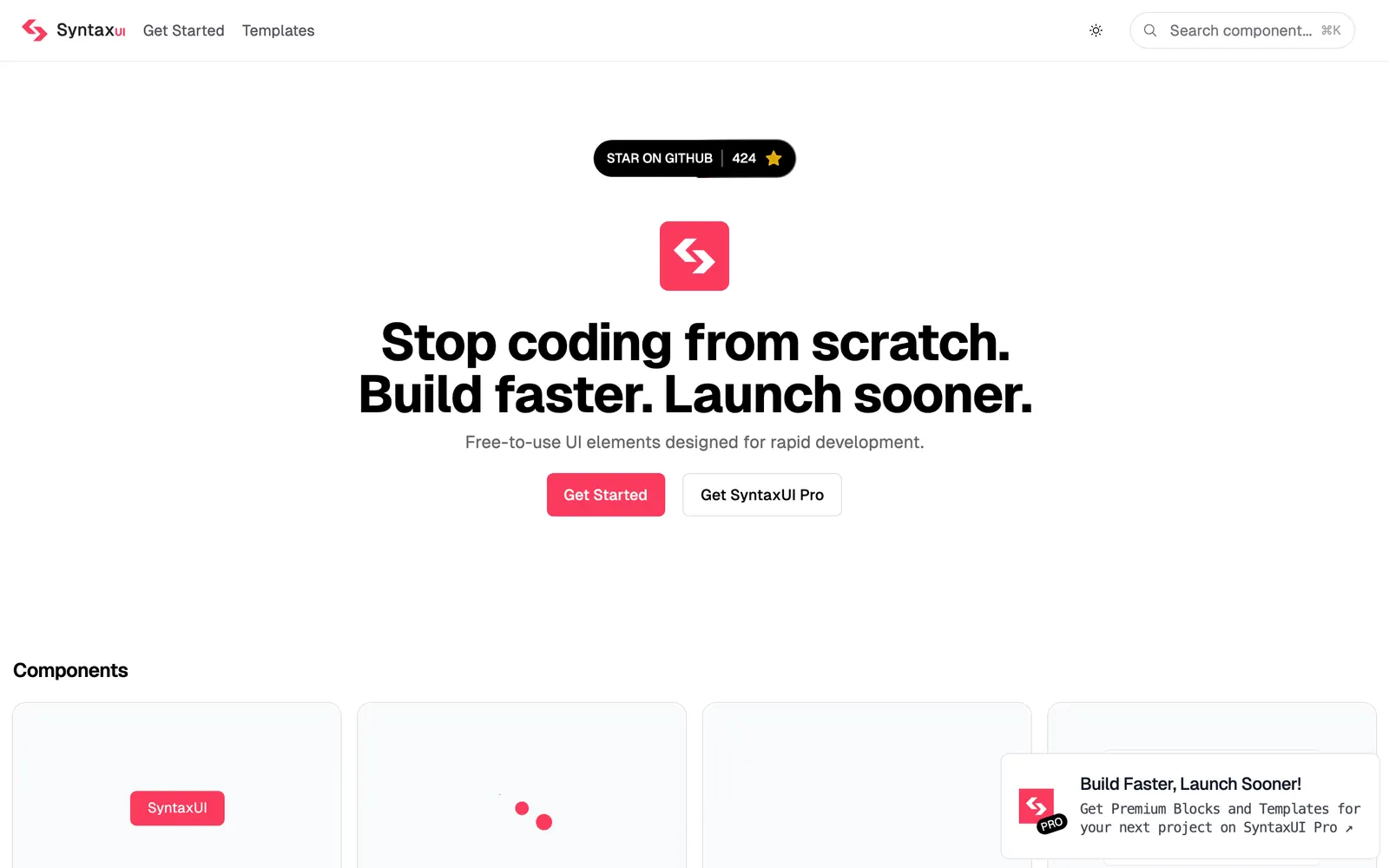
Syntax UI — Animated copy-paste components and creative interactions for landing pages.

Syntax UICollections

Animated copy-paste components and creative interactions for landing pages.

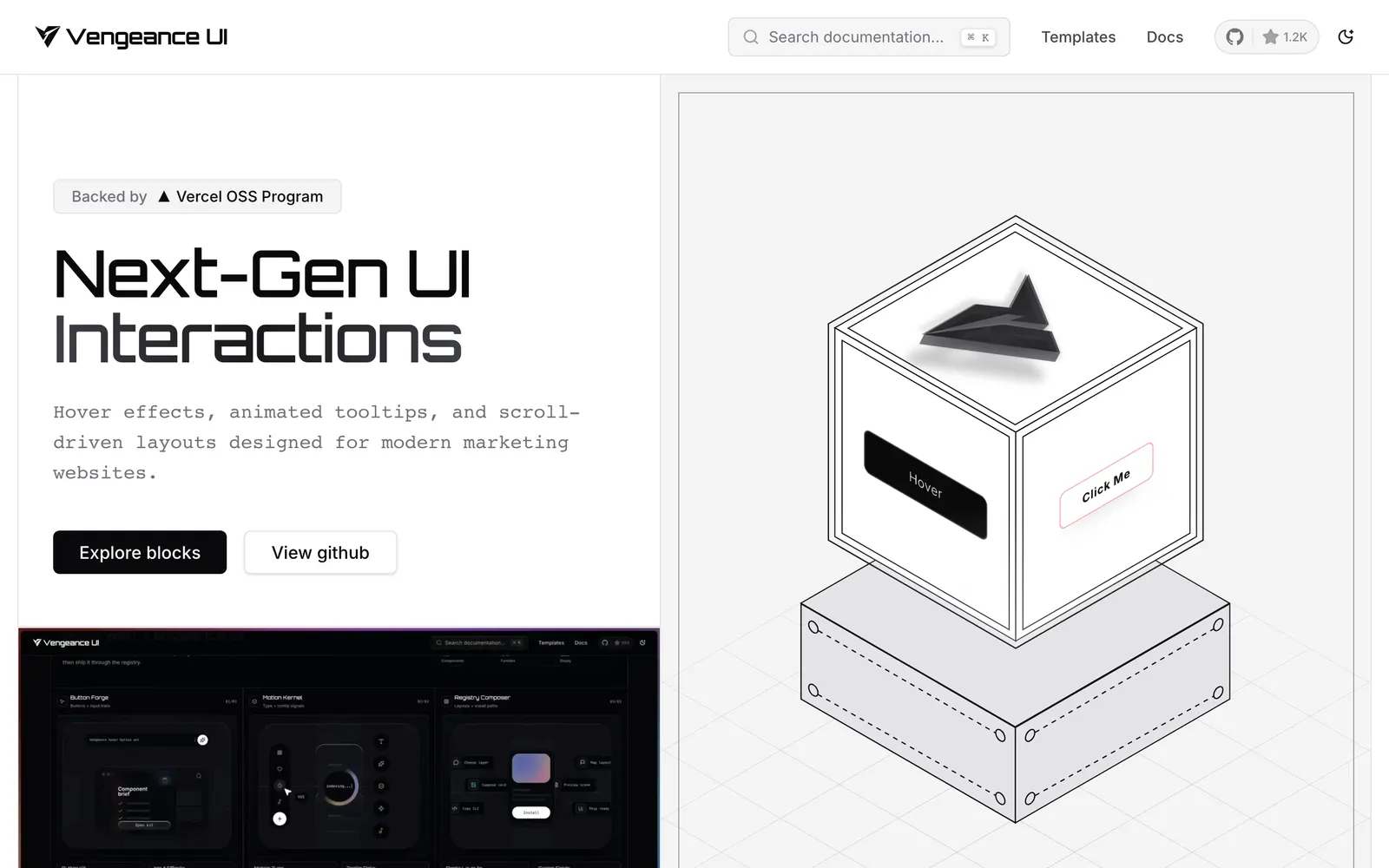
Vengeance UI — Animated React components featuring kinetic scroll interactions and bold motion.

Vengeance UICollections

Animated React components featuring kinetic scroll interactions and bold motion.

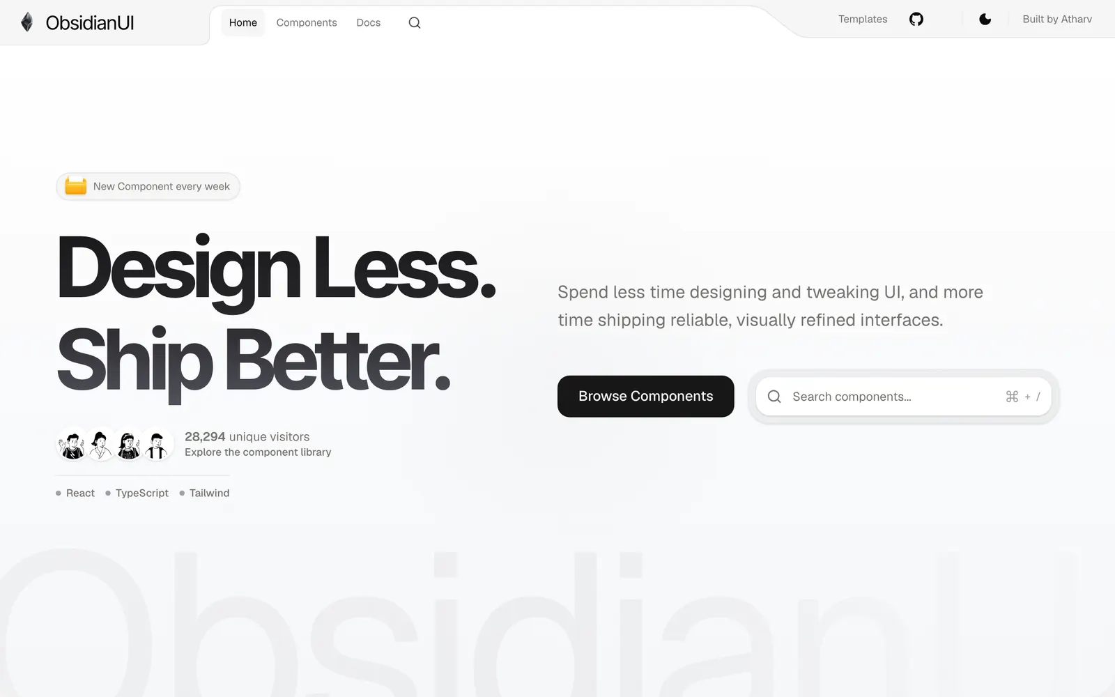
ObsidianUI — A collection of creative animated React components built with Motion and Tailwind CSS.

ObsidianUICollections

A collection of creative animated React components built with Motion and Tailwind CSS.

Rare UI — A curated registry of rare animated React components built with Motion and shadcn.

Rare UICollections

A curated registry of rare animated React components built with Motion and shadcn.

Spectrum UI — Open-source, animation-ready React components and blocks built with Next.js, Tailwind CSS, Motion, TypeScript, and shadcn/ui for SaaS and AI apps.

Spectrum UICollections

Open-source, animation-ready React components and blocks built with Next.js, Tailwind CSS, Motion, TypeScript, and shadcn/ui for SaaS and AI apps.

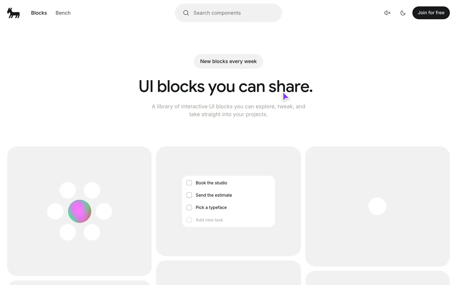
Bencho — A library of live, interactive UI blocks you can explore, tweak, and take straight into your projects — everything is functional, not mocked.

BenchoCollections

A library of live, interactive UI blocks you can explore, tweak, and take straight into your projects — everything is functional, not mocked.

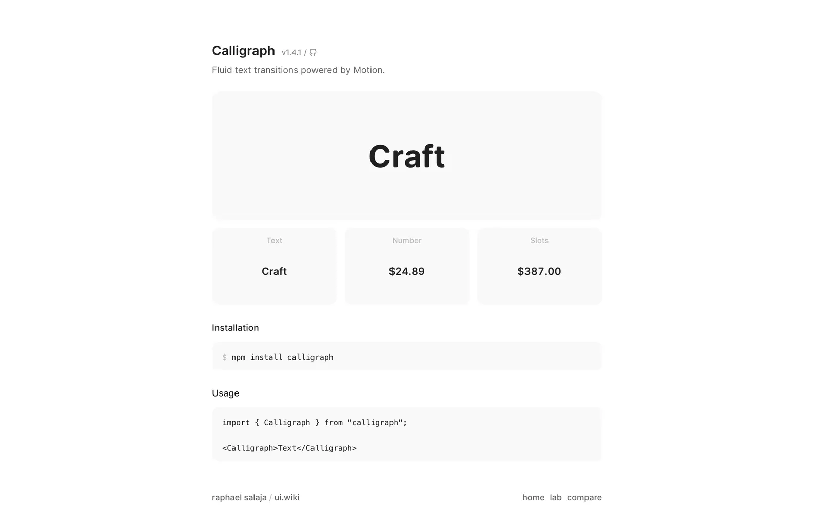
Calligraph — Fluid text transitions powered by Motion. Shared characters slide to their new positions while entering characters fade in and exiting ones fade out.

CalligraphText & Typography

Fluid text transitions powered by Motion. Shared characters slide to their new positions while entering characters fade in and exiting ones fade out.

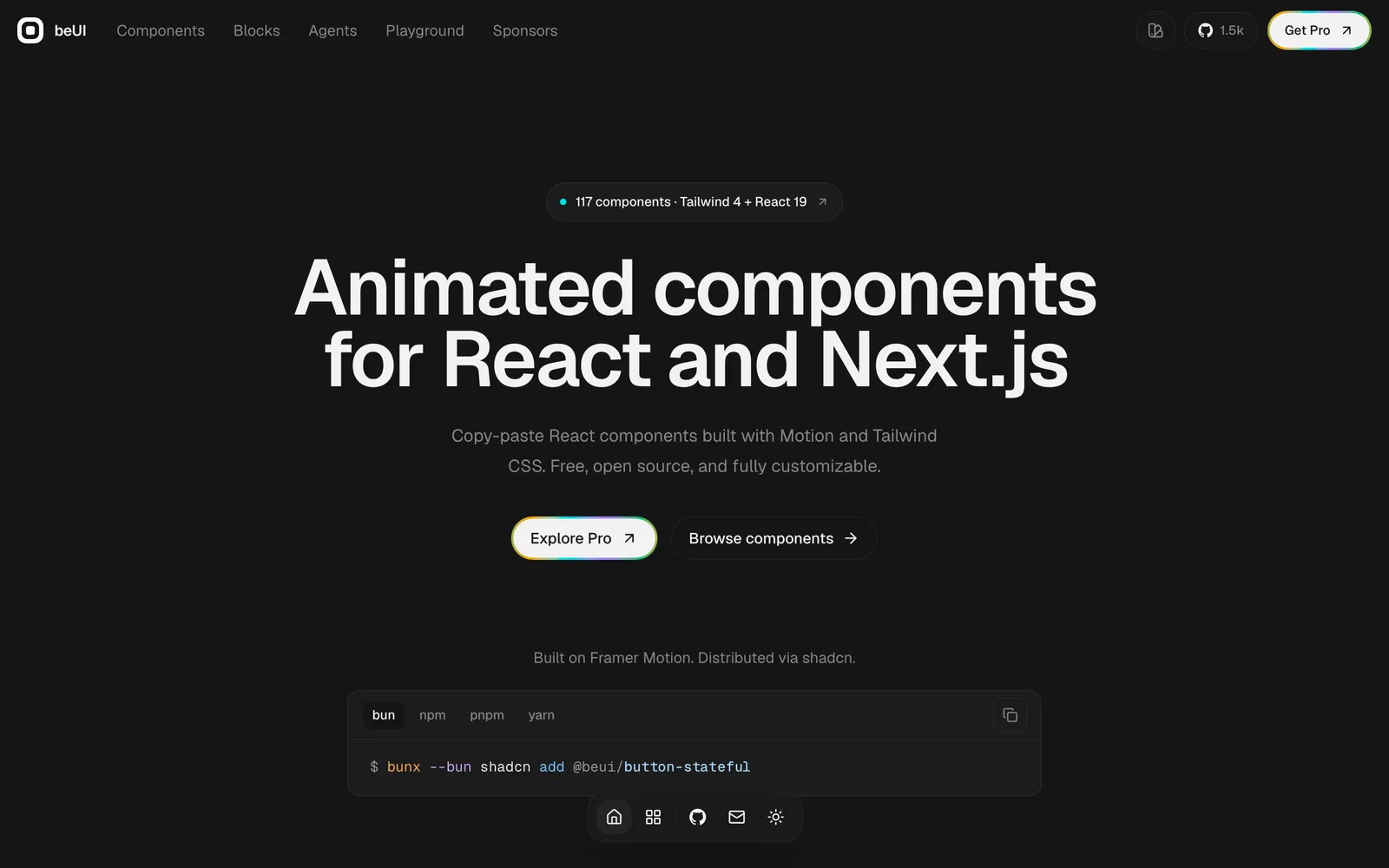
beUI — Free, open-source animated components for React and Next.js, built with Motion and Tailwind CSS. Copy the source or install with the shadcn CLI.

beUICollections

Free, open-source animated components for React and Next.js, built with Motion and Tailwind CSS. Copy the source or install with the shadcn CLI.