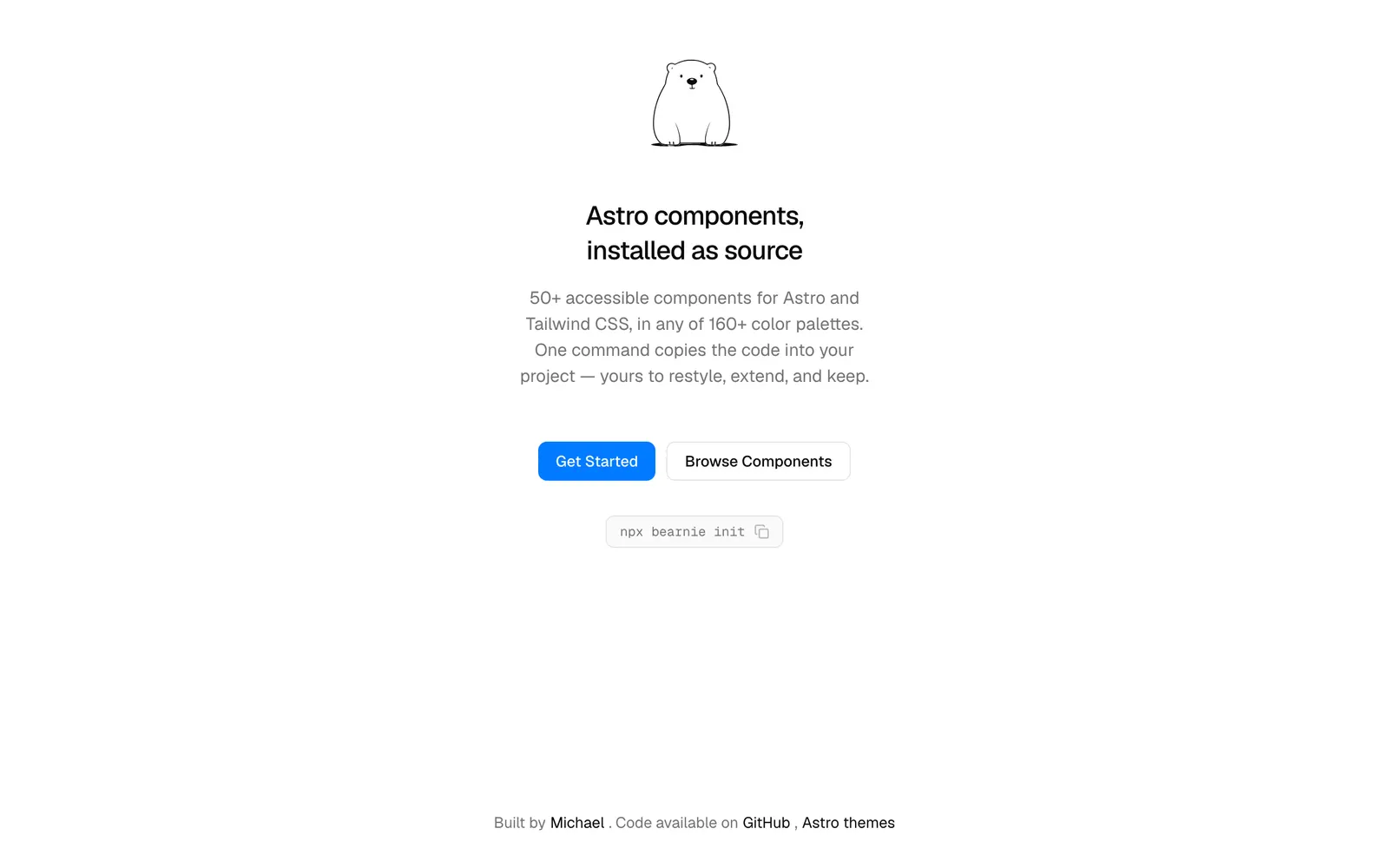
Component collection and landing page blocks designed for Astro and Tailwind.
Included Components
76
bearnieAstro themesMCP ServerAccordionAlertAlert DialogAspect RatioAvatarBadgeBannerBreadcrumbButtonButton GroupCalendarCardCarouselCheckboxCollapsibleComboboxCommandContext MenuDialogDropdown MenuEmptyFieldFile UploadHover CardImage CompareInputInput GroupInput OTPKbdLabelMarqueeMenubarNavigation MenuNumber InputPaginationPopoverProgressRadioRatingScroll AreaSelectSeparatorSheetSidebarSkeletonSliderSpinnerStepperSwitchTableTabsTags InputTextareaTimelineToastToggleToggle GroupTooltipTreeVideoIntroductionGet started with BearnieNextFormLayoutNavigationDisclosureDisplayKobbe.ioLexingtonthemes.comAstro Island HeroStatic Feature GridZero-JS Navigation BarArticle Showcase CardMinimalist CTA
Bearnie is a lightweight UI kit and block collection purpose-built for the Astro web framework and styled with Tailwind CSS. It leverages Astro's zero-JS-by-default architecture to ship lightning-fast content sites, blogs, and SaaS landing pages with zero hydration overhead.