design-engineer

Curated collection of 123 open source UI libraries and design engineering components for design-engineer. Explore component lists, live previews and code repos.

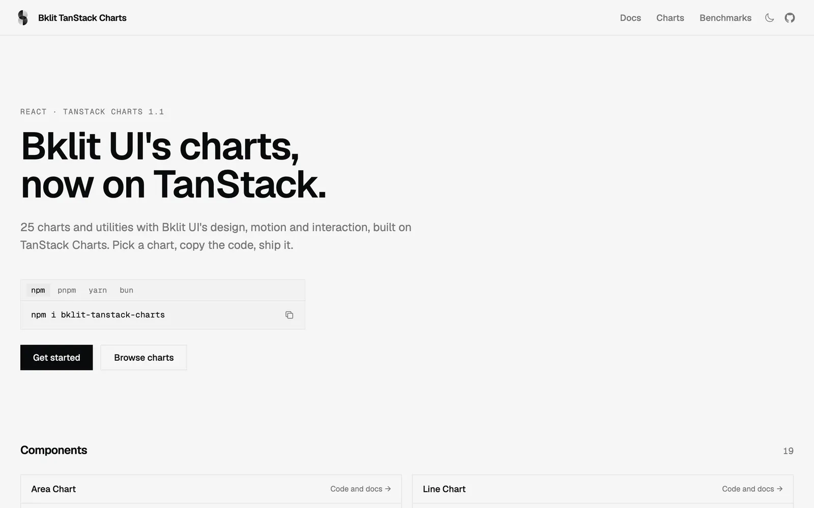
Bklit TanStack Charts — Bklit UI chart components rebuilt on TanStack Charts with identical API and motion.

Bklit TanStack ChartsData Viz

Bklit UI chart components rebuilt on TanStack Charts with identical API and motion.

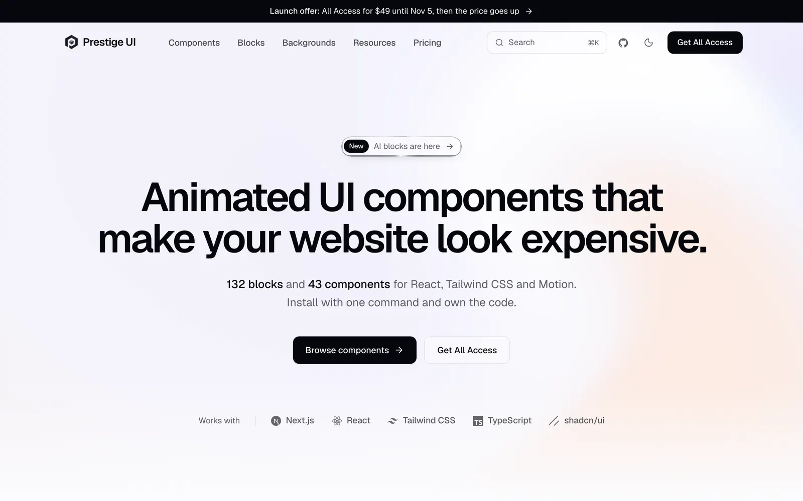
Prestige UI — Animated React components and full-page blocks built with Tailwind CSS and Motion.

Prestige UICollections

Animated React components and full-page blocks built with Tailwind CSS and Motion.

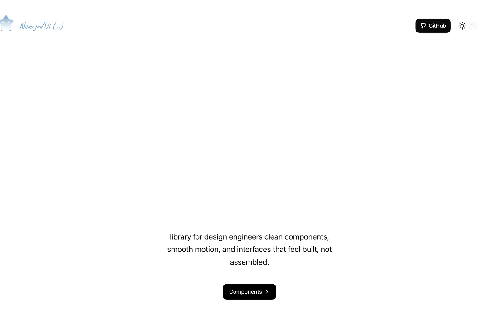
Nexvyn UI — Animated React components with spring physics built on shadcn/ui and Motion.

Nexvyn UICollections

Animated React components with spring physics built on shadcn/ui and Motion.

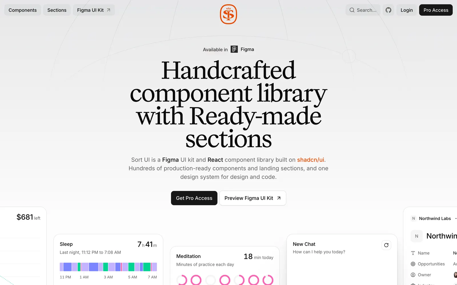
SortUI — Production-grade design system on shadcn/ui with Figma sync and AI components.

SortUICollections

Production-grade design system on shadcn/ui with Figma sync and AI components.

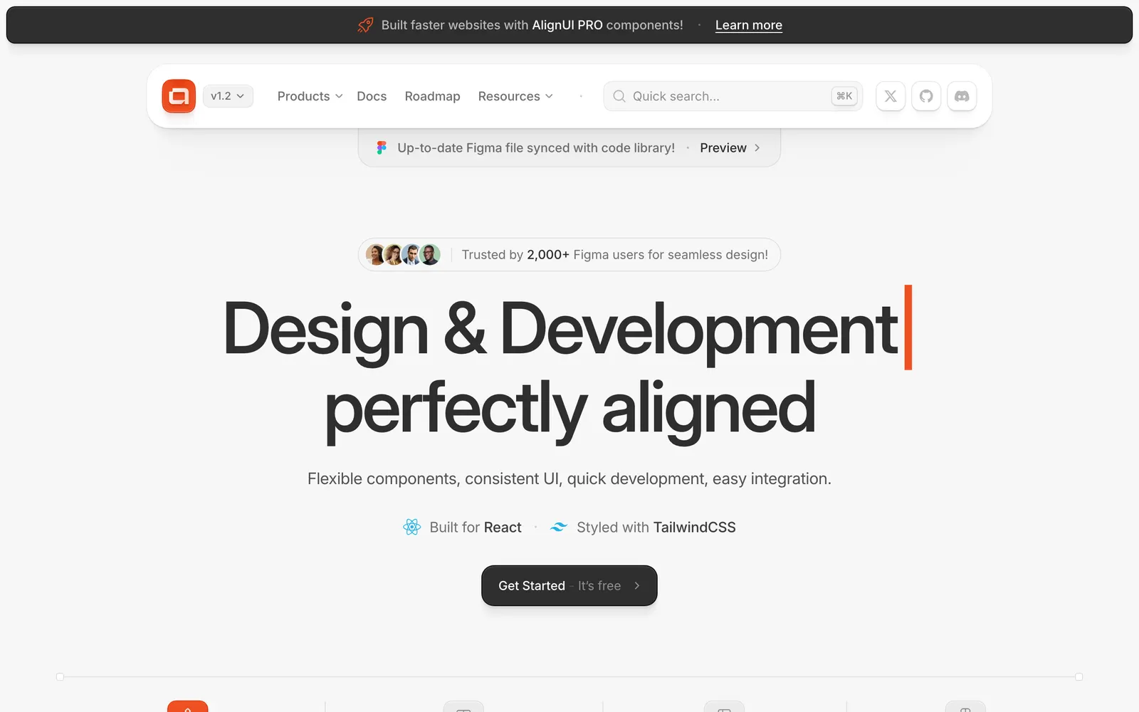
AlignUI — Production-ready Tailwind and Radix UI components with copy-paste CLI.

AlignUICollections

Production-ready Tailwind and Radix UI components with copy-paste CLI.

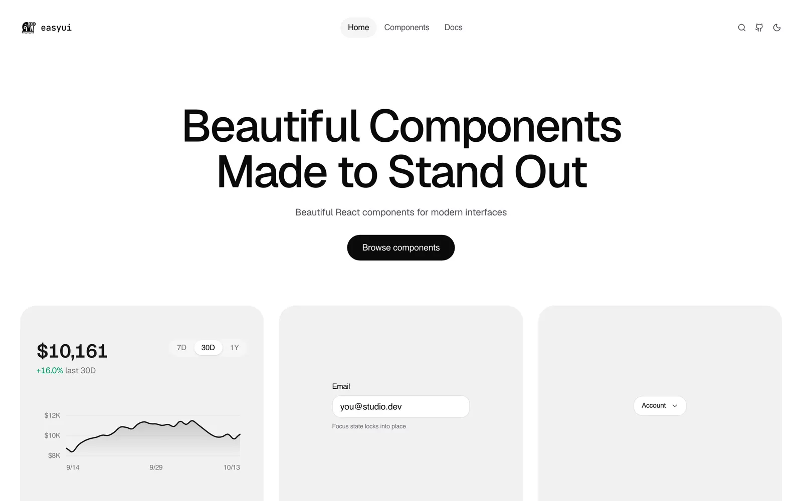
EasyUI — Over 130 production-ready animated React components with shadcn registry support.

EasyUICollections

Over 130 production-ready animated React components with shadcn registry support.

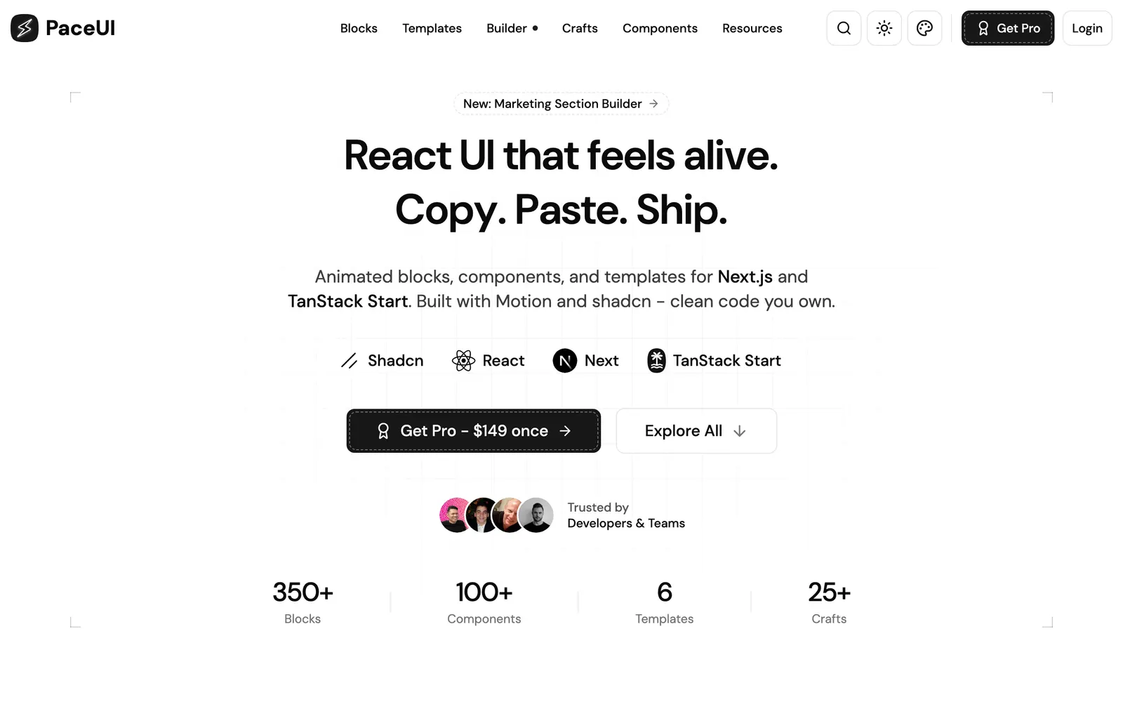
PaceUI — Animated React blocks and crafts for Next.js and TanStack Start with Motion.

PaceUICollections

Animated React blocks and crafts for Next.js and TanStack Start with Motion.

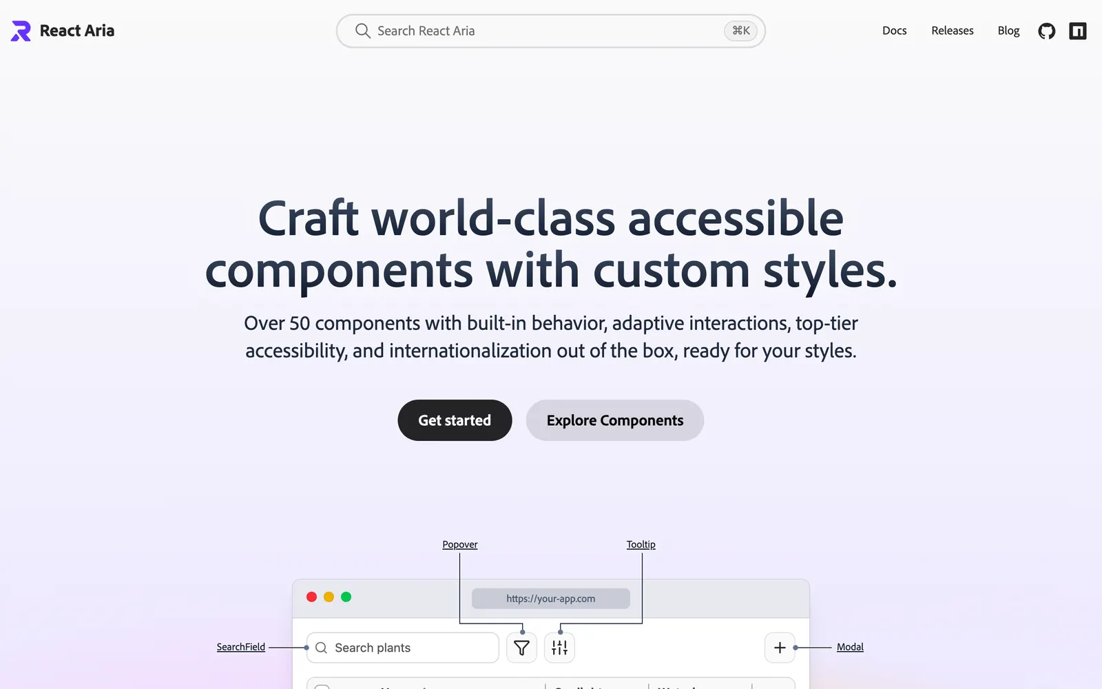
React Aria — Unstyled, accessible React component primitives with adaptive interactions by Adobe.

React AriaCollections

Unstyled, accessible React component primitives with adaptive interactions by Adobe.

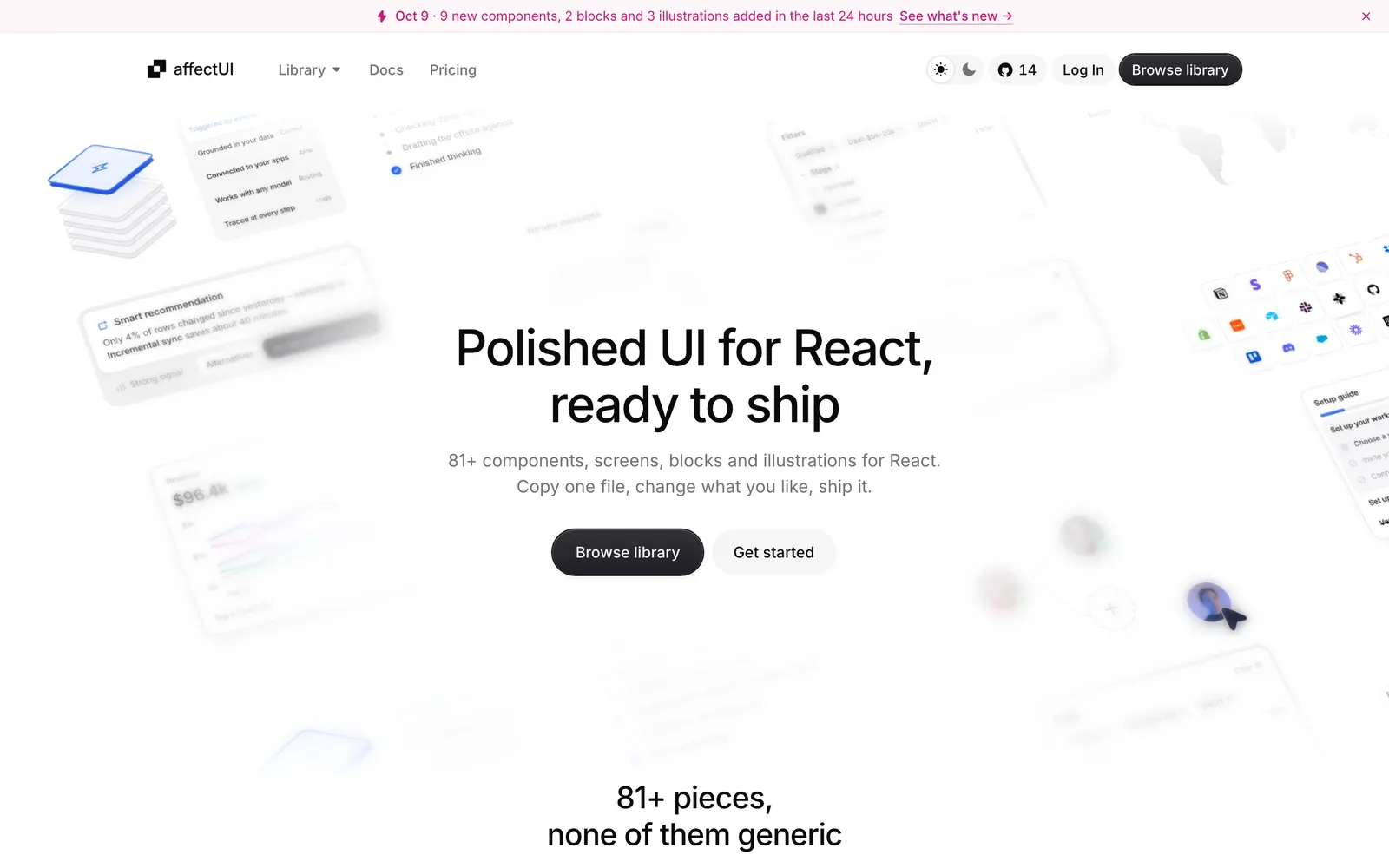
affectUI — Handcrafted React UI components and calm motion for AI apps with zero CSS dependencies.

affectUICollections

Handcrafted React UI components and calm motion for AI apps with zero CSS dependencies.

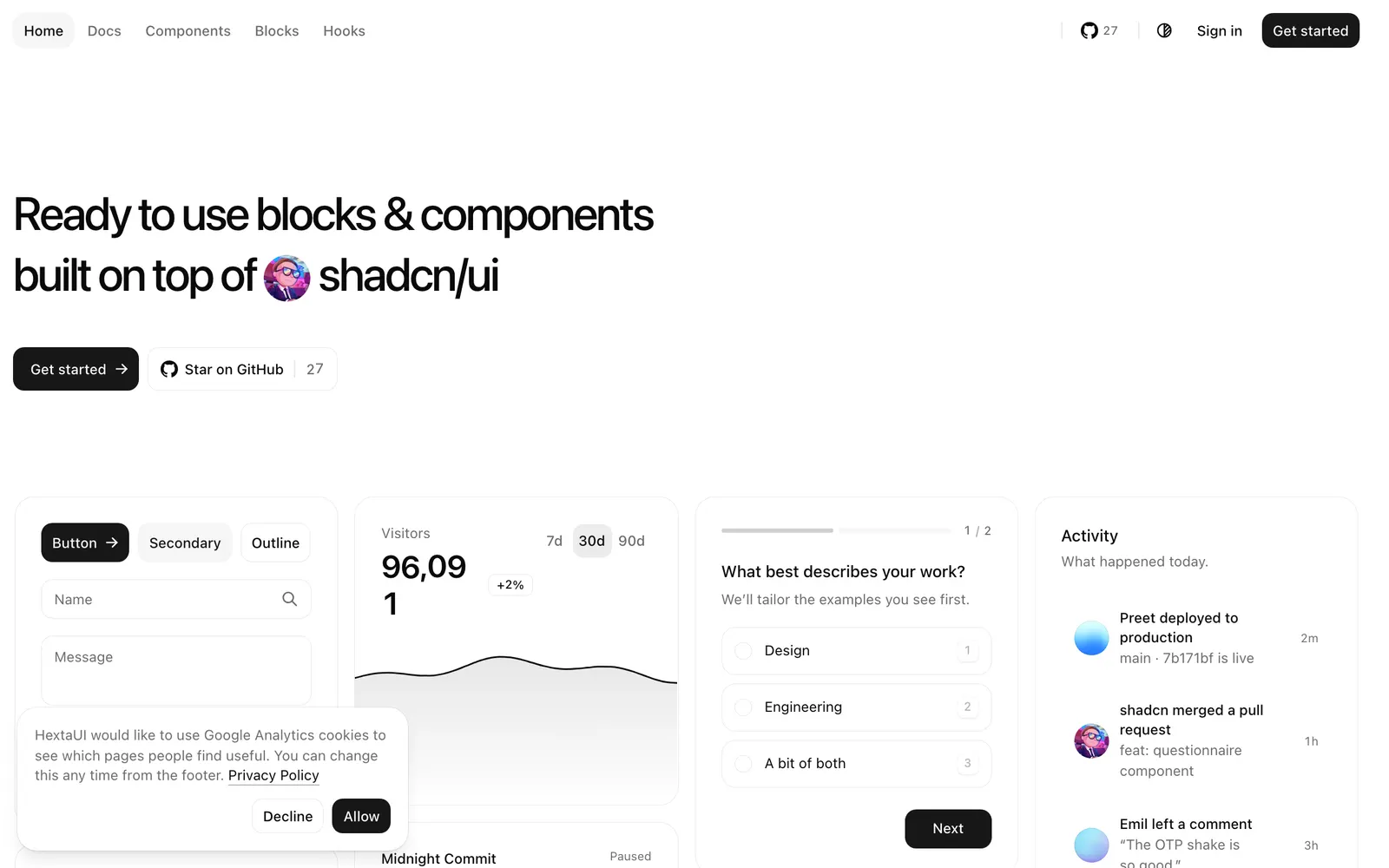
HextaUI — React components and blocks on shadcn/ui and Base UI with built-in motion and states.

HextaUICollections

React components and blocks on shadcn/ui and Base UI with built-in motion and states.

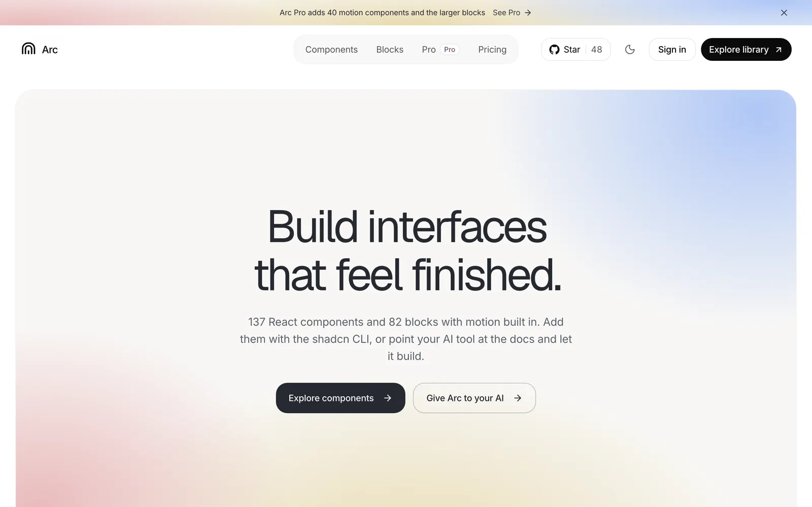
Arc UI — Open-source React components and blocks with calm, polished built-in motion.

Arc UICollections

Open-source React components and blocks with calm, polished built-in motion.

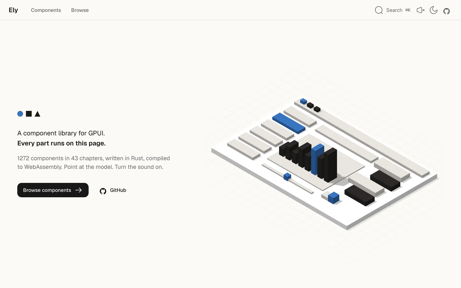
Ely — A warm, minimal GPUI component library in Rust, compiled live to WebAssembly.

ElyCollections

A warm, minimal GPUI component library in Rust, compiled live to WebAssembly.

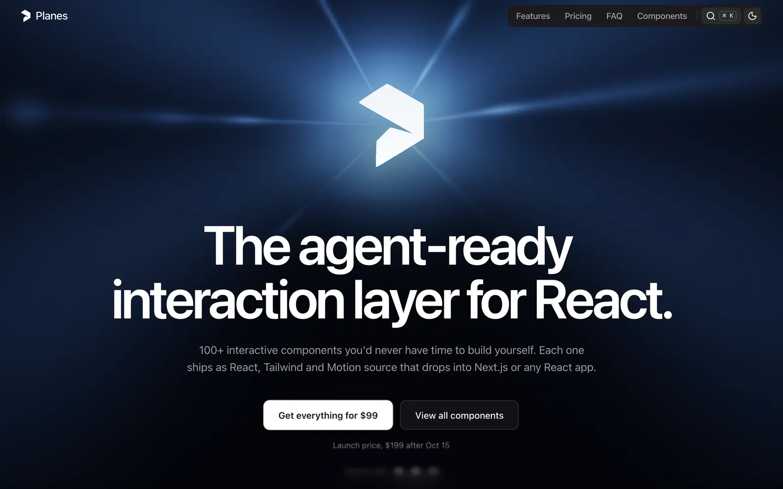
Planes — A high-craft React interaction and motion layer tailored for modern design workflows.

PlanesCollections

A high-craft React interaction and motion layer tailored for modern design workflows.

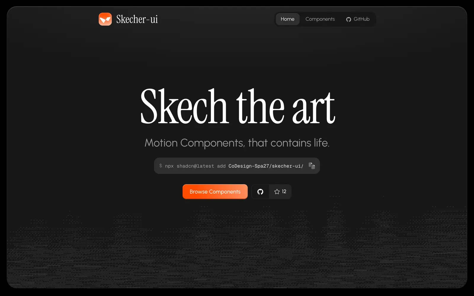
Skecher UI — Polished React motion components and micro-interactions built for the shadcn CLI.

Skecher UICollections

Polished React motion components and micro-interactions built for the shadcn CLI.

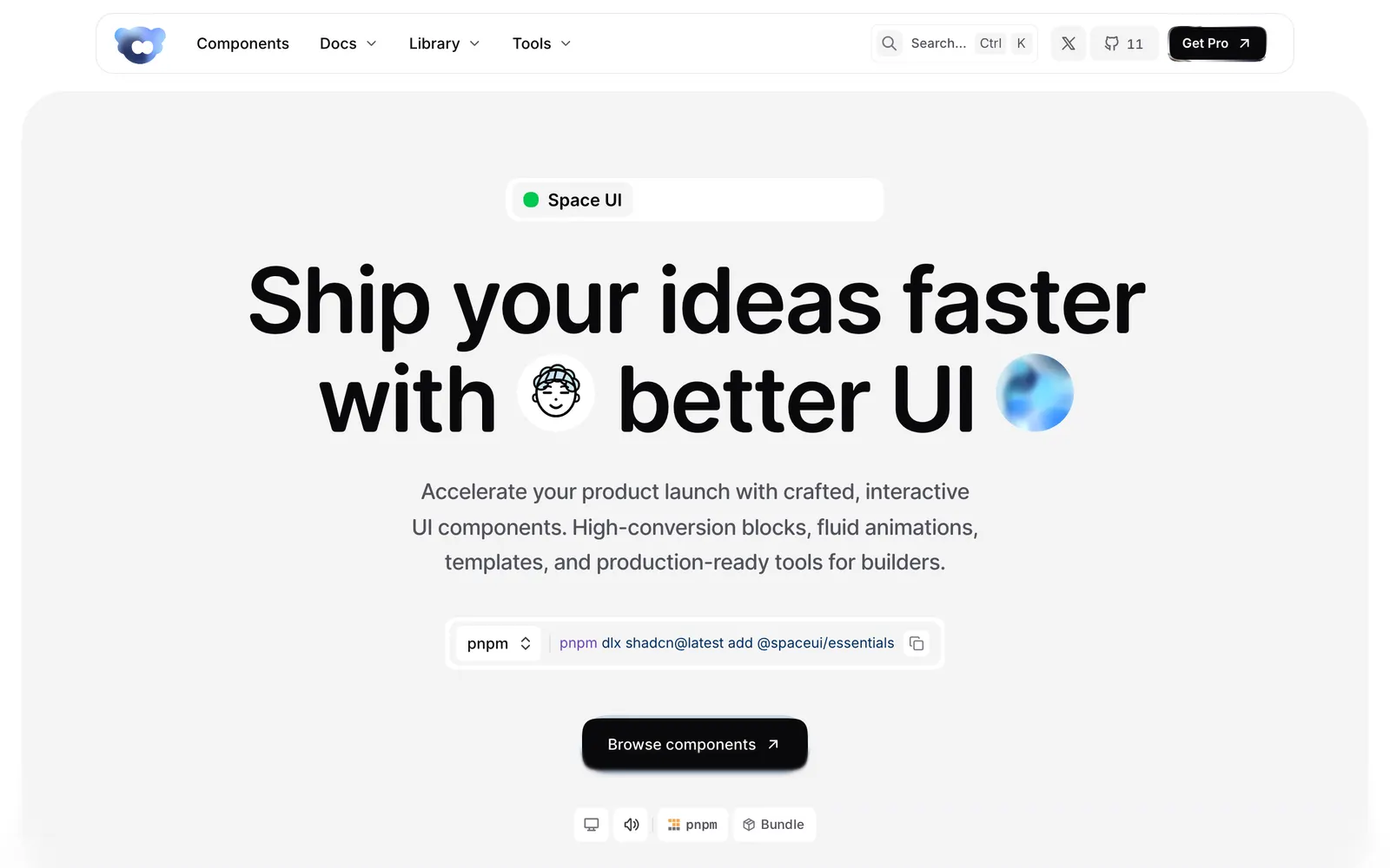
Space UI — Interactive React components, WebGL shaders, and high-conversion landing blocks.

Space UICollections

Interactive React components, WebGL shaders, and high-conversion landing blocks.

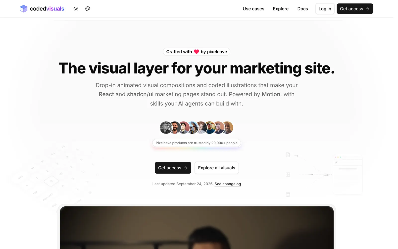
CodedVisuals — Copy-paste animated illustrations and landing visuals for React and shadcn/ui.

CodedVisualsCollections

Copy-paste animated illustrations and landing visuals for React and shadcn/ui.

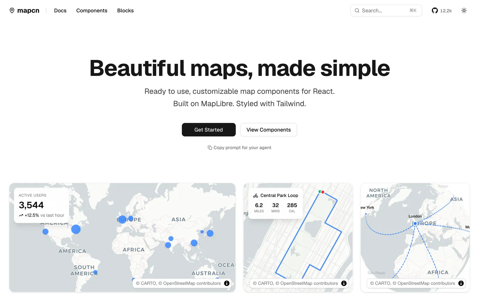
mapcn — Composable React map components built on MapLibre GL and styled with Tailwind CSS.

mapcnData Viz

Composable React map components built on MapLibre GL and styled with Tailwind CSS.

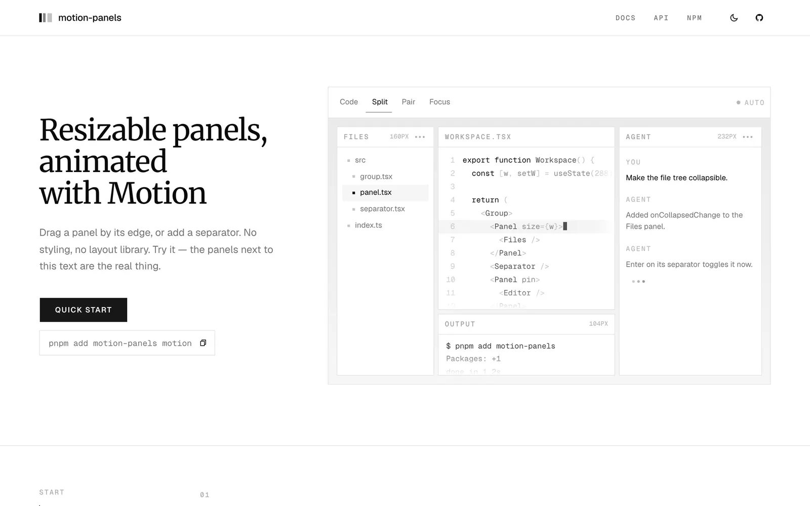
motion-panels — Resizable split panels animated with Motion, featuring smooth folding and snapping.

motion-panelsInput Controls

Resizable split panels animated with Motion, featuring smooth folding and snapping.

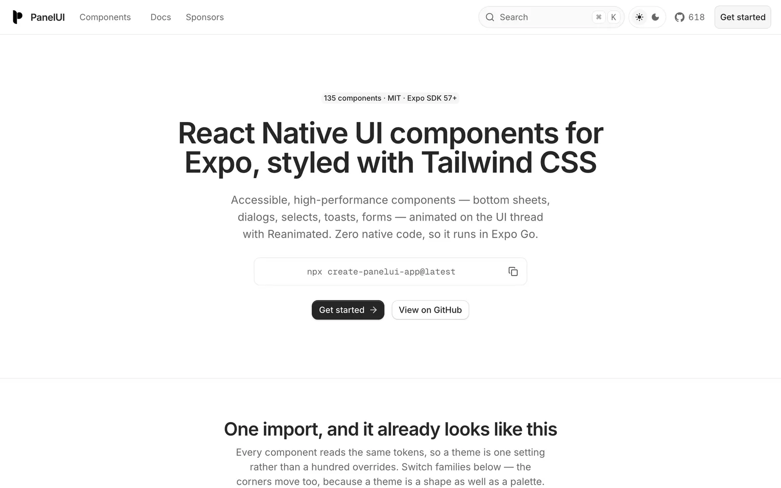
PanelUI — Accessible React Native and Expo component library styled with Tailwind CSS.

PanelUICollections

Accessible React Native and Expo component library styled with Tailwind CSS.

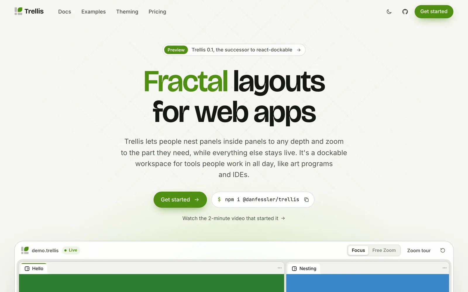
Trellis — Fractal, dockable workspace layouts with deep panel nesting and infinite zoom.

TrellisInput Controls

Fractal, dockable workspace layouts with deep panel nesting and infinite zoom.

AICSS — Crafted UI components for AI agents: thinking states, tool calls, and streaming text.

AICSSCollections

Crafted UI components for AI agents: thinking states, tool calls, and streaming text.

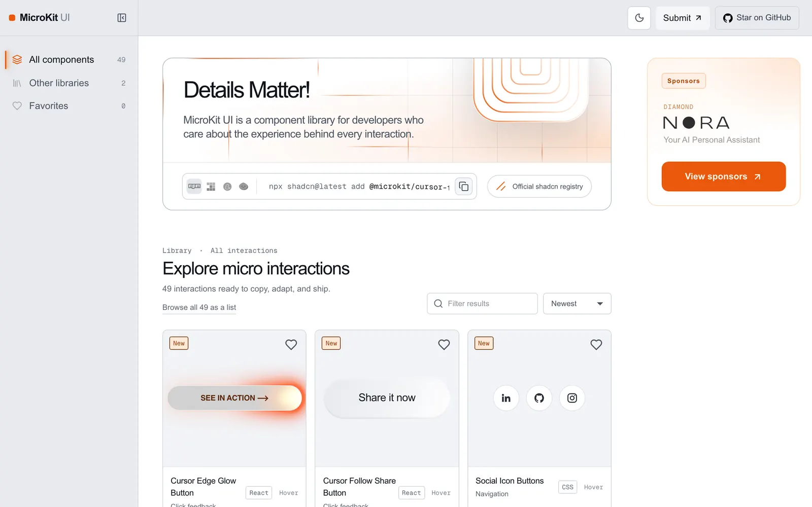
MicroKit UI — Copy-paste microinteractions and subtle UI animations for React and Tailwind.

MicroKit UICollections

Copy-paste microinteractions and subtle UI animations for React and Tailwind.

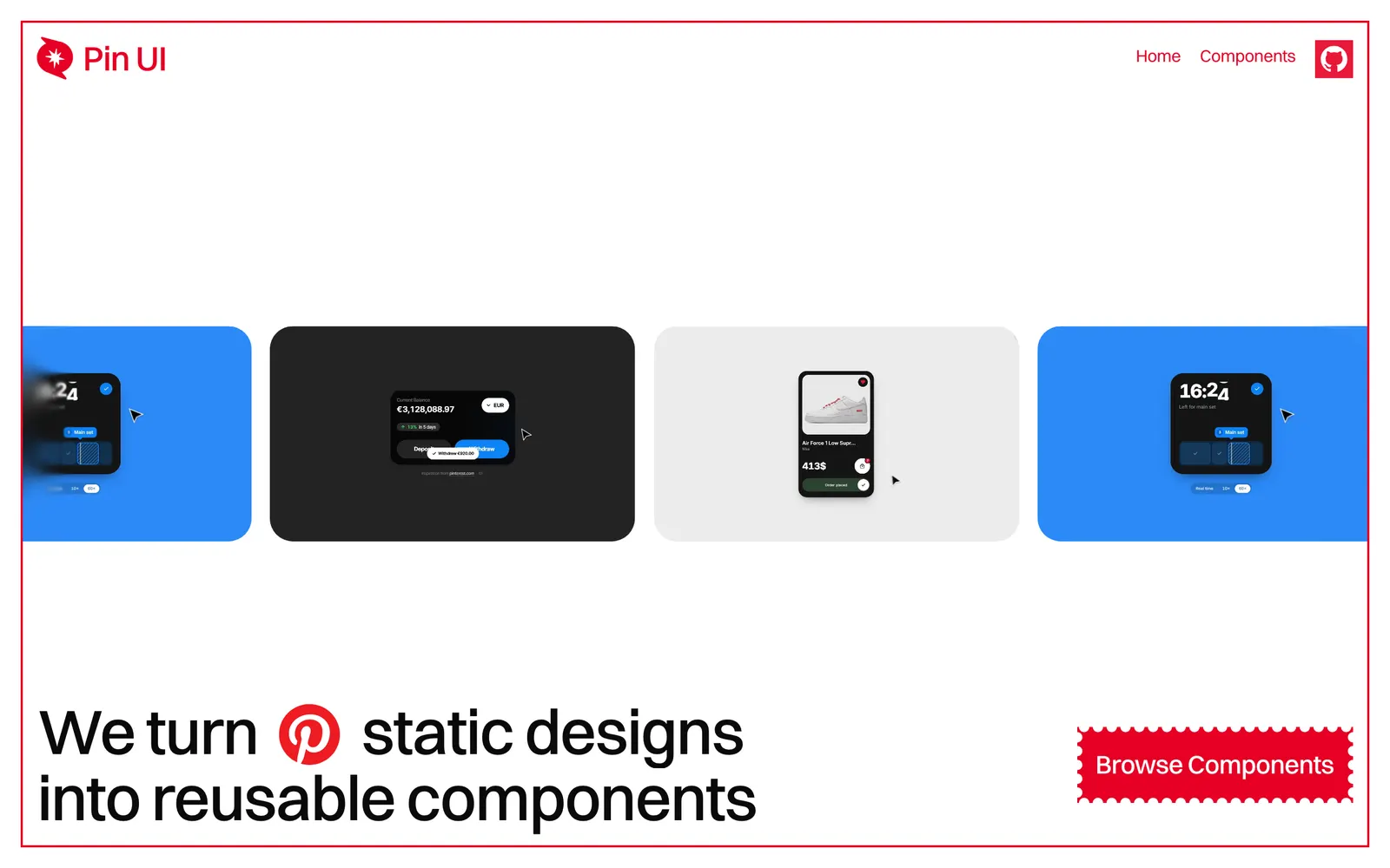
Pin UI — Turns Pinterest visual ideas into production-ready, copy-paste React components.

Pin UICollections

Turns Pinterest visual ideas into production-ready, copy-paste React components.

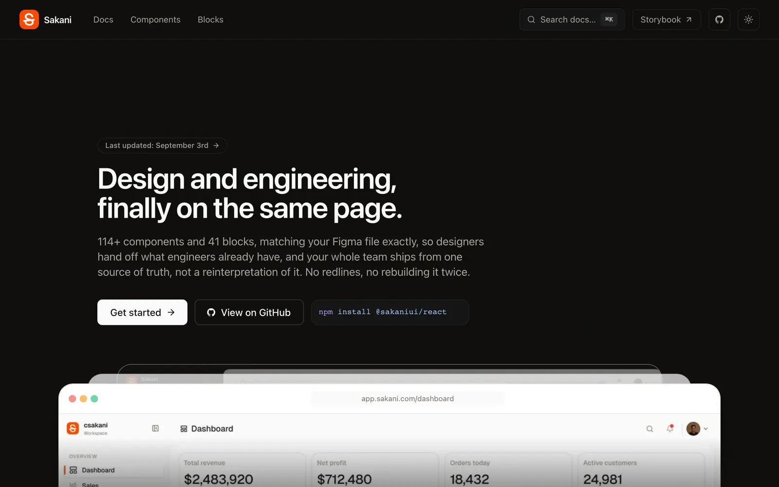
Sakani — Open-source React design system with 114+ accessible components matching Figma 1:1.

SakaniCollections

Open-source React design system with 114+ accessible components matching Figma 1:1.

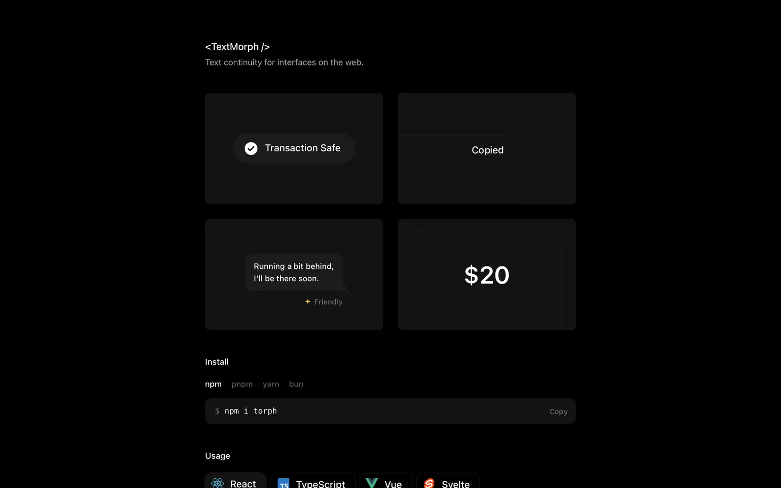
Torph — Dependency-free animated text and numeric morphing component across web frameworks.

TorphText & Typography

Dependency-free animated text and numeric morphing component across web frameworks.

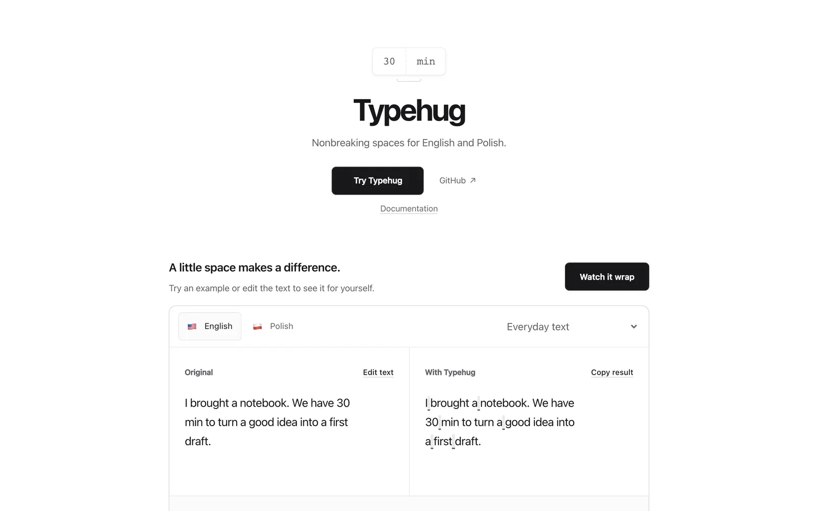
Typehug — Keeps words, numbers, and units together with nonbreaking spaces for web typography.

TypehugText & Typography

Keeps words, numbers, and units together with nonbreaking spaces for web typography.

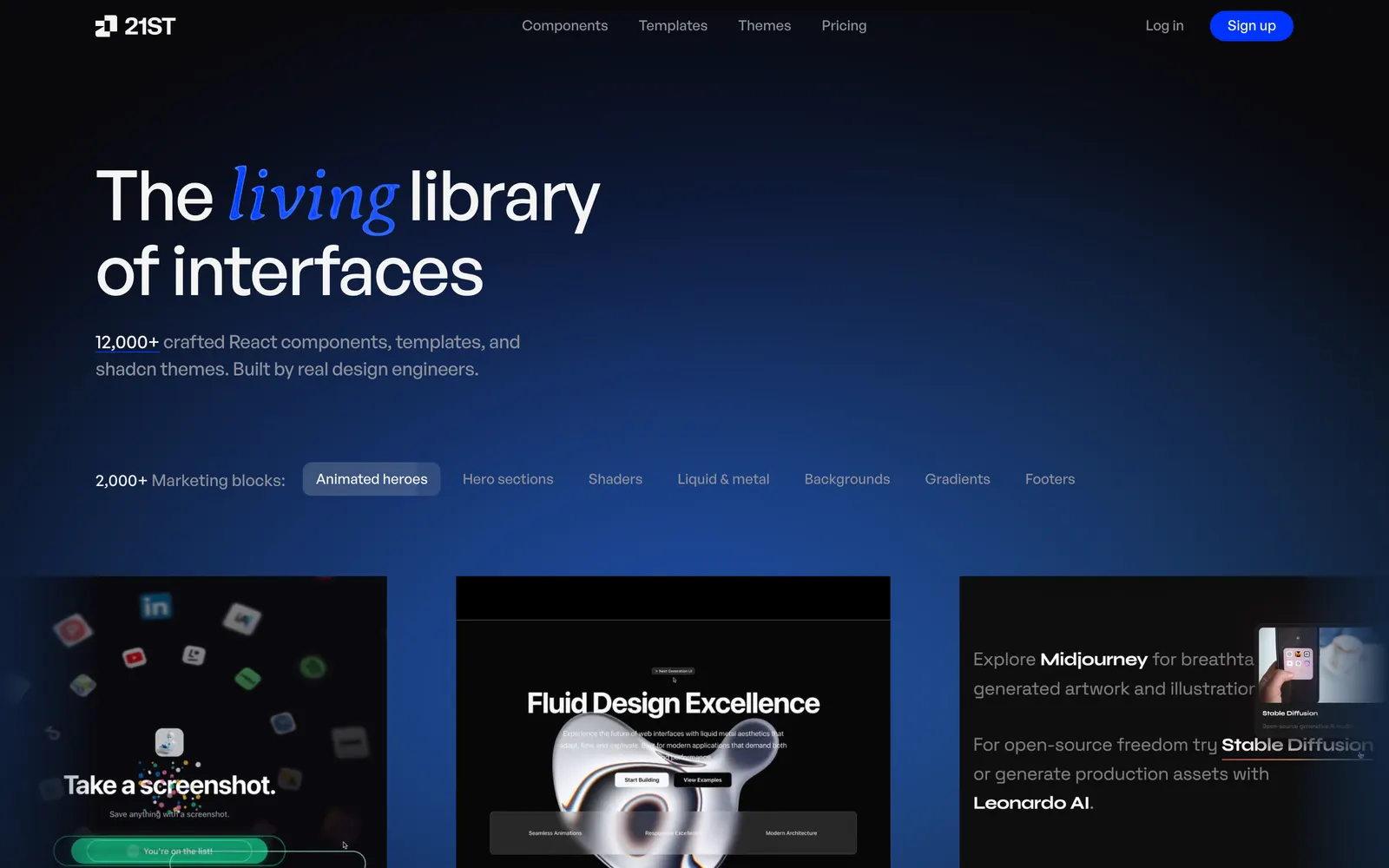
21st.dev — Community registry for shadcn components, motion primitives, and full blocks.

21st.devCollections

Community registry for shadcn components, motion primitives, and full blocks.

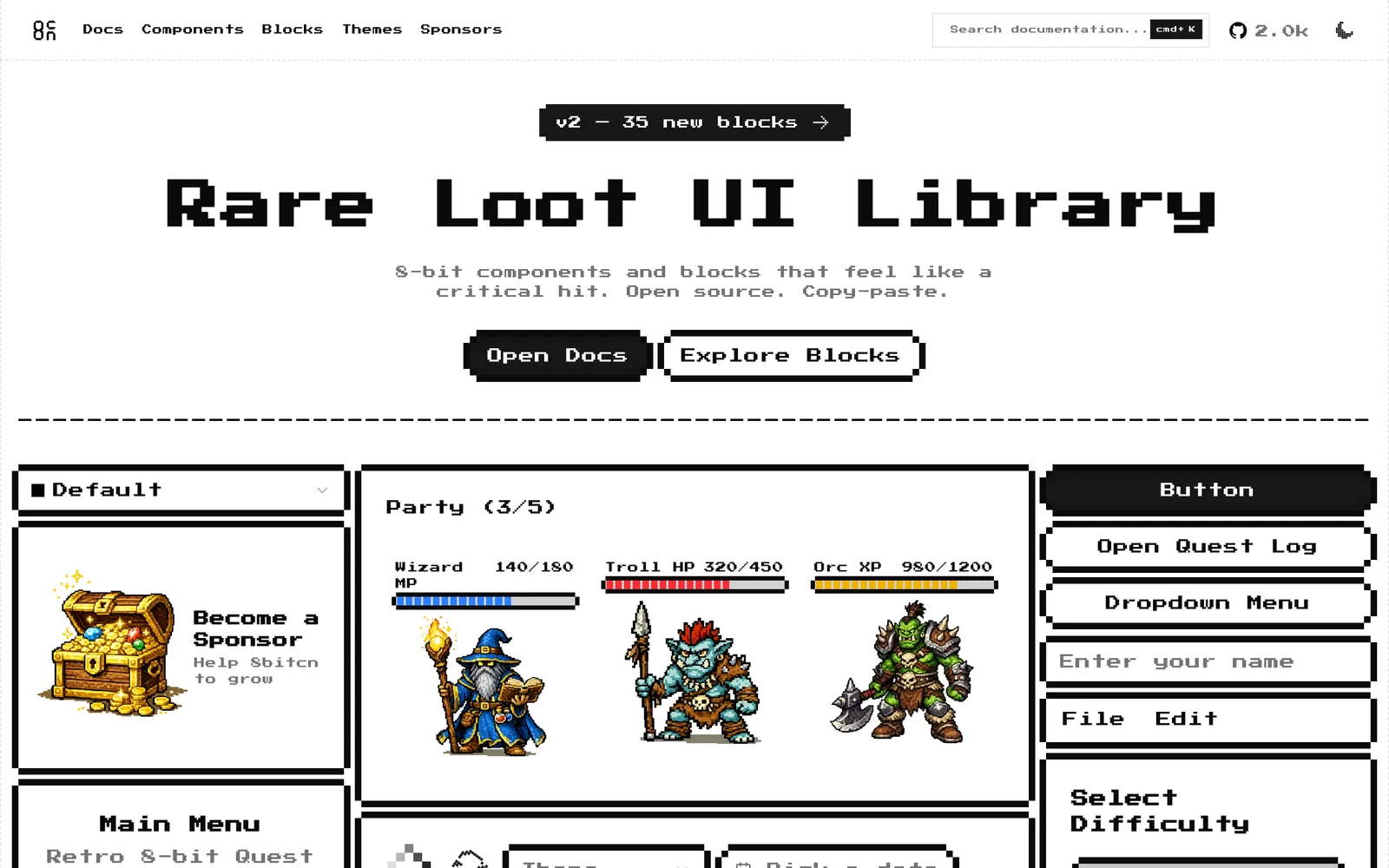
8bitcn — Retro 8-bit pixel art style UI components built on top of shadcn/ui.

8bitcnCollections

Retro 8-bit pixel art style UI components built on top of shadcn/ui.

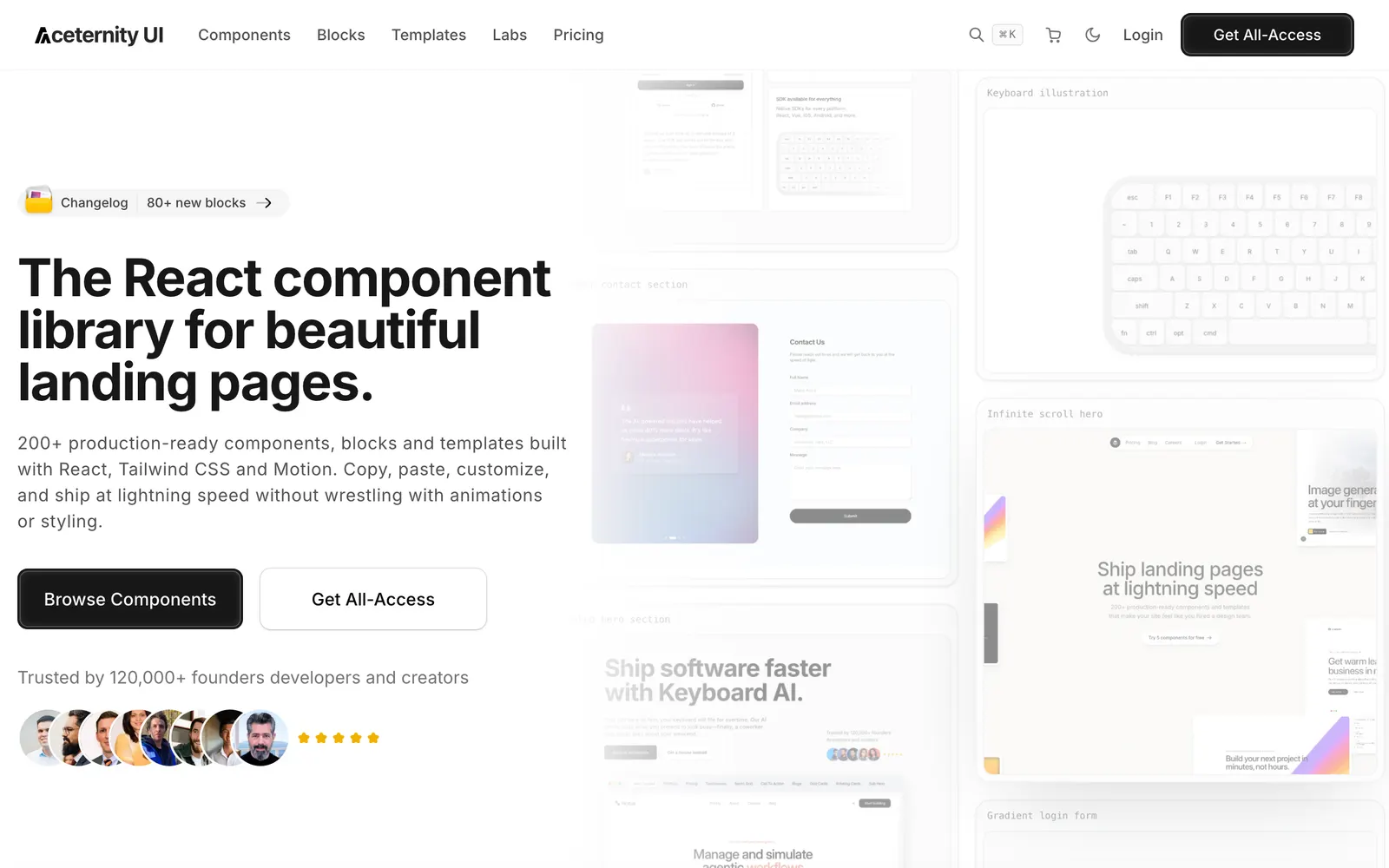
Aceternity UI — Trending copy-paste animated components and hero sections for modern web.

Aceternity UICollections

Trending copy-paste animated components and hero sections for modern web.

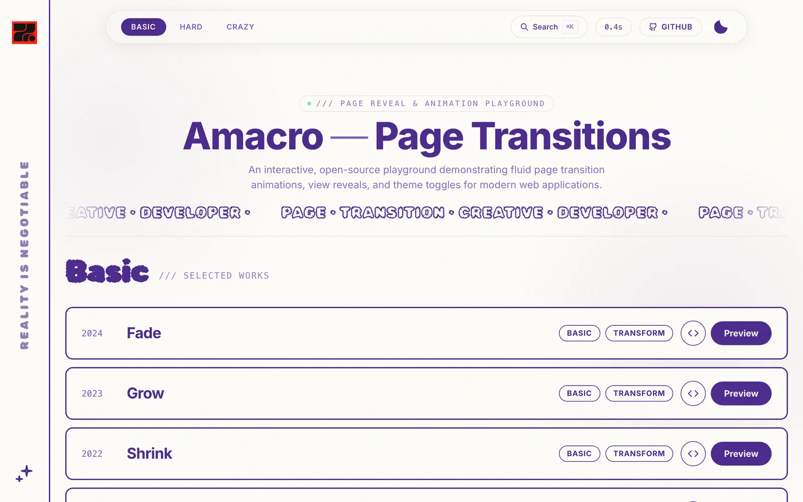
Amacro — Drop-in page reveal animations and fluid scene curtain transitions for React.

AmacroCollections

Drop-in page reveal animations and fluid scene curtain transitions for React.

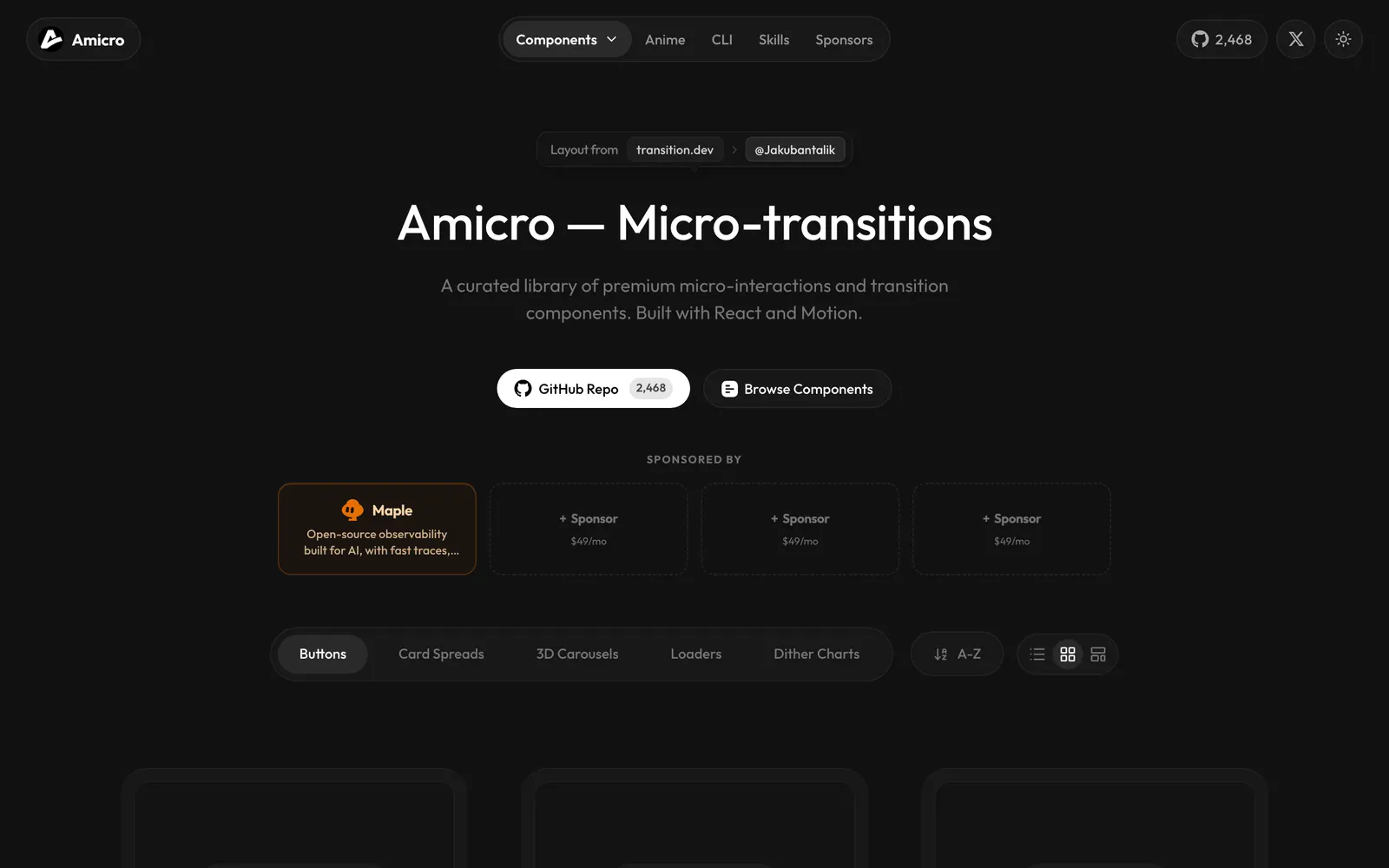
Amicro — Lightweight drop-in React micro-animation primitives for clickable elements.

AmicroCollections

Lightweight drop-in React micro-animation primitives for clickable elements.

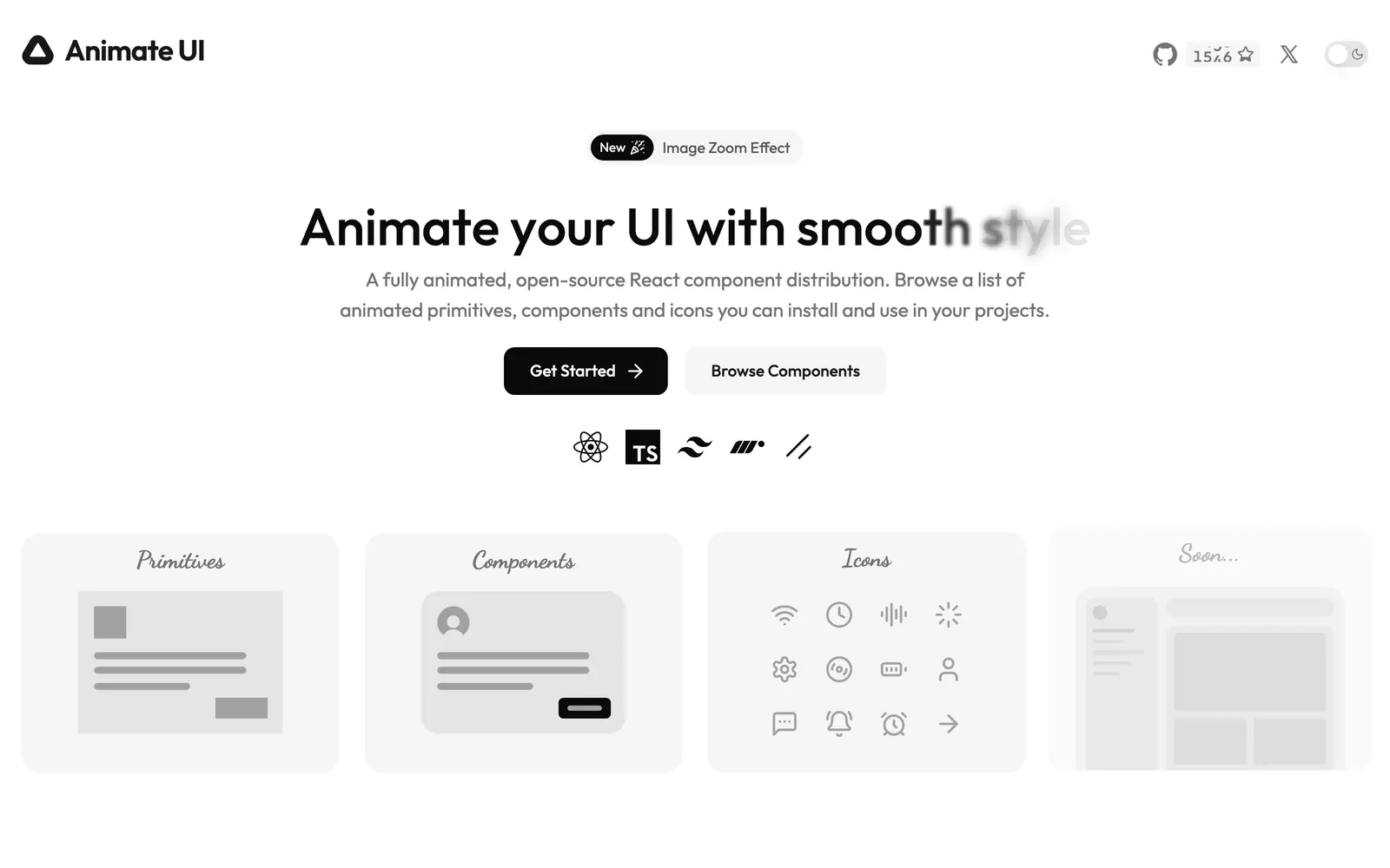
Animate UI — Accessible shadcn UI components beautifully animated with Motion and CSS.

Animate UICollections

Accessible shadcn UI components beautifully animated with Motion and CSS.

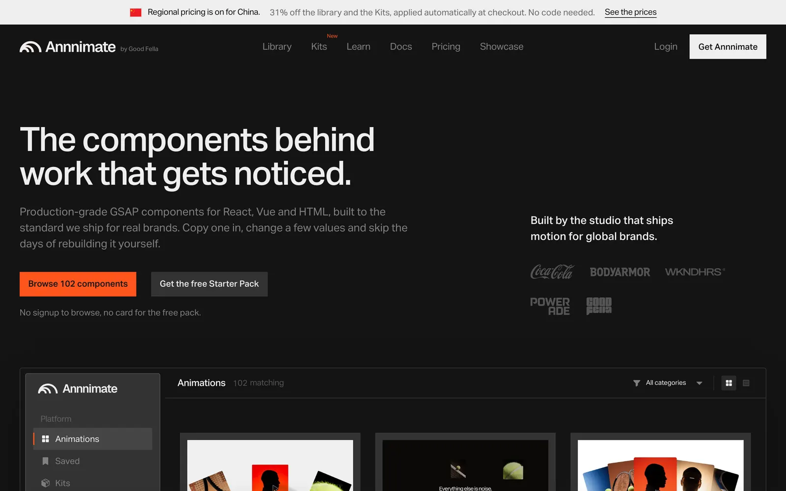
Annnimate — Production-ready GSAP motion components and fluid scroll animations for web.

AnnnimateCollections

Production-ready GSAP motion components and fluid scroll animations for web.

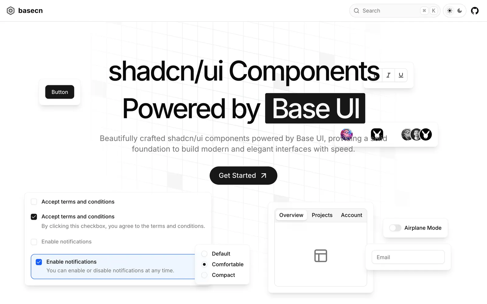
Base CN — Base UI component primitives adapted for the shadcn copy-paste CLI format.

Base CNCollections

Base UI component primitives adapted for the shadcn copy-paste CLI format.

Base UI — Unstyled, accessible UI component primitives for React by MUI and Radix.

Base UICollections

Unstyled, accessible UI component primitives for React by MUI and Radix.

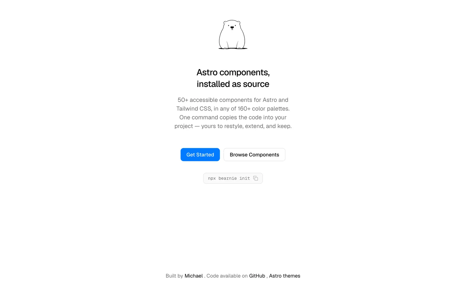
Bearnie — Component collection and landing page blocks designed for Astro and Tailwind.

BearnieCollections

Component collection and landing page blocks designed for Astro and Tailwind.

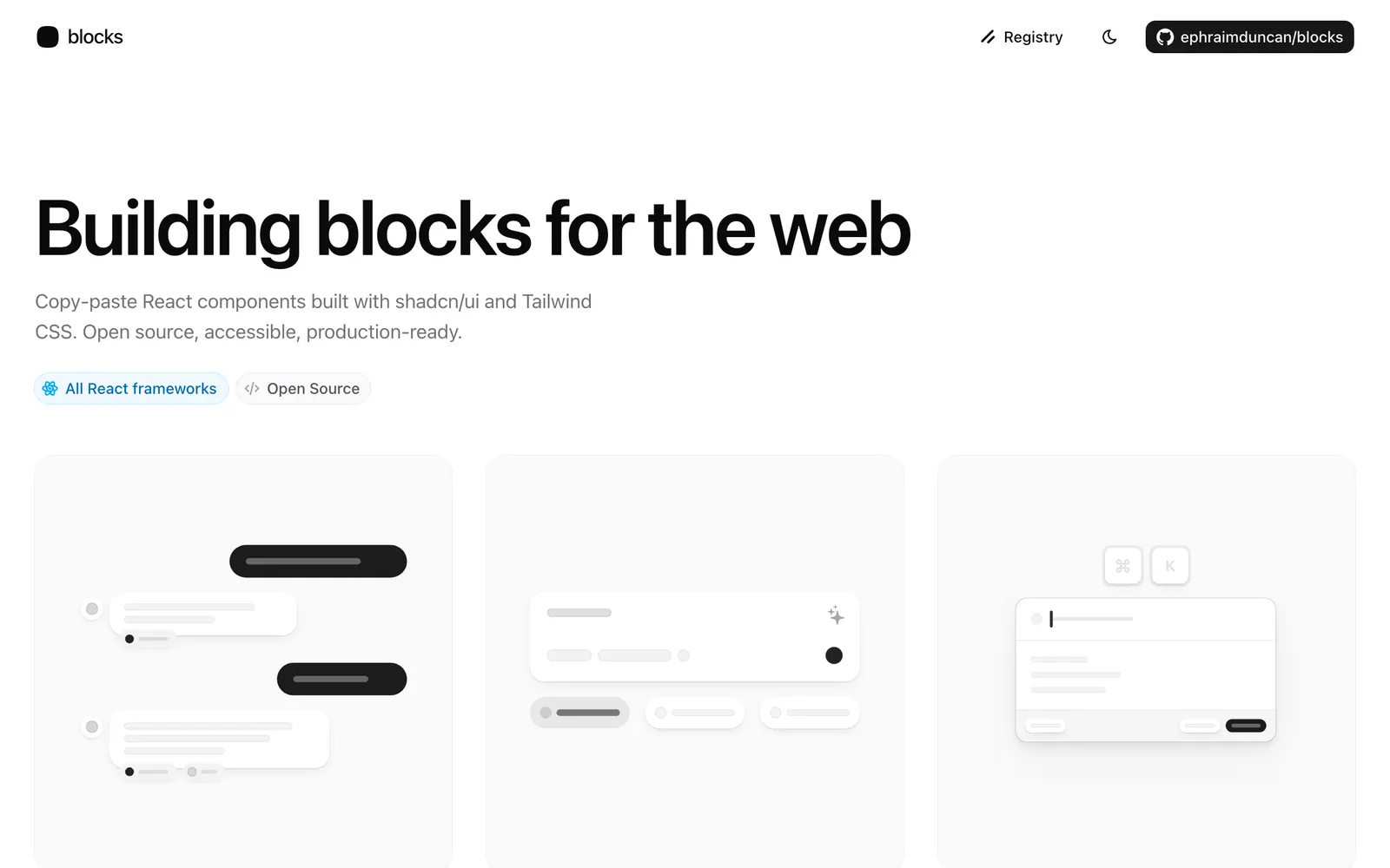
blocks.so — Open-source website blocks and components installable directly via shadcn CLI.

blocks.soCollections

Open-source website blocks and components installable directly via shadcn CLI.

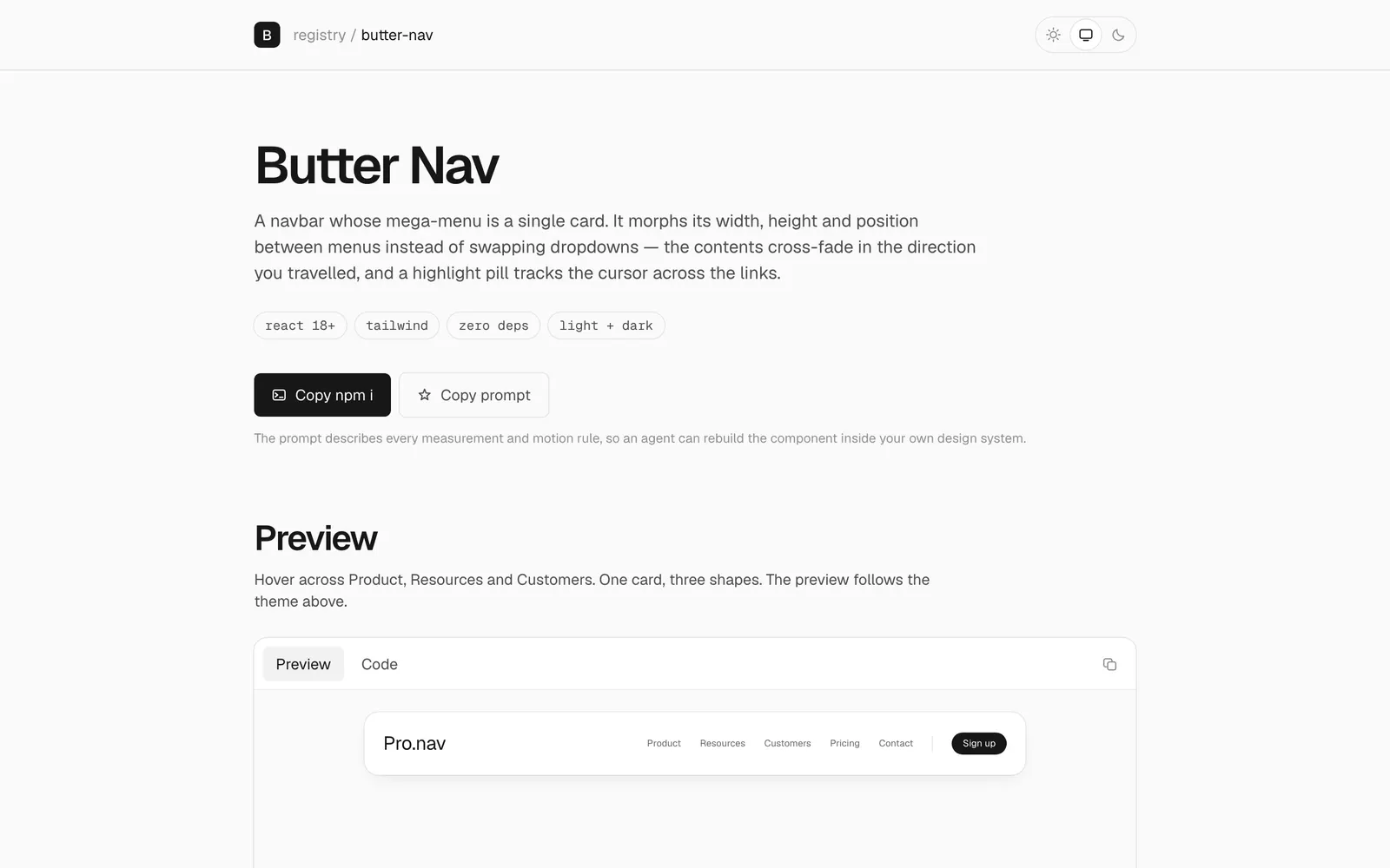
Butter Nav — Mega-menu featuring fluid layout morphing transitions and silky physics.

Butter NavCollections

Mega-menu featuring fluid layout morphing transitions and silky physics.

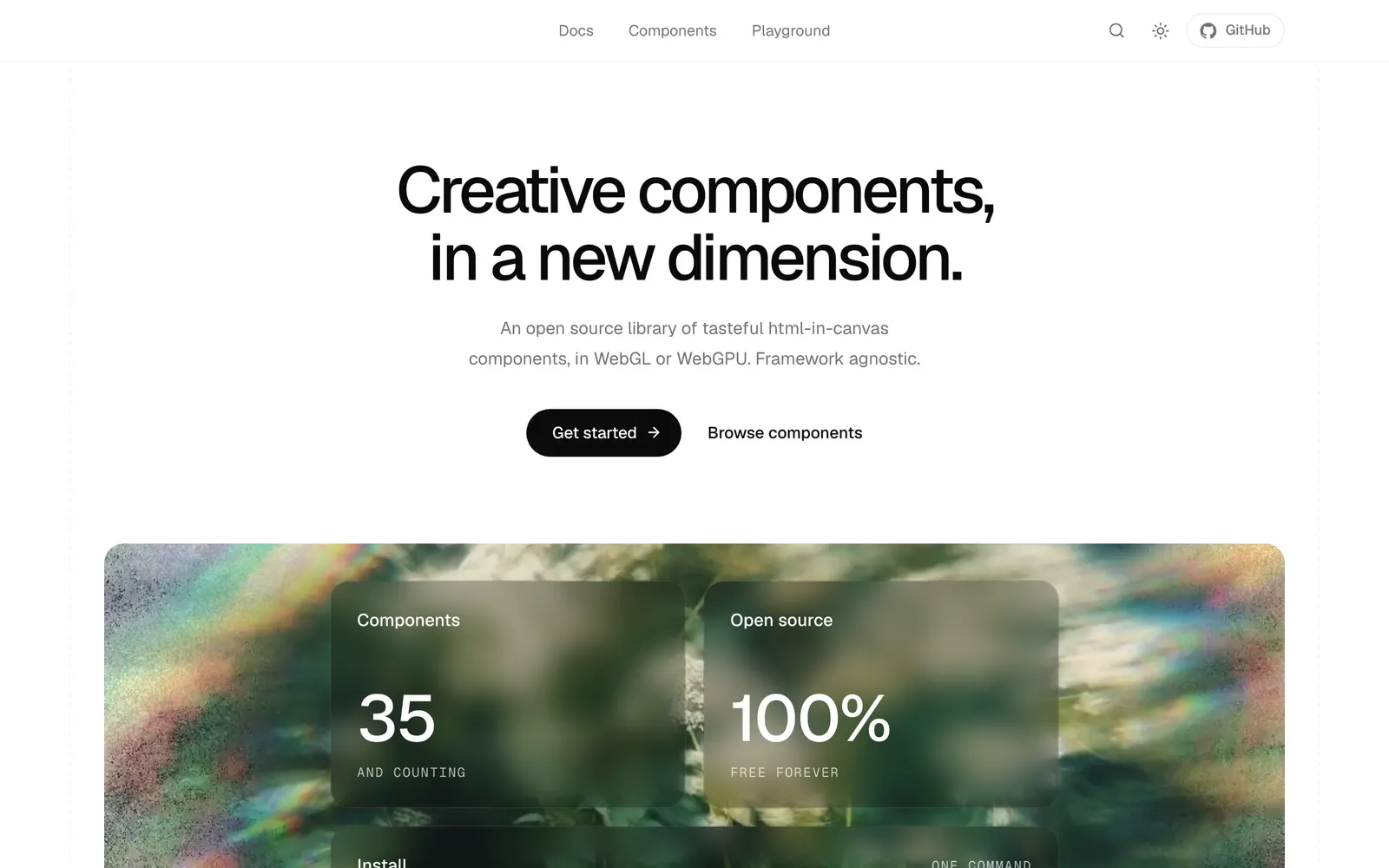
Canvas UI — GPU-accelerated liquid physics, canvas shaders, and interactive web elements.

Canvas UICollections

GPU-accelerated liquid physics, canvas shaders, and interactive web elements.

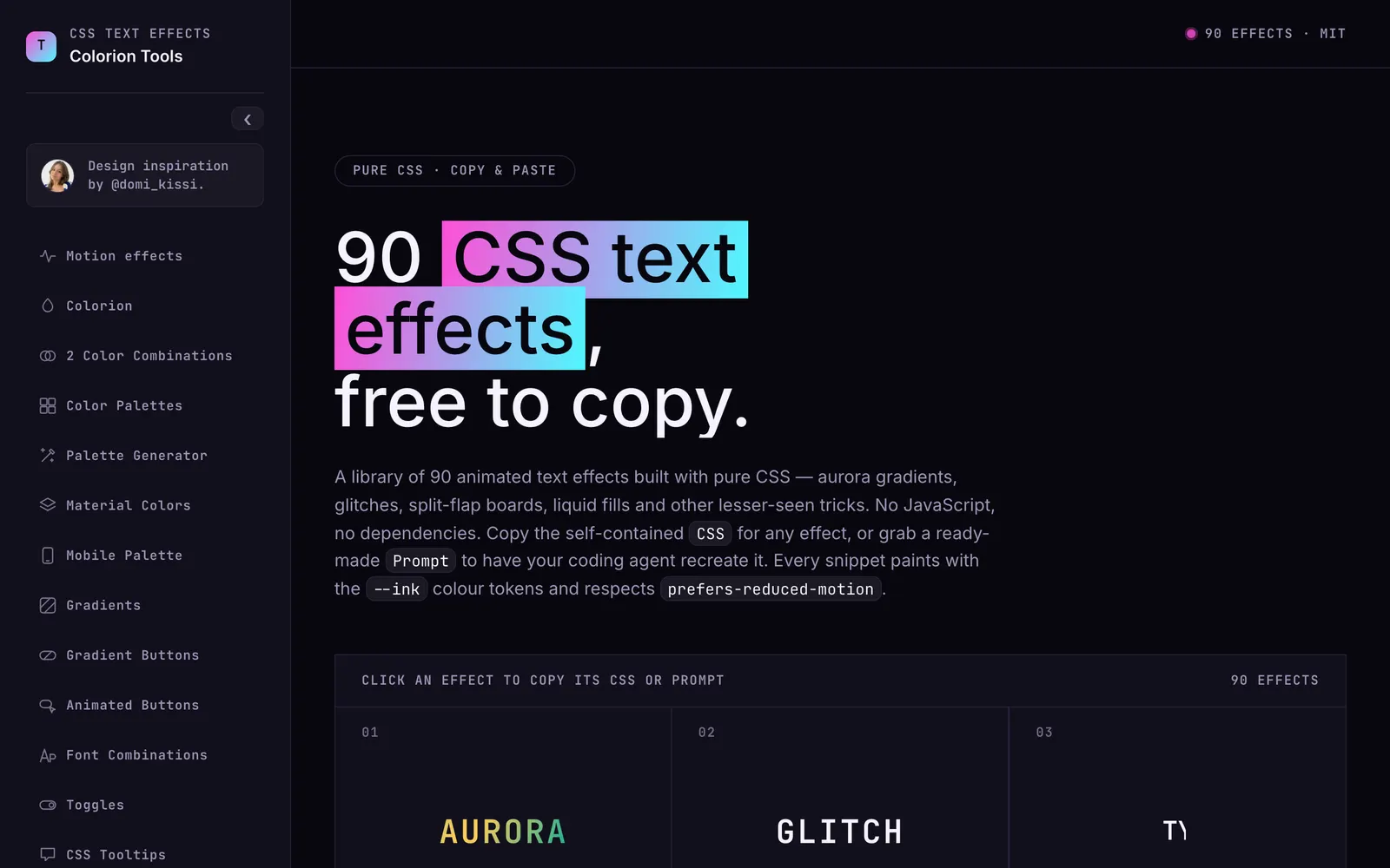
Colorion Text Effects — Animated text effects, kinetic typography presets, and copy-paste CSS recipes.

Colorion Text EffectsText & Typography

Animated text effects, kinetic typography presets, and copy-paste CSS recipes.

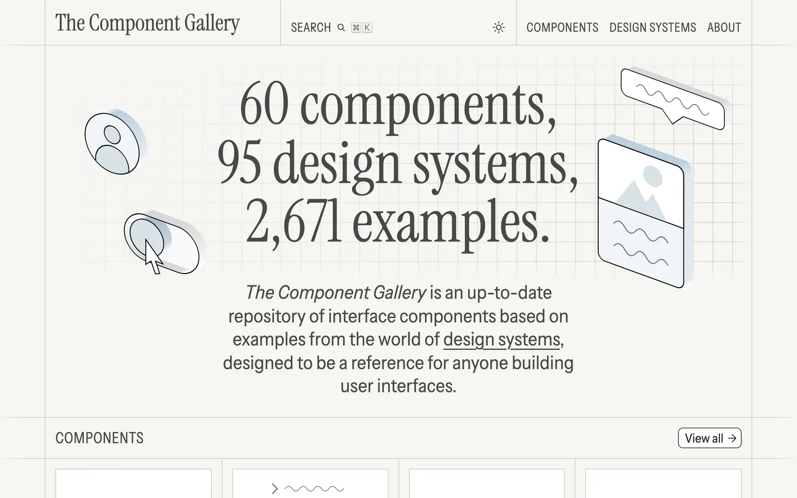
The Component Gallery — A collection of design system components from the best interface libraries.

The Component GalleryCollections

A collection of design system components from the best interface libraries.

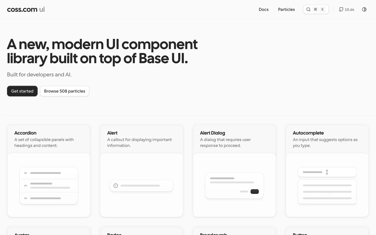
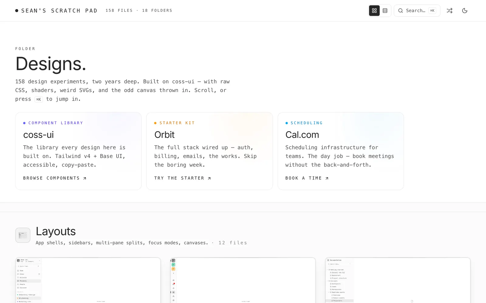
coss ui — Accessible copy-paste UI components built on top of Base UI and Tailwind CSS.

coss uiCollections

Accessible copy-paste UI components built on top of Base UI and Tailwind CSS.

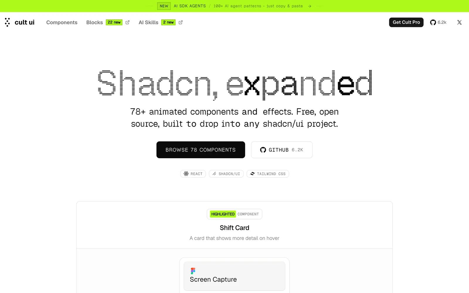
Cult UI — Curated animated React components crafted with Framer Motion and Tailwind.

Cult UICollections

Curated animated React components crafted with Framer Motion and Tailwind.

devl — Minimalist and experimental UI components exploring frontier web aesthetics.

devlCollections

Minimalist and experimental UI components exploring frontier web aesthetics.

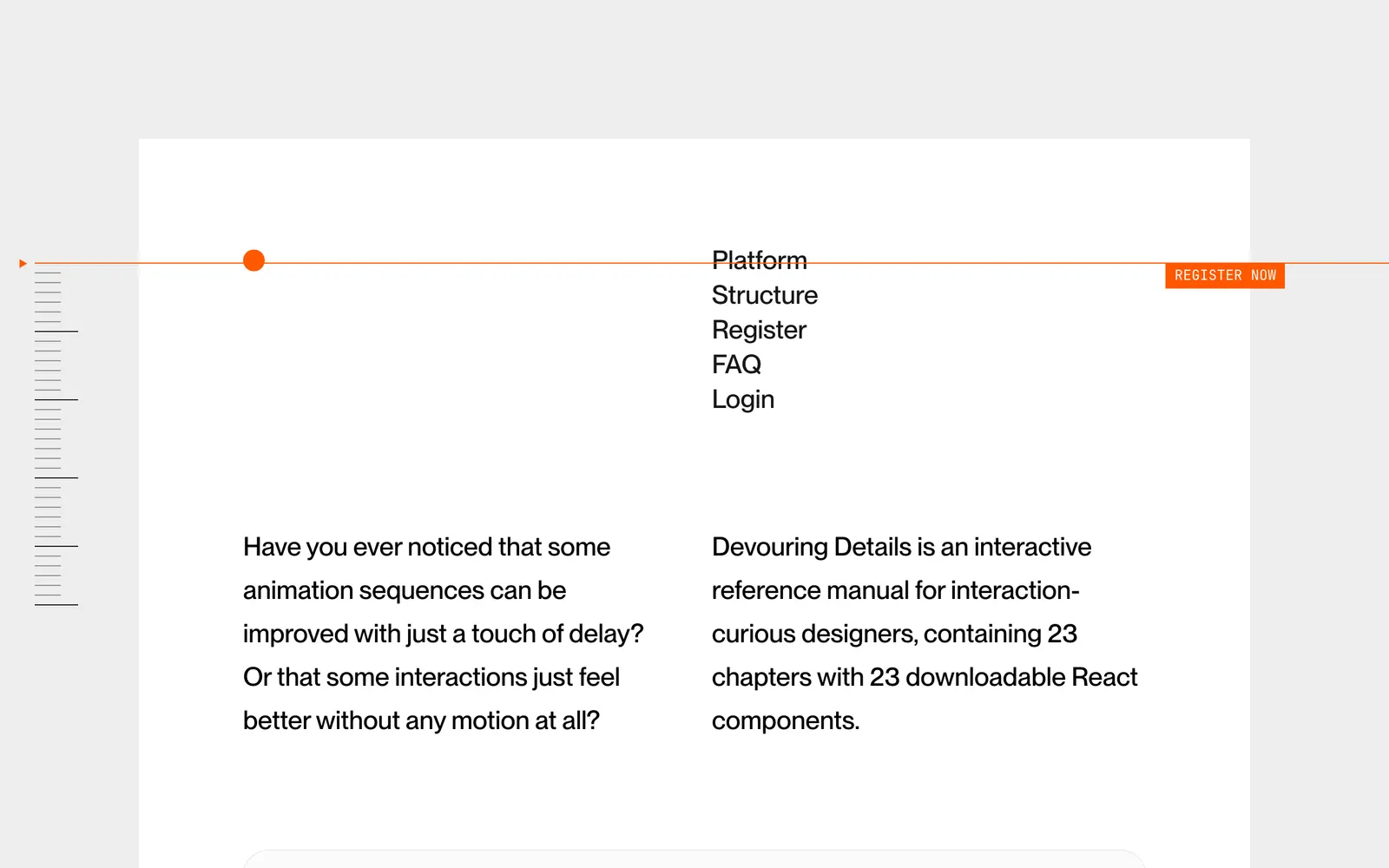
Devouring Details — Interactive digital book teaching micro-interaction design and tactile craft.

Devouring DetailsCollections

Interactive digital book teaching micro-interaction design and tactile craft.

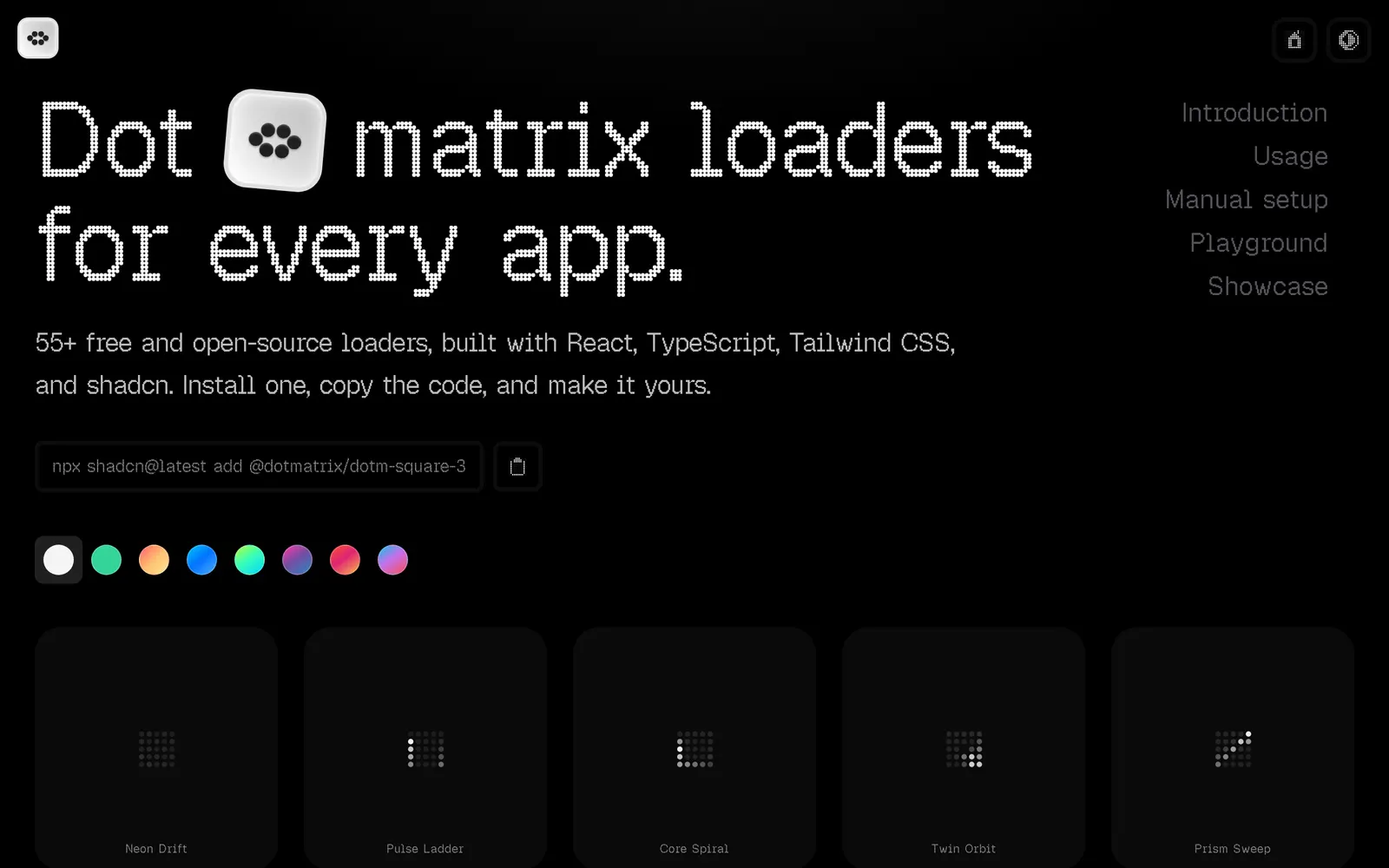
Dot Matrix — Over fifty customizable dot-matrix loaders and pixel indicators for shadcn/ui.

Dot MatrixLoading & Feedback

Over fifty customizable dot-matrix loaders and pixel indicators for shadcn/ui.

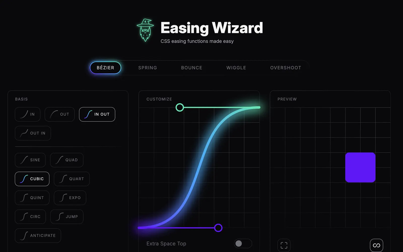
Easing Wizard — Visual spring generator and easing curve designer for modern CSS animations.

Easing WizardCollections

Visual spring generator and easing curve designer for modern CSS animations.

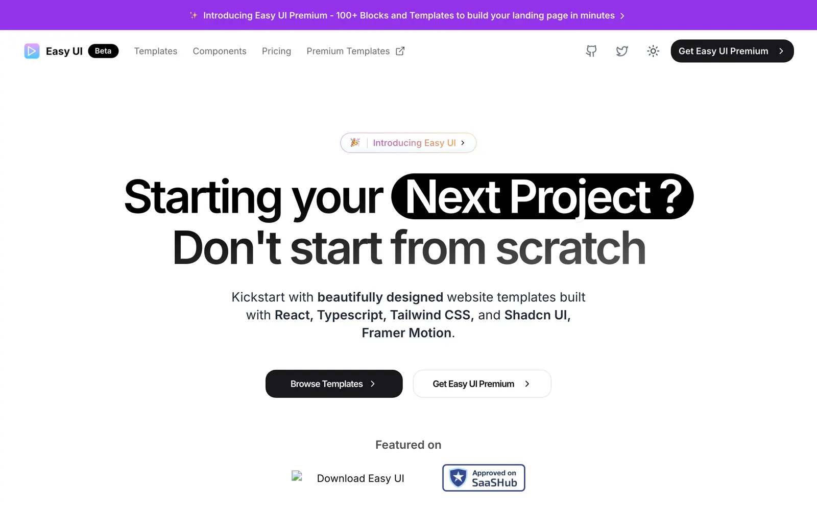
Easy UI — Over 50 ready-to-use high-converting website templates and UI components.

Easy UICollections

Over 50 ready-to-use high-converting website templates and UI components.

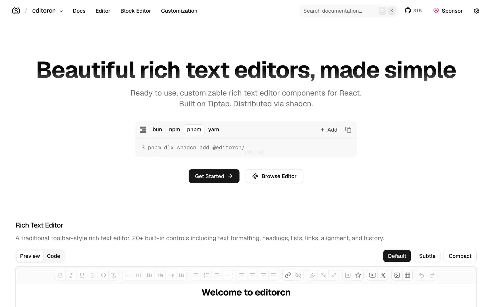
editorcn — Headless rich text editor components for React, built on Tiptap and shadcn.

editorcnFiles & Code

Headless rich text editor components for React, built on Tiptap and shadcn.

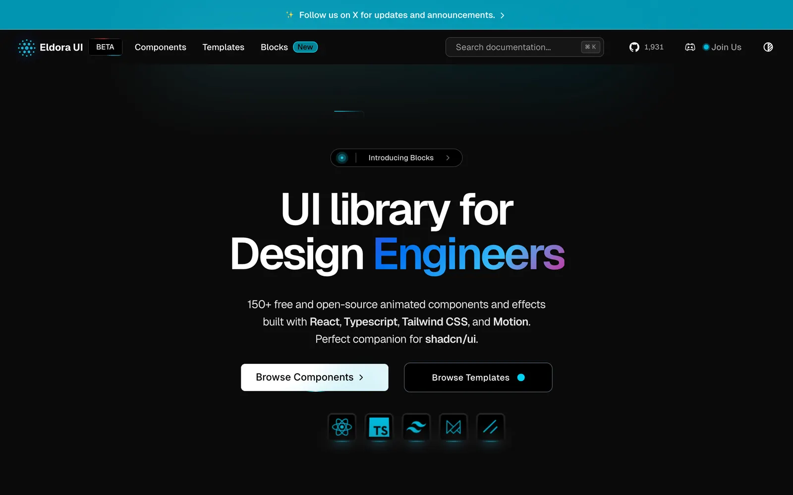
Eldora UI — Animated React components and interactive hero sections tailored for startups.

Eldora UICollections

Animated React components and interactive hero sections tailored for startups.

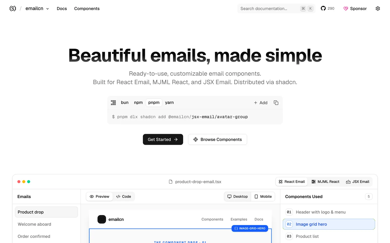
emailcn — Responsive email components compatible with React Email, MJML, and JSX Email.

emailcnCollections

Responsive email components compatible with React Email, MJML, and JSX Email.

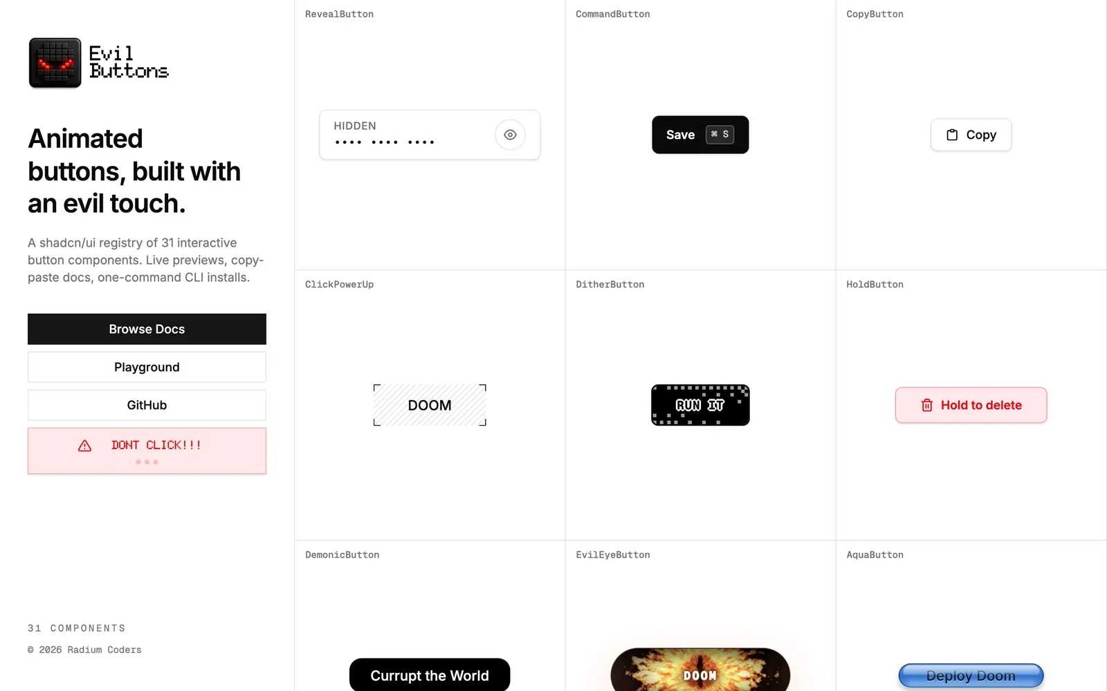
Evil Buttons — Interactive, tactile, and expressive button components crafted for modern apps.

Evil ButtonsInput Controls

Interactive, tactile, and expressive button components crafted for modern apps.

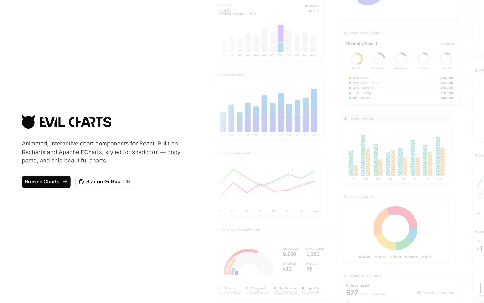
Evil Charts — Animated SVG charts designed specifically for shadcn/ui with minimal weight.

Evil ChartsData Viz

Animated SVG charts designed specifically for shadcn/ui with minimal weight.

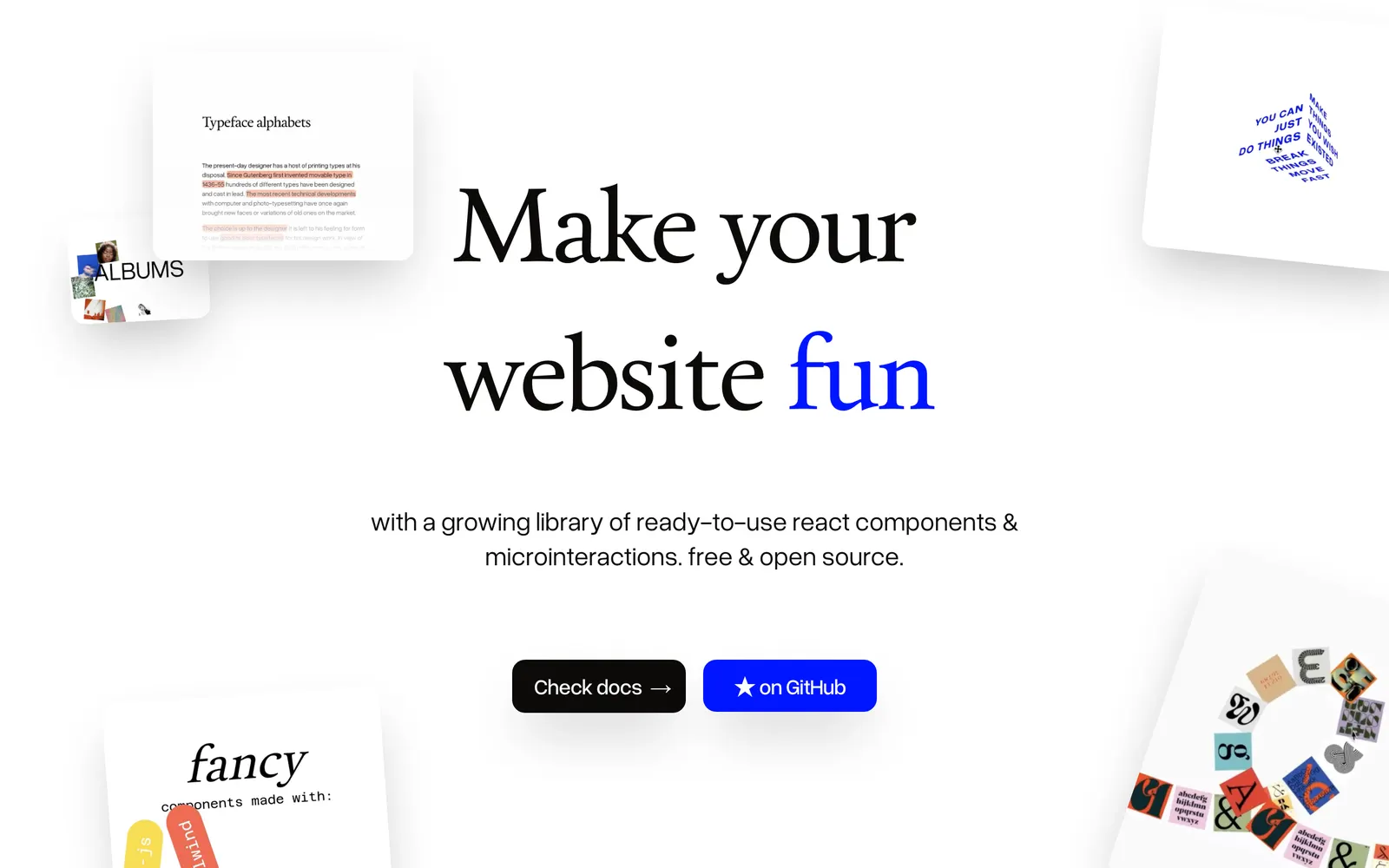
Fancy Components — Playful and physics-driven React components to bring joyful motion to the web.

Fancy ComponentsCollections

Playful and physics-driven React components to bring joyful motion to the web.

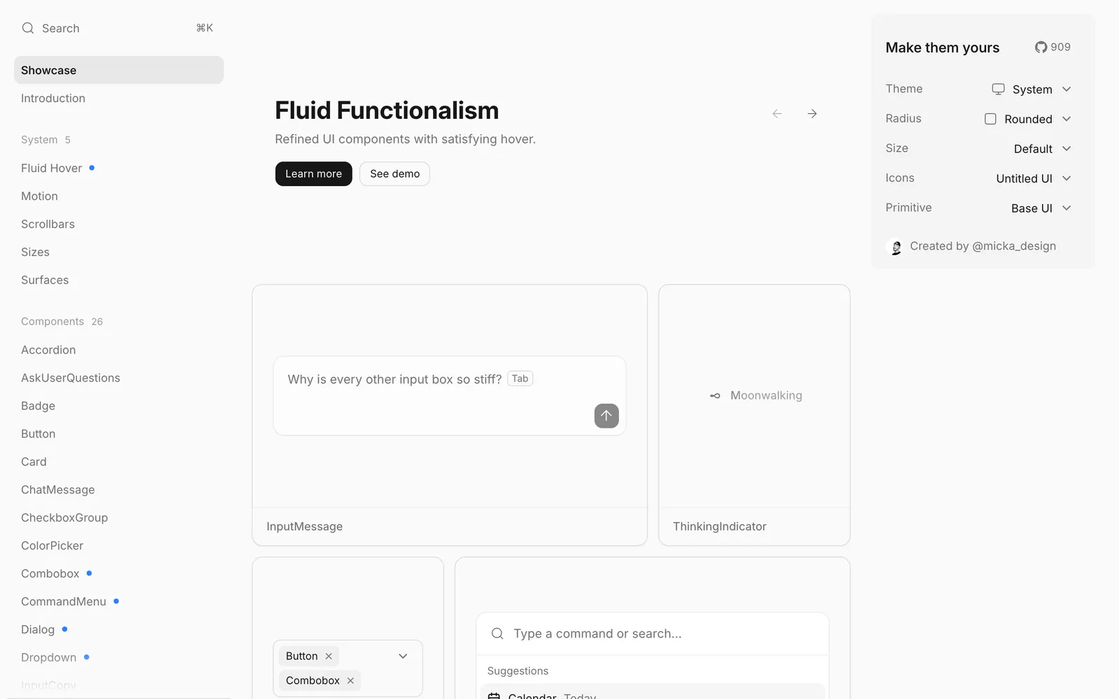
Fluid Functionalism — Design principles and interactive components engineered with purposeful physical animation.

Fluid FunctionalismCollections

Design principles and interactive components engineered with purposeful physical animation.

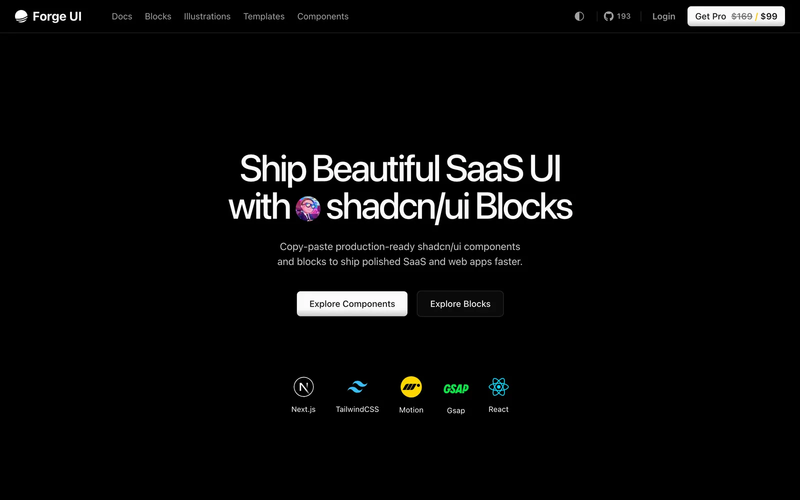
Forge UI — Animated React and Tailwind UI components and blocks compatible with shadcn/ui.

Forge UICollections

Animated React and Tailwind UI components and blocks compatible with shadcn/ui.

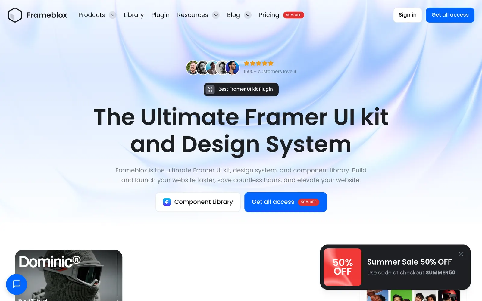
Frameblox — Modular Framer sections and production templates engineered for web designers.

FramebloxCollections

Modular Framer sections and production templates engineered for web designers.

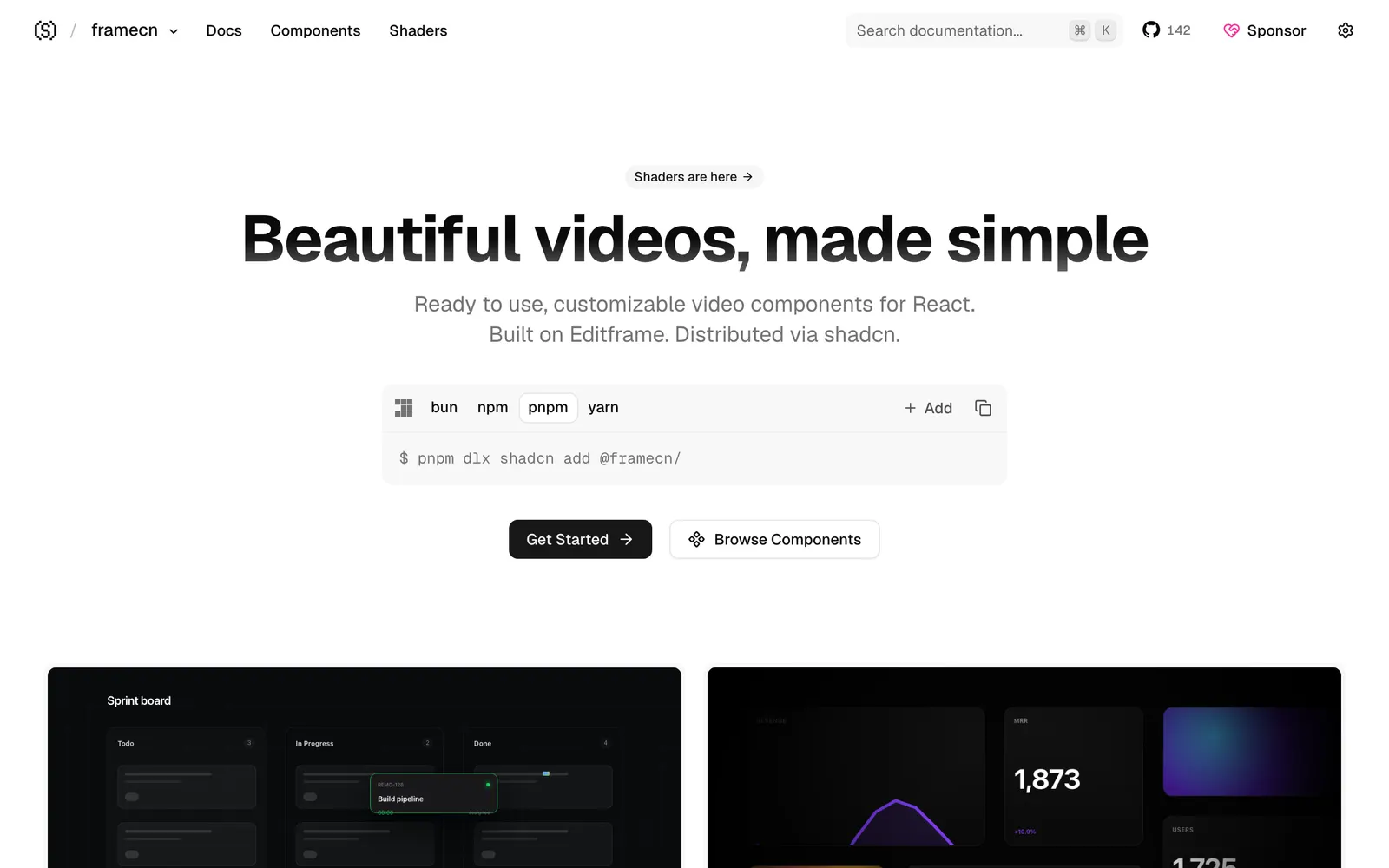
framecn — Video rendering and timeline components for React, built on Editframe.

framecnCollections

Video rendering and timeline components for React, built on Editframe.

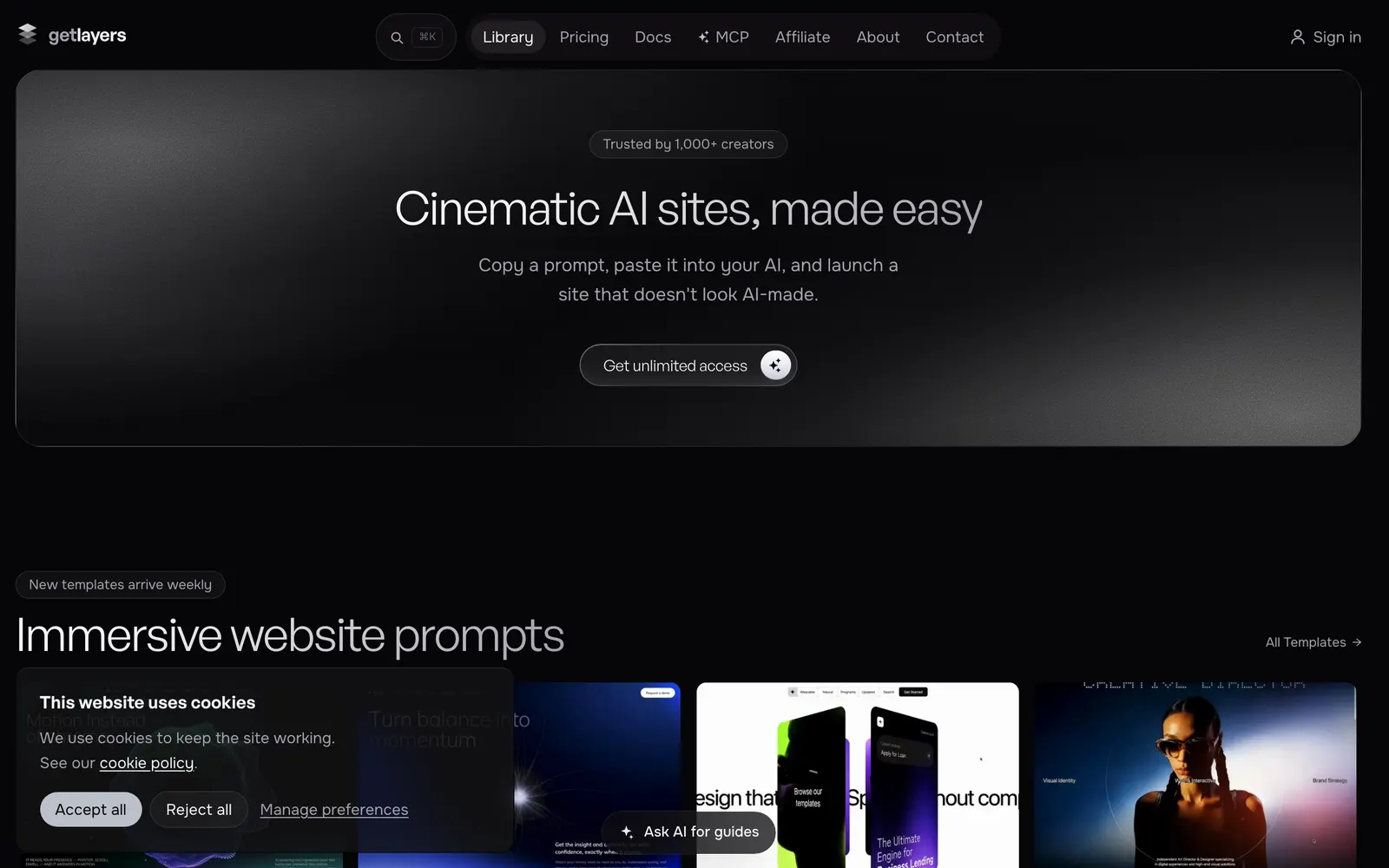
GetLayers — AI prompts and visual section recipes for cinematic, highly layered web pages.

GetLayersCollections

AI prompts and visual section recipes for cinematic, highly layered web pages.

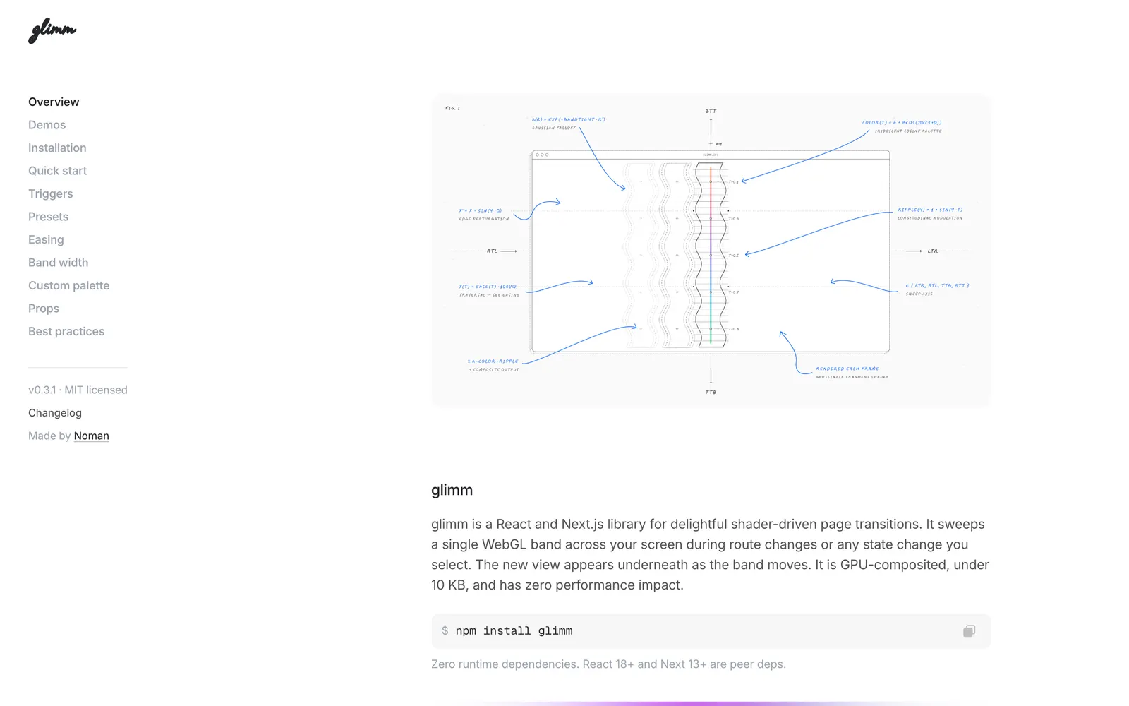
glimm — Shader-driven fluid page transitions and visual effects for Next.js applications.

glimmCollections

Shader-driven fluid page transitions and visual effects for Next.js applications.

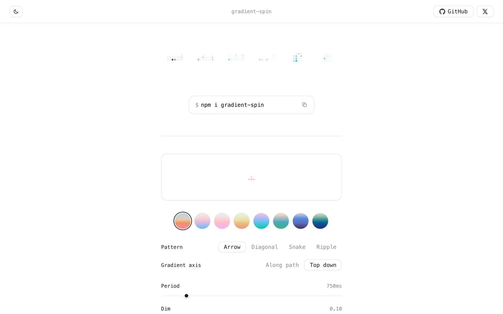
Gradient Spin — Spinning gradient loading indicator and conic ring spinner for modern React.

Gradient SpinLoading & Feedback

Spinning gradient loading indicator and conic ring spinner for modern React.

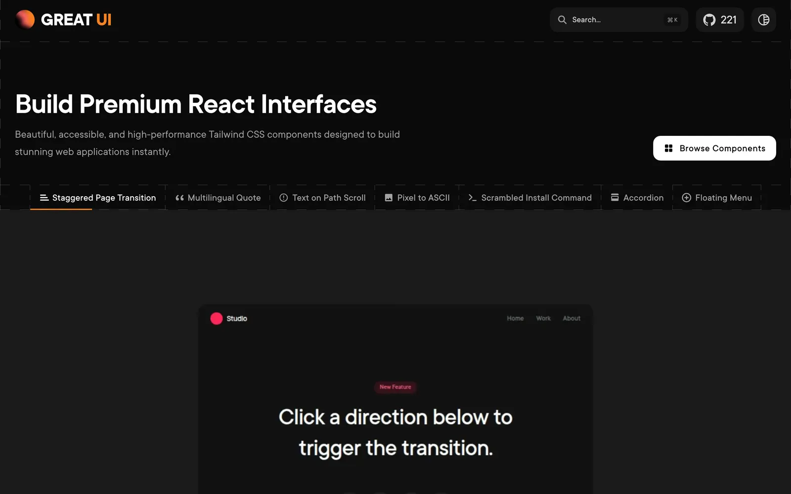
Great UI — Copy-paste React and Tailwind CSS components built with accessible mechanics.

Great UICollections

Copy-paste React and Tailwind CSS components built with accessible mechanics.

GSAP — Industry-standard, ultra-high-performance JavaScript timeline animation engine.

GSAPCollections

Industry-standard, ultra-high-performance JavaScript timeline animation engine.

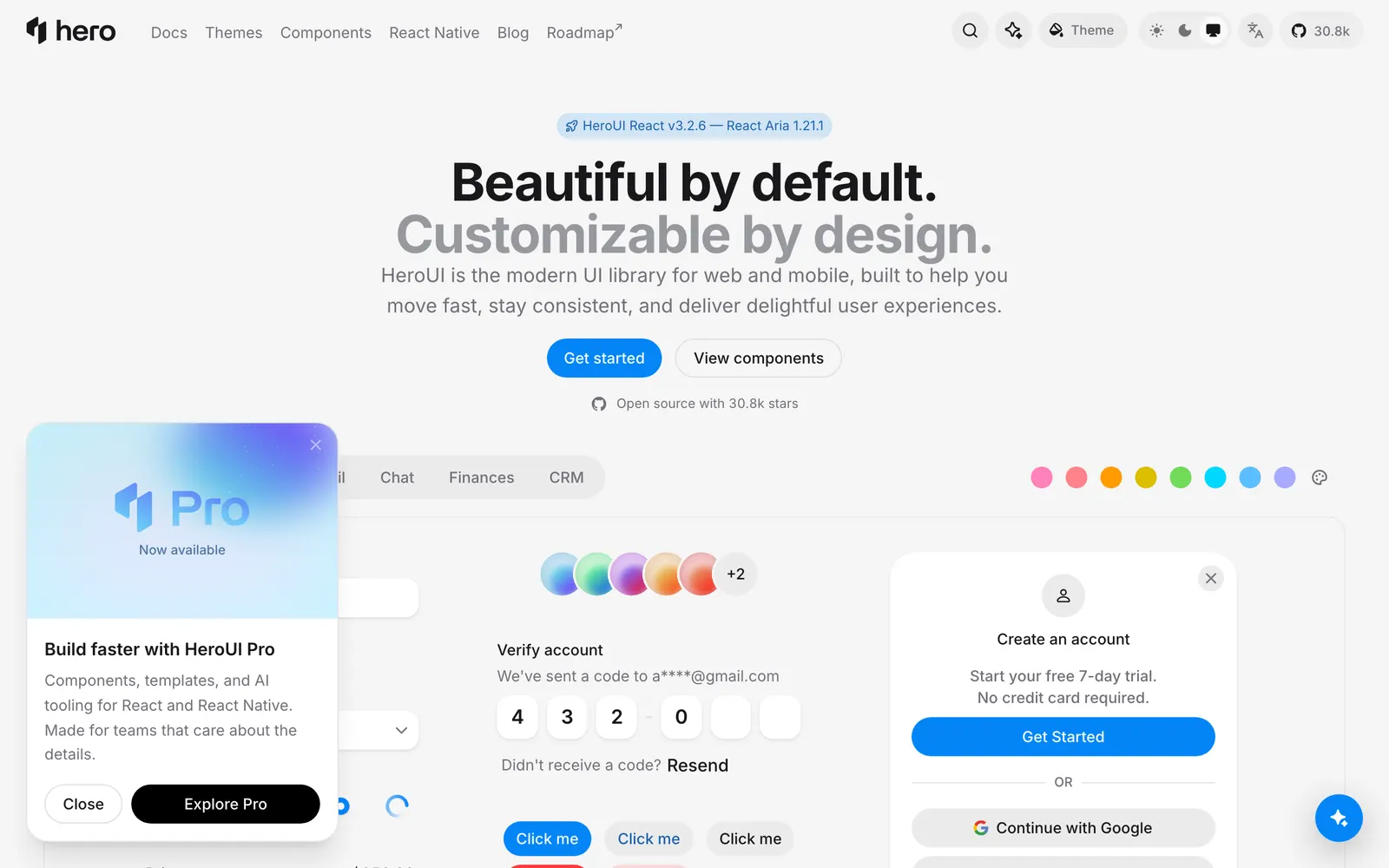
HeroUI — Beautiful, fast and modern React UI library, formerly known as NextUI.

HeroUICollections

Beautiful, fast and modern React UI library, formerly known as NextUI.

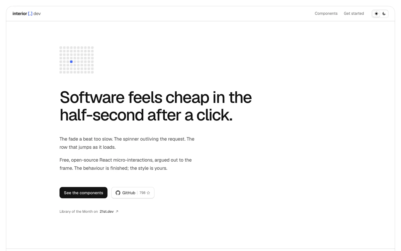
interior.dev — Micro-interactions and tactile UI controls finely tuned for click responsiveness.

interior.devInput Controls

Micro-interactions and tactile UI controls finely tuned for click responsiveness.

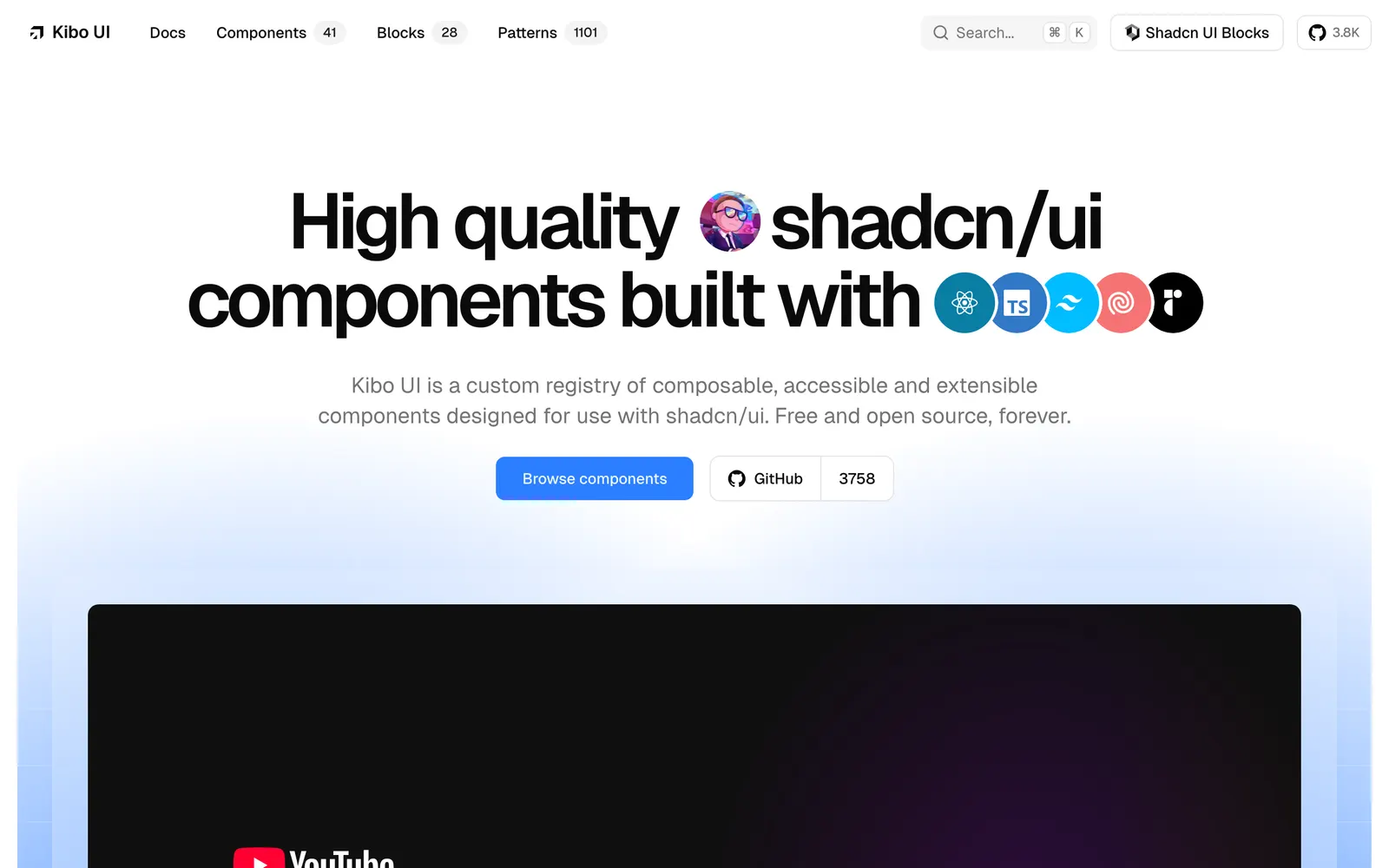
Kibo UI — Component registry tailored for AI interfaces, chat experiences, and workflows.

Kibo UICollections

Component registry tailored for AI interfaces, chat experiences, and workflows.

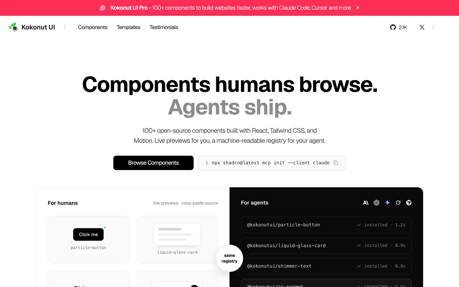
Kokonut UI — Creative interactive components for React and Tailwind in shadcn format.

Kokonut UICollections

Creative interactive components for React and Tailwind in shadcn format.

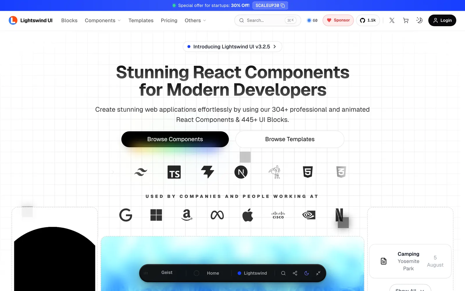
Lightswind — Tailwind CSS components featuring ambient lighting, neon glows, and dark aesthetics.

LightswindCollections

Tailwind CSS components featuring ambient lighting, neon glows, and dark aesthetics.

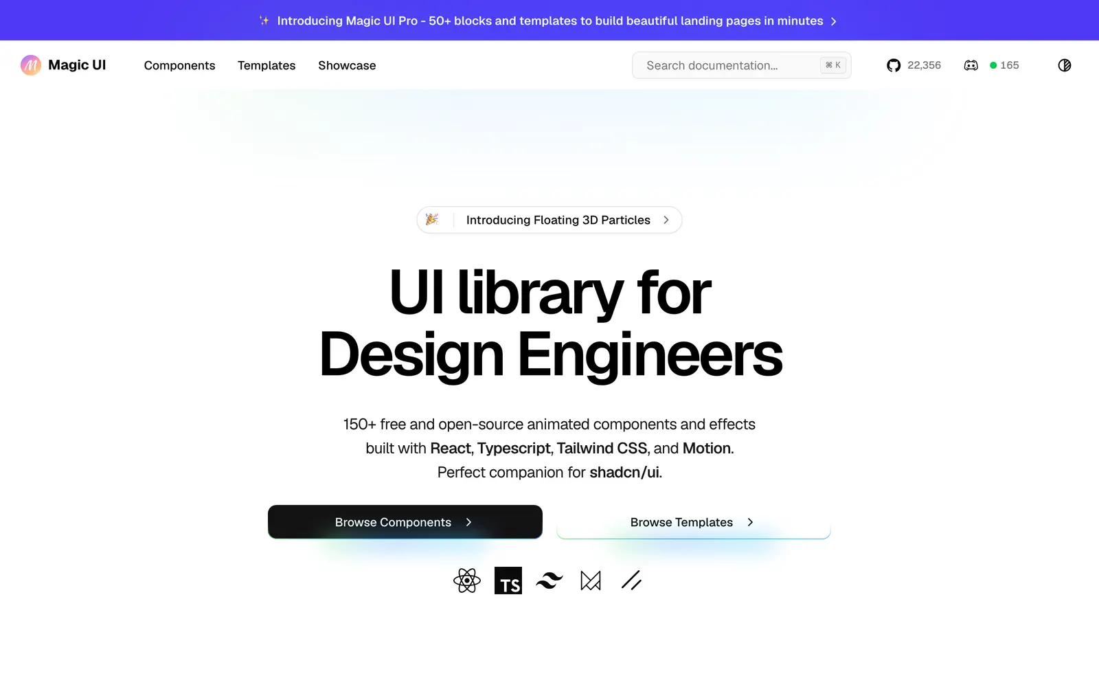
Magic UI — Over 150 animated components crafted for landing pages and modern products.

Magic UICollections

Over 150 animated components crafted for landing pages and modern products.

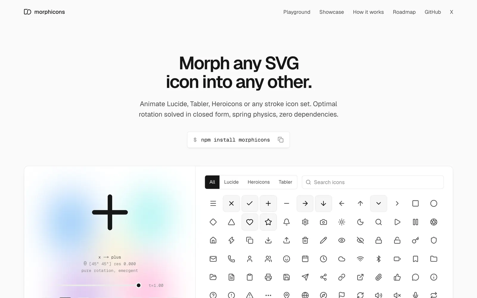
morphicons — Spring-physics icon morphing animation library for smooth state transitions.

morphiconsCollections

Spring-physics icon morphing animation library for smooth state transitions.

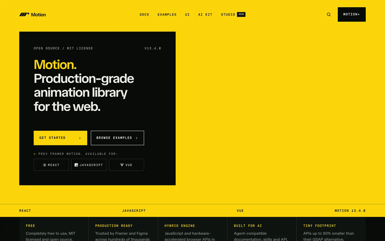
Motion — Production-ready animation and gesture library for React and modern JavaScript.

MotionCollections

Production-ready animation and gesture library for React and modern JavaScript.

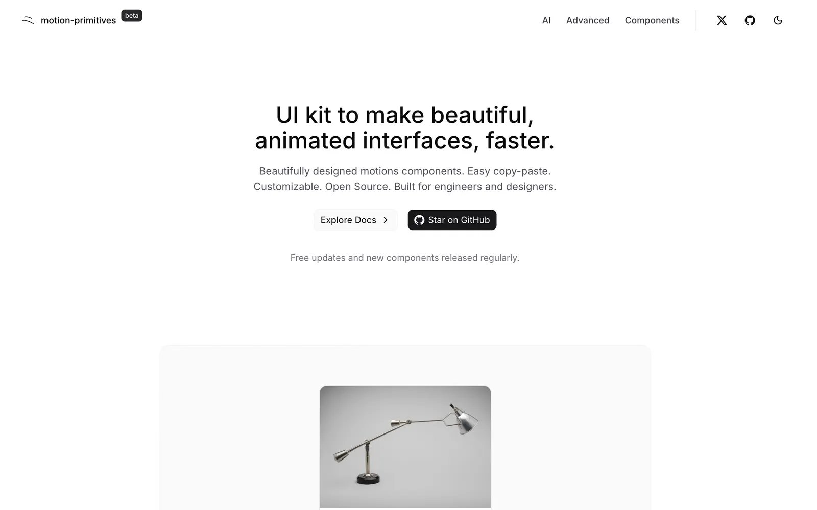
Motion Primitives — Advanced motion and interactive components built with Motion and Tailwind CSS.

Motion PrimitivesCollections

Advanced motion and interactive components built with Motion and Tailwind CSS.

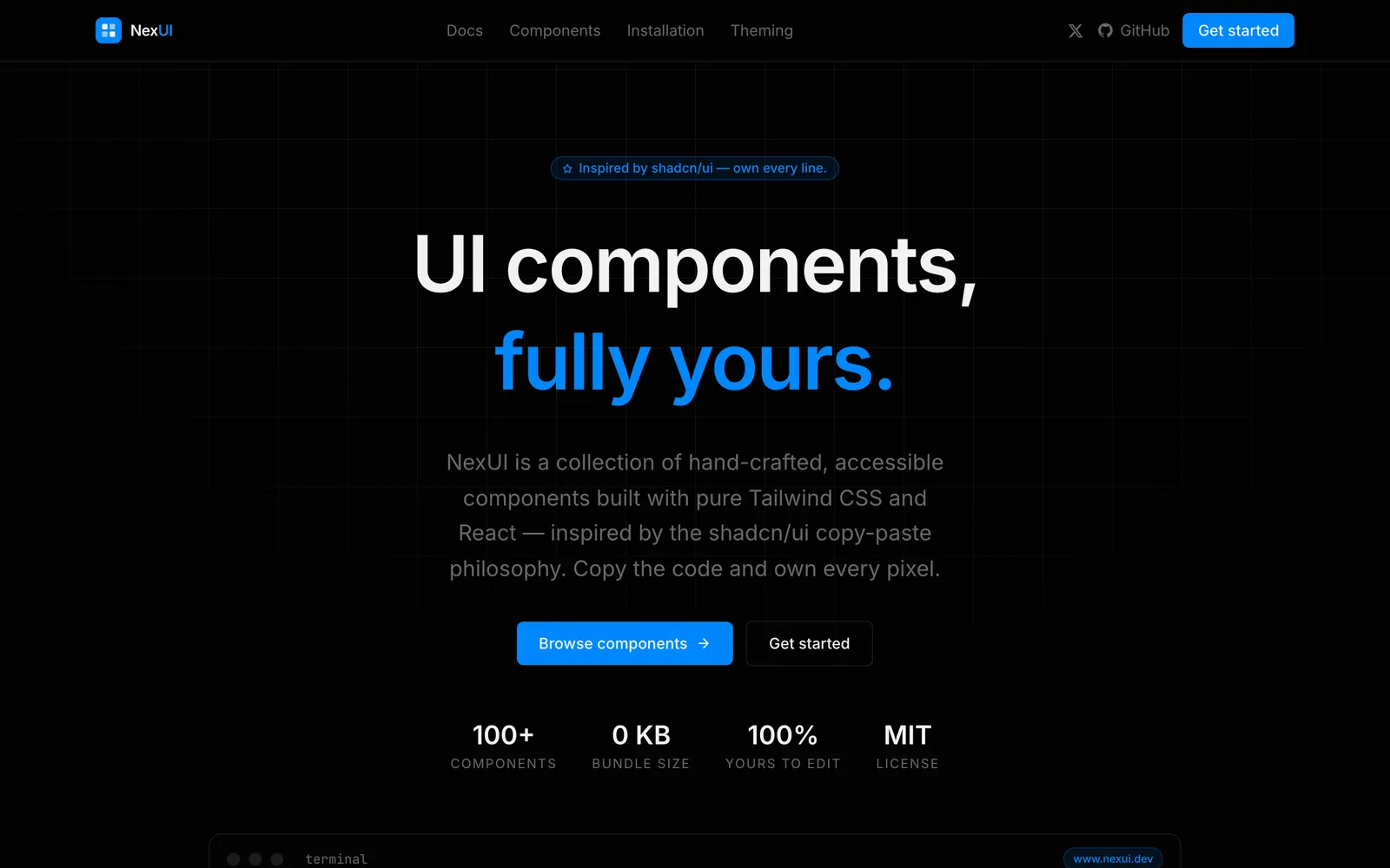
Nex UI — Extensible and accessible component library designed for modern web startups.

Nex UICollections

Extensible and accessible component library designed for modern web startups.

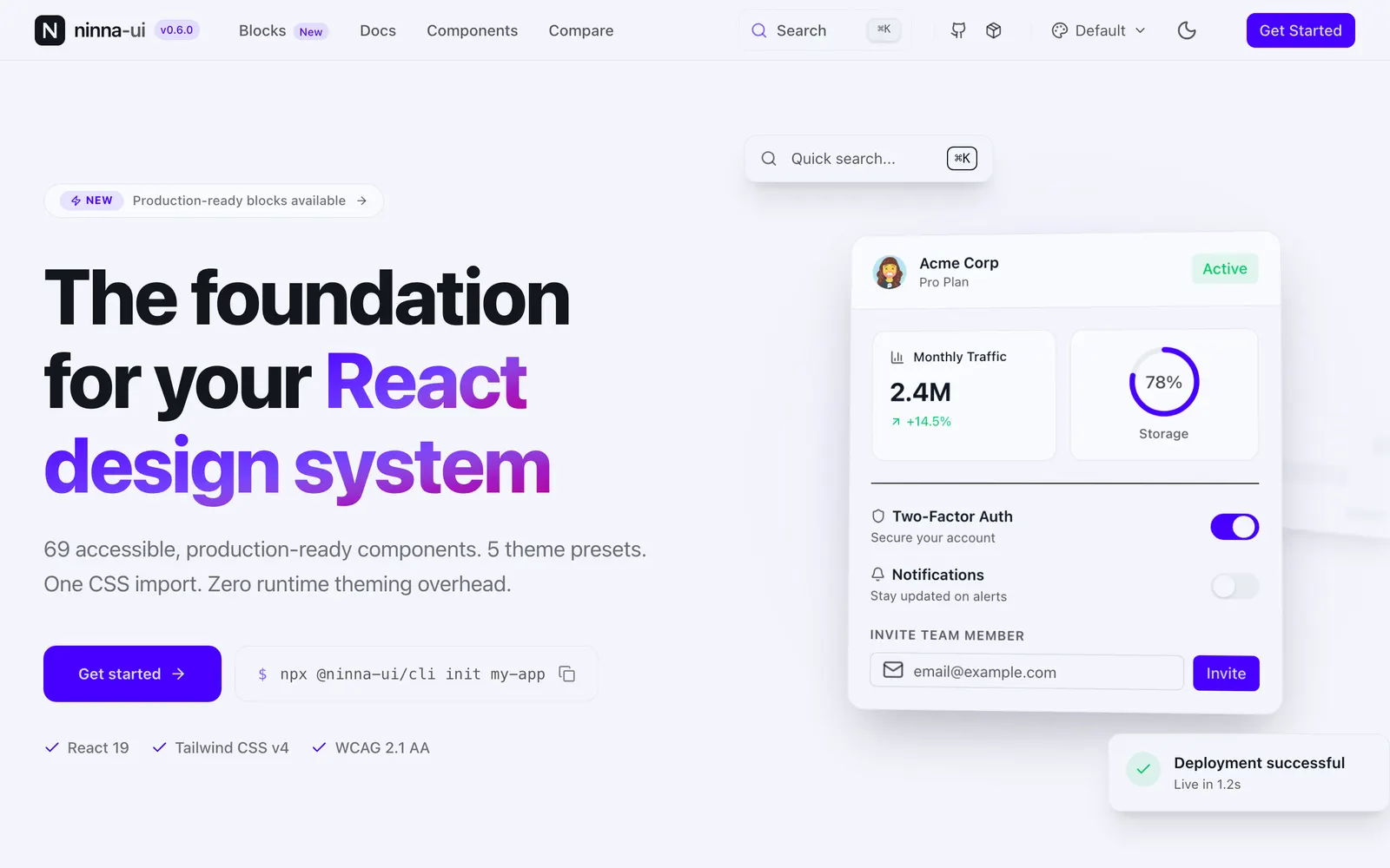
Ninja UI — Lightweight and modular UI components engineered for maximum website performance.

Ninja UICollections

Lightweight and modular UI components engineered for maximum website performance.

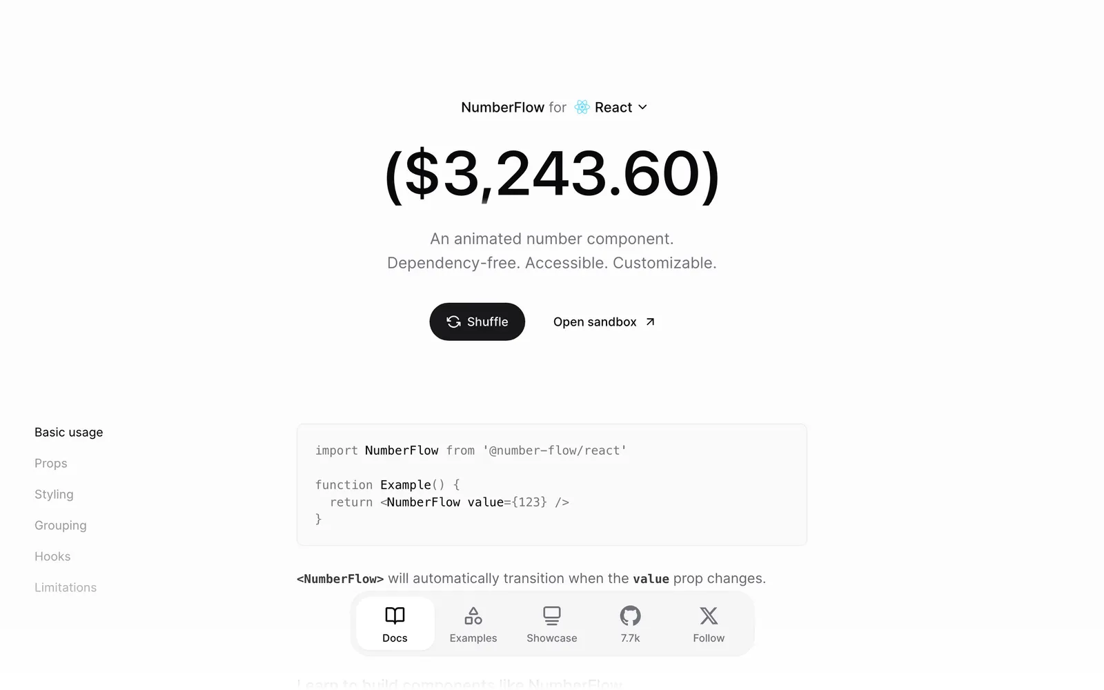
NumberFlow — A component to transition, format, and animate numbers smoothly in modern web.

NumberFlowText & Typography

A component to transition, format, and animate numbers smoothly in modern web.

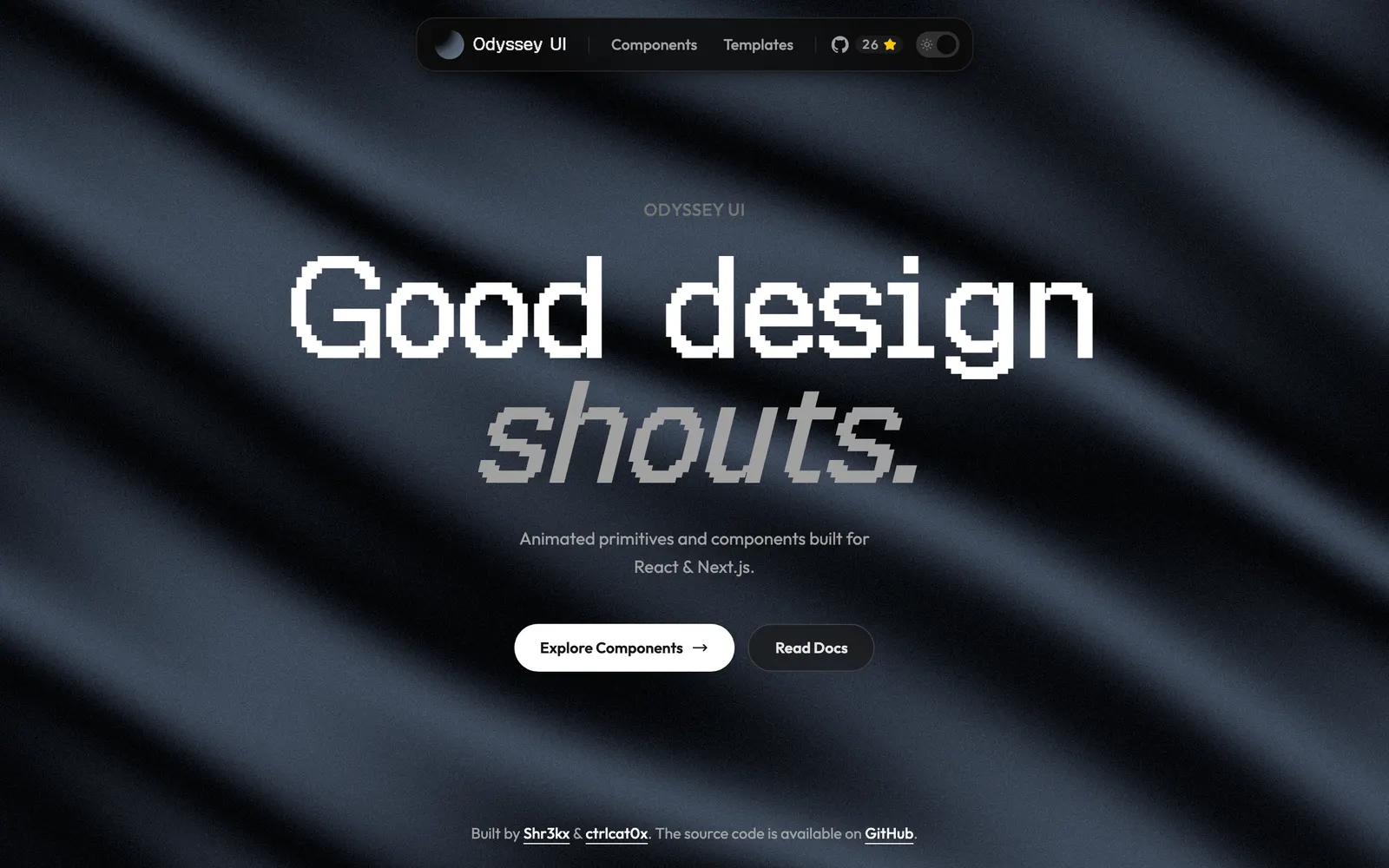
Odyssey UI — Animated React components built on shadcn/ui and Framer Motion for SaaS.

Odyssey UICollections

Animated React components built on shadcn/ui and Framer Motion for SaaS.

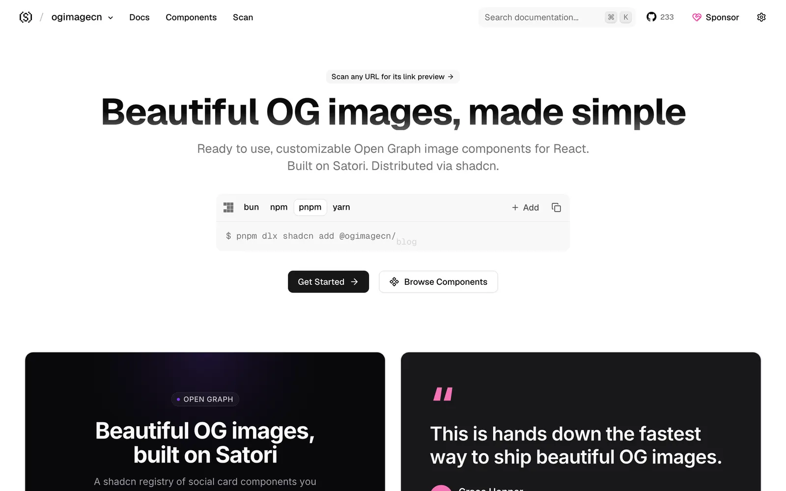
ogimagecn — Dynamic Open Graph image components and generator using Satori and shadcn.

ogimagecnFiles & Code

Dynamic Open Graph image components and generator using Satori and shadcn.

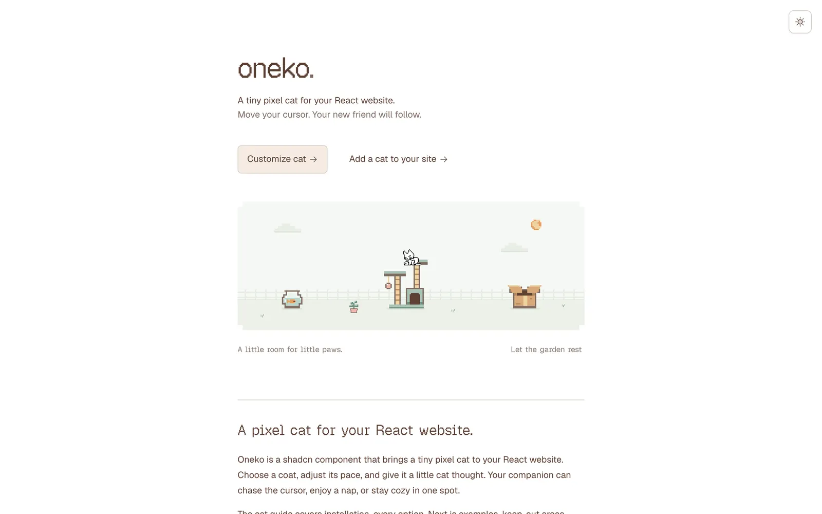
Oneko — Classic nostalgic pixel cat companion that delightfully chases your cursor.

OnekoCollections

Classic nostalgic pixel cat companion that delightfully chases your cursor.

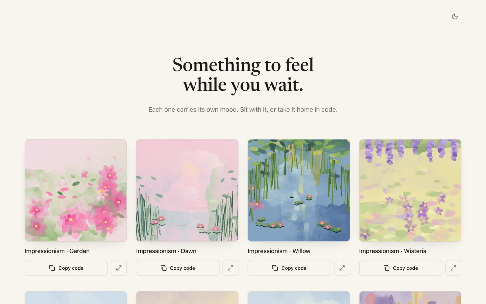
Painterly — Artistic canvas and shader loading indicators designed for creative web apps.

PainterlyLoading & Feedback

Artistic canvas and shader loading indicators designed for creative web apps.

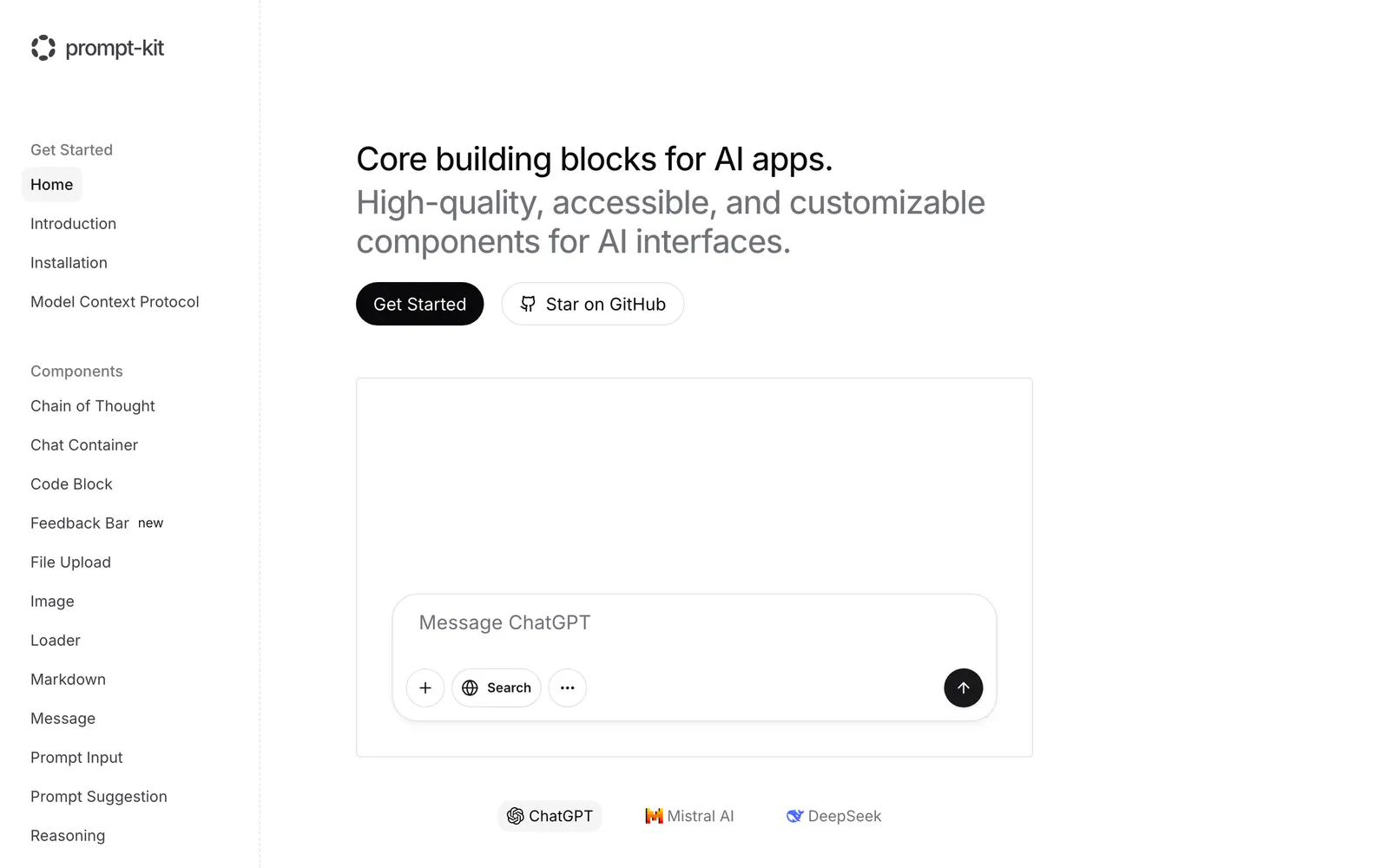
Prompt Kit — Chat and AI interface component primitives for building natural conversational apps.

Prompt KitCollections

Chat and AI interface component primitives for building natural conversational apps.

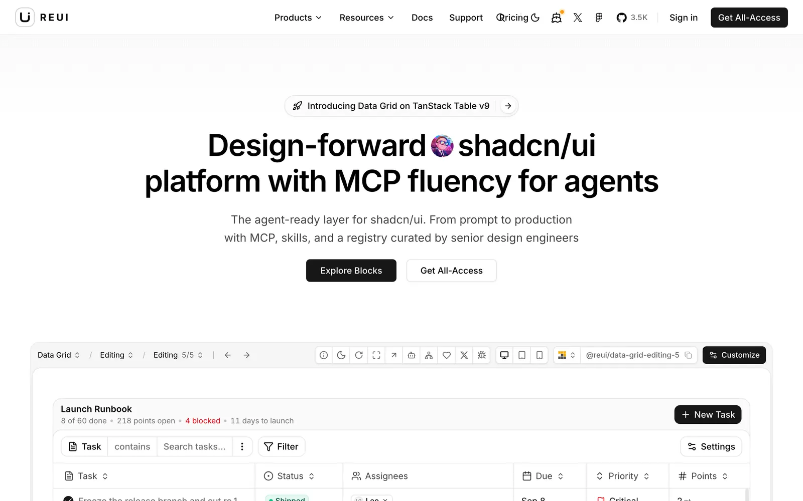
Re UI — Accessible and customizable UI components built using Base UI primitives.

Re UICollections

Accessible and customizable UI components built using Base UI primitives.

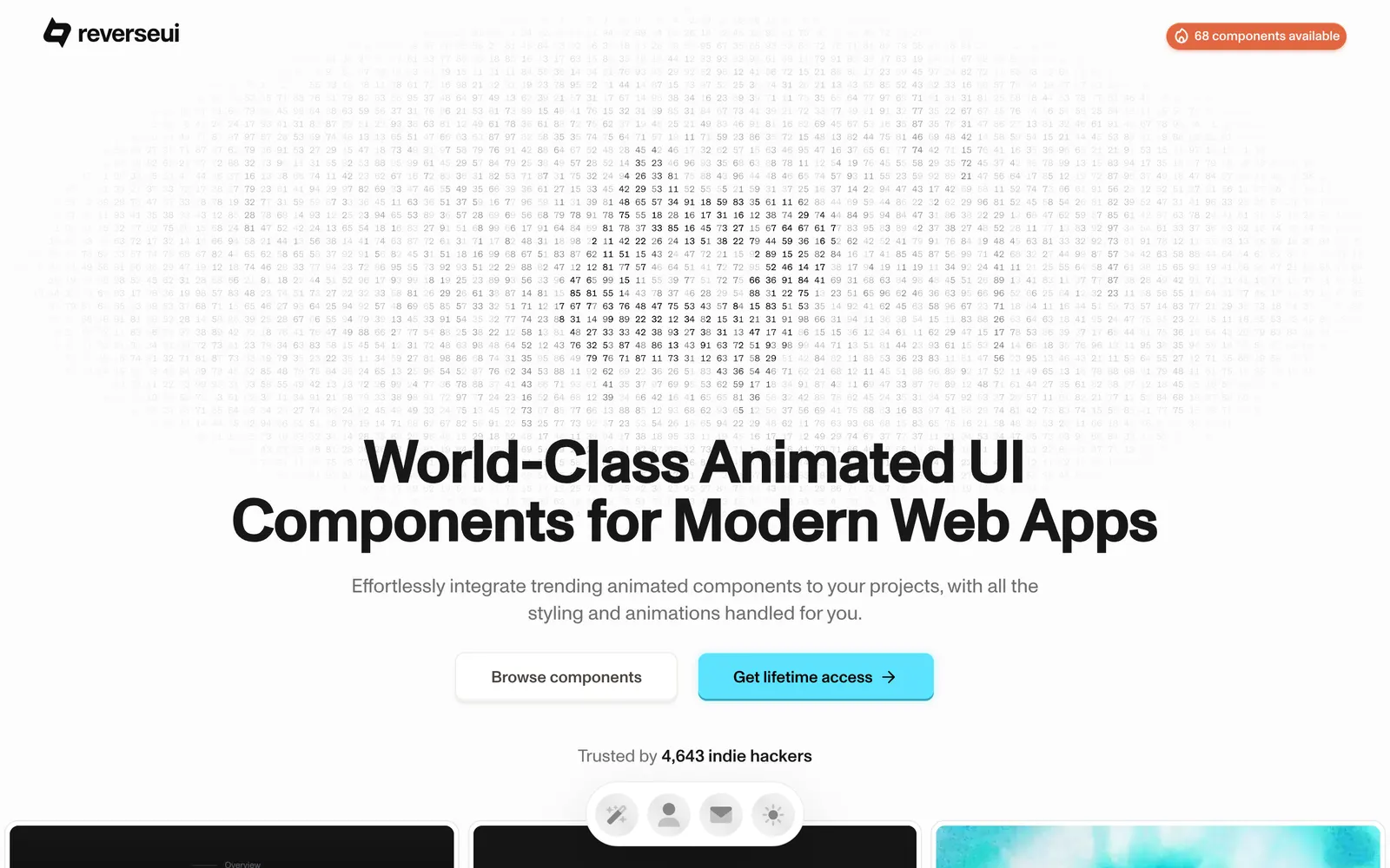
Reverse UI — Creative React and Tailwind CSS components built with playful micro-interactions.

Reverse UICollections

Creative React and Tailwind CSS components built with playful micro-interactions.

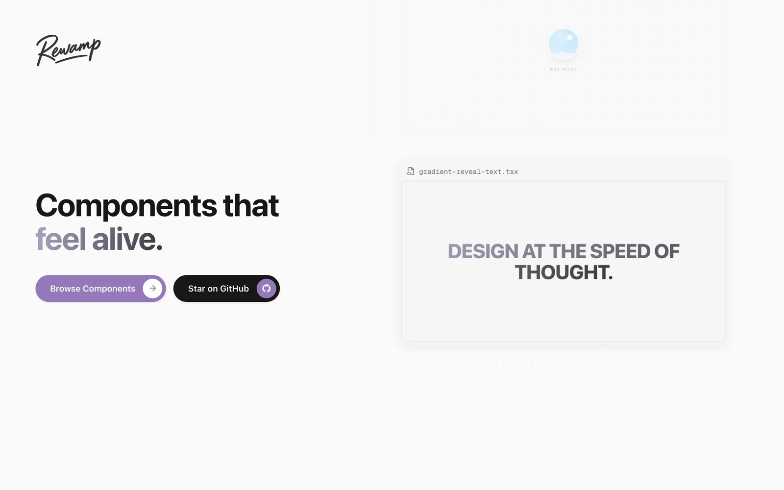
Rewamp UI — A copy-paste React component collection built with Motion, Tailwind CSS, and Three.js.

Rewamp UICollections

A copy-paste React component collection built with Motion, Tailwind CSS, and Three.js.

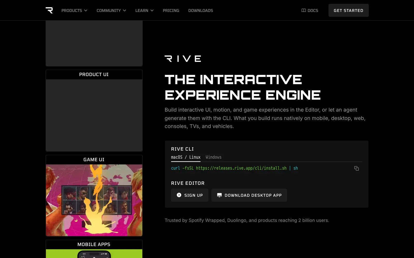
Rive — Interactive vector animation tool and runtime powered by state machines.

RiveCollections

Interactive vector animation tool and runtime powered by state machines.

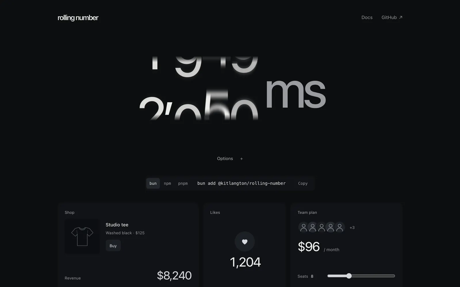
Rolling Number — Smooth digit-rolling number counter component with spring physics for React.

Rolling NumberText & Typography

Smooth digit-rolling number counter component with spring physics for React.

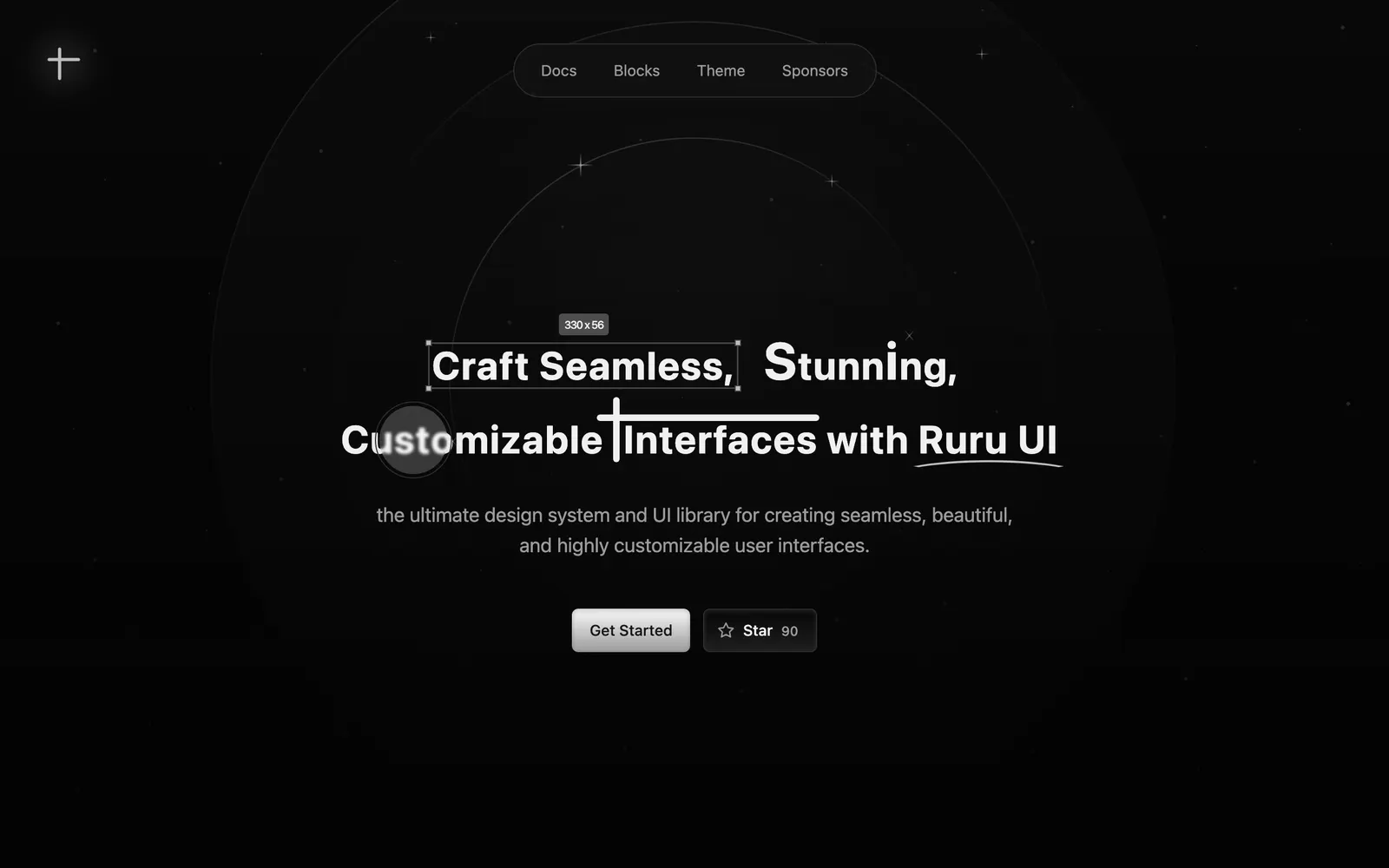
Ruru UI — Accessible and customizable UI components engineered for polished React apps.

Ruru UICollections

Accessible and customizable UI components engineered for polished React apps.

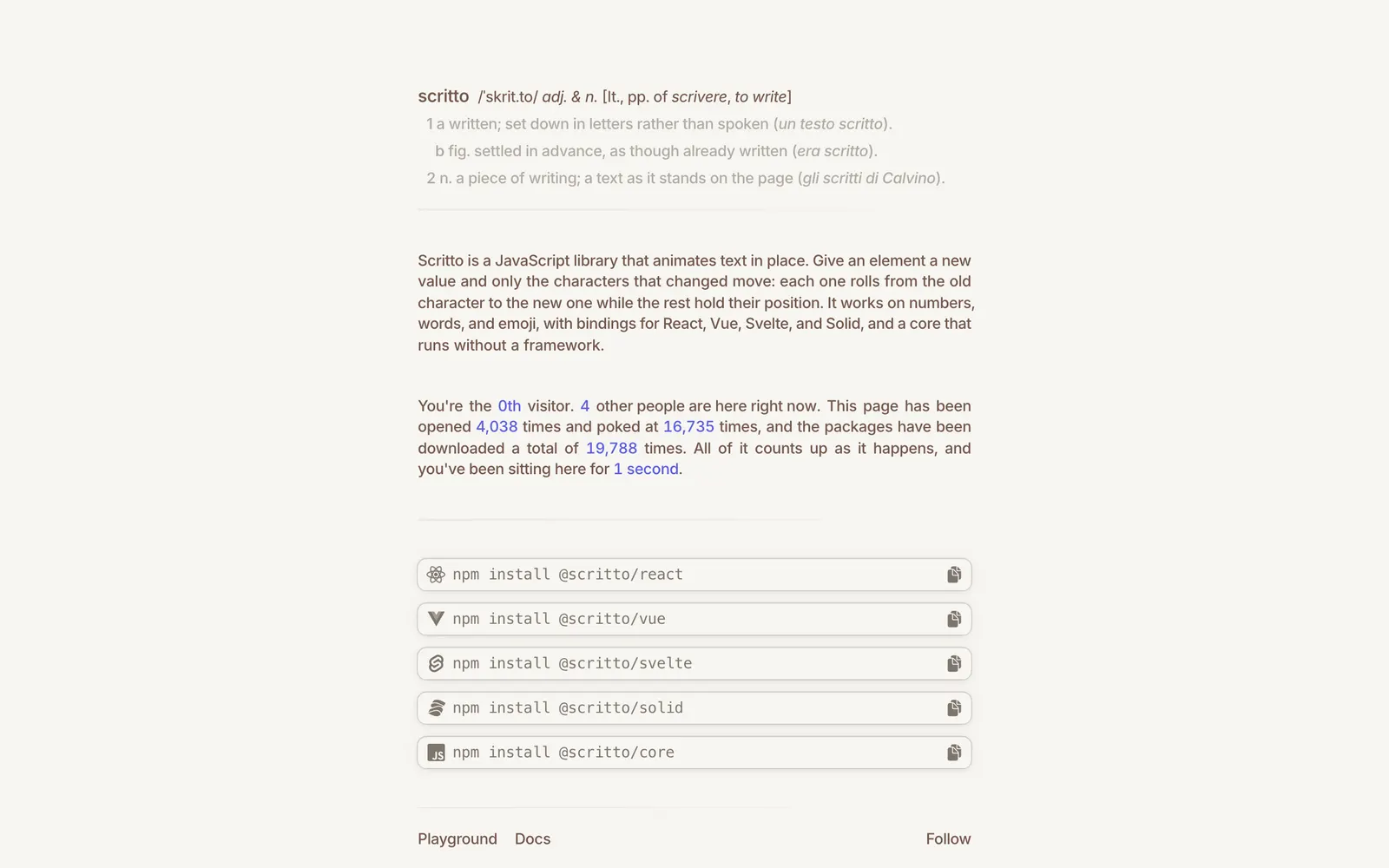
Scritto — Rolling character text transition component library for expressive headings.

ScrittoText & Typography

Rolling character text transition component library for expressive headings.

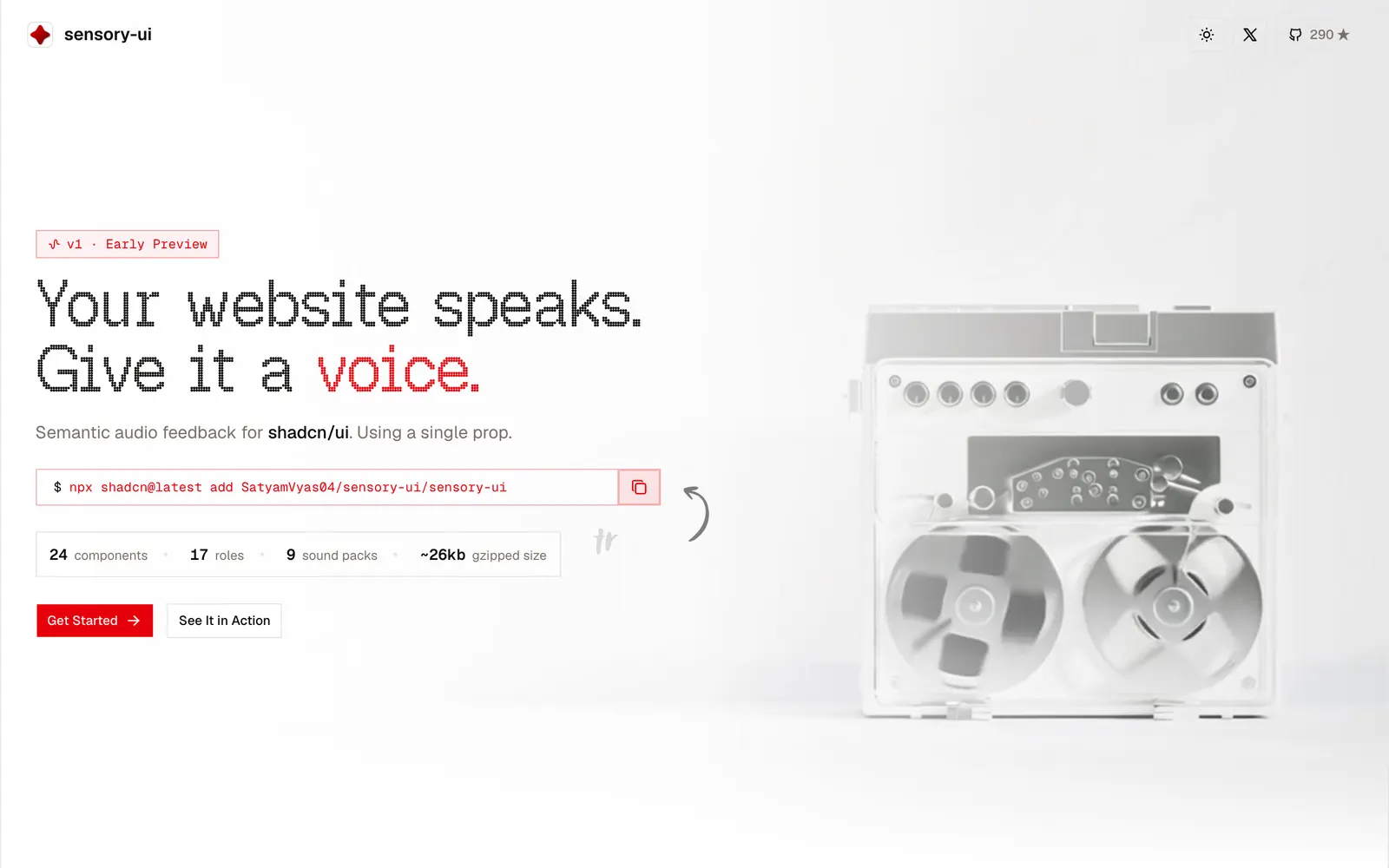
sensory-ui — Sound design system and acoustic tactile feedback for shadcn/ui components.

sensory-uiLoading & Feedback

Sound design system and acoustic tactile feedback for shadcn/ui components.

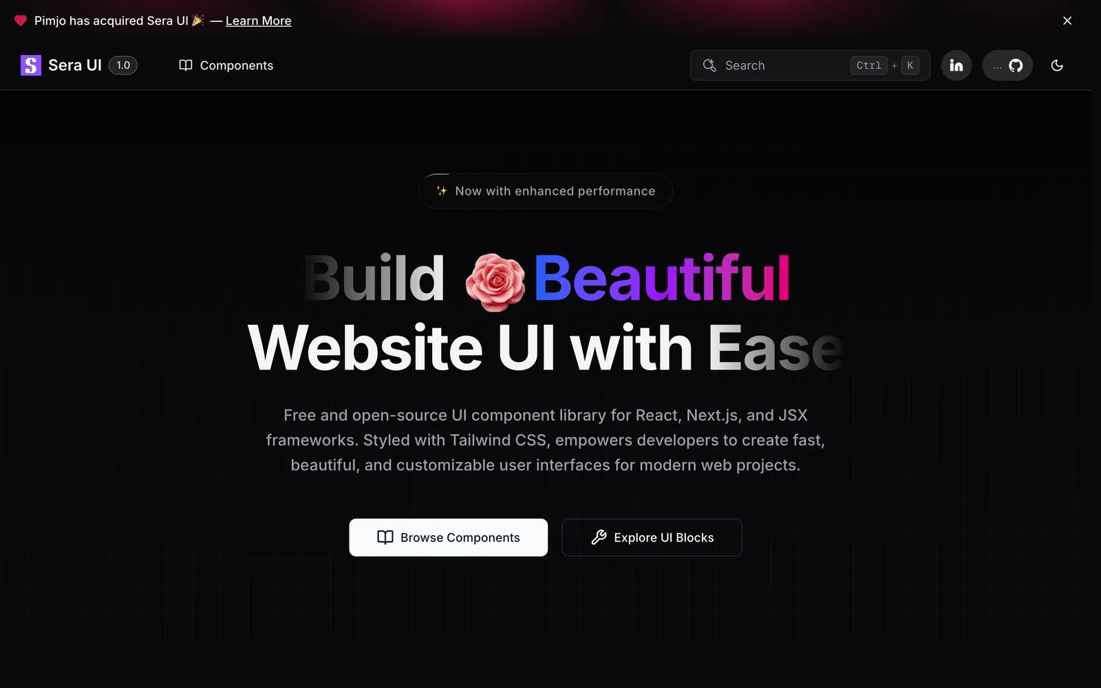
Sera UI — Minimalist React components designed for effortless shadcn CLI integration.

Sera UICollections

Minimalist React components designed for effortless shadcn CLI integration.

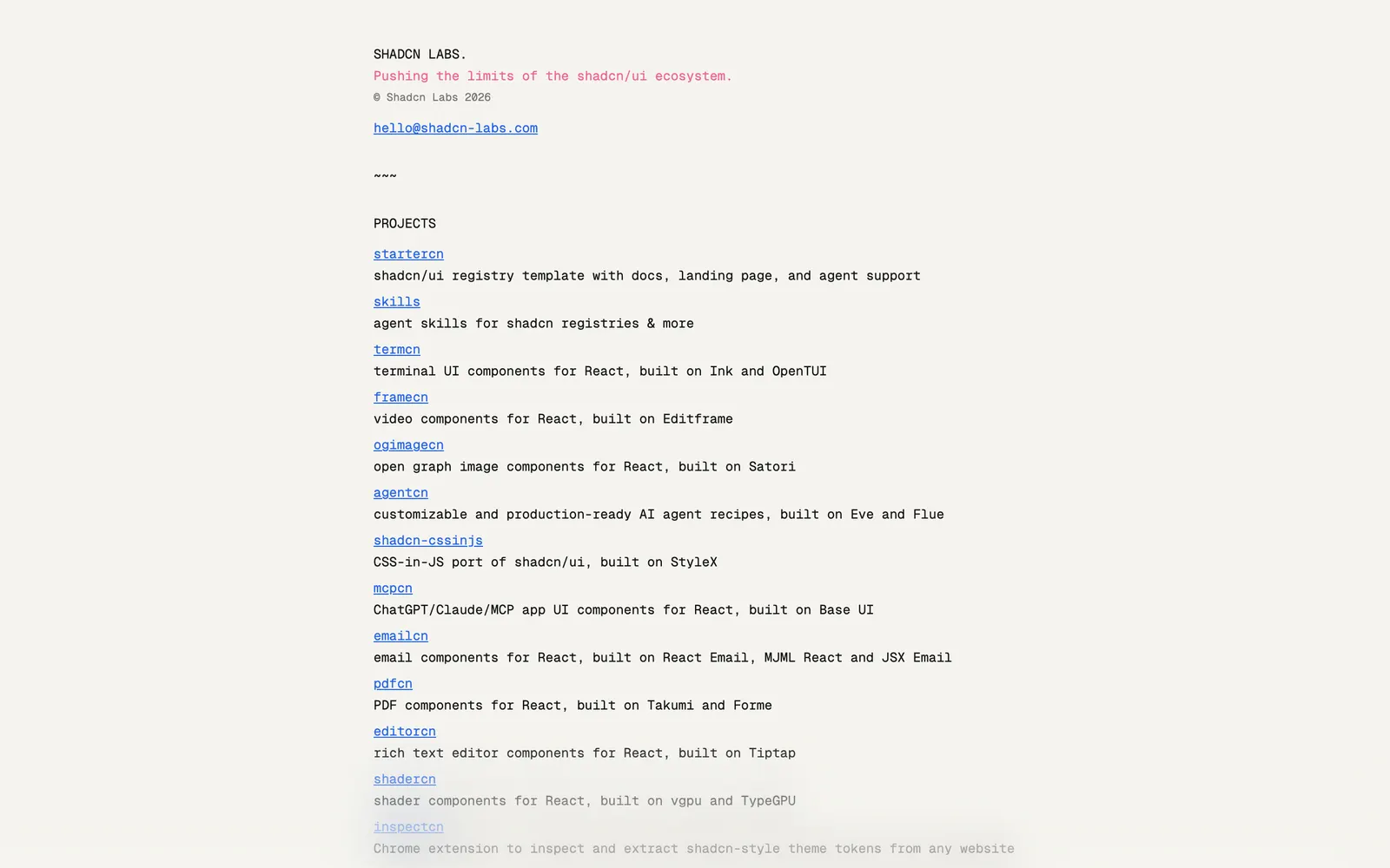
Shadcn Labs — Curated ecosystem and exploration lab for emerging shadcn/ui community registries.

Shadcn LabsCollections

Curated ecosystem and exploration lab for emerging shadcn/ui community registries.

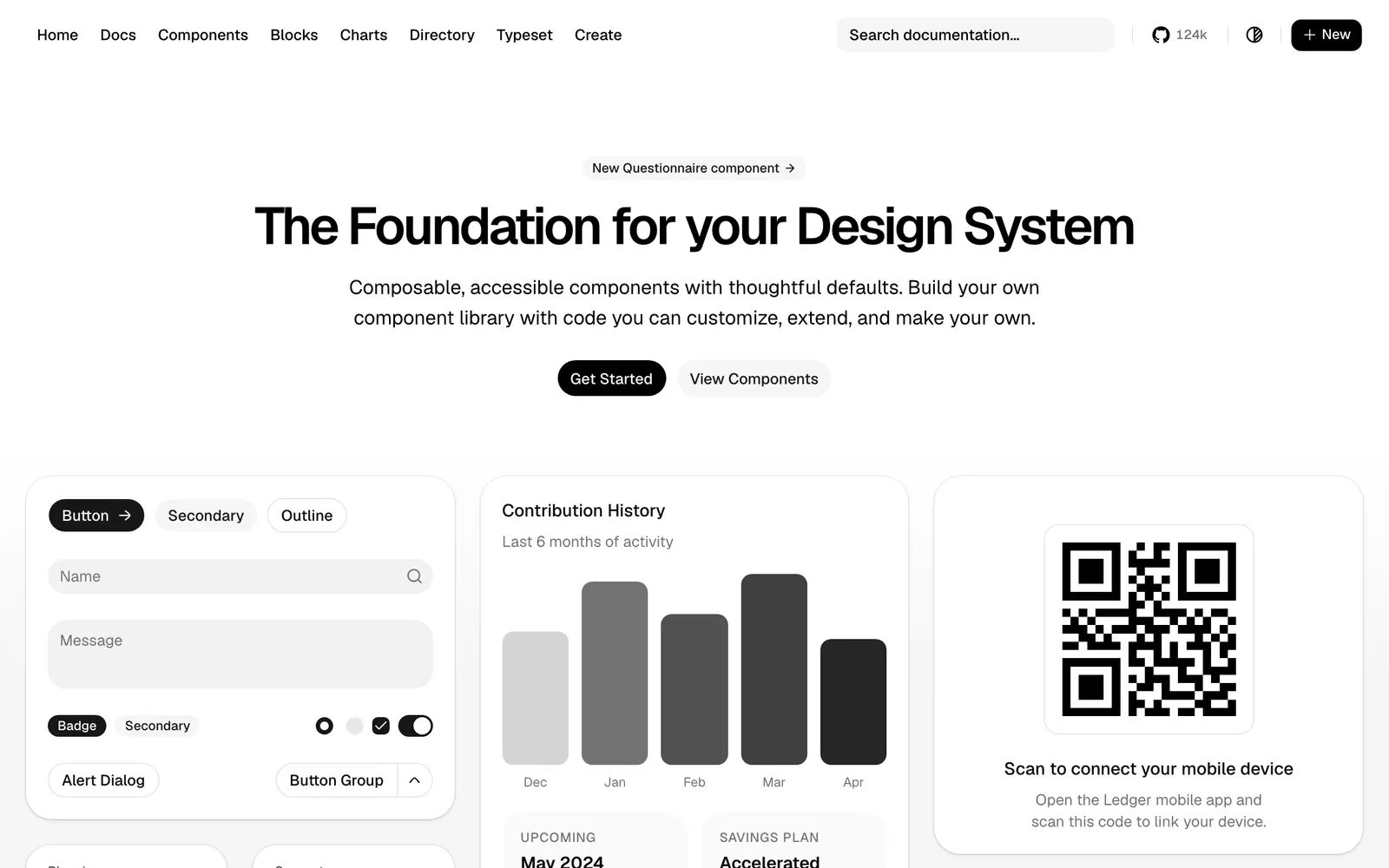
shadcn/ui — Beautifully designed components that you can copy and paste into your apps.

shadcn/uiCollections

Beautifully designed components that you can copy and paste into your apps.

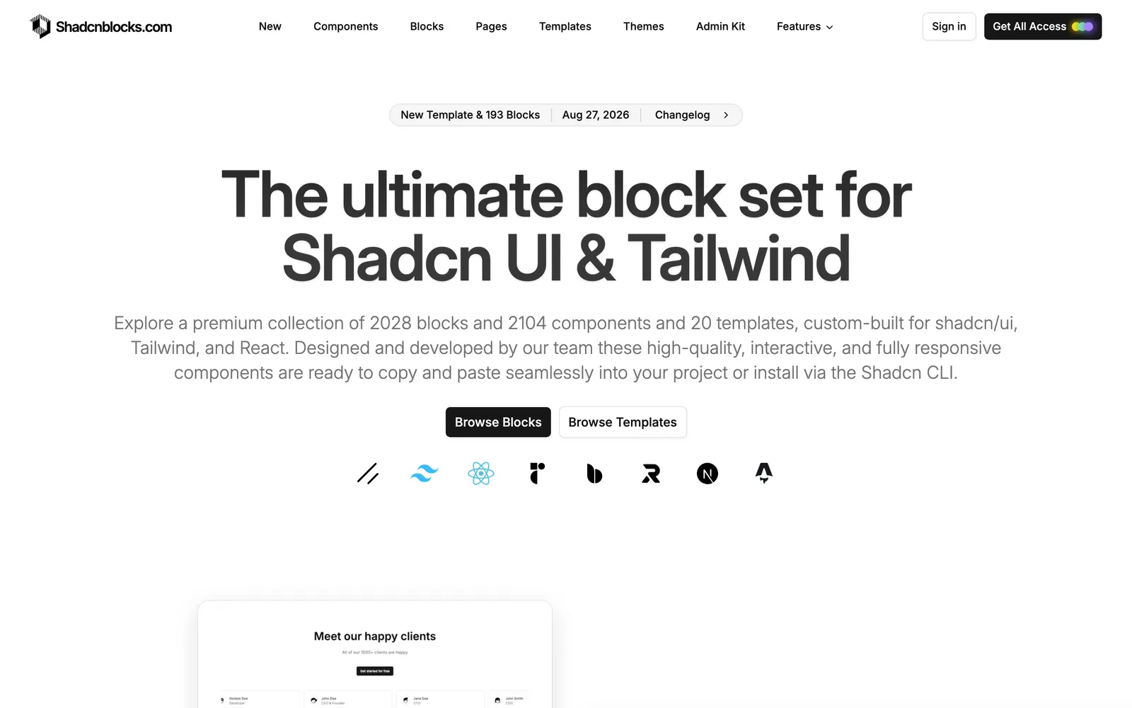
shadcnblocks — Comprehensive library of ready-to-use shadcn website blocks and UI sections.

shadcnblocksCollections

Comprehensive library of ready-to-use shadcn website blocks and UI sections.

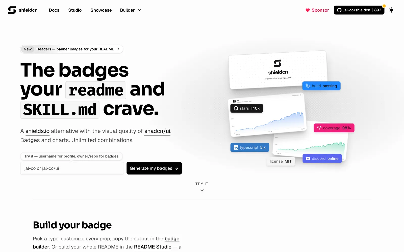
shieldcn — GitHub README badges and status shields styled with clean shadcn aesthetics.

shieldcnFiles & Code

GitHub README badges and status shields styled with clean shadcn aesthetics.

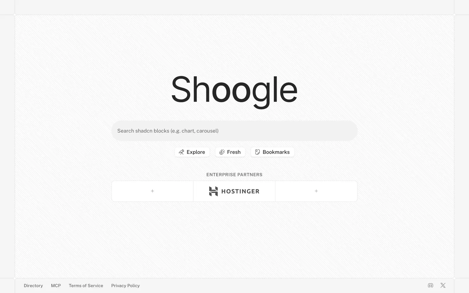
Shoogle — Specialized search engine spanning the growing ecosystem of shadcn registries.

ShoogleCollections

Specialized search engine spanning the growing ecosystem of shadcn registries.

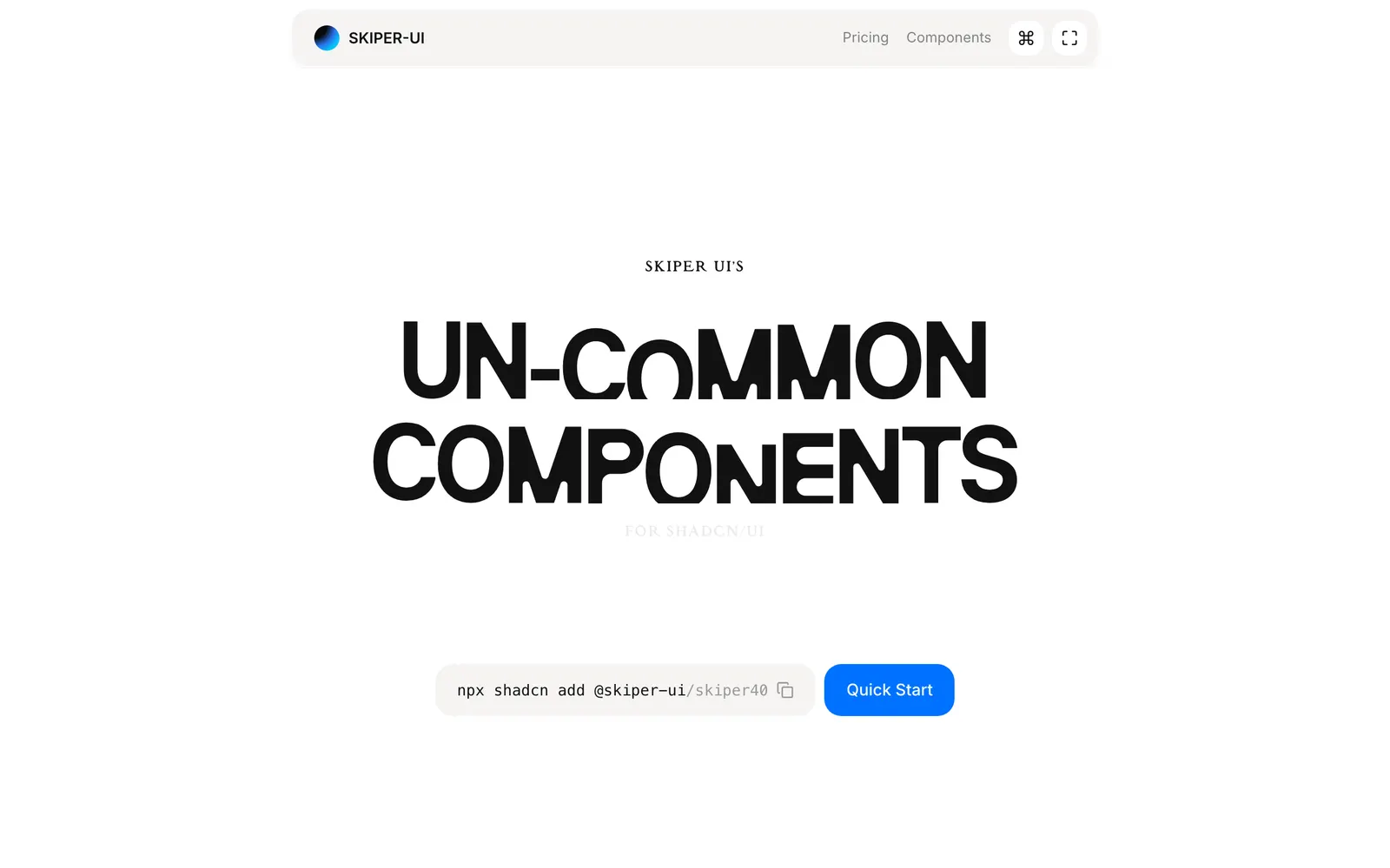
Skiper UI — Animated UI primitives and motion widgets designed for modern Tailwind CSS.

Skiper UICollections

Animated UI primitives and motion widgets designed for modern Tailwind CSS.

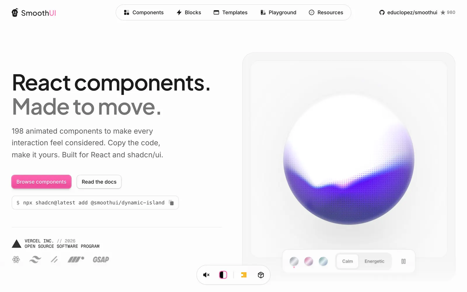
Smooth UI — Motion-heavy React components ready to copy and paste for silky user interfaces.

Smooth UICollections

Motion-heavy React components ready to copy and paste for silky user interfaces.

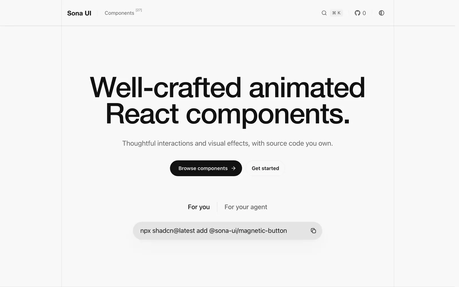
Sona UI — Animated React components designed for developer ownership and fluid aesthetics.

Sona UICollections

Animated React components designed for developer ownership and fluid aesthetics.

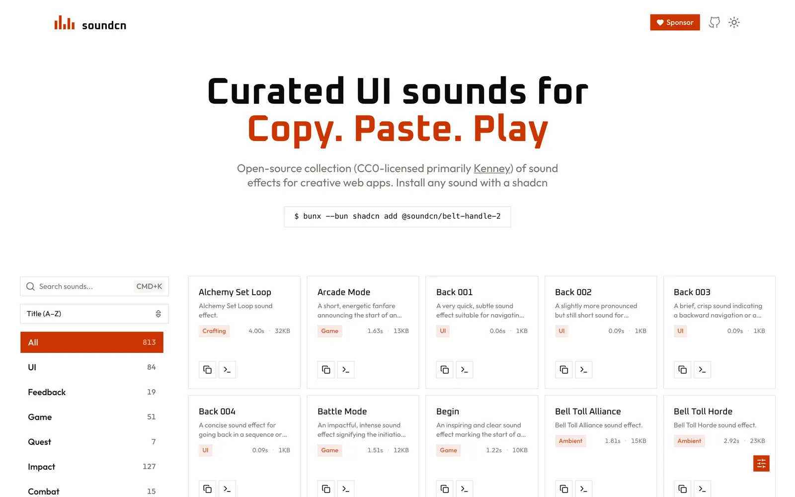
soundcn — Curated collection of copy-paste UI sound effects and audio hooks for the web.

soundcnLoading & Feedback

Curated collection of copy-paste UI sound effects and audio hooks for the web.

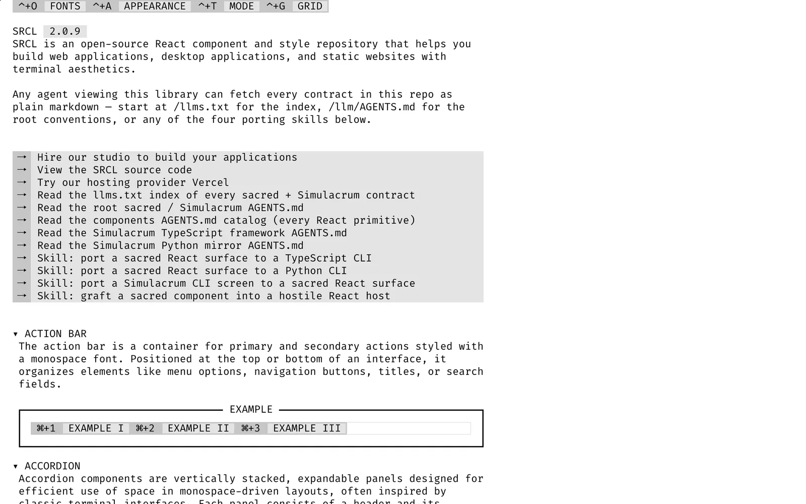
SRCL — Retro DOS-style terminal component kit and vintage cyber interface library.

SRCLCollections

Retro DOS-style terminal component kit and vintage cyber interface library.

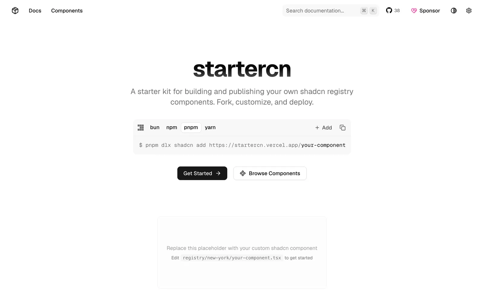
startercn — Comprehensive shadcn/ui registry template with docs, landing page, and AI agent support.

startercnCollections

Comprehensive shadcn/ui registry template with docs, landing page, and AI agent support.

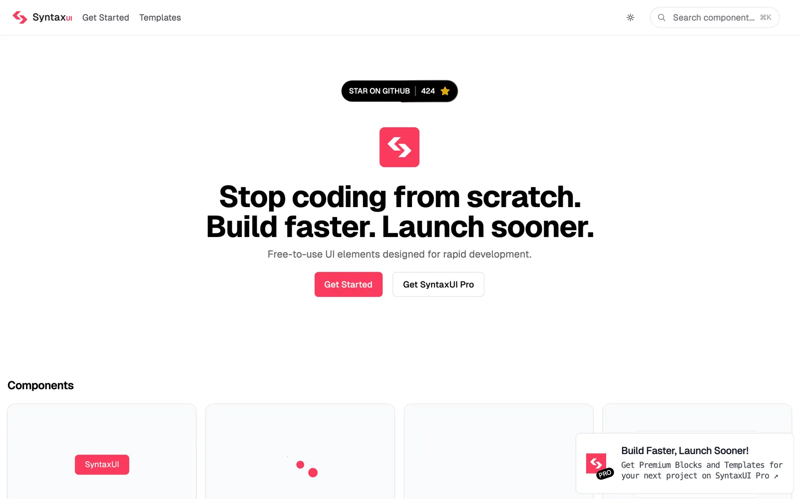
Syntax UI — Animated copy-paste components and creative interactions for landing pages.

Syntax UICollections

Animated copy-paste components and creative interactions for landing pages.

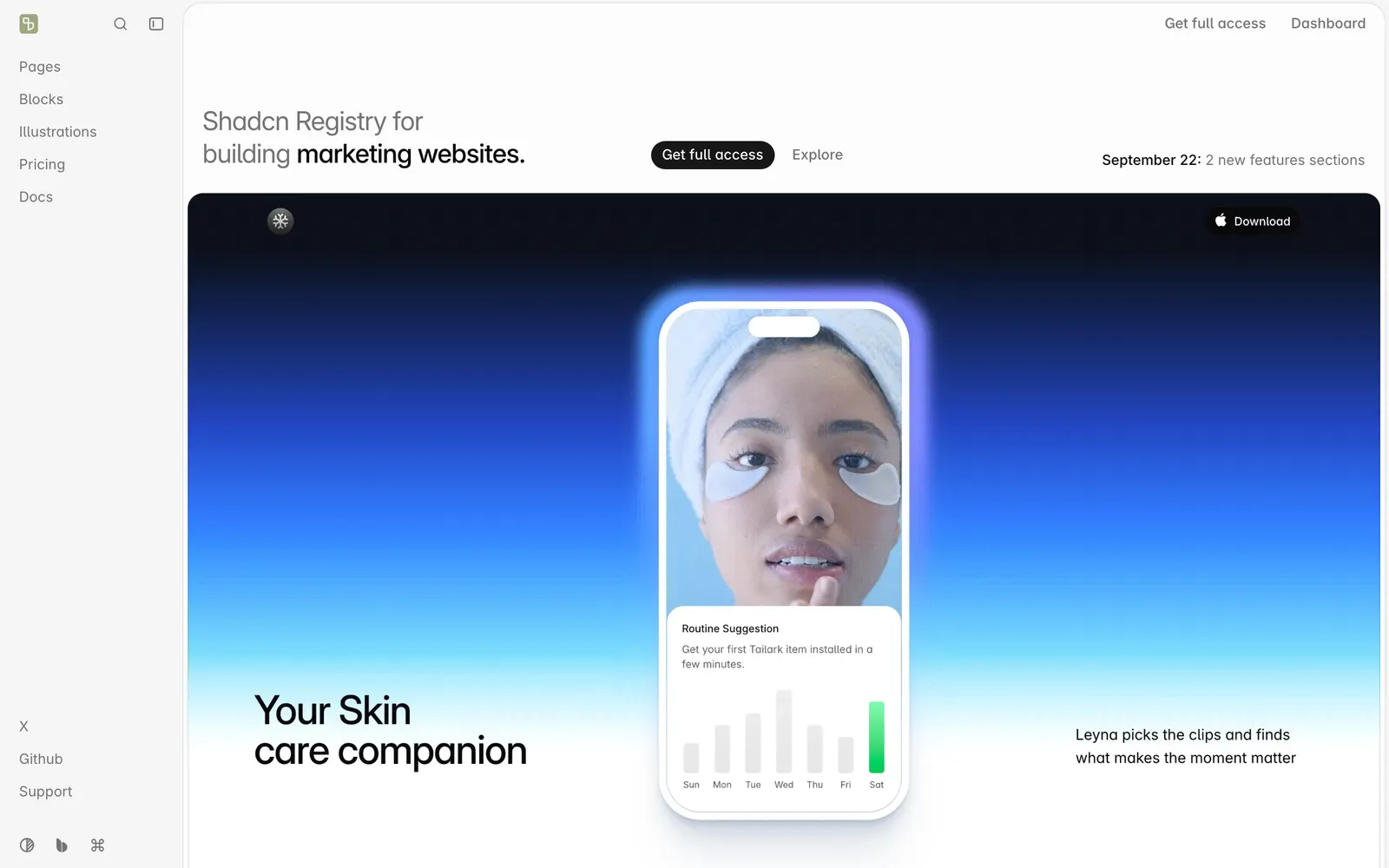
Tailark — Handcrafted Tailwind CSS marketing sections and blocks for SaaS landing pages.

TailarkCollections

Handcrafted Tailwind CSS marketing sections and blocks for SaaS landing pages.

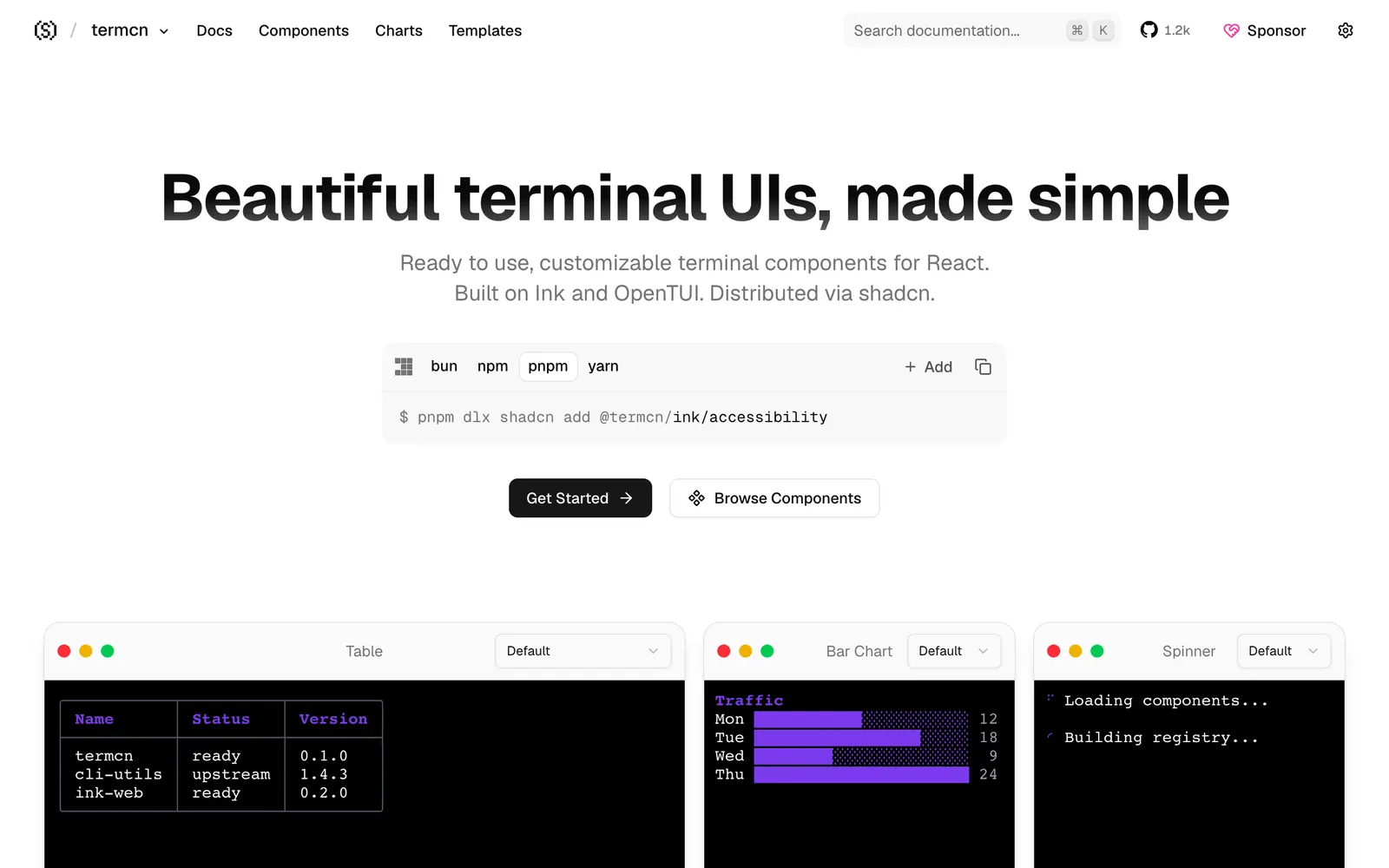
termcn — Terminal UI components for React, built on Ink, OpenTUI, and shadcn conventions.

termcnFiles & Code

Terminal UI components for React, built on Ink, OpenTUI, and shadcn conventions.

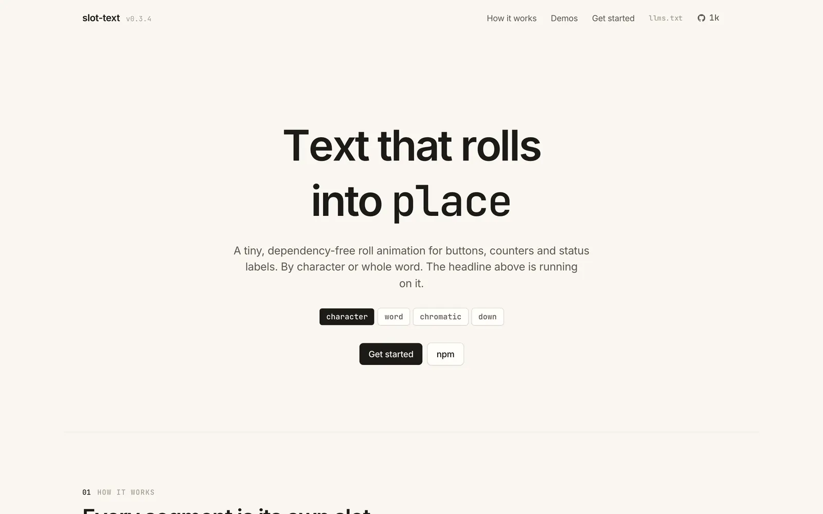
textmotion — Zero-dependency, high-performance kinetic text roll animation primitive.

textmotionText & Typography

Zero-dependency, high-performance kinetic text roll animation primitive.

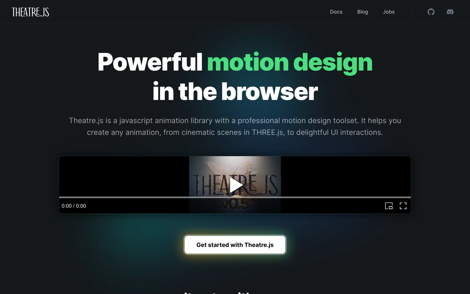
Theatre.js — Visual motion design sequencer and animation studio for DOM, Three.js, and WebGL.

Theatre.jsCollections

Visual motion design sequencer and animation studio for DOM, Three.js, and WebGL.

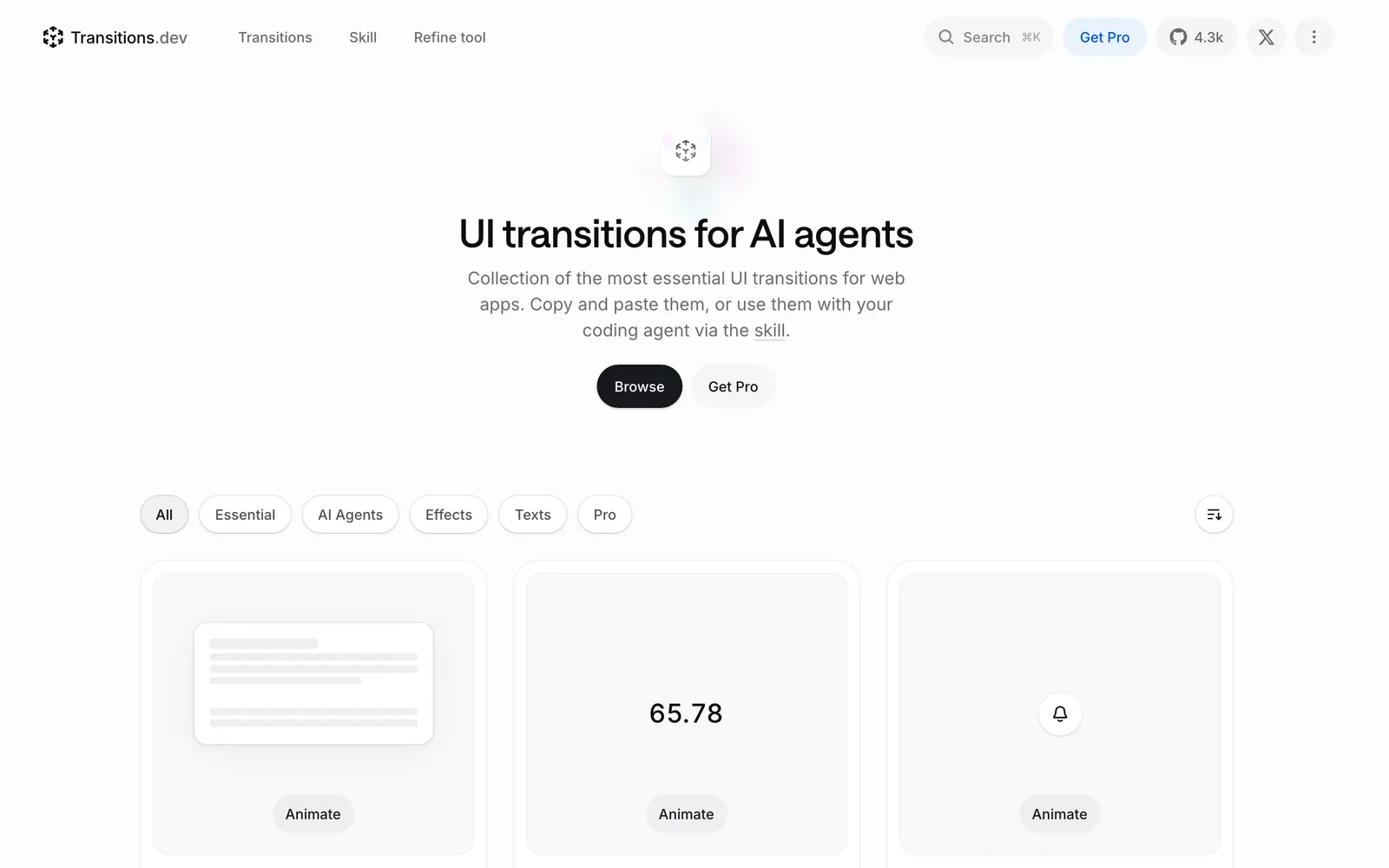
Transitions — Curated collection of CSS transition recipes, custom easings, and animations.

TransitionsCollections

Curated collection of CSS transition recipes, custom easings, and animations.

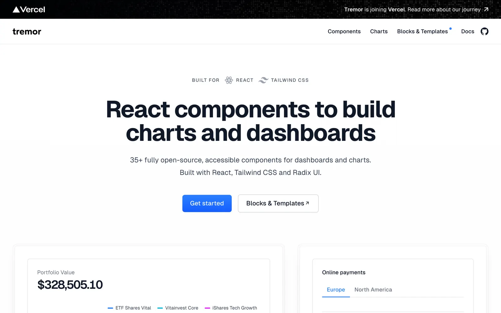
Tremor — Modular React component library built on Tailwind CSS for dashboards and charts.

TremorData Viz

Modular React component library built on Tailwind CSS for dashboards and charts.

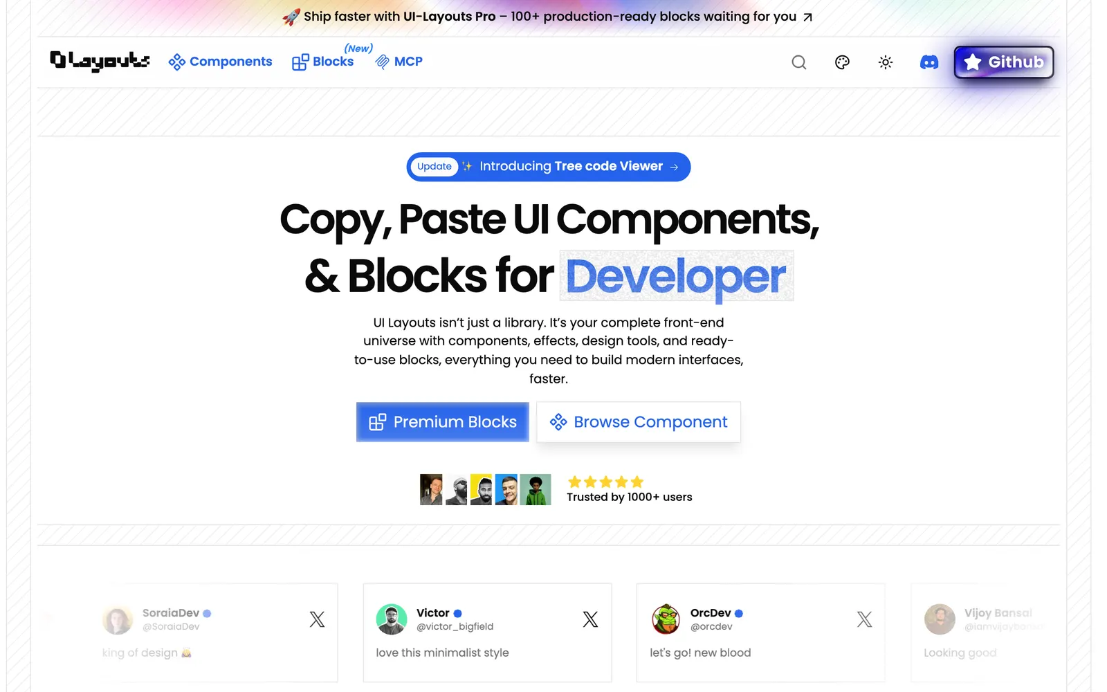
UI Layouts — Full-page layouts, hero sections, and interactive headers built with Tailwind.

UI LayoutsCollections

Full-page layouts, hero sections, and interactive headers built with Tailwind.

Uiuno — AI-assisted workspace for discovering, previewing, and organizing shadcn components.

UiunoCollections

AI-assisted workspace for discovering, previewing, and organizing shadcn components.

unlumen UI — Minimalist, dark-mode first React component library installable via CLI.

unlumen UICollections

Minimalist, dark-mode first React component library installable via CLI.

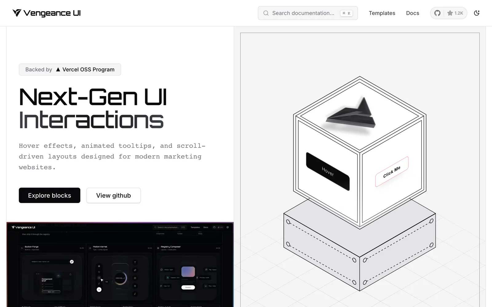
Vengeance UI — Animated React components featuring kinetic scroll interactions and bold motion.

Vengeance UICollections

Animated React components featuring kinetic scroll interactions and bold motion.

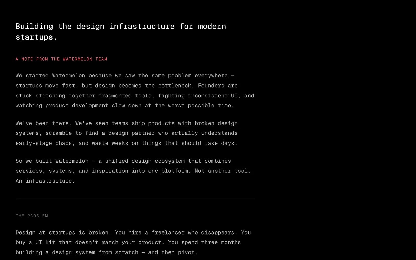
Watermelon UI — Fresh, colorful React component collection expanding the shadcn ecosystem.

Watermelon UICollections

Fresh, colorful React component collection expanding the shadcn ecosystem.

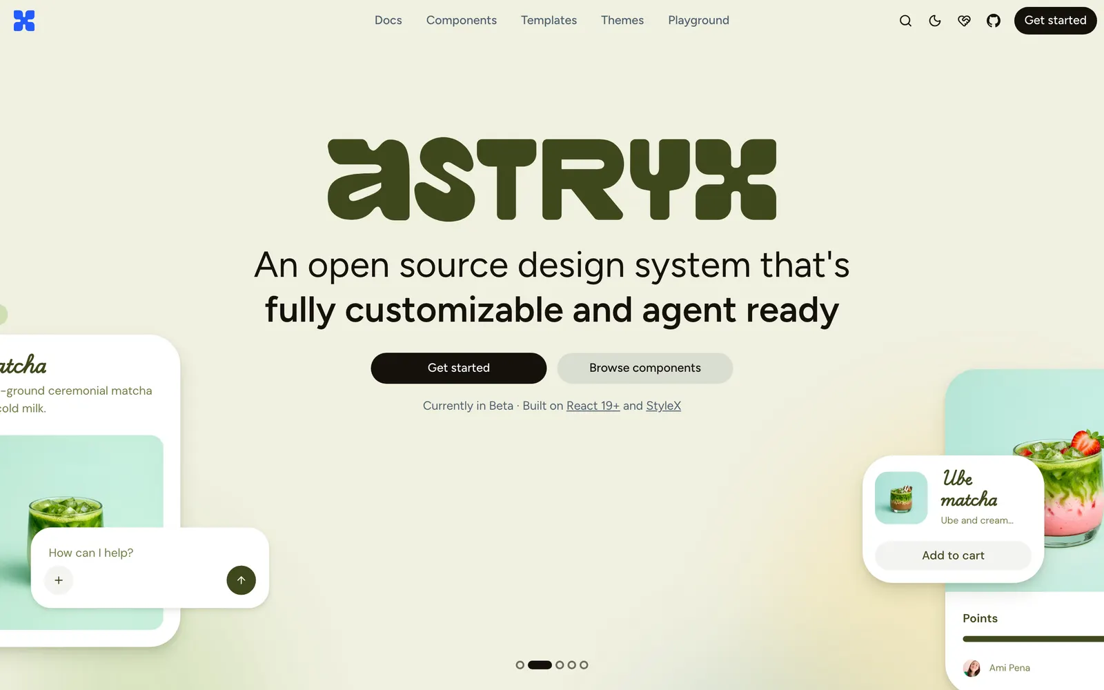
Astryx — An agent-ready React design system from Meta, built on StyleX with customizable themes.

AstryxCollections

An agent-ready React design system from Meta, built on StyleX with customizable themes.

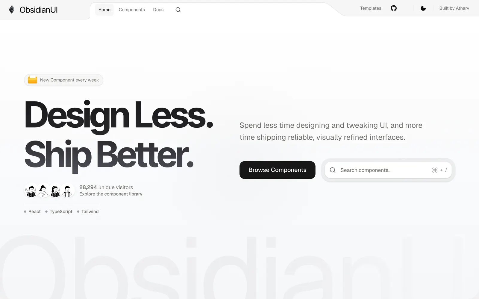
ObsidianUI — A collection of creative animated React components built with Motion and Tailwind CSS.

ObsidianUICollections

A collection of creative animated React components built with Motion and Tailwind CSS.

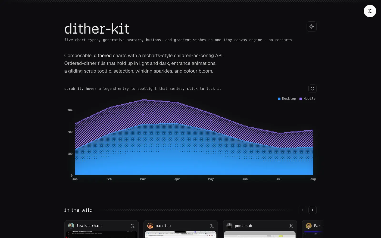
Dither Kit — Composable dithered charts and components for shadcn/ui on a tiny canvas engine.

Dither KitData Viz

Composable dithered charts and components for shadcn/ui on a tiny canvas engine.

Rare UI — A curated registry of rare animated React components built with Motion and shadcn.

Rare UICollections

A curated registry of rare animated React components built with Motion and shadcn.

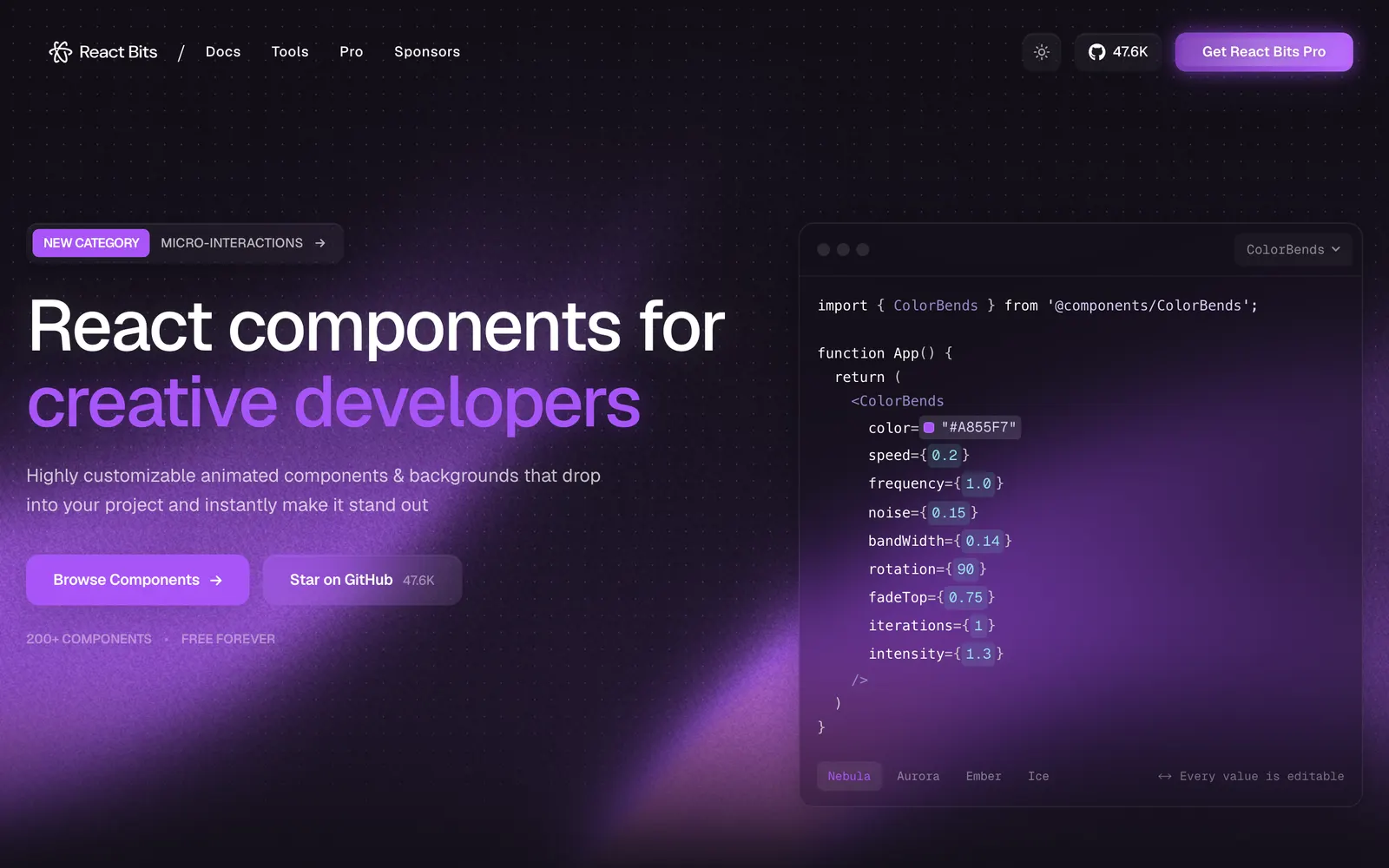
React Bits — Over 200 animated React components, interactive backgrounds, and creative text effects.

React BitsCollections

Over 200 animated React components, interactive backgrounds, and creative text effects.

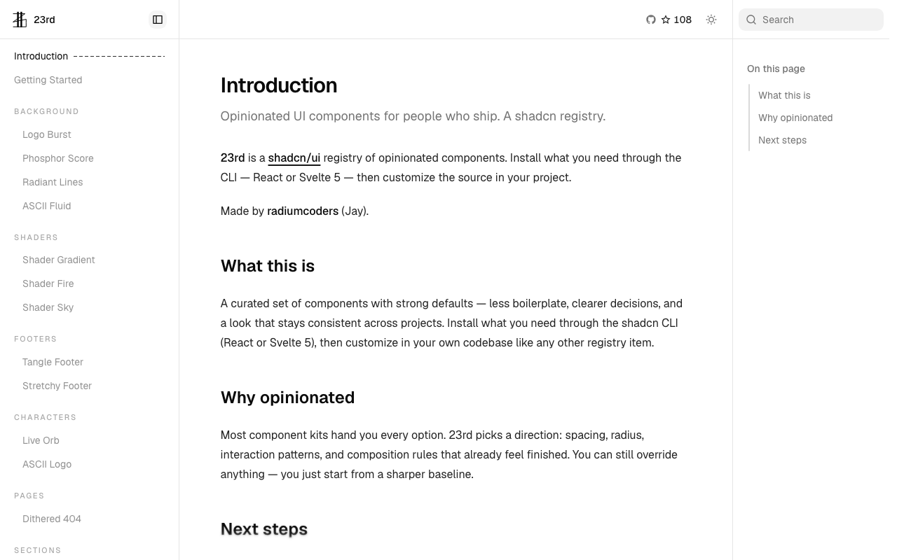
23rd — An opinionated shadcn/ui registry of high-character components for React and Svelte 5, featuring ASCII fluid, GLSL shaders, and organic motion.

23rdCollections

An opinionated shadcn/ui registry of high-character components for React and Svelte 5, featuring ASCII fluid, GLSL shaders, and organic motion.

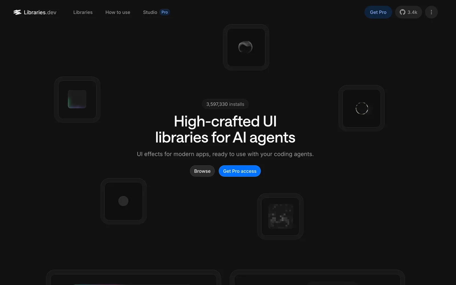
Libraries.dev — High-crafted React effect libraries tailored for AI agents, featuring Border Beam, Thinking Orbs, Gooey, Liquid Metal, and Image Loaders.

Libraries.devCollections

High-crafted React effect libraries tailored for AI agents, featuring Border Beam, Thinking Orbs, Gooey, Liquid Metal, and Image Loaders.

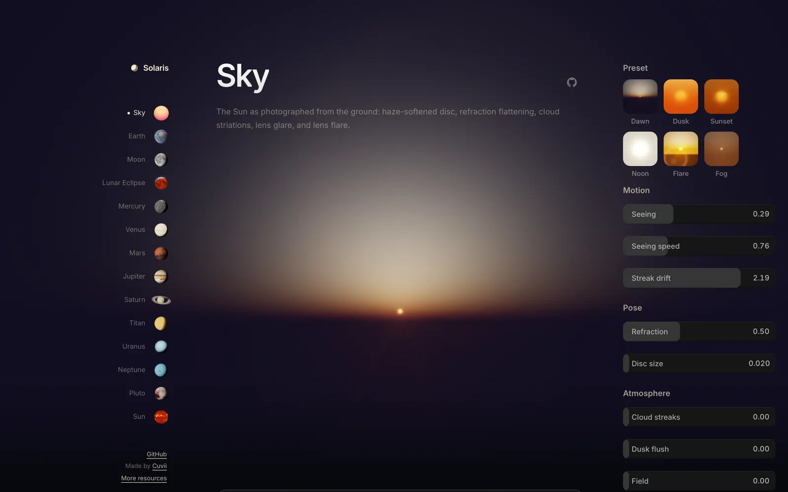
Solaris — Physically styled WebGL2 shader components for rendering the solar system and sky in React 19.

SolarisCollections

Physically styled WebGL2 shader components for rendering the solar system and sky in React 19.

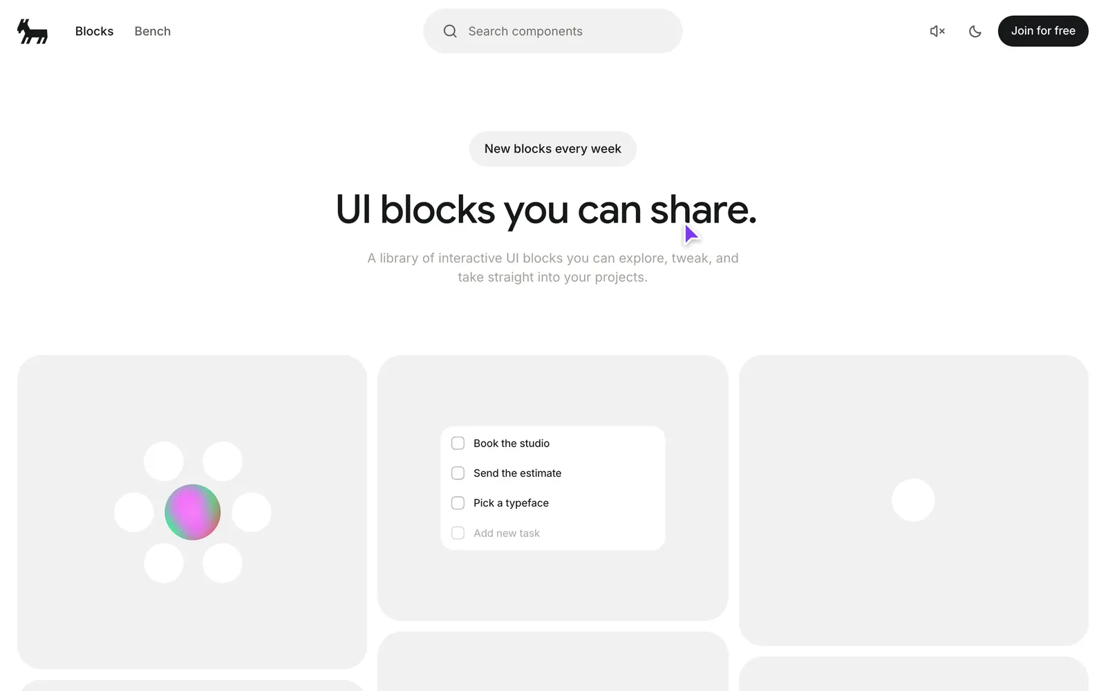
Bencho — A library of live, interactive UI blocks you can explore, tweak, and take straight into your projects — everything is functional, not mocked.

BenchoCollections

A library of live, interactive UI blocks you can explore, tweak, and take straight into your projects — everything is functional, not mocked.

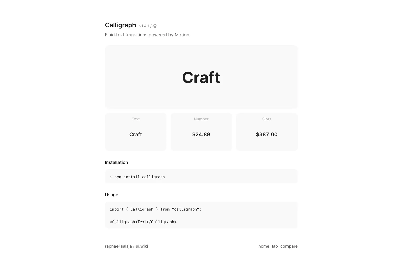
Calligraph — Fluid text transitions powered by Motion. Shared characters slide to their new positions while entering characters fade in and exiting ones fade out.

CalligraphText & Typography

Fluid text transitions powered by Motion. Shared characters slide to their new positions while entering characters fade in and exiting ones fade out.

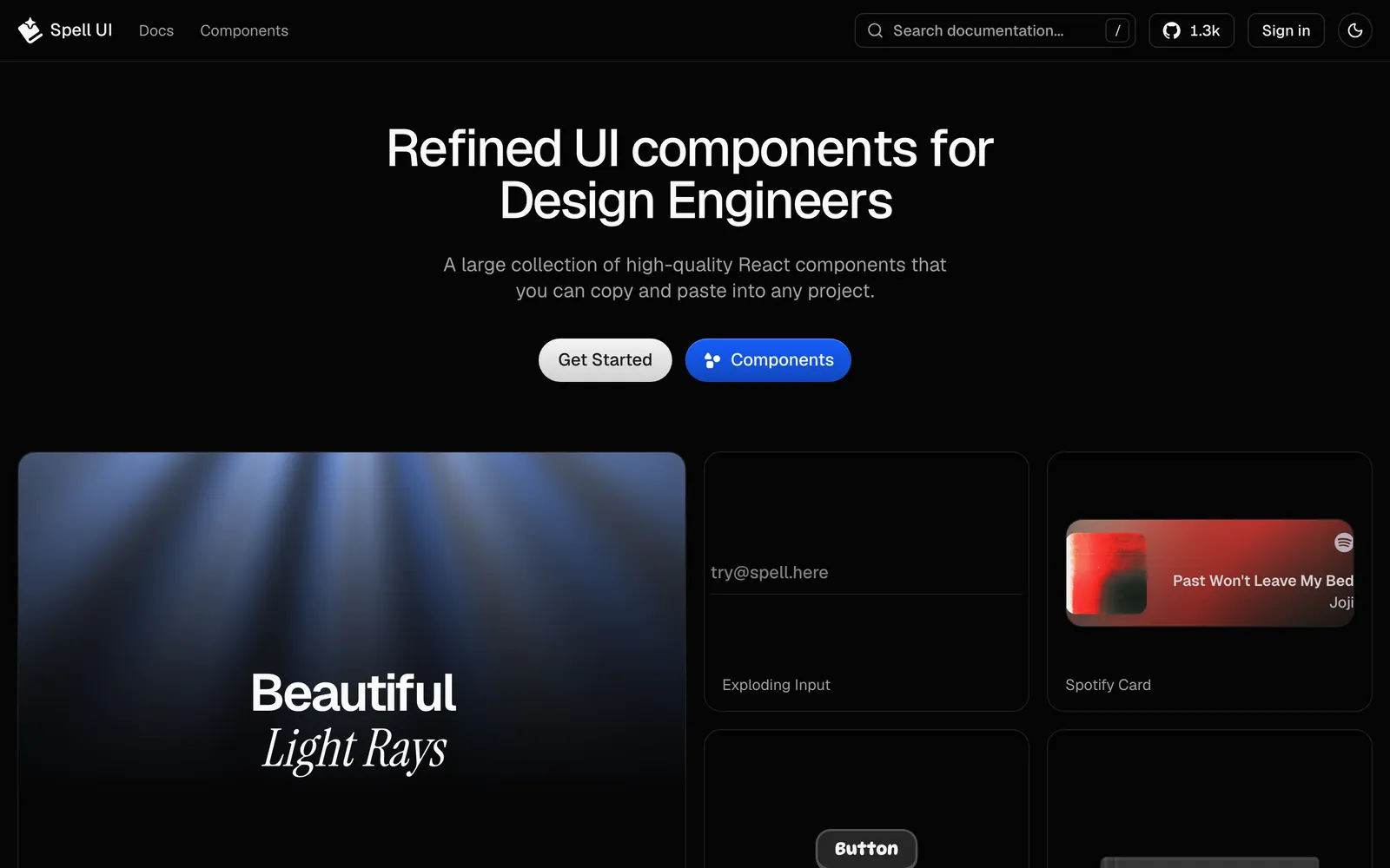
Spell UI — Beautiful, sophisticated UI components designed for modern React and Tailwind CSS applications.
Spell UICollections

Beautiful, sophisticated UI components designed for modern React and Tailwind CSS applications.