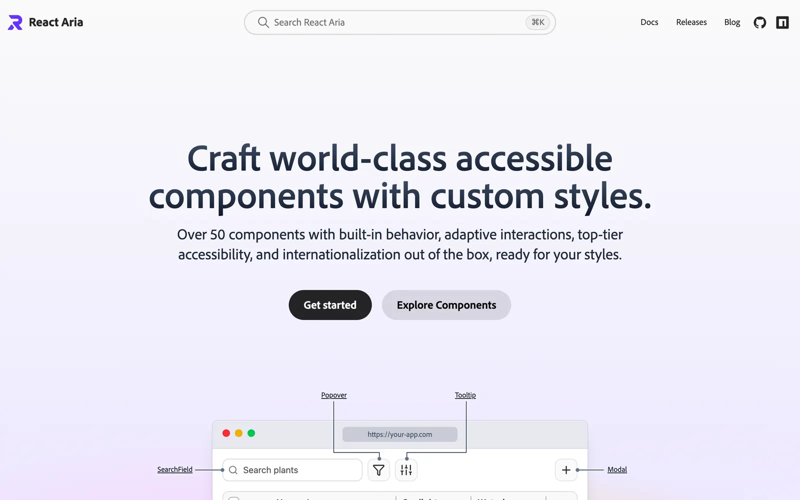
Unstyled, accessible React component primitives with adaptive interactions by Adobe.
Included Components
44
AutocompleteBreadcrumbsButtonCalendarCheckboxColorAreaColorFieldColorPickerColorSliderColorSwatchColorWheelComboBoxDateFieldDatePickerDialogDisclosureDropZoneFileTriggerFormGridListInputListBoxMenuMeterModalNumberFieldPopoverProgressBarRadioGroupSearchFieldSelectSeparatorSliderSwitchTableTabsTagGroupTextAreaTextFieldToastToggleButtonToolbarTooltipTree
React Aria is a comprehensive library of unstyled, accessible UI primitives and React hooks developed by Adobe. Built to power scalable design systems, it packages WAI-ARIA compliance, complex keyboard navigation, touch and pointer normalization, internationalization in over 30 languages, and robust state management across more than 50 components. By abstracting accessibility and device quirks without prescribing visual styling, it leaves styling completely to Tailwind, CSS Modules, or custom tokens.