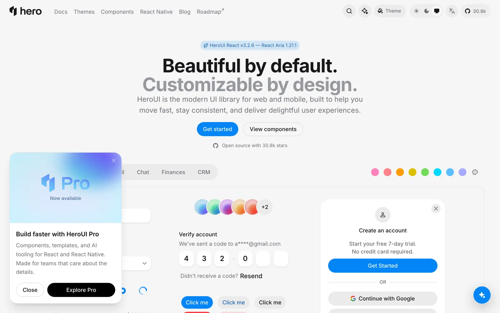
Beautiful, fast and modern React UI library, formerly known as NextUI.
Included Components
139
All Components (React)AccordionAlertAlertDialogAutocompleteAvatarNewAvatarGroupBadgeBreadcrumbsButtonButtonGroupUpdatedCalendarCardUpdatedCheckboxUpdatedCheckboxGroupChipCloseButtonColorAreaColorFieldColorPickerColorSliderColorSwatchColorSwatchPickerNewComboBoxDateFieldDatePickerDateRangePickerDescriptionDisclosureDisclosureGroupDrawerDropdownErrorMessageFieldErrorFieldsetFormInputInputGroupInputOTPKbdLabelLinkListBoxMeterModalNumberFieldPaginationPopoverProgressBarProgressCircleUpdatedRadioGroupRangeCalendarScrollShadowSearchFieldSelectSeparatorSkeletonSliderSpinnerSurfaceUpdatedSwitchUpdatedTableNewTabsTagGroupTextAreaTextFieldTimeFieldUpdatedToastToggleButtonToggleButtonGroupToolbarUpdatedTooltipHeroUI7kReleasesMigrationButtonsButton GroupClose ButtonToggle ButtonToggle Button GroupCollectionsList BoxTag GroupColorsColor AreaColor FieldColor PickerColor SliderColor SwatchColor Swatch PickerControlsSwitchData DisplayTableDate and TimeCalendarDate FieldDate PickerDate Range PickerRange CalendarTime FieldProgress BarProgress CircleFormsCheckboxCheckboxGroupCheckbox GroupError MessageField ErrorInput GroupInput OtpNumber FieldRadioGroupRadio GroupSearch FieldText FieldText AreaLayoutMediaAvatarGroupAvatar GroupNavigationDisclosure GroupTabsOverlaysAlert DialogToastTooltipPickersComboBoxCombo BoxUtilitiesScroll ShadowOn this pageButton with RippleModal with Backdrop BlurSnippetNavbar
HeroUI (formerly NextUI) is a premier React UI library built on top of Tailwind CSS and React Aria. Known for its gorgeous default styling, fluid spring transitions, full keyboard accessibility, and comprehensive TypeScript support, HeroUI elevates modern SaaS design out of the box.