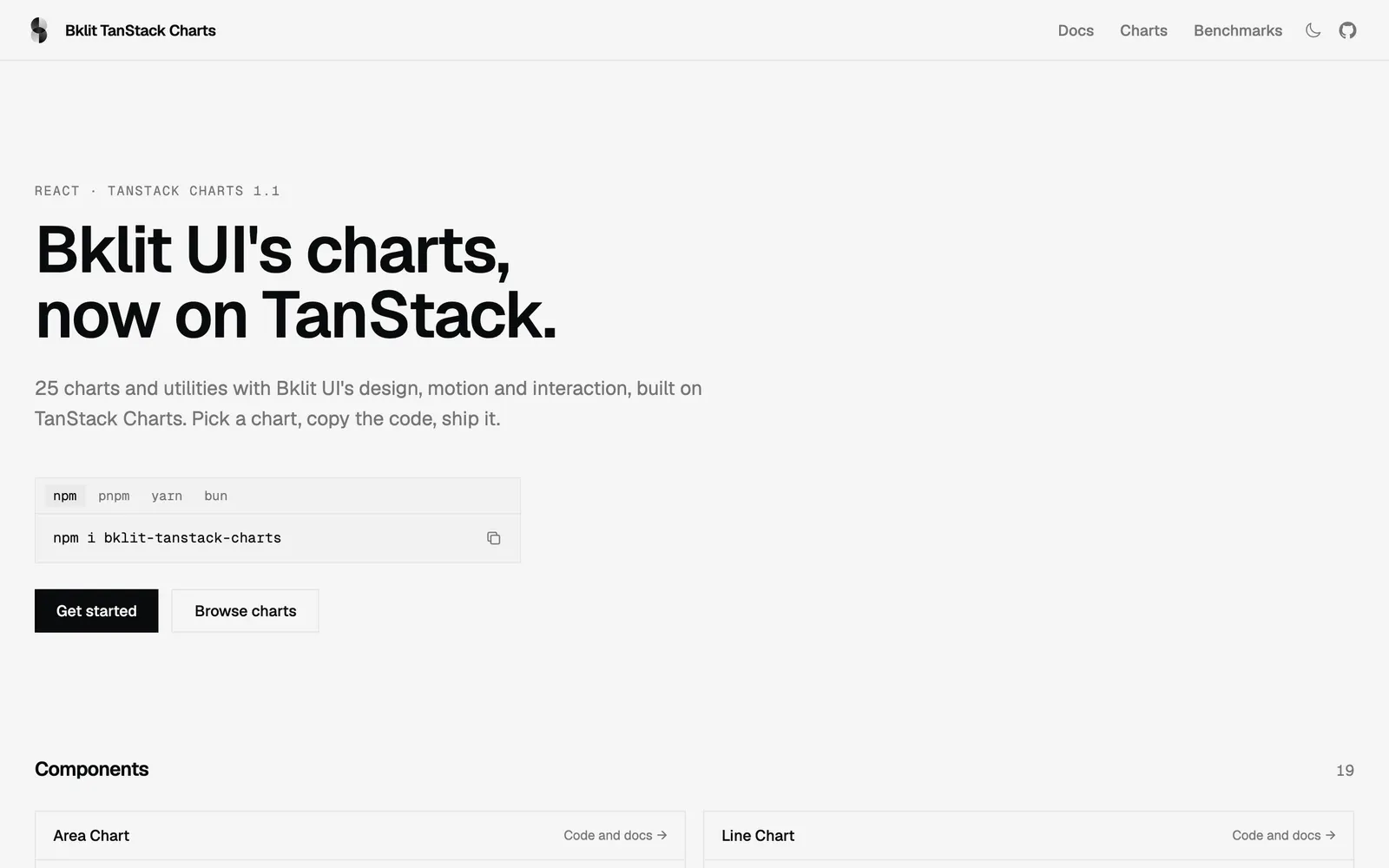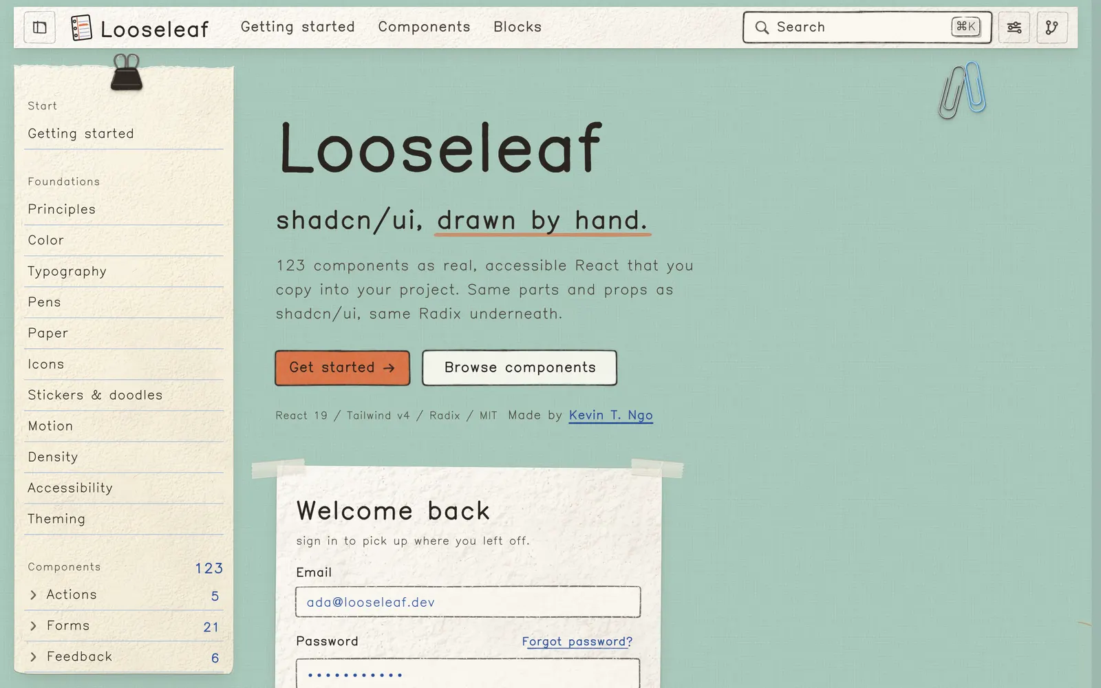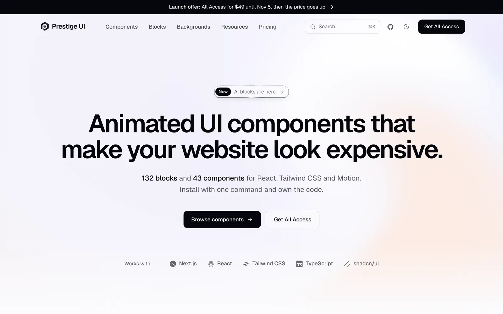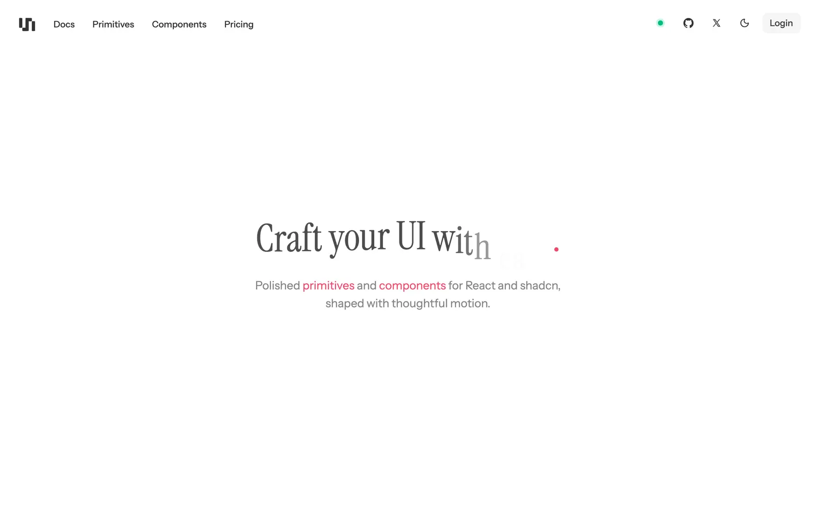
Minimalist, dark-mode first React component library installable via CLI.
Included Components
69
PrimitivesLoginHover Feature CardsFreeStacked Feature CardsMotion FAQs AccordionFreeVideo SliderDia Text RevealCursor Image TrailFreeHover Image ListTilt CardFreeHover ExpandFreeMotion Tabs MenuGooey SVG FilterVercel Snap TextFile TreeFreeGitHub GraphFreeTeam StackAnimated ListFreeFavicon SearchFreeNotion Mention LinkFreeSmart Animate TextAnimate DigitsFreeVercel Animate CountFreeApple SwitchFreePinned ListFreeAnimated InputMatrixFreeAI ChatYoutube Video AmbientFreeSide By Side SlideFreeOrbital Image WheelFreeHorizontal Depth FadeQuestionnaireSocial Hover CardsInline TestimonialsAurora CardBlob CardFreeVertical MarqueeFreeNotion Floating Action MenuDockFreeMotion Slide MenuGooey Navbar MenuFloating NavbarExpandable NavbarMotion Navigation MenuFreeSidebar 001FreeSidebar 002Gravity StarsPixel Liquid BackgroundFreeAurora BarsFreePixel BackgroundPixel Scroll TransitionWave BackgroundSquare PatternSidebar Toggle IconFreeList View IconFreeCompact View IconFreeCards View IconFreeAnimationsImage EffectsMarketingNavigationBackgrounds & ShadersIconsDark Console ModalPrecision Tab StripMuted Toggle SwitchMinimalist TooltipStatus Dot Bar
unlumen UI is a dark-mode first, minimalist component collection created for developers crafting focused developer tooling and terminal-adjacent web dashboards. It offers precision spacing, muted grays, and razor-sharp borders installable via a dedicated CLI.